zachrupertdsn
Well-Known Member
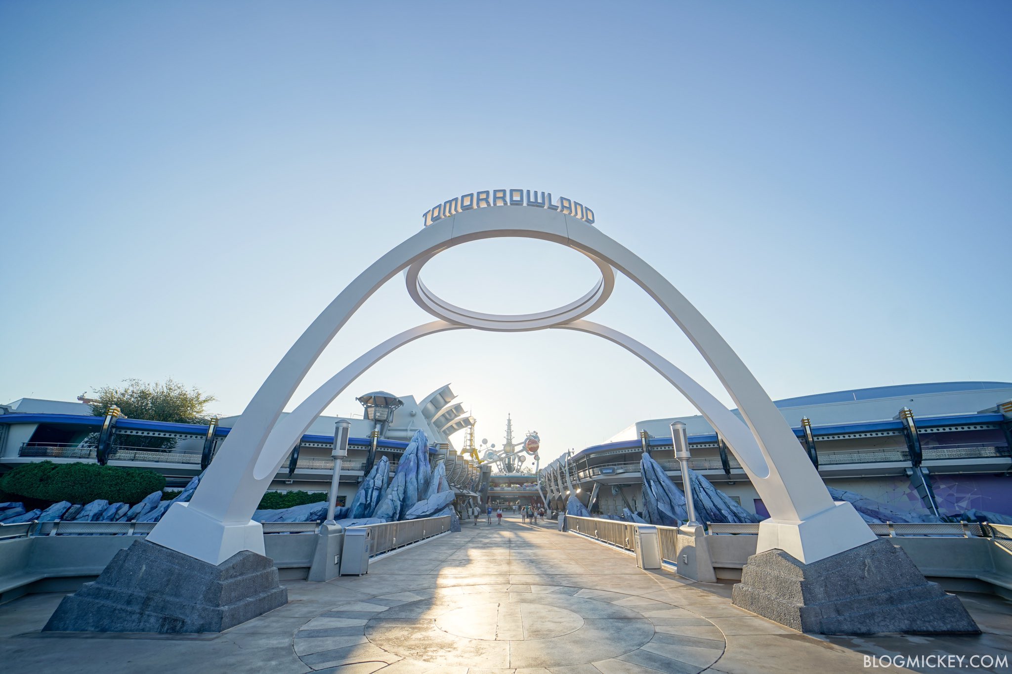
Love it. Love the direction of clean, bright Tomorrowland.
Thanks for your insight. I understand why things are the way they are, but I do hold out at least a little sliver of hope that the added capacity of Tron might help push things in the opposite direction once that opens.
I largely agree with what you’re saying, but I think it’s less of an Iger and Chapek thing and more of a WDW management thing. Despite the influence of the Bob’s, the other parks around the world have continually managed to refurb and update their attraction’s accordingly. WDW, on the other hand, keeps their attractions running as long as possible and with the vast majority of refurbs only lasting long enough to serve existing maintenence needs. Keep in mind that Martin also put the blame of the 2009 refurb going the way it did on Phil Holmes, who was VP of MK at the time, and not anyone above TDO. So, while there’s no denying the faults of Iger and Chapek, what’s happened to Space Mountain and various other attractions across the resort in need of plusing is almost exclusively a WDW problem.
") Their deficiencies have just been amplified in the past 10 years or so, starting with Iger and Staggs' belief that the theme parks were "mature" and didn't require significant investment. $hapek is getting credit for approving spending, which I will begrudgingly acknowledge, but it's still playing catch-up for a decade of neglect. And there are many, many questions about how that money is being spent, along with $hapek's IP mandate. Let's just say I think there's a lot of good that could have come around Tomorrowland from the money being used to build Tron. Or maybe not, given WDI's profligate ways these days.
Their deficiencies have just been amplified in the past 10 years or so, starting with Iger and Staggs' belief that the theme parks were "mature" and didn't require significant investment. $hapek is getting credit for approving spending, which I will begrudgingly acknowledge, but it's still playing catch-up for a decade of neglect. And there are many, many questions about how that money is being spent, along with $hapek's IP mandate. Let's just say I think there's a lot of good that could have come around Tomorrowland from the money being used to build Tron. Or maybe not, given WDI's profligate ways these days.Great!!! Bring back the water tower monoliths to replace the purple rockwork!Love it. Love the direction of clean, bright Tomorrowland.
I was thinking the exact same thing as you were about Astro Orbiter. The current refurb was an emergency refurb, so I understand why they may not have the necessary parts prepped if a redo. However, I can’t imagine that it won’t be touched again sometime befor the 50th given the way everrything else is going aesthetically right now.Totally agree. The base looks bizarre and out of place with what's attached to it.
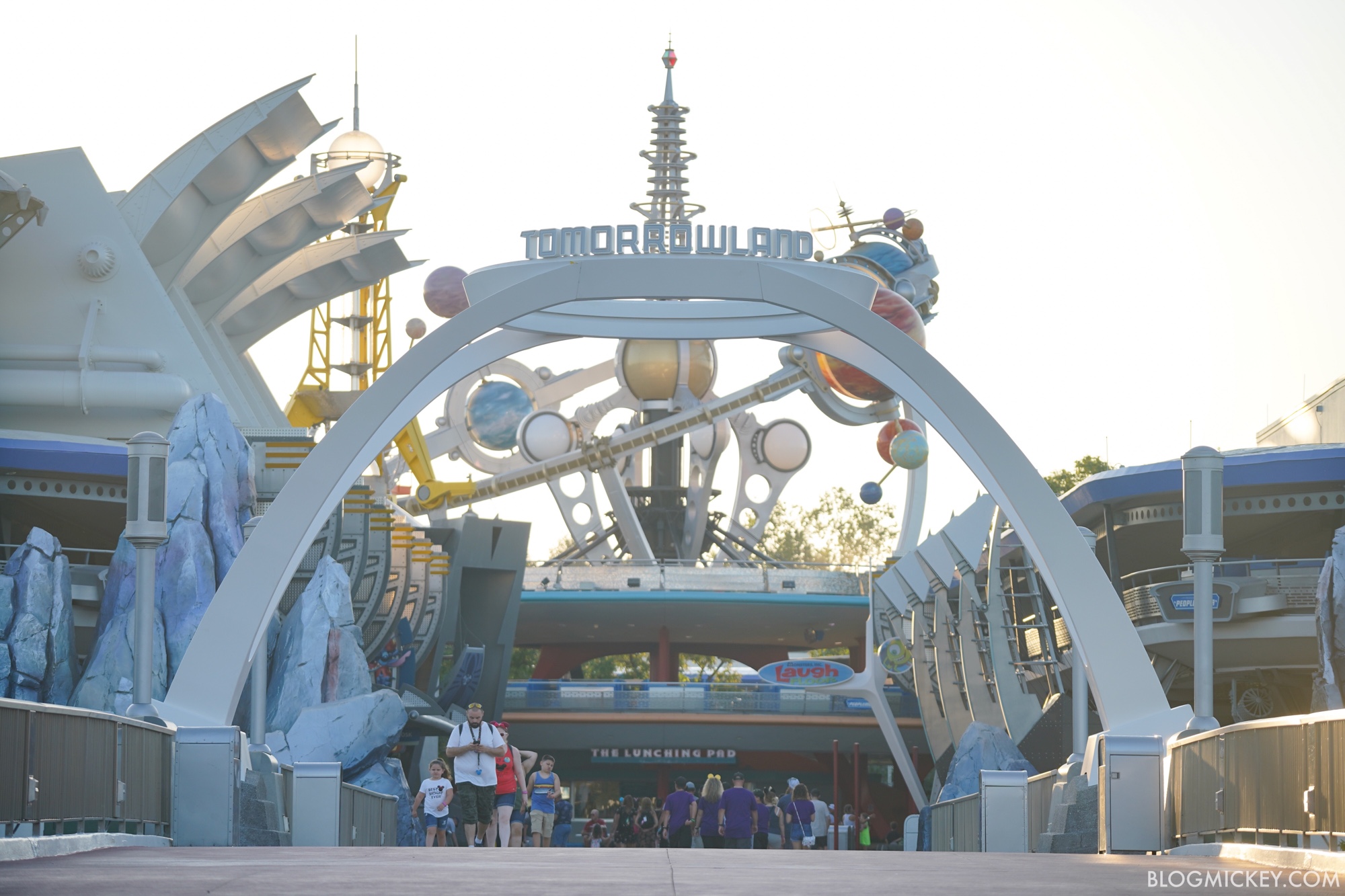
Also, looking through the sign at the Astro Orbiter (and the other fins etc.) is serious clash of styles. While the Astro Orbiter is down, they should go ahead and re-do it so it doesn't look so dissonant.
Too bad that'll never happen. Or at least with the scope of this project.Great!!! Bring back the water tower monoliths to replace the purple rockwork!
!
It’s so, plain.
Finally a good quality picture (until @wdwmagic gets there):
It does go nicely with the "new" Monsters sign:
It's happening very slowly (hopefully they continue with it).
I actually like the blue tones. I wish the whole land would just be a mixture of blue and white. The other colors look very strange in some instances.Am I the only one that things the purple on the rocks just don’t match the new land!? I feel like a grey would have looked better
About two pages ago actually.Did we talk about the theming being stripped elsewhere in Tomorrowland already?
https://blogmickey.com/2019/09/even...-stripped-from-tomorrowland-at-magic-kingdom/
About two pages ago actually.
But I like having pictures that were taken by someone that can work a camera.
Correct me if I am wrong here but they are basically reverting the the look of the people mover to pre 94? Also @marni1971 is there any planed updates to the people mover itself?Did we talk about the theming being stripped elsewhere in Tomorrowland already?
https://blogmickey.com/2019/09/even...-stripped-from-tomorrowland-at-magic-kingdom/
Indeed. The sign works well with the original designs for the land overhaul.I actually like the blue tones. I wish the whole land would just be a mixture of blue and white. The other colors look very strange in some instances.
Indeed. The sign works well with the original designs for the land overhaul.
Where the random wall painting efforts are coming from though I don’t know.
Did we talk about the theming being stripped elsewhere in Tomorrowland already?
https://blogmickey.com/2019/09/even...-stripped-from-tomorrowland-at-magic-kingdom/
Register on WDWMAGIC. This sidebar will go away, and you'll see fewer ads.