jt04
Well-Known Member
Here now, there’s black duct tape over the empty frame where the ship sat.
I'm betting it is Flex Tape.
Here now, there’s black duct tape over the empty frame where the ship sat.
I cant imagine them putting the waterfalls back. I remember when I worked there people always complained it got them wet (apparently even a moderate breeze was enough to send water over the walkway) and for some reason they just couldn't keep them clean.
Yep.From what I've heard and read on here, any bit of wind would blow water onto the main entrance into TL. This could cause slick concrete but mainly guests were getting a shower they didn't ask for.
It's probably why Tokyo's version don't have water coming out of them. But at least they still have them!
Well, I say since screens are such a big deal now...bring 'em back screen style. Simulated waterfalls and all that jazz.From what I've heard and read on here, any bit of wind would blow water onto the main entrance into TL. This could cause slick concrete but mainly guests were getting a shower they didn't ask for.
It's probably why Tokyo's version don't have water coming out of them. But at least they still have them!
Well, I say since screens are such a big deal now...bring 'em back screen style. Simulated waterfalls and all that jazz.
Edit: And if they simulate waterfalls, they could add colors!
(I got ideas.)
I've always thought if they did bring back the spires (no water) that they could use some nice LED lighting to draw attention to them in a tasteful and not super in your face way. Classic TL by day, Tronmorrowland by night. Heck, change the area loops at night while they're at it.Well, I say since screens are such a big deal now...bring 'em back screen style. Simulated waterfalls and all that jazz.
Edit: And if they simulate waterfalls, they could add colors!
(I got ideas.)
")
More and more, I'm convinced that there are very few people left in WDI who understand the power of good architecture and how it can add meaning to a space. Instead of buildings that exude their theme from their very core, there has been a rise of relatively nondescript spaces that are "themed" only by superficial decoration. TL94's reliance on visual clutter and text-heavy signage was certainly a step down that road, but WDI's apparent design philosophy has continued to evolve since then
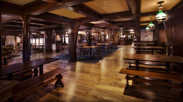
As an example of how things have changed, consider the interior design of the Columbia Harbour House at MK. Everything from the low ceilings, heavy beams, turned columns, and wooden floors to the light fixtures and furniture reflects the nautical theme, and evokes the feeling of a square-rigged ship. There is almost nothing on the walls, but the design is instantly understood in a universal way.
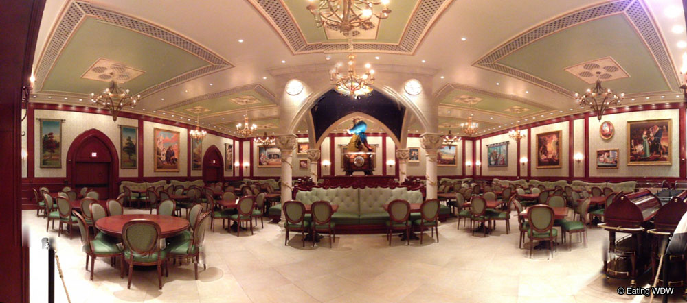
More recently, the music box room at Be Our Guest looks more like a generic hotel ballroom, and only reflects the theme through (rather heavy-handed) artwork scattered around. Very little about the room's dimensions and proportions, building materials, or fixtures indicates that it's supposed to be inside a castle hundreds of years ago. Swap out the art for nature photos with inspirational sayings, and it's suddenly Multipurpose Room B at your local airport Hilton.
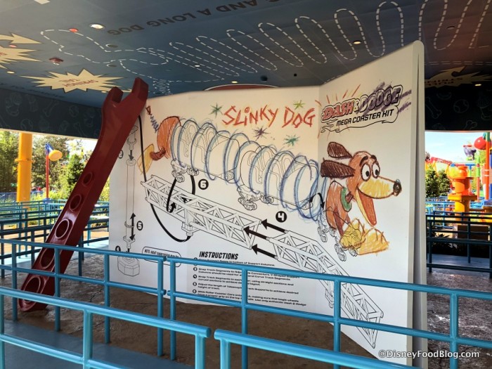
In a rather extreme example, Toy Story Land consists almost entirely of rectangular buildings with flat walls, which are themed only by the graphics applied to them. Put up a fresh coat of paint, and any hypothetical meaning from the structures no longer exists.
Much like using names of fictional proprietors (Chester & Hester's Dinorama, Mater's Junkyard Jamboree, Oga's Cantina) graphics, text, and other set dressings can be a shortcut for designers to quickly give meaning to a space. However, when they're used in place of meaningful architecture, the entire experience feels hollow, as there is no real context for the space.
There's an adage in cinema that it's better to show the audience something than to tell them; using signage and graphics in a theme park setting tells the audience, but showing them through meaningful design is far more powerful. Creating that kind of space requires designers who understand how to evoke various concepts and who trust their audience to pick up on context clues. These are the kinds of things that separate Disney's parks from the rest. It's been a gradual decline over many decades, but it seems like this is increasingly rare from WDI.
[Let the record state that I know there are plenty of examples contrary to this, but this seems to be the trajectory over a very long period. I actually think most of the BOG complex is well themed, and recognize that Pandora was done with almost no graphics or signage (though the photos in the Satu'li Canteen queue venture too far into the Applebee's school of design for my preference)]
View attachment 315286
Thanks J&D
Compared to the original, unobscured by arcade and canopies view;
View attachment 315287
Without the arcade the SM show building looked massive. But still quite a distance away. It’s slopeing sides gave a forced perspective look.As much as we may want things to be the way they used to be - and I am not at all impressed with the arcade building - the presence of the arcade building makes SM look to be further away - deeper in the photo - when something is large is put closer. I love seeing the entirety of the SM structure from the monorail, but in the park I'm happy with it a bit tucked away - like it's a bit of a journey to get to it.
Remember the original plan for the observatron where it would play a light show at night? I would really love to see that implemented somehow in the new tomorrowland, even if at a minimal scale compared to the plans.Projections at night.
Or some edible plants if they want to continue the agrifuture thing.If they brought the towers back, they could always replace the waterfall part with a wall of succulents. There are some amazing designs that could be done with the plants. I also think it could start to add some green to the Tomorrowland. Could repeat the idea in other locations to add more spots of green.
Just a thought.
I like it, but I think Future World in EPCOT could use it. I think Tomorrowland works best as a science fictional counterpart, especially when another massive park uses similar themeology.Something like...
View attachment 316688
That plant wall would be great somewhere in a revamped The LandI like it, but I think Future World in EPCOT could use it. I think Tomorrowland works best as a science fictional counterpart, especially when another massive park uses similar themeology.
Yep.
As mentioned/shown previously in this thread...
Register on WDWMAGIC. This sidebar will go away, and you'll see fewer ads.