ToTBellHop
Well-Known Member
In the jungle, it is.lol i thought the same thing....the nice lawn looks so much better....is tomorrow in the jungle?
In the jungle, it is.lol i thought the same thing....the nice lawn looks so much better....is tomorrow in the jungle?
What’s up with all that overgrown foliage??
WAG: No need to mow. Keeps people from going out there to watch the fireworks.
Small question, but with all the work on Tomorrowland facade, will the Astro Orbiter be updated? Seems like it would stick out against the sleeker redesign they're going for.
Star Jets might be a little too antiquated for today, but maybe a new tower with a mix of Tron and Classic Tomorrowland could work.Agreed. To me it makes no sense to get rid of the majority of the 1994 look, but keep the AE tower and Orbiter. Especially if the planets are never going to spin again. They should just go back to the Star Jets look, or something similar.
More and more, I'm convinced that there are very few people left in WDI who understand the power of good architecture and how it can add meaning to a space. Instead of buildings that exude their theme from their very core, there has been a rise of relatively nondescript spaces that are "themed" only by superficial decoration. TL94's reliance on visual clutter and text-heavy signage was certainly a step down that road, but WDI's apparent design philosophy has continued to evolve since then.....
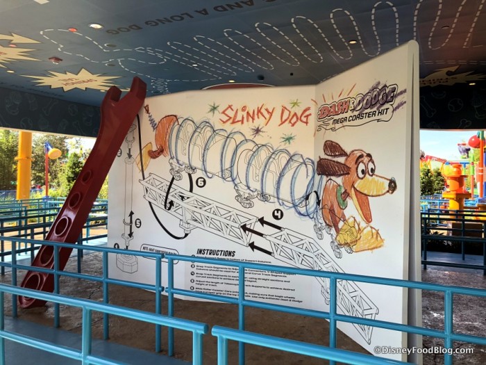
In a rather extreme example, Toy Story Land consists almost entirely of rectangular buildings with flat walls, which are themed only by the graphics applied to them. Put up a fresh coat of paint, and any hypothetical meaning from the structures no longer exists.
]
They got their info from me.
To reiterate what I’ve seen saying for two years;
The plan is a de clutter and mild cosmetic change. You’ve seen the rocks. The paintwork on the walls and CoP. The CoP sign.
Expect a blue / white / purple overall theme. The theatre dome structure should be removed. The AE tower should stay as should the Stitch FP tent. The steampunk-style fins on the Peoplemover should all go. There will be more spires, but not the scale of the original entrance pylons. Signage should be uniform, and a new sign should stand on the archway on the moat bridge.
An overall more smooth, retro future look. Cyan is the new yellow.
It's gone!
It's gone!
From a while back someone asked "what's going to go away", so I circled mostly everything (tower thing is staying). Just ignore the red lines and you got a decent comparison.Who has a nice comparison photo...this photo compared to what it looked like before the demolition, side by side..

The idea was I thought it would be good to see them side by side.From a while back someone asked "what's going to go away", so I circled mostly everything (tower thing is staying). Just ignore the red lines and you got a decent comparison.
The idea was I thought it would be good to see them side by side.
The tower is staying? Won’t that look kinda out of place when the refurbrishment is done?From a while back someone asked "what's going to go away", so I circled mostly everything (tower thing is staying). Just ignore the red lines and you got a decent comparison.
@marni1971 said it should stay and turn a shade of cyan.The tower is staying? Won’t that look kinda out of place when the refurbrishment is done?
I belive the AE Tower is staying. That’s the proposal anyway. It should blend in well with the rest of the completed project.The tower is staying? Won’t that look kinda out of place when the refurbrishment is done?
The big yellow bit on top of the AE entrance?I belive the AE Tower is staying. That’s the proposal anyway. It should blend in well with the rest of the completed project.
Register on WDWMAGIC. This sidebar will go away, and you'll see fewer ads.