News Tomorrowland love

Incomudro

Well-Known Member
Is there any chance that the removal of the "dome thingy" could be a start to integrate Tron into the entire land? The aesthetic, colors, and feel of the Tron canopy could really bring some life to the rest of Tomorrowland.

Currently adding Tron to the area gives us at least 3 distinct looks for a land that should be cohesive. (The awful mechanical look, the contemporary style of Space Mountain, and then the "flowing/digital" look of Tron).

I watched a video somewhere on youtube, which said that is the intention.
 
Last edited:

marni1971

Park History nut
Premium Member
Original Poster
Is there any chance that the removal of the "dome thingy" could be a start to integrate Tron into the entire land? The aesthetic, colors, and feel of the Tron canopy could really bring some life to the rest of Tomorrowland.

Currently adding Tron to the area gives us at least 3 distinct looks for a land that should be cohesive. (The awful mechanical look, the contemporary style of Space Mountain, and then the "flowing/digital" look of Tron).
I understand that blue and white will be the overall look. So, TRON's blue dome and the blue TL highlights will tie together. All the metallic bits should be gone and all should be smooth, clean curves.
i watched a video somewhere on youtube, which said that is the intention.
They got their info from me.

To reiterate what I’ve seen saying for two years;

The plan is a de clutter and mild cosmetic change. You’ve seen the rocks. The paintwork on the walls and CoP. The CoP sign.

Expect a blue / white / purple overall theme. The theatre dome structure should be removed. The AE tower should stay as should the Stitch FP tent. The steampunk-style fins on the Peoplemover should all go. There will be more spires, but not the scale of the original entrance pylons. Signage should be uniform, and a new sign should stand on the archway on the moat bridge.

An overall more smooth, retro future look. Cyan is the new yellow.
 
Last edited:

trainplane3

Well-Known Member
They got their info from me.

To reiterate what I’ve seen saying for two years;

The plan is a de clutter and mild cosmetic change. You’ve seen the rocks. The paintwork on the walls and CoP. The CoP sign.

Expect a blue / white / purple overall theme. The theatre dome structure should be removed. The AE tower should stay as should the Stitch FP tent. The steampunk-style fins on the Peoplemover should all go. There will be more spires, but not the scale of the original entrance pylons. Signage should be uniform, and a new sign should stand on the archway on the moat bridge.

An overall more smooth, retro future look. Cyan is the new yellow.
I was actually looking for one of your previous posts where you stated that just to remind everyone of the changes (since more questions were coming up) but this works too!
 

sedati

Well-Known Member
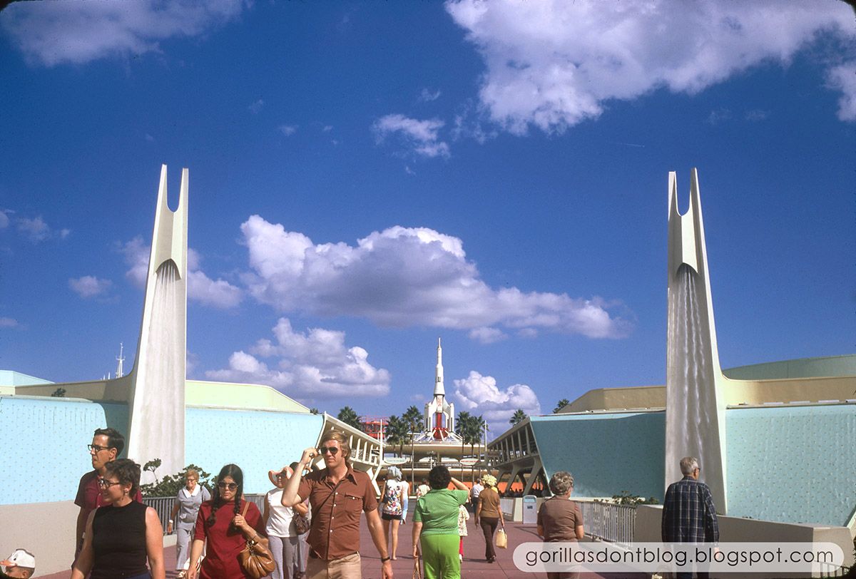
I did love the look of the entry pylons. I don't recall water running down them on my earliest visit in '80.
Here's a great vintage pic found on gorillasdontblog to compare with the Tokyo one above, note Space Mountain to the left:
WDW-11-1974-TL.jpg
 

Timothy_Q

Well-Known Member
The plan is a de clutter and mild cosmetic change. You’ve seen the rocks. The paintwork on the walls and CoP. The CoP sign.

Expect a blue / white / purple overall theme. The theatre dome structure should be removed. The AE tower should stay as should the Stitch FP tent. The steampunk-style fins on the Peoplemover should all go. There will be more spires, but not the scale of the original entrance pylons. Signage should be uniform, and a new sign should stand on the archway on the moat bridge.

An overall more smooth, retro future look. Cyan is the new yellow.
Thanks for the specific details!
I'm excited to follow this project

Do they plan on doing anything with the ugly stage and the SM arcade?
 

FullSailDan

Well-Known Member
I did love the look of the entry pylons. I don't recall water running down them on my earliest visit in '80.
Here's a great vintage pic found on gorillasdontblog to compare with the Tokyo one above, note Space Mountain to the left:
WDW-11-1974-TL.jpg

God those pylons and the expanse are iconic retro-futurism. They mirror the peaks of space mountain so well, the lines going skyward almost a metaphor for development and new heights. The high waterfalls keep it grounded in nature but allude to liftoff as well. Such epic design, lost to a sea of neon and chrome.

I understand the desire to open up the vista by removing the waterfall walls. However, they missed the point, and failed to understand how architecture could tell a story without resorting to garish decoration. I suppose this is the nature of constant change in the parks, but how could they not find a way to incorporate such beautiful architecture into a new design?
 

FerretAfros

Well-Known Member
God those pylons and the expanse are iconic retro-futurism. They mirror the peaks of space mountain so well, the lines going skyward almost a metaphor for development and new heights. The high waterfalls keep it grounded in nature but allude to liftoff as well. Such epic design, lost to a sea of neon and chrome.

I understand the desire to open up the vista by removing the waterfall walls. However, they missed the point, and failed to understand how architecture could tell a story without resorting to garish decoration. I suppose this is the nature of constant change in the parks, but how could they not find a way to incorporate such beautiful architecture into a new design?
More and more, I'm convinced that there are very few people left in WDI who understand the power of good architecture and how it can add meaning to a space. Instead of buildings that exude their theme from their very core, there has been a rise of relatively nondescript spaces that are "themed" only by superficial decoration. TL94's reliance on visual clutter and text-heavy signage was certainly a step down that road, but WDI's apparent design philosophy has continued to evolve since then

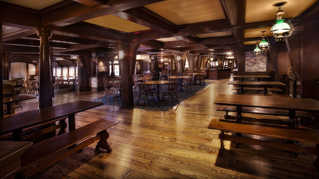
As an example of how things have changed, consider the interior design of the Columbia Harbour House at MK. Everything from the low ceilings, heavy beams, turned columns, and wooden floors to the light fixtures and furniture reflects the nautical theme, and evokes the feeling of a square-rigged ship. There is almost nothing on the walls, but the design is instantly understood in a universal way.
columbia-harbour-house-gallery03.jpg


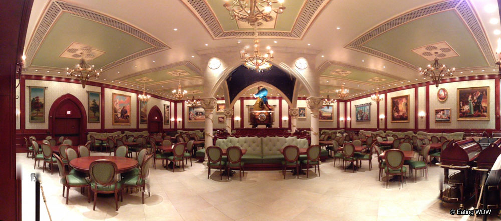
More recently, the music box room at Be Our Guest looks more like a generic hotel ballroom, and only reflects the theme through (rather heavy-handed) artwork scattered around. Very little about the room's dimensions and proportions, building materials, or fixtures indicates that it's supposed to be inside a castle hundreds of years ago. Swap out the art for nature photos with inspirational sayings, and it's suddenly Multipurpose Room B at your local airport Hilton.
be-our-guest-music-box-room.jpg


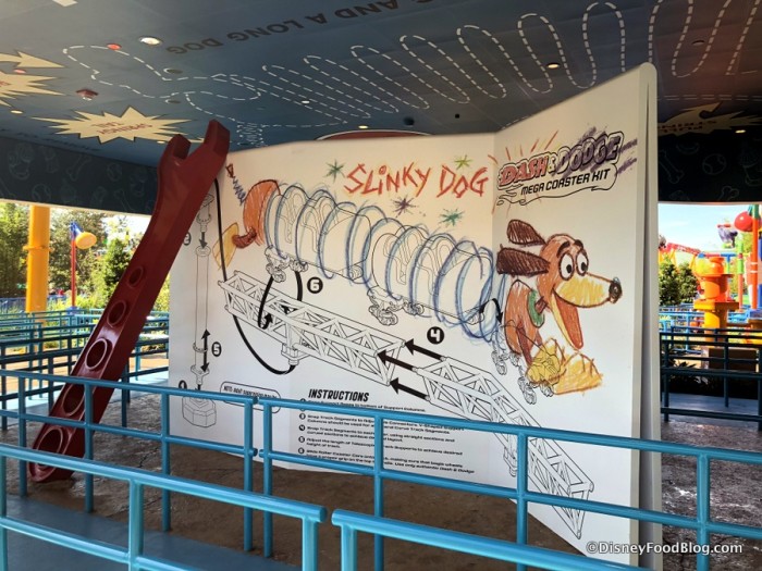
In a rather extreme example, Toy Story Land consists almost entirely of rectangular buildings with flat walls, which are themed only by the graphics applied to them. Put up a fresh coat of paint, and any hypothetical meaning from the structures no longer exists.
Toy-Story-Land-Slinky-Dog-Dash-8-700x525.jpg


Much like using names of fictional proprietors (Chester & Hester's Dinorama, Mater's Junkyard Jamboree, Oga's Cantina) graphics, text, and other set dressings can be a shortcut for designers to quickly give meaning to a space. However, when they're used in place of meaningful architecture, the entire experience feels hollow, as there is no real context for the space.

There's an adage in cinema that it's better to show the audience something than to tell them; using signage and graphics in a theme park setting tells the audience, but showing them through meaningful design is far more powerful. Creating that kind of space requires designers who understand how to evoke various concepts and who trust their audience to pick up on context clues. These are the kinds of things that separate Disney's parks from the rest. It's been a gradual decline over many decades, but it seems like this is increasingly rare from WDI.

[Let the record state that I know there are plenty of examples contrary to this, but this seems to be the trajectory over a very long period. I actually think most of the BOG complex is well themed, and recognize that Pandora was done with almost no graphics or signage (though the photos in the Satu'li Canteen queue venture too far into the Applebee's school of design for my preference)]
 

prberk

Well-Known Member
God those pylons and the expanse are iconic retro-futurism. They mirror the peaks of space mountain so well, the lines going skyward almost a metaphor for development and new heights. The high waterfalls keep it grounded in nature but allude to liftoff as well. Such epic design, lost to a sea of neon and chrome.

I understand the desire to open up the vista by removing the waterfall walls. However, they missed the point, and failed to understand how architecture could tell a story without resorting to garish decoration. I suppose this is the nature of constant change in the parks, but how could they not find a way to incorporate such beautiful architecture into a new design?

You are exactly right. And the aesthetic carries over to EPCOT Center's Future World, too, especially with all of the water fountains and even the "backwards waterfall" area near Imagination.

This just reminds us all of the pure detail built into the original architecture of the all of the parks. I even think of the Mickey design visible from overhead in the original plan of Disney-MGM Studios, and of course all of the building architectural highlights.

This is some of the care for detail that made me fall in love with Disney in the first place, recognizing the difference between a Disney "THEME park" and a local "AMUSEMENT park."
 

prberk

Well-Known Member
More and more, I'm convinced that there are very few people left in WDI who understand the power of good architecture and how it can add meaning to a space. Instead of buildings that exude their theme from their very core, there has been a rise of relatively nondescript spaces that are "themed" only by superficial decoration. TL94's reliance on visual clutter and text-heavy signage was certainly a step down that road, but WDI's apparent design philosophy has continued to evolve since then

As an example of how things have changed, consider the interior design of the Columbia Harbour House at MK. Everything from the low ceilings, heavy beams, turned columns, and wooden floors to the light fixtures and furniture reflects the nautical theme, and evokes the feeling of a square-rigged ship. There is almost nothing on the walls, but the design is instantly understood in a universal way.
columbia-harbour-house-gallery03.jpg


More recently, the music box room at Be Our Guest looks more like a generic hotel ballroom, and only reflects the theme through (rather heavy-handed) artwork scattered around. Very little about the room's dimensions and proportions, building materials, or fixtures indicates that it's supposed to be inside a castle hundreds of years ago. Swap out the art for nature photos with inspirational sayings, and it's suddenly Multipurpose Room B at your local airport Hilton.
be-our-guest-music-box-room.jpg


In a rather extreme example, Toy Story Land consists almost entirely of rectangular buildings with flat walls, which are themed only by the graphics applied to them. Put up a fresh coat of paint, and any hypothetical meaning from the structures no longer exists.
Toy-Story-Land-Slinky-Dog-Dash-8-700x525.jpg


Much like using names of fictional proprietors (Chester & Hester's Dinorama, Mater's Junkyard Jamboree, Oga's Cantina) graphics, text, and other set dressings can be a shortcut for designers to quickly give meaning to a space. However, when they're used in place of meaningful architecture, the entire experience feels hollow, as there is no real context for the space.

There's an adage in cinema that it's better to show the audience something than to tell them; using signage and graphics in a theme park setting tells the audience, but showing them through meaningful design is far more powerful. Creating that kind of space requires designers who understand how to evoke various concepts and who trust their audience to pick up on context clues. These are the kinds of things that separate Disney's parks from the rest. It's been a gradual decline over many decades, but it seems like this is increasingly rare from WDI.

[Let the record state that I know there are plenty of examples contrary to this, but this seems to be the trajectory over a very long period. I actually think most of the BOG complex is well themed, and recognize that Pandora was done with almost no graphics or signage (though the photos in the Satu'li Canteen queue venture too far into the Applebee's school of design for my preference)]

Agree here as well. This is what I somehow discovered as a kid... and I think the concept of "showing them rather than telling them" was a key driver in the immersive experience that Disney used to insist upon. You are right that they still do that in some spaces, but too many times today they go with the Hilton Ballroom concept -- nice and clean but not truly themed to take you to a new place and time. The new Hilton, uh, er, DVC tower being built at Coronado Springs is the most obnoxious recent example.
 

Register on WDWMAGIC. This sidebar will go away, and you'll see fewer ads.

Back
Top Bottom