Marketing is about shaping the public's view, but it is far from a conspiracy theory or anything nefarious you keep implying I said.
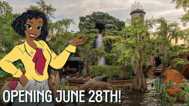
I do think, based on the items previously discussed, they are aiming to make this version of the flume attraction feel more welcoming to younger families.
Similarly, when the previous flume attraction opened, Disney chose to market the attraction in a way that built up the thrill factor because Eisner was trying to appeal to teens. The artwork, warning signs, and promotional special starring Ernest all pushed the thrill.
I wouldn't call either marketing campaign a conspiracy theory or accusations of deception.