News Tiana's Bayou Adventure - latest details and construction progress

LittleBuford

Well-Known Member
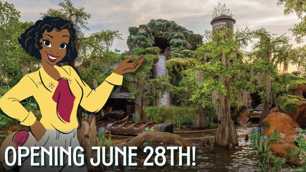
Absolutely. I don't know why everyone is reacting as if you said something ridiculous. She's literally blocking the drop on the poster. They've put large trees that partially block the drop depending on where you're standing. They are definitely trying to downplay the drop.
In this (admittedly drab) promotional image from the other day, Tiana’s hand is drawing attention to the drop:

hgfdsdfgfdsasdfghgfdsasdfghg-624x351.jpg
 

Professortango1

Well-Known Member
There is no evidence. It is not supported by any statement from the designers of the attraction. In fact, Charita essentially contradicted it. That people have pretended it is a thing for hundreds of pages is a tiresome waste of oxygen serving only to spread misinformation in the future. If you want to say that, in your opinion, what they have done to the facade minimizes the drop, that’s cool, but let’s not perpetuate a conspiracy theory that they’re trying to lure unsuspecting younger riders onto the attraction. I’ll leave it at that.
I had offered evidence. The attraction poster and how the drop is framed in the released on ride photo.

I never claimed there was a conspiracy theory so please do not put words in my mouth. I will look up what Chirita is to have a better understanding of what you are talking about about, but from the evidence I cited, I understand the speculation. That's all.
 

Chi84

Premium Member
Perhaps you could shed some light. The post referred to the attraction poster's composition, which was previously shared in here. It made no hyperbolic statements or references to other attractions.

I also referenced the ride's photo, which was not censored and how it's depiction of the final drop seemed less severe than was the previous standard for the drop. No judgement calls were made nor did I say the name of the attraction which must not be mentioned. It was a simple analysis of how they chose to depict the drop in the ride photo compared to other similar attraction photos.

You may continue to troll me, but if you would care to point out how the information I shared in the post was cause for reporting and censoring, please do let me know as I honestly do not understand how it went against the thread's rules and previously authorized content. I was very deliberate about how I responded and so I am obviously missing some aspect.
If you have any questions about a moderator’s decision, you should contact the moderator privately to ask for an explanation. Actions by moderators are not to be discussed in the threads. All of this is in the forum terms of service.
 

James Alucobond

Well-Known Member
I had offered evidence. The attraction poster and how the drop is framed in the released on ride photo.

I never claimed there was a conspiracy theory so please do not put words in my mouth. I will look up what Chirita is to have a better understanding of what you are talking about about, but from the evidence I cited, I understand the speculation. That's all.
Saying that what they have done obscures the drop a bit, makes it recede, minimizes it, etc. is not a conspiracy theory. I support your right to put that forth.

Drawing conclusions about intention and suggesting that the minimization was done very purposefully to downplay the drop to appeal to younger audiences is in fact a conspiracy theory with no evidence whatsoever. You very much did say that they were downplaying it on purpose.
 

mickEblu

Well-Known Member
Wait, is this really up for debate? There is definitely less emphasis placed on the drop than before.

Let’s start with the name. SPLASH Mountain is now called Tiana’s Bayou Adventure. Tiana’s Bayou Splash would have been much better.

Next, they placed a huge water tower and tall trees in the foreground making the entire “mountain” seem much shorter. You also have foliage from various angles obscuring the view of the drop.

The attraction poster features a Tiana-Zilla the size of the mountain again taking the emphasis away from the drop and mountain. You also have no logs coming down the flume. Which seems like a very odd yet calculated choice.

What I’m unsure of is how intentional it all is. Is all of this just a natural byproduct of them focusing on Tiana and the story they went with? I’d lean towards yes but the attraction poster makes me second guess.
 

Professortango1

Well-Known Member
In this (admittedly drab) promotional image from the other day, Tiana’s hand is drawing attention to the drop:

hgfdsdfgfdsasdfghgfdsasdfghg-624x351.jpg
A fine rebuttal. I'd argue that the drabness (your words, not mine) point to it being something quickly thrown together to show off the physical attraction rather than an artist's depiction. Given the scale of the mountain in the photo, for Tiana to have a position similar to the attraction poster, she would appear quite small in the composition. So they have a more eye-catching standard display pose where her hand is presenting the attraction as a whole.

You are correct the drop isn't hidden nor obscured in this released announcement. I'm simply offering my opinion on why.
 

Ghost93

Well-Known Member
Wait, is this really up for debate? There is definitely less emphasis placed on the drop than before.

Let’s start with the name. SPLASH Mountain is now called Tiana’s Bayou Adventure. Tiana’s Bayou Splash would have been much better.

Next, they placed a huge water tower and tall trees in the foreground making the entire “mountain” seem much shorter. You also have foliage from various angles obscuring the view of the drop.

The attraction poster features a Tiana-Zilla the size of the mountain again taking the emphasis away from the drop and mountain. You also have no logs coming down the flume. Which seems like a very odd yet calculated choice.

What I’m unsure of is how intentional it all is. Is all of this just a natural byproduct of them focusing on Tiana and the story they went with? I’d lean towards yes but the attraction poster makes me second guess.
I agree there is less emphasis on the drop, but I feel that is more a byproduct of them trying to make the story fit a bayou setting rather than trying to downplay the thrill aspect for small children.
 

mickEblu

Well-Known Member
I agree there is less emphasis on the drop, but I feel that is more a byproduct of them trying to make the story fit a bayou setting rather than trying to downplay the thrill aspect for small children.

Yeah I’m inclined to agree but the attraction poster is a head scratcher.
 

Professortango1

Well-Known Member
Saying that what they have done obscures the drop a bit, makes it recede, minimizes it, etc. is not a conspiracy theory. I support your right to put that forth.

Drawing conclusions about intention and suggesting that the minimization was done very purposefully to downplay the drop to appeal to younger audiences is in fact a conspiracy theory with no evidence whatsoever. You very much did say that they were downplaying it on purpose.
Marketing is about shaping the public's view, but it is far from a conspiracy theory or anything nefarious you keep implying I said.

I do think, based on the items previously discussed, they are aiming to make this version of the flume attraction feel more welcoming to younger families.

Similarly, when the previous flume attraction opened, Disney chose to market the attraction in a way that built up the thrill factor because Eisner was trying to appeal to teens. The artwork, warning signs, and promotional special starring Ernest all pushed the thrill.

I wouldn't call either marketing campaign a conspiracy theory or accusations of deception.
 

mickEblu

Well-Known Member
I agree there is less emphasis on the drop, but I feel that is more a byproduct of them trying to make the story fit a bayou setting rather than trying to downplay the thrill aspect for small children.

My guess is that they may even be trying to “story” the attraction poster as opposed to using it to serve its purpose of advertising the ride and getting people excited. I can see them finding some story related reason to not showcase people riding logs down her salt dome. Nothing else makes sense. The drop is clearly still there. The ride is still going to have a 40 inch height requirement.
 

Professortango1

Well-Known Member
Is this the photo that some here are saying downplays the drop? I’m not sure I follow given that the ride vehicle is shown hurtling steeply down the flume.
From my perspective, it looks like a river rather than a fall. Previous drop photos had vultures or key characters looking frightened by the fall and the fall appeared more exaggerated through forces perspective. This has the drop widen at the bottom rather than narrow, reducing that forced perspective. The characters observing seem more pleasant and unfrightened.

These are just my observations and in no way am I saying one image is better or worse, merely the effect it has on me.

If someone else wishes to post a comparison between attraction posters and on-rise photo art, please do. I don't believe I can do so.
 

wbostic12

Well-Known Member
In the Parks
No
My guess is that they may even be trying to “story” the attraction poster as opposed to using it to serve its purpose of advertising the ride and getting people excited. I can see them finding some story related reason to not showcase people riding logs down her salt dome. Nothing else makes sense. The drop is clearly still there. The ride is still going to have a 40 inch height requirement.
I agree. In addition, that late 80s mandate of Eisner to appeal to teens probably influenced a lot of the marketing back then (including the word mountain to make it seem in line with BTMR and Space) is certainly not in place now.
 

James Alucobond

Well-Known Member
Marketing is about shaping the public's view, but it is far from a conspiracy theory or anything nefarious you keep implying I said.

I do think, based on the items previously discussed, they are aiming to make this version of the flume attraction feel more welcoming to younger families.

Similarly, when the previous flume attraction opened, Disney chose to market the attraction in a way that built up the thrill factor because Eisner was trying to appeal to teens. The artwork, warning signs, and promotional special starring Ernest all pushed the thrill.

I wouldn't call either marketing campaign a conspiracy theory or accusations of deception.
It is misinformation at best. It has been brought up over and over and over again as if it is a certainty when it is in fact a leap in logic. You are seeing the ultimate visual effect but know absolutely nothing about the upstream reasoning or design intent. I'd suggest everyone stop trying to divine an ill-evidenced rationale.
 

Professortango1

Well-Known Member
It is misinformation at best. It has been brought up over and over and over again as if it is a certainty when it is in fact a leap in logic. You are seeing the ultimate visual effect but know absolutely nothing about the cause or design intent. I'd suggest everyone stop trying to divine an ill-evidenced rationale.
Misinformation once again implies some nefarious motivation, or, that we are speaking about something objective. Once again, I ask you to stop misrepresenting my posts.

I am simply saying, based on my observations of the factors I spelled out previously, the marketing is looking to make the ride as appealing as possible to younger riders and families.

You can disagree with my subjective opinion, but I am merely responding to how Disney has chosen to market this attraction. You can have another take from the same marketing. Neither is misinformation or pushing a false narrative, it is simply forming an opinion based upon the pieces of art we are viewing.
 

James Alucobond

Well-Known Member
Misinformation once again implies some nefarious motivation, or, that we are speaking about something objective. Once again, I ask you to stop misrepresenting my posts.
It implies that you are repeating, amplifying, and spreading information that, in the future, will potentially be regurgitated as if it were fact, much like the many incorrect rumors surrounding, say, the yeti that were perpetuated over the years. It's not that you specifically have nefarious motivation. It is that there's absolutely nothing to it. It's not a fact. It's not a construction update. Instead, it's generally (though maybe not from you) an attempt to accuse the ride of being somehow less mature, more juvenile.

Again, talking about the ultimate effect of the construction on the facade is on topic and totally fair game. You can say that it looks less impressive all you want. What is probably less on topic is parroting the same unsubstantiated claims about the designers' intent that you and others have repeatedly drawn from the ether across hundreds of pages. All of your "evidence" points to the effect, not the cause (or, perhaps more accurately, the rationale behind the cause).
 

Disgruntled Walt

Well-Known Member
In the Parks
No
In this (admittedly drab) promotional image from the other day, Tiana’s hand is drawing attention to the drop:

hgfdsdfgfdsasdfghgfdsasdfghg-624x351.jpg
But you have to admit the drop blends in and is certainly not the center of attention. What's weird is that they put in so much extra stuff that even the water tower is hidden behind a giant tree. The whole attraction is like a lesson in camoflauge.
 

LittleBuford

Well-Known Member
You are correct, they are both examples of forced perspective. Getting large implies closer to the camera, so the wider waterway at the bottom makes me view it as closer to the camera, giving the impression of traveling towards me laterally. The previous surrounding artwork had the waterway narrowing to imply it was further away, making the movement look more vertical.
The ride photos have, as far as I know, never shown the flume narrowing the way you suggest. Given the angle from which the photos are taken, it would actually undermine the effect to show the top wider than the bottom.
 

Register on WDWMAGIC. This sidebar will go away, and you'll see fewer ads.

Back
Top Bottom