LittleBuford
Well-Known Member
I much preferred the original design. I still can't say that the current version looks bland, however. It's whimsical and colourful.The original design had the stump replaced with Mama Odie’s treehouse.
I much preferred the original design. I still can't say that the current version looks bland, however. It's whimsical and colourful.The original design had the stump replaced with Mama Odie’s treehouse.
It's whimsical and colourful.

It is going to be a bit more work possibly when they get to the base of that tree. I have a pic of Imagineering installing it.
Not according to the model, which just features a bland hilltop.


Yes, but 7DMT didn’t replace an iconic attraction with an existing shape that’s been..reshaped.I can't help but wonder where these types of complaints were when Disney built this on the other side of the park:
View attachment 709209
That stump added the illusion of height.
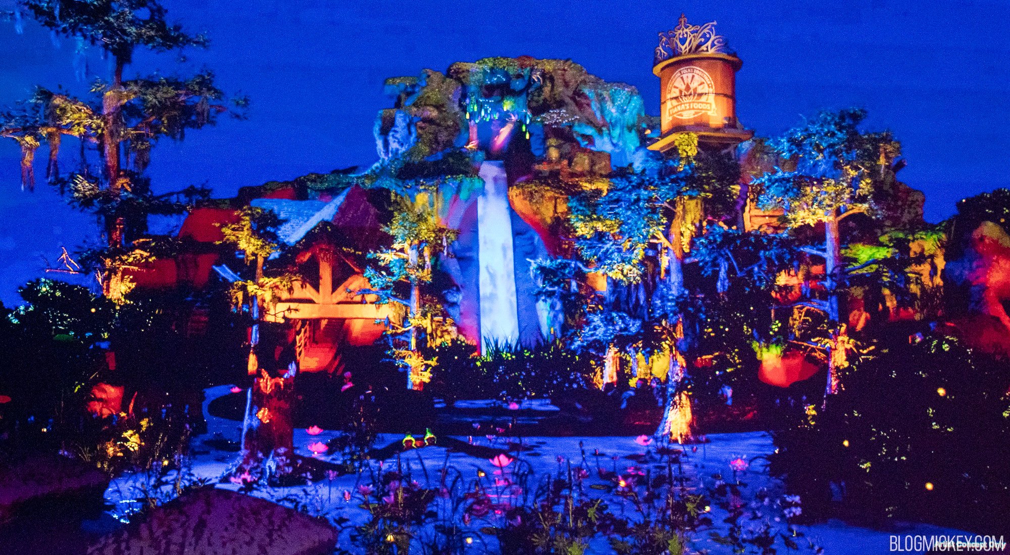
I actually think that picture highlights it perfectly. While this is obviously stylized, the eye is drawn directly to the water tower. Compare that to the same picture on the original Splash, and your eye is drawn to the apex of the hill. There's only so much you can do with the physical hill, of course. So, it's going to look like a 50 foot drop. But, in this design, it's clear they are trying to at least share focus elsewhere if not divert focus elsewhere. In Walt's speak, the Weenie here is attempting to be the water tower (though I might say it's multiple competing weenies, personally). The original design made the hill the clear singular weenie.I’m not convinced by the claim repeatedly made here that they’re trying to disguise or minimise the drop. The hill still looks pretty high to me in the model and concept art below:

My eye is drawn to the water gushing from the drop, but I realise it’s subjective. I guess we’ll all have a better sense of what impression it will give once they actually complete the overhaul.I actually think that picture highlights it perfectly. While this is obviously stylized, the eye is drawn directly to the water tower. Compare that to the same picture on the original Splash, and your eye is drawn to the apex of the hill. There's only so much you can do with the physical hill, of course. So, it's going to look like a 50 foot drop. But, in this design, it's clear they are trying to at least share focus elsewhere if not divert focus elsewhere. In Walt's speak, the Weenie here is attempting to be the water tower (though I might say it's multiple competing weenies, personally). The original design made the hill the clear singular weenie.
I would have preferred Mama Odie’s treehouse. I’m not looking for topographical accuracy at the Magic Kingdom.People complain there are no mountains in LA.
So, the architecture is changed to make it look less mountainous.
So... why would anyone *want* there to an illusion of height?
My eye is drawn to the water gushing from the drop, but I realise it’s subjective. I guess we’ll all have a better sense of what impression it will give once they actually complete the overhaul.
To be clear, I agree they’re trying to make it look less like a mountain—they’ve told us it’s a salt dome, after all—but I disagree with the idea that they’re trying to make it look less thrilling and more suitable for little kids.Yes. And, one are where I think we will likely agree is this in reality. I think the drop will be far more prominent in real life. I still stand by my opinion on their intent. But, I think your view will more likely be the reality after it is built.
People complain there are no mountains in LA.
So, the architecture is changed to make it look less mountainous.
So... why would anyone *want* there to an illusion of height?

To be clear, I agree they’re trying to make it look less like a mountain—they’ve told us it’s a salt dome, after all—but I disagree with the idea that they’re trying to make it look less thrilling and more suitable for little kids.

You don’t have to convince me of the absurdity of their attempts at justifying the elevation. It’s something they shouldn’t have given a second thought.The real kicker is that the salt dome they took inspiration from is 1500 feet below a slight incline.
Because of the 2-mile diameter, one could walk right over it without knowing what it was.

This really isn't stylized - it's from the digital scale model of the new attraction. There may be minor differences between this and the finished product, but something like this should be taken much more as gospel than the average piece of concept art.I actually think that picture highlights it perfectly. While this is obviously stylized, the eye is drawn directly to the water tower. Compare that to the same picture on the original Splash, and your eye is drawn to the apex of the hill. There's only so much you can do with the physical hill, of course. So, it's going to look like a 50 foot drop. But, in this design, it's clear they are trying to at least share focus elsewhere if not divert focus elsewhere. In Walt's speak, the Weenie here is attempting to be the water tower (though I might say it's multiple competing weenies, personally). The original design made the hill the clear singular weenie.
To be fair, the Imagineers opened the door to this sort of criticism by trying to justify the attraction's height in the first place. It should never have been an issue. As you say, who needs realism in the Magic Kingdom?The idea of trying to use the size of real life Louisiana salt domes or the state's actual geography in an attempt to somehow discredit the upcoming attraction seems silly to me. If you're going to be using that logic on an attraction in the Magic Kingdom, then you also need to apply the same to Splash and be upset that real life animals don't sing, talk or dance.
Register on WDWMAGIC. This sidebar will go away, and you'll see fewer ads.
