JoeCamel
Well-Known Member
Smooth as frog......Smooth jazz...
Smooth as frog......Smooth jazz...
I’m not sure if the professional basketball team from SALT lake city will be in the BGM… maybeBut will there be jazz in the BGM
Karl and John are gone so maybe...I’m not sure if the professional basketball team from SALT lake city will be in the BGM… maybe
Which brings up the whole issue of this ride's placement.I like the murals. They just don't seem consistent with the aesthetic of either PatF or Frontierland.
Not really. There's nothing else about the exterior that I would consider incongruous with the rest of the land [ETA: except for the crown, though I've come to terms with that].Which brings up the whole issue of this ride's placement.
Because it takes place inside the attraction.Some that did not care about Mardi Gras theme of the post 1920s.
There's nothing about the water tower that clashes with Frontierland other than the crown. It's actually the most Frontierland element of the rethemed exterior (again, minus the crown).Some did not care about the 1920s water tower.
Hardly "somehow". The reason is pretty obvious: it's outside and in view of the other elements of Frontierland.Now we have 1920s Mardi Gras mural artwork...
and it is somehow a little jarring to Frontierland.
Like a paint by numbers or overlaid printing process I don't think it's done yet.I like the murals. They just don't seem consistent with the aesthetic of either PatF or Frontierland.
Because it takes place inside the attraction.
There's nothing about the water tower that clashes with Frontierland other than the crown. It's actually the most Frontierland element of the rethemed exterior (again, minus the crown).
Hardly "somehow". The reason is pretty obvious: it's outside and in view of the other elements of Frontierland.
Oh, I know it isn't finished, but the (modernist) style is already apparent, and I don't think it matches the rest of the land or indeed PatF's own aesthetic.Like a paint by numbers or overlaid printing process I don't think it's done yet.
I think they work from light to dark so I expect tans, browns and black outlines to be addedOh, I know it isn't finished, but the (modernist) style is already apparent, and I don't think it matches the rest of the land or indeed PatF's own aesthetic.
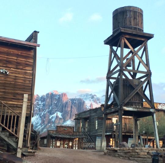
The water tower looks like (and, according to the backstory, is supposed to be understood as) a preexisting structure that was adapted when Tiana took over the site and added the crown to it. There is nothing about the water tower itself that reads as 1920s. Here, for comparison, is the water tower at Goldfield Ghost Town:Right, but since the crown is there, it's not separable. It is an out of place design because it is a post 1920s water tower. Not an 1800s frontier one.

The water tower looks like (and, according to the backstory, is supposed to be understood as) a preexisting structure that was adapted when Tiana took over the site and added the crown to it. There is nothing about the water tower itself that reads as 1920s. Here, for comparison, is the water tower at Goldfield Ghost Town:

I'm talking about the style, not the colouring.I think they work from light to dark so I expect tans, browns and black outlines to be added
Black changes many things including styleI'm talking about the style, not the colouring.
I prefer the murals (or what we’ve seen of them) to the crown. However, I find the crown—which at least looks true to the aesthetic of the film—less stylistically intrusive than the murals. It’s fine if you disagree.Yes, but the fact that the finished product has the crown, means it is now the 1920s. That is the difference.
Haunted Mansion with a Neon Sign would not feel very Liberty Square inspired would it?
I prefer the murals (or what we’ve seen of them) to the crown. However, I find the crown—which at least looks true to the aesthetic of the film—less stylistically intrusive than the murals. It’s fine if you disagree.
Register on WDWMAGIC. This sidebar will go away, and you'll see fewer ads.
