The Sorcerer's Apprentice Season 4: Homecoming Edition

TheOriginalTiki

Well-Known Member
You could have taken a vacation day if you needed it! Now is not the time to dwell on past -- keep moving forward! Nintendo awaits.

Honestly...with me being so familiar with not having vacation days in SYWTBAI I keep forgetting Vacation Days exist. That's my bad because if I would have remembered they were a thing I certainly would have suggested we take one. I think the Rocket Rods concept was great and we had some really good gags for it, but scheduling killed us. Today was one of those "endlessly busy with everything going wrong" type of days for me, but tomorrow I literally have nothing going on, haha. I'll definitely be more tuned in to if we need to use vacation days after this.
 

spacemt354

Chili's
Original Poster
As both teams work on the Nintendo Lounges in Universal Studios Japan - to go along with the Nintendo theme of this Stanza, I've resurrected two Nintendo Open-Brainstorming threads if anyone watching is interested in designing Nintendo attractions (or movies!)

latest

By @kmbmw777
Thread Here

img0717*1024xx3556-2000-0-0.jpg

By @Magic Feather
Thread Here
 

Pi on my Cake

Well-Known Member
In the Parks
Yes
logo8-jpg.280982


Team Brava proudly presents:​

enhance


Intro

Super Nintendo World is set to be one of the most immersive lands ever created in a theme park. However, it wouldn't be complete without a restaurant. Announcing Luigi's Mansion Lounge, which is set to double as a family-friendly restaurant and a bar, with an Osaka-inspired menu and drinks. Think of it as the Mario Edition of a traditional Japanese izakaya pub, something which locals will find both comforting and one-of-a-kind.

Befitting a bar, the haunted Luigi's Mansion theme is ideal as it is more mature than most of the Mario Games while still being closely related to the Mushroom Kingdom’s favorite hero. This old gothic spook house provides great atmosphere, and is able to create both a fun experience for the whole family, and a great environment for the lounge. Considering the relaunch of the original version for 3DS, it's a safe bet that the franchise should receive a new installment soon, as it’s proved to be a viable franchise.


Facade/Entrance

300px-Toadhousesm3dl.png


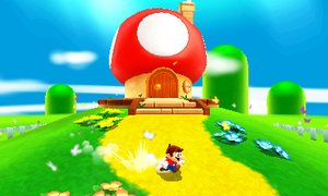
The dark, haunted exterior of Luigi's Mansion is hidden away to not ruin the atmosphere of the Mushroom Kingdom. From the outside, all guests see is a Toad House at the base of a hill.

vmBEQTa.png


Inside, guests will find an E. Gate (from Luigi's Mansion Dark Moon). E. Gates are portal devices designed by Prof. E. Gadd. They are used to transport guests from the Toad House in the Mushroom Kingdom to the dark Mansion.

In reality, the E. Gate is essentially just a metal archway with some blinking lights, on the other side is a staircase that will take guests underground into the main dining room. The library and the bar are above the dining room hidden by the hill. That way, the whole Mansion is well hidden and isolated so it can be easily made to feel dark and haunted. While also being compact and not taking up much space.


Interior

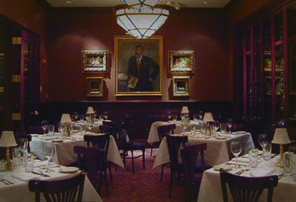
As guests enter Luigi's Mansion Lounge, they are greeted by Victorian architecture and furniture which closely resembles the game. Several chandeliers hang from the ceiling. There are countless paintings on the wall, but they are all covered by white cloth so that no guest can see them, leaving them to wonder what is so horrifying that needs to be covered up. Why hasn't Luigi cleaned the place up if he wants to make a full restaurant?

hotel-savoy-spooky-dining-room.jpg


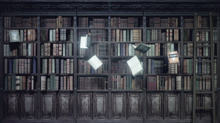
Guests sit in the main dining room (which seats about 50), the library (which seats about 25), or the bar (which seats about 25). All rooms feature some covered paintings, and a few uncovered. Guests who look closely will notice that the painting of Daisy and Luigi has eyes that follow you. The library features a piano which plays itself and books which move around on the shelf. Eerie music plays in the background during all meals.

Screenshot+%2821%29.png


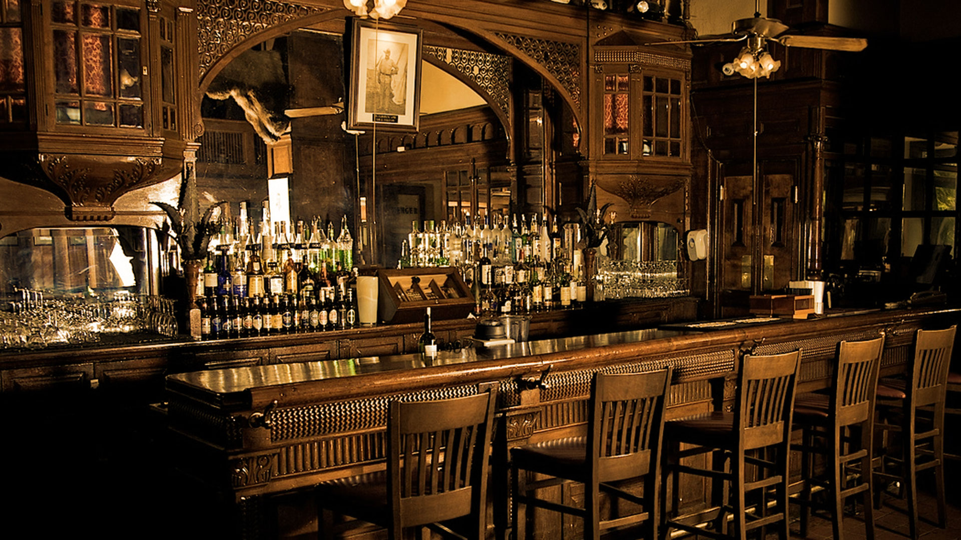
In the bar, which is exclusively for adults, guest find similar architecture, furniture, and gimmicks. However, this room features low, smooth jazz playing in the background, while the other two feature corny, family-friendly-yet-spooky music.

Menger-Bar-Interior-Orange.jpg


Special Effects & Hidden References

BOO TO YOU - Whenever King Boo's Power Brew is ordered, the classic Boo sound from the Mario Games plays across the restaurant.

SPOOK-A-SHADOW - The shadows of ghostly Boos will be moving through Luigi's Mansion Lounge, and if guests are paying attention to their surroundings they'll identify the different shadow sizes.

INTERACTIVE WINDOWS - The main dining room will have three windows that will immerse you further into the lounge's story, as it will be perpetually raining, with occasional thunder claps, and Luigi seen chasing ghosts every half hour.

CHANDELIER - From time to time the chandeliers will begin swinging. By the sound of it, the chandelier might fall at any given moment! During the nighttime, the swinging might or might not be accompanied by Sia's Chandelier...

THROUGH THE LOOKING MIRROR - In the Library Room, guests will find a mirror which not only reflects a ghoulish version of themselves, but some Luigi's Mansion ghosts passing by from time to time.

ELVIN TV - Randomly, Professor Elvin Gadd is set to interrupt your local programming in order to give you update on Luigi's progress in his adventure. He also offers Nintendo Fun Facts.

PAULINE'S WORLD TOUR - In the reception room there's a globe like the one used in the Odyssey to travel. When spun, it will play Jump Up, Super Star! by Pauline.

TOSTARENAN AMIGO - If you look closely to the bar, you'll find a Tostarenan next to the Tequila. However, we can't confirm if he has been drinking...that's classified.

A CAP TO REMEMBER - In the bar you'll also be able to find a Mario cap hanging from the counter.

VICTORY FLAG - The flag from the classic Mario games can be seen in one of the interactive windows.

BOWSER STATUE - A Golden Bowser statue can be found in the Library. It’s partially covered, and if someone touches it the classic Bowser laugh (which plays when you lose the game) will be heard across the room.

LUISY PORTRAITS - In the Library Room, you can find two portraits, one of Luigi and one of Daisy, whose eyes seem to follow you around.

Costumes

View media item 5650
Taking inspiration from not only the game, but traditional kimono as well, the costumes worn are designed to blend with the surrounding environment and even interact with the special effects in each room.

Toad - The toads serve as the host/hostess, always ready to guide the guests where they need to go and provide helpful answers.

Professor E. Gadd's Assistants - Be on the lookout for silly assistants making strange concoctions at the bar. They're there to give helpful advice, but don't be surprised if some of your drinks have some "interesting" side effects. Their crazy eyeglasses light up and swirl intermittently.

Boo - These mischievous ghosts may seem harmless as they serve guests their drinks and food, but beware! They like to play pranks and seem enamored when Melody Pianissima comes out to play a haunting concert for the guests.

Bogmire - Although these ghosts seem quiet and sad, they still serve guests who decide to sit in the library. When the lightening flashes in the windows, the Bogmire's eyes light up and a low moan sounds in the room.


Character Entertainment

Melody Pianissima - Found in the main dining hall, she appears periodically to play a piece on the piano. As she plays, Boo ghosts (projections) appear and float on the walls. The Boo waitresses seem to react to the music playing becoming more playful and active.

Shivers, the Wandering Butler - Always caring a light up candelabra, this ghost wanders from table to table asking guests if he has seen his master's will or professing his admiration for Melody Pianissma, even though she never seems to notice him.

Madame Clairvoya - Often found wandering the Library, Clairvoya often seeks out guests looking for a reading. She will gladly tell a guest's fourtunes after she examines a personal item, or she will invite guests to look into her crystal ball and attempt to see their futures (only 49 days into the future, of course).

enhance


enhance


enhance


enhance


enhance


enhance


Also here's a sample page of the menu in Japanese:

enhance


When guests order certain drinks from the bar, special effects and sounds play nearby! Below are a list of some of the most exciting.

SUPER MARIO VICTORY - Mario will appear in the interactive windows and jump into the flag as soon as someone drinks a Super Mario Super Sake Flight! We can assure everyone will see it, not just whoever order the drink.

KABO-BOOM - The Sake Bob-Omb will generate a explosion sound, as well as temporarily create some “damage” to the building, after the guests receives it’s drink.

LUMA GALAXY - After a Rosalina’s Moonberry Martini is ordered, the ceiling will be projecting a nighttime sky full of stars, until the drink is delivered.

EXTRA LIFE- When the 1-UPetini gets ordered it will trigger the 1-UP sound effect to be heard.

WARIO TIME - Whenever an order of Wario Wings is handed to the guests, the coin sound plus Wario saying his own name will be heard across the lounge.​
 

spacemt354

Chili's
Original Poster
spacemt354's Reviews
Before beginning I would like to add the disclaimer that I don't know Nintendo very well. We thought it would be a good dynamic (with @MonorailRed being more familiar with Nintendo properties than I am) to have reviews from both a fan's perspective, and an average guest. To convince both that this lounge is a good fit and exciting new area in Universal Studios Japan.
logo6-jpg.280987

Paper Lounge

From the jump this project you were on your game, and out of the seven Stanzas so far in the competition for Team Castle, this might be your proudest achievement in the game. Is it still what I think is your ceiling for potential? No (but that's a good thing!) Because from the teamwork, to the organization, to the preparation - this team truly impressed me with this project.

- From a presentation standpoint, the three headed punch of a custom introduction video (great job Tiki adding some humor and levity to the project!) to the custom BGM (great work Brer!) and the custom Weebly website (RM at his finest), this was such a team effort immediately with the first impressions.
- The location choice in CityWalk Osaka was bold - thinking outside the box I like it. While I'm not 100% sold on the portal entrance (I think that is a bit too much of an effort for just a restaurant) it was well explained to go from the 3D to 2D world and the visuals helped! How many Stanzas have I said to include custom visuals because they help make the project more original and explanatory;)
- That being said, despite the iffy portal, the music was a catchy choice!
- The backstory of the lounge is also commended. You were able to take a property I'm personally not familiar with, and describe it so it makes sense to an average joe Nintendo bro reading this.
- And the artwork for the interior, yes yes and yes! I'll say it again, how many times did I say there were artists on this team? You don't have to be Picasso to be praised, it's the effort that counts for me, and this got the point across to me in a way that I don't think you would have if you just used the reference photos you had in your thread. Also, the paper characters along with the actual guests helped explore that 2D/3D trippy dimensional analysis game being played throughout the interior.
- I like the layered approach, and the separate entrances.
- The restaurant stage lost me a bit, it could have been explained a bit more clear, because to me are these character actors on stage in 2D costumes? Or is it a screen?
Window effects, with another hand-drawn image! Again, it's not the Mona Lisa, but it shows effort to me, so great work IDI on that!
- Labo Pipe Organ was solid as well - a nice touch!
- And lastly the menu, really enjoy the extensive research done here knowing that really nobody on the team knew anything about Japanese cuisine and that was a concern early on in the brainstorming - you really made it as authentic as you could, and provided some great visuals because I as the reader sometimes don't even know a dish off the top of my head. The references to Mario are great too -- and wow, I just realized, which I will address in Brava's the names are great, so great minds must think alike because you both had Princess Peach Fizz :hilarious:
- I liked the mention of a Japanese menu, but I would have actually liked to see it -- show me don't tell me - I feel like I'm from Missouri!
- A small detail, but the 'make a reservation' with the link to the USJ website - nicely done there.

Addressing the teamwork to round out this review, everyone on the team had a hand in this project in some fashion - yet the leadership (Poe and Tiki as a tagteam on this, along with Brer as a Nintendo expert, and others as role players willing to help) the ability to trust one another without shutting ideas down really stood out. You learned from the past and applied it here, overall - fantastic job!


logo8-jpg.280982

Luigi's Mansion Lounge

Unlike some other reviews, this might be the most mixed I have ever been about a Team Brava project, and the best way to explain it is first focusing on the positives of the project, then delving into some things I was disappointed by from this team, rather than reviewing in a linear fashion similar to other reviews.

Project Positives
- I thought it was a wise choice to pick a Nintendo property with a more mature theme to it. A haunted spook house would provide a great atmosphere, and separating the lounge from the family area was another good choice to make.
- The costumes and menu art work, just wow! A welcome back to Figment and another stellar contribution from D Hindley, who both continue to top themselves in the art department. These were definitely the highlights of the project for me. The attention to detail in not only the authenticity of the character costumes and designs, but also the specialization of the drinks themselves, including down to the glasses themed to Nintendo characters, were astounding design choices.
- Continuing with the menus, the yen inclusion for prices and the choices - were home runs for what I would call 'creative realism' - taking imagineering items and presenting them in a creative fashion, by making it look...real!
- The names and designs were Nintendo through and through - and as mentioned before, you both even had some of them like Princess Peach Fizz the same :p
- To add, the touch of an authentic Japanese menu was superb! Great creative thinking, and something that stood out to me more than just the mention that it is available in Japanese.
- The special add-ons when ordering drinks reminds me of Trader Sam's in a good way, a perfect blend of innovation to go along with the interactive lounge setting of Luigi's Mansion.

Project Negatives
- As sad as it is for me to say, I have to be honest...this was probably the worst teamwork of the first seven Stanzas for Brava. From the beginning you just didn't get off to the rapid fire brainstorming start that the team is known for. It stuttered out of the gate, and to me...that falls on leadership.
- Pi was gone for the first day of the project, and by Saturday, wasn't even aware that the project was extended an extra day.
If you're busy, it's totally fine, but you should have had the awareness to either a) relinquish the PM role for the benefit of the team, or b) find a way to make it work and cut short the wishy-washy decision making of the team who were trying not to step over anyone.
- Because being in and out activity wise...that caused others such as Figment to have to organize the project (the PM's responsibility), the menus to be designed before even the theme of the restaurant was voted upon (causing the menu to feel disjointed from a more dark, haunted Luigi's Mansion), and others on the team wanting to help, but instead sitting on their hands, waiting for assignments, and eventually just feeling disconnected from the project.
- Out of all the teams, Brava especially should know that if a Project Manager is busy, or inactive, that you're allowed in this game to internally switch. Stanza II, you switched from englanddg to Voxel, and you created one of the best projects of the season in my opinion. Where were the people from 'classic' Brava who could have stepped up early on, and offered this option, especially given the brevity of these challenges? This team knows better.

How to fix this?
1 - For starters, and shocking that I am saying this to one of the most talkative teams in history, you need better communication from leadership on down. For Stanza VIII till Stanza X, if the Project Manager is not available early on, have the PM step down or someone else step up, to not waste time. If/when the Project Manager returns, there can't be another full vote for 'okay let's decide on the theme' when components of the project are already in progress. Just go with what fits that progress (in this case the menu) the best and run with it.
2 - The 'trying new things' element of this team has been slacking as of late. This project felt very boiler plate, aside from the brilliant art work, unlike the Brava of old who would have found a more creative route to take with the project...and not settled for the standard.
3 - Help each other out! There were people on the team wanting to help, and others who knew Nintendo and claimed to know special things about Osaka -- but did nothing to help the progress of the team. Make them feel included rather than wondering if they can do something or not.

This was in many ways a harsh review yes, somewhat unlike me, but...I want to be honest and upfront because I care and know you can do better than this effort!

This is not a bad project - many things out of this were very positive, and some of the best artwork of the season! But the teamwork and overall perspective of this project, stood out to me as something that could (and should) improve going forward!​
 

MonorailRed

Applebees
logo6-jpg.280987

Really liked the intro video! It's a small piece of the project but really gets it off to an original start, unique from any other project in SA so far!

The background music was a great aspect too

Overall the website looked clean, not the best Weebly I've seen, but for this project it got the job done looking like a real restaurant website! The reservation option I especially enjoyed.

Paper Mario was an interesting choice to pick, it would feel out of place in Super Nintendo World, so great job using the option to place it in CityWalk...well you placed it outside CityWalk on the opposite side of the street, I'm not sure how much I buy that...but it's presented well and thought out! The portal for me was a great way to get there!

The two floor split family and bar area was excellent but if the portal leads to the bar, wouldn't the kids want to walk on it? I feel you could have flipped the bar to the first floor to taxi exits for potential...drinkers, and have the kids enjoy the bridge to the Paper world.

The interior though was great! @Brer Oswald and @IDInstitute with the concept art! Nice job you two!

Great menu items and very well presented with the food images giving a more immersive feel to the menu. It's always easier to explain with visuals! Special effects such as the windows and fireplace were wonderful choices too....really adds to the immersion of being in a Paper world.

Lastly, the teamwork was the best it ever has been this project...credit to @Poe Dameron for being a terrific leader! Everything was so organized from the start and to @TheOriginalTiki for coming up with the Paper Mario concept. This was a perfect example of teamwork...you set aside that Tiki and Brer were the Nintendo experts...so Poe as manager listened to them and let them essentially guide the direction while Poe organized it and others chimed in filling out the remainder of the project. Very proud of this team!


logo8-jpg.280982

First off, I’d like to say I think the logo fits well with the game you’re basing the lounge off of.

Though it’s been sort of extinct since its original GameCube release in 2001 - until Dark Moon in 2013. I played this game countless times – it’s the only game I played on my brother’s GameCube back in the day, so I’m incredibly familiar with the storyline. Let’s look into it!

Luigi’s Mansion is a great choice for atmospheres in the Nintendo world! The spookiness evokes mystery and the classic idea of going on an “adventure” in many Mario games.

Visuals on where this would be going exactly in super Nintendo world, or some sort of guideline as to if it was near the Mario Kart attraction, Peach Castle, DK, or standalone would have been incredibly helpful. It fits in well as another “miniland” similar to Donkey Kong’s area, but I’m not sure about how it fits into the Mario area on itself alone.

The atmosphere of Luigi’s Mansion seems to differ from previous concept artwork of Super Nintendo World. The rooms sound great, and the Daisy and Luigi effect sounds Ghost-y enough. Very Eerie concept - it sounded more adult mystery bar than Luigi’s Mansion. When I think of Super Nintendo World, I think bright, bold colors with over the top characters. Whereas the interior seems a little more on the subtle side with the gracing Victorian theme. I was hoping for more neon color effects, similar to the ghosts and effects within the game – which was incredibly disappointing.

I wish the music was cohesive, I feel like the smooth jazz again makes it more of a “gimmick-y” adult bar that is kinda themed to Nintendo – than an actual Nintendo Bar.

The hidden references and costumes were excellent! I think they were incredibly cohesive with the storyline. The “characters” all play an excellent role in the story as well. Great job on that.

I was incredibly disappointed with the how little the Bar’s theme and the Drink menu were cohesive. It seemed like the Bar drinks were solely based on “Mario” and not the game. I understand one or two, I mean Trader Sam’s has the Nautilus – but most of the menu was based off of generic Mario Bros. Easter Eggs, which sadly have nothing to do with the game presented. The only “Spooky” one was King Boo’s Power Brew. There was no direction from the Project Manager on theming the drinks to the atmosphere – which really brought down the presentation.

The illustrations were phenomenal – but the execution of the final product was lacking in storyline. It’s really sad too – I loved the menu choices! Though, the different elements involving the drinks were a nice touch.

All in all, I know Team Brava can do better than what was given – and I’m disappointed. The teamwork on this seemed very far out and procrastinated. I understand knocking a proposal out last minute, but what I didn’t understand was Project Manager not getting ahold of things ahead of time when there were many unconnected elements being created before final atmosphere decisions were made. When this happened, it made any element that was created before the storyline decision less story centric, which gave it a confusing identity within your Theme. The menu didn’t have much to do with the “votes” of the overall theme. I also think the adult sophistication element was maybe a tad too overboard in this project – It’s Super Nintendo World – Let’s have with it! I think a lot went wrong here, but I’m hoping the best that next round deadlines and story connection are more prominent – for the Team’s sake.
 

michmousefan

Well-Known Member
Team Castle guest review (of sorts):

While not an expert by any means of the Nintendo universe, I was still able to see the tech and the attention to detail added to both the physical design and layout of the lounge and the menu as well. From the story it sounds like you have done a good job in extending the Paper Universe (with new stories) to this lounge. Nice touch with the intro video, and the background music loop certainly adds to the feel of the place. Appropriate to a game scenario, the interactivity will be fun, with the overall energy (particularly for game fans) rather high as the window and other effects make for a fun drinking, dining (or both) experience.

I was a little concerned as I'm not a nintendo guy (the HQ trivia questions that often roil me are video-game ones), but it would appear that the right details for a fun restaurant/lounge are well in hand. Nice work!
 

WowFactor

Well-Known Member
:: WowFactor's Team Castle Review - Stanza VII ::
誰もマリオの魅力に抵抗することはできません​

I absolutely loved the concept, it simply fits and has a huge appeal to the Japanese public. It's a mix of everything: It's cool, retro, modern, family, adult... That's exactly what I think about Japan, a mix of styles and a burst of information. Not to mention that the paper refers us directly to the Japanese millenary art, ORIGAMI.

Contrary to the doubts of Monorail and Space I strongly believe in the portal idea, it is a way to get out of the real world and be transported to the world of Paper Mario. The music and the bridge are sure to fulfill that role.

I missed a draft showing the different floors and façade of the building. On the other hand the art of the interior of the restaurant was good and already shows us a bit of the atmosphere of the establishment. Here I include the FX idea of the digital WINDOW too (Just one comment about it, I would use the blueprint technique already linked by Space). I imagine that the PIPE ORGAN is well attended like those dance games (like DDR) that we have in every video arcade. You could have a giant on a stage for those who want to demonstrate their potential and have the mini version on the tables for those who want to play among the friends (like that old table’s jukebox).

The point that should be improved are the reference pictures. Guys, everyone's telling you to put more gear, it sells more than a thousand words. I wish I had seen the uniforms of the employees and I do not understand how you did not present a store on the project. This place has HUGE commercial potential, I'm sure I'm sure that those Jump From Paper bags would be sold there.

Screen Shot 2018-05-14 at 11.07.03.png


Overall, I felt a great evolution in the team in the area of leadership, organization, ideas. I agree with Space that we still do not have the maximum of you. I'm really looking forward to seeing what else you guys are going to introduce us to.

Thank you CASTLE and thank you Mr. Miyamoto!
 

P_Radden

Well-Known Member
Team Brava Review:

What I like: The special effects are fun, the menu item look tasty, the cocktails list is well done as well. Lunge would definitely be a fun experience, and overall interior aesthetics pay good homage to the haunted mansions featured throughout various Super Mario games. Nice work with the graphics used this round. Nice use of hidden references.


What could have been better:
Although a unique aspect to the Super Mario games, I feel there are other, better, options for this restaurant & lounge's theme, such as the many great levels of Donkey Kong Country, Mario Kart, or Super Smash Bros. Each of these titles present many diverse climates to base dining-rooms, lounges, and general themes around, as well as offer many unique opportunities for various effects based on action sequences from those games.

I don't feel like the "mushroom land" exterior and "haunted mansion" interior themes mix well. I understand why the haunted mansion is to be hidden from the land but, IMO, it just doesn't feel like a natural mix. Additionally, I'm not a huge fan of the portal transition. It feels underwhelming and somewhat like a missed opportunity.

Overall: Not my favorite Team Brava project but certainly not badly done either. There's some really neat and fun things I like about this project, but overall, I think you guys can do better. :)
 

spacemt354

Chili's
Original Poster
Stanza VII Results
0.05.JPG

Thank you to both teams for continued commitment to the competition and to all the guest judges as well for your valued insight and feedback given to the players to use going forward. A hard fought Stanza but there can be only one winner...and that winner is...

Team Castle
- You did it! You came together as a team, worked off each other, used people's strengths to your advantage, trusted one another, which created a very strong project as a whole
- Teamwork and organization on Castle were much improved, and you sold us on the Paper Lounge, while keeping to a central theme that permeated the entire lounge. While Luigi's Mansion was a good choice, we both would have liked to have seen more emphasis placed on the spooky and haunted elements which went along with your central theme

Ultimately, Team Castle should be proud of this accomplishment, it feels good after all this time, aside from Stanza V, to finally come together and win as a team and use your skills to earn a win!

For Team Brava, forget this round and move forward, which I have confidence you will. And just remember when it comes to reviews (to borrow one of your old images) just remember...

We scare because we care:)
32074050_1640746976006813_5958847603679428608_n.png

Congratulations everyone and let's continue on through Act II to Stanza VIII
 

Register on WDWMAGIC. This sidebar will go away, and you'll see fewer ads.

Back
Top Bottom