scrapbook challenge Oct 8-15th

Uponastar

Well-Known Member
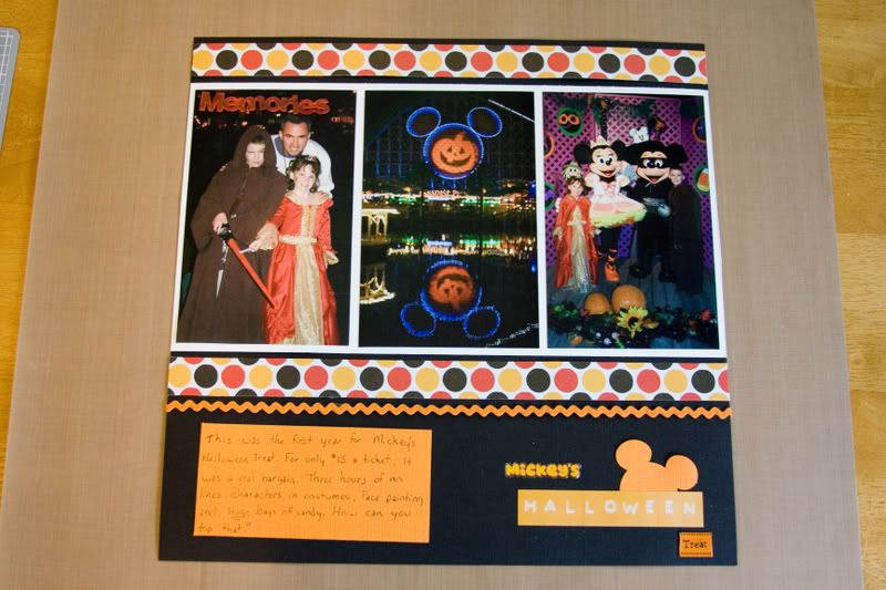
Dot that looks great! You fit so many pictures on there!! I've got like 30 pictures from Mickey's Halloween Treat at DL and I've only fit 3 pictures on my page!! I really like yours.

I'm almost done. I'm just hung up on journaling. I HATE journaling!! Curses to you eagles!!:fork::lol:

Thanks!
 

Coree

Well-Known Member
I agree that it's a great page, Dot. I'm also impressed at the number of photos you fit on the page, but you did it without making it look crowded. I also love the journaling element--very original.
 

minnie2000

Well-Known Member
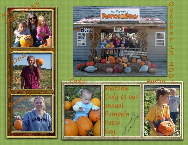
Dot, I love your layout, especially the picture of the giant pumpkins!

Disneyfalcon, I hate journalling too, I only did it because Eagles said we had to! It took me a long time to think of something to write.
 

Uponastar

Well-Known Member
I agree that it's a great page, Dot. I'm also impressed at the number of photos you fit on the page, but you did it without making it look crowded. I also love the journaling element--very original.

Dot, I love your layout, especially the picture of the giant pumpkins!

Disneyfalcon, I hate journalling too, I only did it because Eagles said we had to! It took me a long time to think of something to write.

Thank you girlies!
I'm finding that my biggest problem in scrapbooking is that there are just too many choices! :lol:
 

Disneyfalcon

Well-Known Member
I'm done!! Okay, I confess I cheated a little. I made a journaling block and laid it on top of my layout, took a picture, and then promptly through the journaling block away!!

I really, really hate journaling.:D

Actually I do want to say something about Mickey's Halloween Treat, but I'll leave it for a companion page that I'll do later.

IMG_1835001.jpg
 

Coree

Well-Known Member
Tammy, I think I need to take lessons from you on creating pages in the traditional Mickey color scheme--black, red, yellow. I never like mine when I do them, but yours look so great! So if you took the journaling block off, did you put anything else in its place? :)
 

Disneyfalcon

Well-Known Member
Thank you Coree. I'm trying to do my whole Disneyland album in that color scheme, but I don't know if I'm going to make it. Some of the pages are starting to look too much alike.

I left the space blank. I'm no expert, but the classes I've taken say sometimes it's good to leave a little "negative space". That's a blank space where the eye can rest. I'm totally paraphrasing but that's the basic gist!:)
 

minnie2000

Well-Known Member
Disneyfalcon - great page! I love the colours you used, they work so well together. The yellow/orange looks great against the black background.
 

eagles

Active Member
Original Poster
well all i can say about all these pages are WOW. ALL of you have really impressed me!

i am on my way to the shower and then off to the pumpkin patch/corn maze today. i have my work cut out for me now.

i hate journaling also, i don't think i have any except 1 or 2. but when i looked back into my traditional book i realized how important journaling was. especially when feelings or someone did or said something was written down. journaling is important for latter on, and we need to incorporate this very important element. i am trying to look at it now as another photo to add, or add it as an embellishment.

"blank/negative" space coming to a scrapbook challenge near you. hint hint
 

SewIn2Disney

Well-Known Member
Ooh! Have fun!
I'm going tomorrow to my first cornfield maze---I can't wait! I've wanted to go to one for like 3 years now.
Jo-Lees has a great "hay ride" dimensional sticker set....but at $5.00 I can't justify buying it....hopefully if I use this challenge to scrapbook it, I won't have to buy it.

Anyway--have fun--can't wait to see the pics!
 

Disneyfalcon

Well-Known Member
i hate journaling also, i don't think i have any except 1 or 2. but when i looked back into my traditional book i realized how important journaling was. especially when feelings or someone did or said something was written down. journaling is important for latter on, and we need to incorporate this very important element. i am trying to look at it now as another photo to add, or add it as an embellishment.

I know it's important, it's just sooooo hard!!!(said in my best whiny voice):lol:
 

eagles

Active Member
Original Poster
pump2.jpg


pumpkin1copy.jpg


journaling WAS/IS very hard, I know, and now you all know I found it hard also, as one of my pages I could not come up with anything. and the other wasn't very ahemmm creative. LOL

anyway, this is what i came up with so far. i still have the corn maze to do, and lots more pictures to do something with. so you might be seeing more pages. just a warning.

you know i think they are rather boring pages, i just don't have pages that has that wow factor, like all of yours.
 

eagles

Active Member
Original Poster
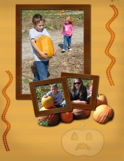
looking back on them now, the second one is really missing something. what else could i do to it? i need some ideas. do i need to get rid of that unhappy pumpkin?
 

Disneyfalcon

Well-Known Member
eagles I really like the first one. Great colors. The second one is nice too! I like the pumpkin. If I were going to change something I would add something in the upper left corner.

Another thing I've learned from classes is you want a "Z" effect. That's the way your eye naturally moves across a page, so you want something to draw the eye to those intersections. I usually try to go for something in the top left and bottom right at least.

I'm looking forward to the negative space challenge!:)
 

minnie2000

Well-Known Member
pump2.jpg


pumpkin1copy.jpg


journaling WAS/IS very hard, I know, and now you all know I found it hard also, as one of my pages I could not come up with anything. and the other wasn't very ahemmm creative. LOL

anyway, this is what i came up with so far. i still have the corn maze to do, and lots more pictures to do something with. so you might be seeing more pages. just a warning.

you know i think they are rather boring pages, i just don't have pages that has that wow factor, like all of yours.

I love your pages! They are not boring at all! Can't wait to see some more!
 

mouselvrmom

Well-Known Member
I was just in New York, so I didn't have a chance to make my pumpkin pictures yet, so I'll have to work on them this week and then post them when I'm done.

Everyone did such a good job making festive fall pumpkin pages!

minnie- I love the colors you used on your page. They are so fall!

Uponastar- I love the crossed border you used on two sides- and I like how you used smaller pictures so you could fit more on a page.

Tammy- I love how you pulled the classic mickey colors and the fall colors together! Your pictures are so cute, I love that center one and mickey and minnie dressed in costume!

eagles- I don't think your pages are boring at all! I really love the green you used on the first page. I think that is my new favorite fall color!
 

trose61

Member
All of your pages are so lovely!

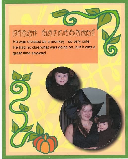
Here's mine for this week. I wanted to put in more journaling, but my program kept freezing up on me and doing weird things with black boxes...so I just stuck with what I had.

Tami

scan0001.jpg
 

minnie2000

Well-Known Member
All of your pages are so lovely!

Here's mine for this week. I wanted to put in more journaling, but my program kept freezing up on me and doing weird things with black boxes...so I just stuck with what I had.

Tami

scan0001.jpg

Great layout - and he really is cute!
 

Register on WDWMAGIC. This sidebar will go away, and you'll see fewer ads.

Back
Top Bottom