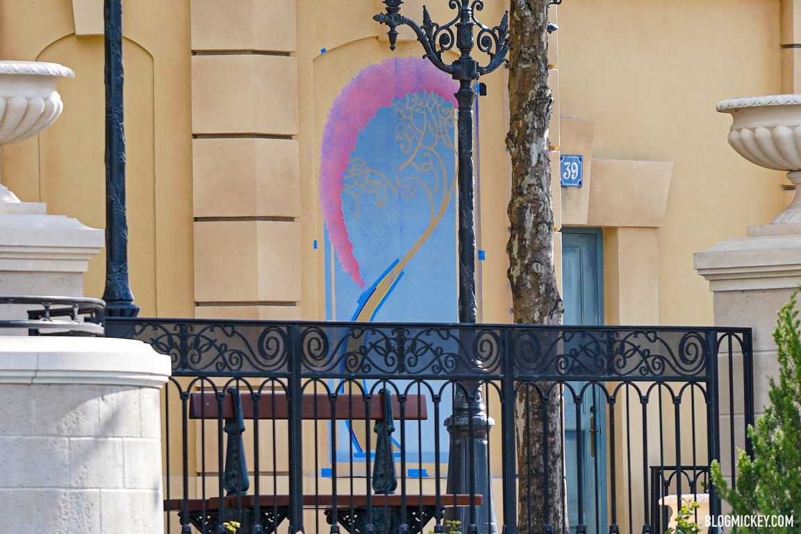
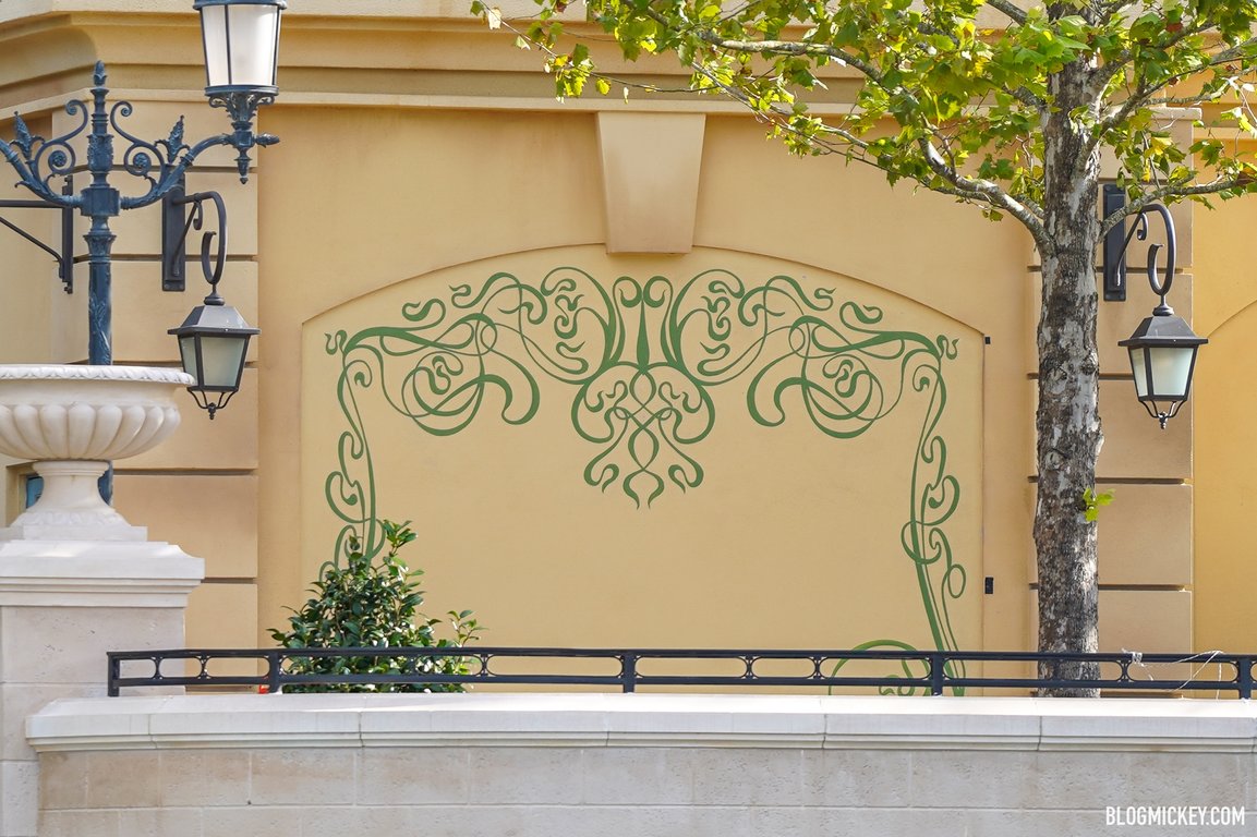
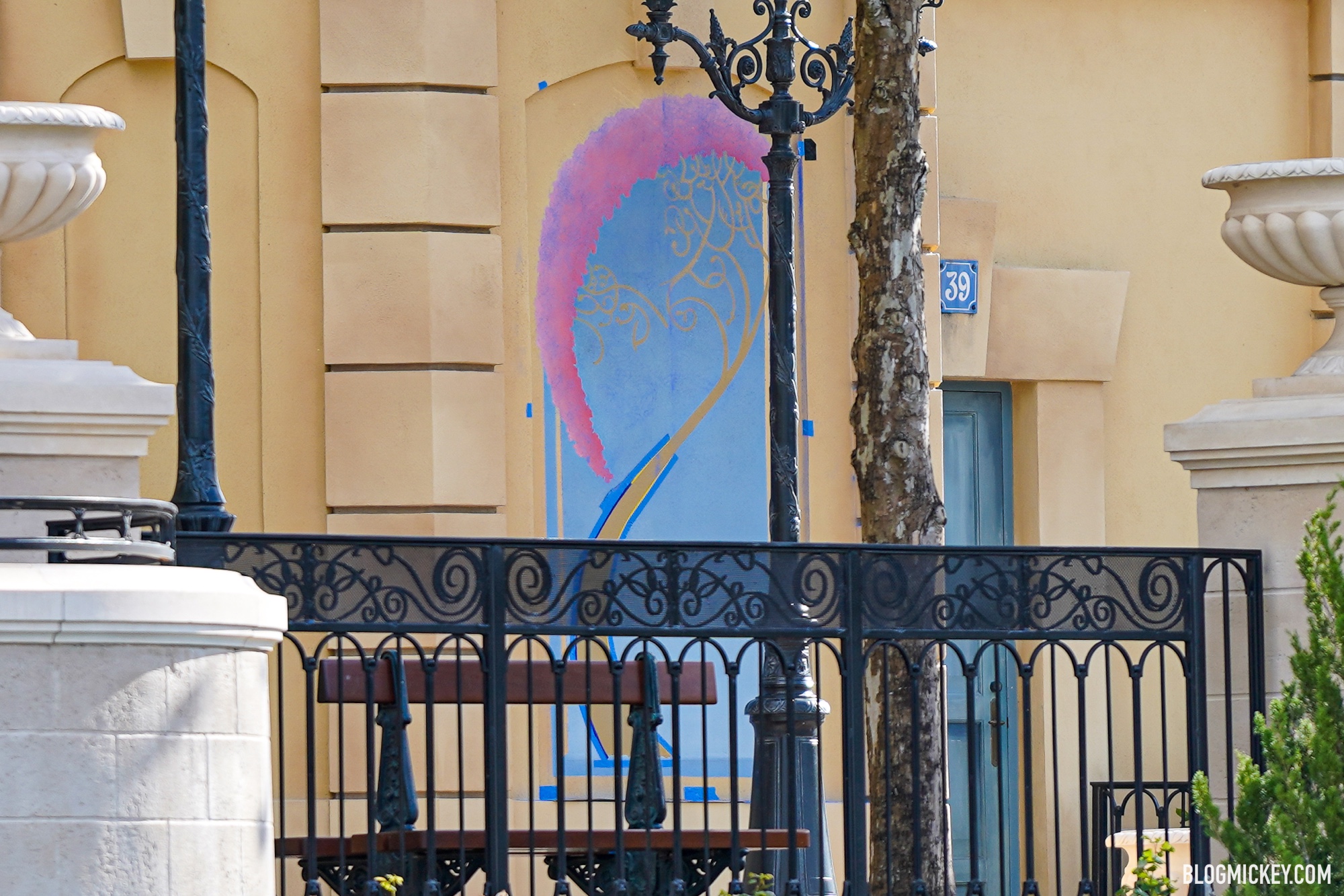
Hand-Painted Art Nouveau "Instagram Walls" Added to France Pavilion at EPCOT
Walt Disney World news, photos, and reviews! We provide you with daily news from the Walt Disney World theme parks and beyond
 blogmickey.com


 blogmickey.com
View attachment 513993View attachment 513994
Hand-Painted Art Nouveau "Instagram Walls" Added to France Pavilion at EPCOT
Walt Disney World news, photos, and reviews! We provide you with daily news from the Walt Disney World theme parks and beyondblogmickey.com
I'm really not a fan of that. Partially because I don't think it fits the aesthetic of the area (especially the second), but moreso because that area isn't very big to begin with and it's going to create serious traffic flow issues if a bunch of people are stopping in the middle to take pictures with a wall.
I would have preferred to see some wheat-pasted street art / advertisemtns, since that seems more fitting.
http://driehausmuseum.org/images/uploads/blog/_big/blog-poster-maniac.jpg
Ornament is not inherently a detail.Not sure why adding detail is a problem. Imagine if people said about Main Street “yeah, too nice. It distracts everybody and slows us down as we run towards the castle and the rides!!1!” I hope they add more detail, not less. I’d prefer to have a sensory overload than be underwhelmed. Ideally, there’s a balance. But, I’d posit that the balance leans towards more detail.
In any case, I’ll take more ornament over less. The modernist structures being built today are ugly as hell. Buildings, especially these days, need more details and ornamentation.Ornament is not inherently a detail.
Even in Classicism ornament has a place. It isn’t just slathered on to hide a bad design decisions.In any case, I’ll take more ornament over less. The modernist structures being built today are ugly as hell. Buildings, especially these days, need more details and ornamentation.
I agree to that but I think re Rat we have to understand the context of the expansion. It’s not exactly shoehorned but there are still constraints. I have a soft spot for murals and mosaics so maybe I’m biased but I like seeing Disney do more murals. It’s one thing Disney used to excel at and something I’m glad they’re reviving. From the Fantasia mural at the Welch Grape Juice stand at DL to EC’s glorious murals to this new generation of murals, I love them all.Even in Classicism ornament has a place. It isn’t just slathered on to hide a bad design decisions.
There is nothing about the context of the expansion that required its placement or the insistence on reusing such a lousy facade.I agree to that but I think re Rat we have to understand the context of the expansion. It’s not exactly shoehorned but there are still constraints. I have a soft spot for murals and mosaics so maybe I’m biased but I like seeing Disney do more murals. It’s one thing Disney used to excel at and something I’m glad they’re reviving. From the Fantasia mural at the Welch Grape Juice stand at DL to EC’s glorious murals to this new generation of murals, I love them all.
I’m sorry. I’m critical when I need to be but I am usually an optimist. It seems like some will continuously find fault in everything Disney does. If they added no details and ornamentation, they would cry “it’s too bland!” When they do add it “they’re just covering their poor design choices.” You just can’t win with these people. As someone who has experience building out successful hospitality enterprises, I can appreciate all the hard work that goes into designing and building these projects (and then maintaining and operating them). It’s one of the reasons I love going to the parks so much. Disney gets a lot of flack from the keyboard warriors at home but in the end it’s Disney who’s making billions every normal year.There is nothing about the context of the expansion that required its placement or the insistence on reusing such a lousy facade.
I’m well aware of what goes into a project. I’ve explained in detail why projects like this and TRON cannot just be dropped into place. Whether or not ornament is appropriate is entirely dependent on the story being told. Forcing people to walk around the pavilion was not a necessity. Keeping an old, poorly designed facade that is not integral to the theater’s building envelope was not a necessity with hundreds of millions of dollars.I’m sorry. I’m critical when I need to be but I am usually an optimist. It seems like some will continuously find fault in everything Disney does. If they added no details and ornamentation, they would cry “it’s too bland!” When they do add it “they’re just covering their poor design choices.” You just can’t win with these people. As someone who has experience building out successful hospitality enterprises, I can appreciate all the hard work that goes into designing and building these projects (and then maintaining and operating them). It’s one of the reasons I love going to the parks so much. Disney gets a lot of flack from the keyboard warriors at home but in the end it’s Disney who’s making billions every normal year.
How dare youI’m sure it’ll have a weathered look to it eventually. Just like the blue building, they will add some stuff to give it that old rustic weathered look.
I’m sorry. I’m critical when I need to be but I am usually an optimist. It seems like some will continuously find fault in everything Disney does. If they added no details and ornamentation, they would cry “it’s too bland!” When they do add it “they’re just covering their poor design choices.” You just can’t win with these people. As someone who has experience building out successful hospitality enterprises, I can appreciate all the hard work that goes into designing and building these projects (and then maintaining and operating them). It’s one of the reasons I love going to the parks so much. Disney gets a lot of flack from the keyboard warriors at home but in the end it’s Disney who’s making billions every normal year.
I’m sorry. I’m critical when I need to be but I am usually an optimist. It seems like some will continuously find fault in everything Disney does. If they added no details and ornamentation, they would cry “it’s too bland!” When they do add it “they’re just covering their poor design choices.” You just can’t win with these people. As someone who has experience building out successful hospitality enterprises, I can appreciate all the hard work that goes into designing and building these projects (and then maintaining and operating them). It’s one of the reasons I love going to the parks so much. Disney gets a lot of flack from the keyboard warriors at home but in the end it’s Disney who’s making billions every normal year.
Don't even THINK about comparing this expansion to the absolute perfection of Main St. USA.Not sure why adding detail is a problem. Imagine if people said about Main Street “yeah, too nice. It distracts everybody and slows us down as we run towards the castle and the rides!!1!” I hope they add more detail, not less. I’d prefer to have a sensory overload than be underwhelmed. Ideally, there’s a balance. But, I’d posit that the balance leans towards more detail.

A “sneak peek”?Sneak peek of the ride will air during ABC's “The Wonderful World of Disney: Magical Holiday Celebration” on Thanksgiving Night

Disney Parks Blog
Welcome to the Disney Parks Blog! Discover the stories you know and love — from the locations, attractions, cruise ships, expeditions, products, and so much more.disneyparks.disney.go.com
Register on WDWMAGIC. This sidebar will go away, and you'll see fewer ads.
