News Refurbishment coming soon to Disney's Polynesian Village Resort - Moana details to be included

Bocabear

Well-Known Member
I don't mind them so much. They look modern but not industrial.
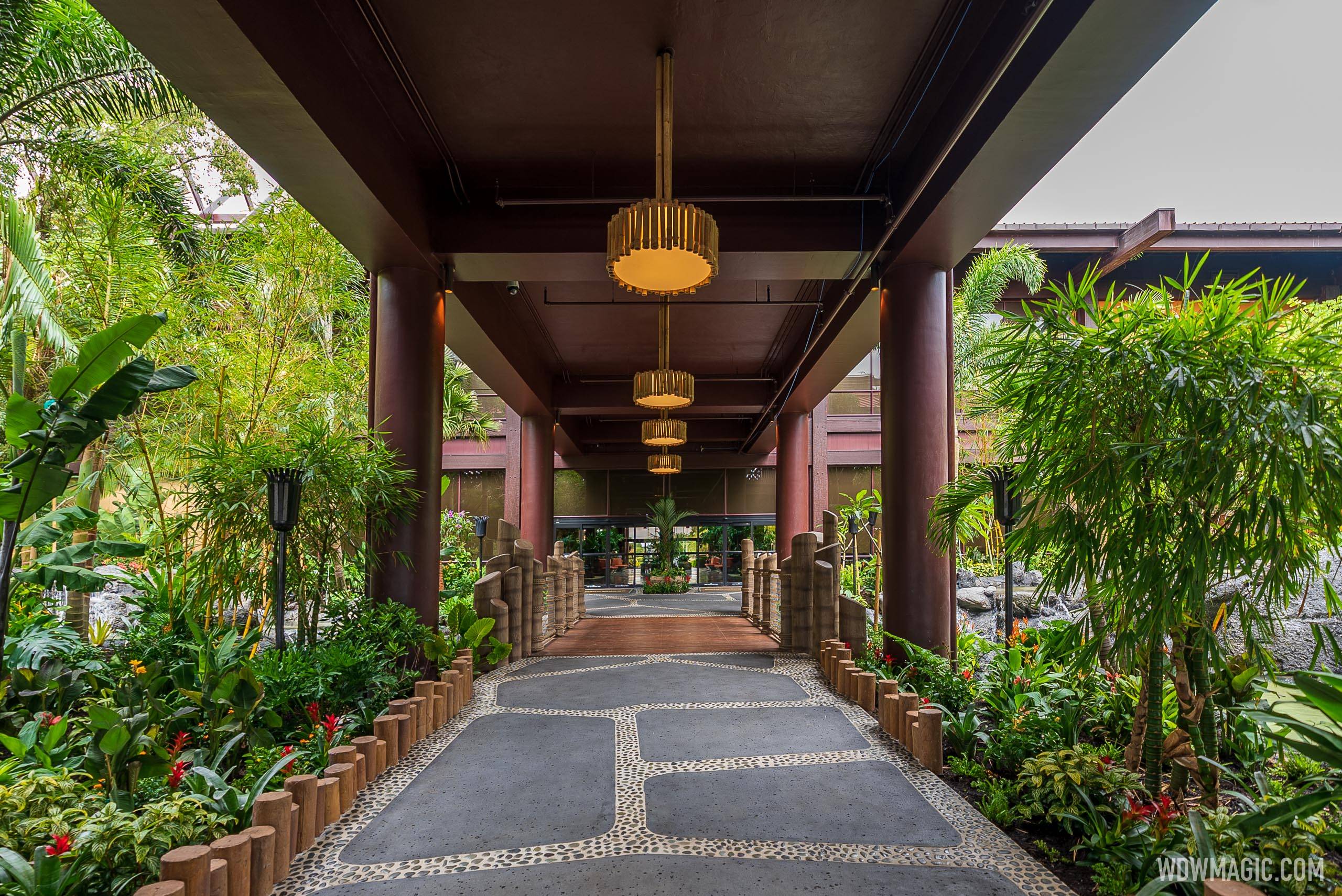
Disneys-Polynesian-Resort_Full_44164.jpg
Even if they bundled Bamboo poles around the columns it would feel mor organic and less painted brown concrete...
The Balloon Nets are a far greater sin...they look really terrible..
Giving credit where it is due, I am pleased with the water features, though a smaller footprint, it is a lot more stylish...
The color panels don't bother me as much as the way too light ceiling...that is a bigger problem along with the Balloons...just weird looking.
 

Bocabear

Well-Known Member
It would look like bamboo strapped around something huge. Nothing organic about that.
except that the surface has an organic covering rather than brown concrete...I was thinking quick and cheap...but actually detail painting would be nice...or sculpting over the existing form with a medium to look more distressed and wood-like...like Disney used to do.
The brown ceiling inserts could be painted in a faux Tapa style to add a little interest as well... but I think they feel like they are done...I am more concerned with the actual ceiling and balloon nets...
 

Epcot82Guy

Well-Known Member
Having now seen it in person, I agree with what everyone is saying. It feels like a project that simply wasn't finished. The ideas behind all of them are fine. It's just missing the finishing touches that make it Disney. The warehouse roof is noticeable and feels weird. The thatch on the roof also looks a little suspicious up close. The panels are cool - though they feel a bit plastic. The gardens are actually a nice balance of smaller (good for budget) and intimate - so they work (or at least will work once the foliage grows back in). The columns are more non-descript, but they do come off as very plain and almost like they painted the framework of the house vs. put up the walls. And, you really notice it as soon as you go to any other hotel or resort in that area. Even the stark Contemporary walk ups have the studded concrete, tiles, etc. - and it was always flagged as being the one lacking theme or details. Sadly, Poly's columns and roof underside may now take that cake.

Luckily, it's not a project that totally ruined anything. If they simply added to what they have and got appropriate lighting fixtures, the thatch would be the only real negative.
 

UNCgolf

Well-Known Member
Having now seen it in person, I agree with what everyone is saying. It feels like a project that simply wasn't finished. The ideas behind all of them are fine. It's just missing the finishing touches that make it Disney. The warehouse roof is noticeable and feels weird. The thatch on the roof also looks a little suspicious up close. The panels are cool - though they feel a bit plastic. The gardens are actually a nice balance of smaller (good for budget) and intimate - so they work (or at least will work once the foliage grows back in). The columns are more non-descript, but they do come off as very plain and almost like they painted the framework of the house vs. put up the walls. And, you really notice it as soon as you go to any other hotel or resort in that area. Even the stark Contemporary walk ups have the studded concrete, tiles, etc. - and it was always flagged as being the one lacking theme or details. Sadly, Poly's columns and roof underside may now take that cake.

Luckily, it's not a project that totally ruined anything. If they simply added to what they have and got appropriate lighting fixtures, the thatch would be the only real negative.

I wondered about the thatch. I thought it looked more like a giant rug/welcome mat draped over a frame than an actual thatched roof in photos, but it's always different in person. Not great that it looks off in person too.
 
Last edited:

fgmnt

Well-Known Member
I think it's fair to keep in mind that this project replaced one of the most decrepit and unavoidable structures in a deluxe resort, so there are a lot of upgrades here, and I think the project had a pretty hard deadline that made it easy to justify cuts that also appeased bean counters. It is jarring to see some of it look pretty close to perfect and some of it looked phoned in. The underside of the roof and the ball lights are abysmal, and I actually think you could get them to go back and redo those in the Spring if they get enough complaints.
 

thomas998

Well-Known Member
I mean if Disney would just come out and say.

"Demand isn't there, we have to adjust the park operating model, we won't need half the staff and resorts till 2022"

That actually MIGHT go over better than this BS. At least it cuts the speculation out.
Pick a date, stick with it.. instead of this willy-nilly week by week closure, opening, delay, rethink, adjustment, etc.

Rooms being re-done could be done one building at a time with the resort open.
So that's not a good reason.

They've closed half the main lodge before, kept it open while working.
The company is short on cash, but spending to rehab right now?

Nope, it all stinks.
Bingo. I've had several stays at WDW and DL resorts where they were refurbishing the resort and it meant a pool would be closed and some areas of the resort would be off-limits. You don't have to close an entire resort for a refurb, they don't want it open but don't want to let investors know the demand is down.
 

peter11435

Well-Known Member
Bingo. I've had several stays at WDW and DL resorts where they were refurbishing the resort and it meant a pool would be closed and some areas of the resort would be off-limits. You don't have to close an entire resort for a refurb, they don't want it open but don't want to let investors know the demand is down.
Lack of demand is not the only reason to not be willing/able to open a resort.
 

rreading

Well-Known Member
I think it's fair to keep in mind that this project replaced one of the most decrepit and unavoidable structures in a deluxe resort, so there are a lot of upgrades here, and I think the project had a pretty hard deadline that made it easy to justify cuts that also appeased bean counters. It is jarring to see some of it look pretty close to perfect and some of it looked phoned in. The underside of the roof and the ball lights are abysmal, and I actually think you could get them to go back and redo those in the Spring if they get enough complaints.

Having stayed at Universal's Royal Pacific this summer, and not having any nostalgia for Poly, I actually prefer this video of entering the Poly to the experience of walking to the Royal Pacific. The RP has a large canyon of landscaping under an adorned bridge and is thus an impressive but cold entry. Even with its limitations, this one seems much more cozy and welcoming.
 

Register on WDWMAGIC. This sidebar will go away, and you'll see fewer ads.

Back
Top Bottom