News Refurbishment coming soon to Disney's Polynesian Village Resort - Moana details to be included

lazyboy97o

Well-Known Member
To be honest, the concept art is not great and I at least assumed it was just a poor rendering of an entrance that would be akin to those they have at their other resorts. The thatched roof, for example, looks like a formica kitchen counter top in that rendering and I would have been surprised if that was what they went with. I reiterate, I would have been surprised... now, not so much!
Based on the art it would have been reasonable to expect to not see the underside of the roof deck but a ceiling and one that could conceal things like conduit and sprinklers as there is a rather sizable fascia. Although the art also makes the roof look like a late addition as the beams don’t align to the roof which just looks like something added on top of the image in Photoshop.

The art though doesn’t suggest that the final design isn’t so much a design as it is just engineering. It’s not a stylized interpretation, just a rather bog standard structure with some paint and a few decorative embellishments. The art doesn’t suggest things like wide- beams, exposed structural connections, surface mounted conduit or standard concrete flooring. It’s made all the worse because the Polynesian Village is a mid-century hotel that was intended as a showcase for US Steel so there is plenty of precedent to draw upon.

The panels deserved more detail just because they are if a different context than the longhouse gables. Something you can walk right up to should be treated differently than something that’s always more than 30’ away.
 

LittleBuford

Well-Known Member
Based on the art it would have been reasonable to expect to not see the underside of the roof deck but a ceiling and one that could conceal things like conduit and sprinklers as there is a rather sizable fascia. Although the art also makes the roof look like a late addition as the beams don’t align to the roof which just looks like something added on top of the image in Photoshop.

The art though doesn’t suggest that the final design isn’t so much a design as it is just engineering. It’s not a stylized interpretation, just a rather bog standard structure with some paint and a few decorative embellishments. The art doesn’t suggest things like wide-****** beams, exposed structural connections, surface mounted conduit or standard concrete flooring. It’s made all the worse because the Polynesian Village is a mid-century hotel that was intended as a showcase for US Steel so there is plenty of precedent to draw upon.

The panels deserved more detail just because they are if a different context than the longhouse gables. Something you can walk right up to should be treated differently than something that’s always more than 30’ away.
I think I've made it quite clear that I'm referring to expectations of what is visible in the art, not what isn't. Again, I would appreciate it if people didn't jump to the most extreme interpretation of whatever I post.
 

James Alucobond

Well-Known Member
The panels deserved more detail just because they are if a different context than the longhouse gables. Something you can walk right up to should be treated differently than something that’s always more than 30’ away.
Pretty sure the only place you can actually get close to the panels is at the bottom of the emergency stairs on either side of the front where it’s just plain vertical slats anyway, and I think both sides have beds for landscaping in front of them. Haven’t seen pictures of the final plantings for those spaces, though. Short of that, I think you literally have to be taking the emergency exit to get a closer look.
 

lazyboy97o

Well-Known Member
Pretty sure the only place you can actually get close to the panels is at the bottom of the emergency stairs on either side of the front where it’s just plain vertical slats anyway, and I think both sides have beds for landscaping in front of them. Haven’t seen pictures of the final plantings for those spaces, though. Short of that, I think you literally have to be taking the emergency exit to get a closer look.
The stairways only have a small planter in front of the panels allowing people to be quite closer. Just walking under them puts the viewer closer to them than the gables.
 

Vegas Disney Fan

Well-Known Member
I honestly don’t mind it.

Could it be taken more over the top as has been mentioned by many? Sure it can. The only thing I’m not fully sold on is the lights used in the nets.

Do I think it’s generally an improvement to resort entry experience? Yes I do.

I have checked out the Poly to see the resort a few times, many years ago, I just recall everything being very dark and claustrophobic (IMO).

I like the new lobby, I like the more airy and open entry, the colourful “wood” detailing is fun, and I think using the white above keeps it feeling bright and uplifting versus dark and dreary.

This is very close to my thoughts also, the new entrance isn’t perfect but I like it more than the old entrance, I think the same about the lobby, it’s not perfect but I prefer it to what was there before.

My complaints with the new entrance are cosmetic and could easily be solved, whether they will be is debatable, but they can be. I don’t like the bright white roof but that’s easily solved with a paint job, I also don’t like the smooth round columns but those could easily be plussed into trees or wrapped with decorative panels.

The bones are good, once the resort is fully reopened and making money again hopefully some more details will be added over time.
 

castlecake2.0

Well-Known Member
When Citricos was getting ready to reopen management was told “it’s done”. Management saw the new carpet and said um no it’s not done. Flooring was ripped out and redone. This could be a similar scenario, just in public. We still don’t know if it’s done or not, similar to a rolling refurbishment like jungle cruise got. Things could be delayed due to Covid. I cannot fathom those hanging light nets are permanent, still more landscaping to do, painting patterns on the columns possibly. I think they just wanted to get the monorail station open as soon as possible. I hope.
 

LittleBuford

Well-Known Member
I also don’t like the smooth round columns
I don't mind them so much. They look modern but not industrial.

Disneys-Polynesian-Resort_Full_44164.jpg
 

James Alucobond

Well-Known Member
I don't mind them so much. They look modern but not industrial.

Disneys-Polynesian-Resort_Full_44164.jpg
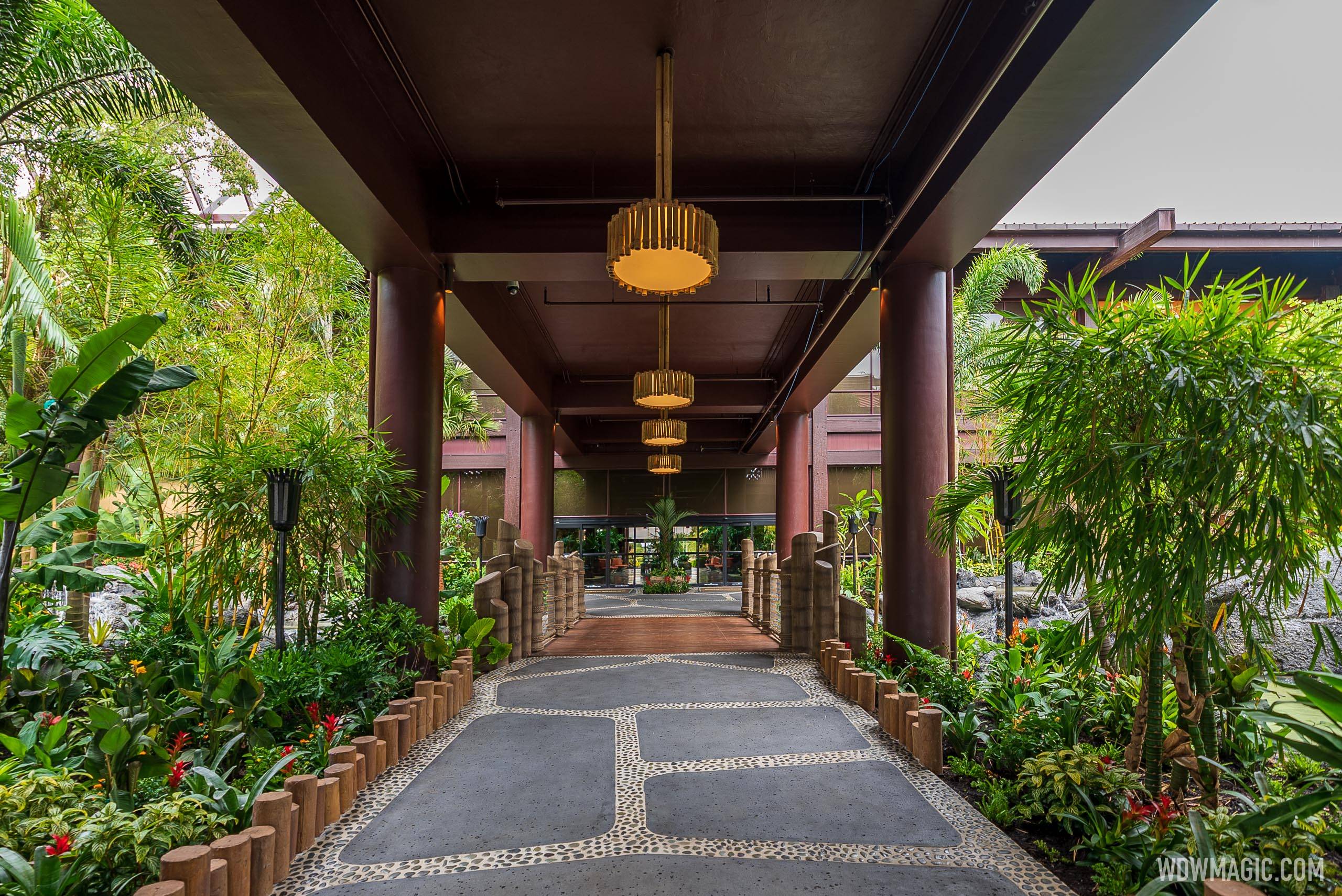
It's nice, but it could be perfect with minimal additional effort. Just add some non-structural horizontal slats to the ceiling to obfuscate the various pipes and add some sort of appliqué or finish to the pillars. Worst part is definitely the stray blue wire on the right just stapled around one crossbeam and hanging completely loose closer to the main doors.
 

LittleBuford

Well-Known Member
It's nice, but it could be perfect with minimal additional effort. Just add some non-structural horizontal slats to the ceiling to obfuscate the various pipes and add some sort of appliqué or finish to the pillars. Worst part is definitely the stray blue wire on the right just stapled around one crossbeam and hanging completely loose closer to the main doors.
I agree with all of this except for the bolded. I'm not confident that the columns would look better with a finish or design added to them, especially if it's anything like what we see in the concept art.
 

WDWTrojan

Well-Known Member
That's fair enough.

Your post makes me wonder what those who've seen the new entrance in person think. Are there any posters here who've actually seen the new structure in the flesh?

Saw it. Took some of the photos in this thread. The colorful panels do not bother me. What bothers me is the thatching looks like a weird sh@g carpet, far faker than some of the other faux-thatching on property. The biggest problem, as mentioned, is the moment you drive inside. None of the theming was designed to be underneath it. It is an un-themed warehouse once inside.

Once you head towards the building it gets nicer as you're surrounded by the lush tropical environment and they painted the underside of the bridge brown, but the concrete columns are still jarringly plain - though they do not stand out as much as here the roof is also brown, so it all blends in.
 
Last edited:

LittleBuford

Well-Known Member
Saw it. Took some of the photos in this thread. The colorful panels do not bother me. What bothers me is the thatching looks like a weird carpet, far faker than some of the other faux-thatching on property. The biggest problems, as mentioned, is the moment you drive inside. None of the theming was designed to be underneath it. It is an un-themed warehouse once inside.
Thanks for sharing your impressions. I’m sorry it doesn’t look better in person.
 

Vegas Disney Fan

Well-Known Member

For me this falls into the “Disney touches” that you don’t necessarily notice but that make Disney Disney.

The round columns don’t look bad, but your picture screams Disney. It’s the plussing that you don’t notice but you also notice.

My biggest complaint with most Disney renovations lately is they are generic… white sheets, plank floors, lack of specific theming, none of it looks bad but with the lack of details it’s getting hard to tell a Caribbean Beach room apart from a French Quarter room. That’s not to say I dislike the changes, I prefer the new flooring to the carpet and I don’t miss the old bedspreads at all, to me the new rooms are unquestionably better, I just miss the little details (like bed runners, wallpaper borders, etc) that differentiated the rooms.

I think they could accomplish your quick photoshop with something as simple as fabric banners.
 

JoeCamel

Well-Known Member
For me this falls into the “Disney touches” that you don’t necessarily notice but that make Disney Disney.

The round columns don’t look bad, but your picture screams Disney. It’s the plussing that you don’t notice but you also notice.

My biggest complaint with most Disney renovations lately is they are generic… white sheets, plank floors, lack of specific theming, none of it looks bad but with the lack of details it’s getting hard to tell a Caribbean Beach room apart from a French Quarter room. That’s not to say I dislike the changes, I prefer the new flooring to the carpet and I don’t miss the old bedspreads at all, to me the new rooms are unquestionably better, I just miss the little details (like bed runners, wallpaper borders, etc) that differentiated the rooms.

I think they could accomplish your quick photoshop with something as simple as fabric banners.
I remember rapping my knuckles against rails and columns to see if they were real or Disney. They were Disney and impressive that I had to check.
 

Register on WDWMAGIC. This sidebar will go away, and you'll see fewer ads.

Back
Top Bottom