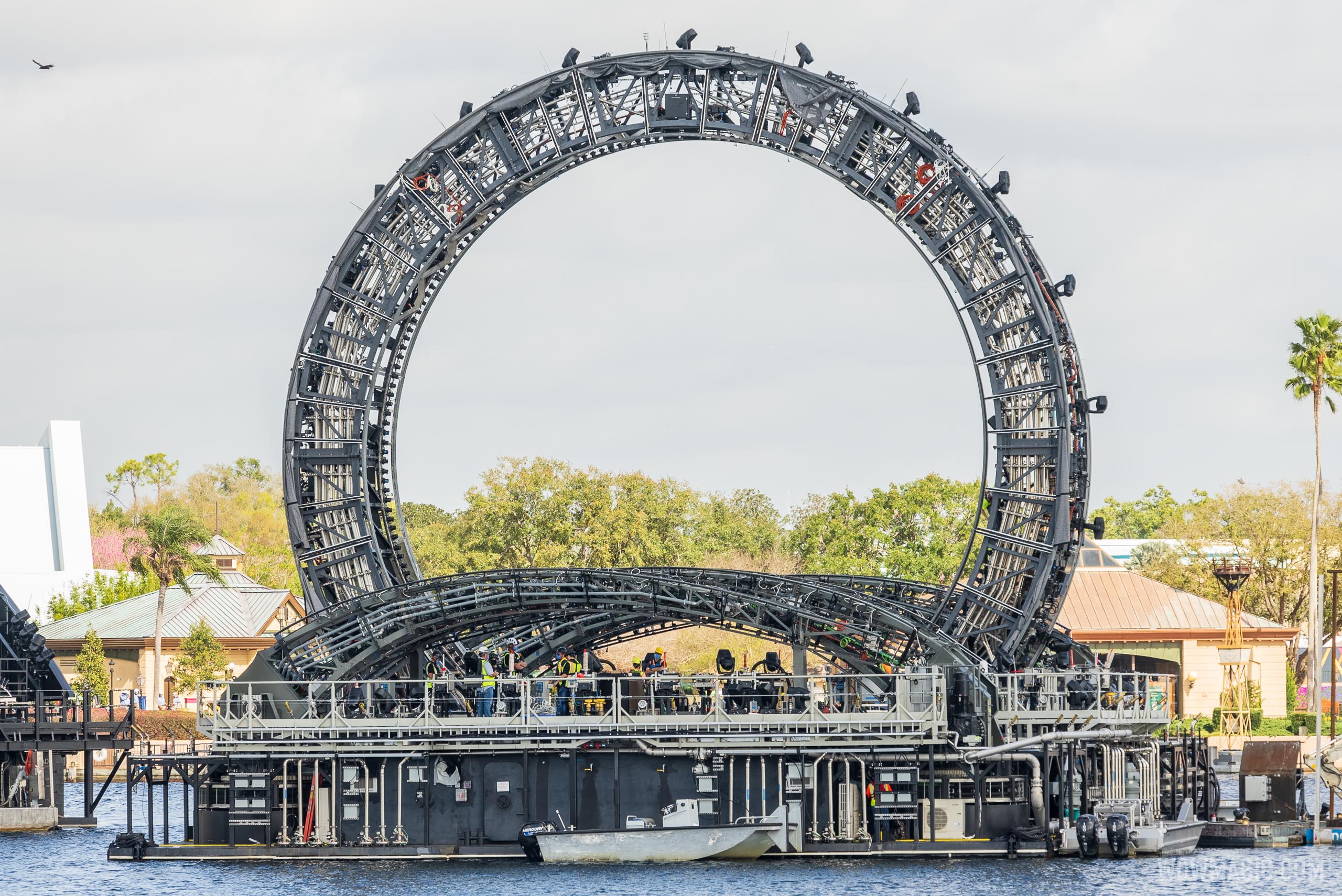
It seems like EPCOT is a reflection of the larger issue at WDW right now that's the trend toward rampant overdevelopment (ironic since it's the same trend plaguing many areas of Florida right now as well). In the past several years, WDW has been on an unprecedented building spree. A spree without much consideration, it seems, to any responsible or cohesive master plan. A dramatic departure from the first few decades of the resort's operation.
Today we have theme parks jammed to the hilt with food and merchandise kiosks, scores of trees and landscape at some of the resort's most picturesque spots plowed under forever (see the Ft. Wilderness Settlement), tranquil lakefront views decimated with scores of bungalows that 90% of visitors will never be able to afford to stay at, 15 story towers springing up at resorts that were originally deliberately laid out with low-lying buildings, highway overpasses everywhere you turn, giant show buildings destroying carefully crafted sightlines, and now a nighttime show at EPCOT with a ton of cold, ugly, post-apocalyptic hardware thrown in without any regard to the brilliant design of the park's original layout. A design where architecture and sightlines weren't just a byproduct, they were the entire point of the thing in the first place.
Whew.
Ironically, one of the only buildings coming down anywhere is Innoventions West, which further throws EPCOT off center, diluting the architectural and design intent of harmony and balance that was deliberately and carefully crafted as a metaphor for the park's theme.
Folks say they might not notice the changes, or spend much time appreciating the views. But I don't think overt appreciation was the point. Good design works in the background, informing and supporting intent without calling attention to itself. This was discussed at length in Karal Ann Marling's The Architecture of Reassurance: Building the Disney Theme Parks (both the book and the touring exhibition that inspired it). From the exhibition's introduction:
"Primarily, Walt was dissatisfied with Los Angeles and with other American cities of his era, the 1940s and 1950s. He was dissatisfied because the American city, it seemed to him, had become an utterly chaotic environment: cars rocketing here and there, unplanned suburbs, no sense of visual coherence, no sense of safety and reassurance. Walt Disney was also interested, however, in theming. Specifically, he was interested in what the American city had been in the past, the frontier West, the life of the small town as he remembered it at the turning of the century. He was interested finally, I think, in creating a place where people could feel safe and reassured.
We call this exhibition “The Architecture of Reassurance” because at every point in the design of Disney’s theme parks you feel safe, secure—you feel as though you know where you are in space."
Sadly it seems this philosophy has been all but abandoned, and in some ways also actively frowned upon. The Guardians show building, for example, almost seems deliberately designed to tower over Spaceship Earth, as an expression of power and metaphor of disdain for everything that made the park great in the first place. A deliberate insult to the design philosophy and talent of those who created EPCOT. A message from current management that they know better, that their creation, Guardians of the Galaxy, is literally way bigger, and far more important, than that "stupid golf ball" and everything it represents.
Much in the same way the size, scale and deliberate off-center location of the Harmonious barges destroys the balance and beauty of World Showcase. The message is clear: ignore the stuffy, preachy, outdated concepts of the past. Pay attention to our message. Buy what we are selling instead.
But in their haste, they took the lazy approach. To simply build the embodiment of their vision so large and intrusive that it literally cannot be ignored.
Which, at the end of the day, is the exact opposite of the very word "harmonious."
It's anything but harmonious. But it does, however, perfectly represent the odious nature of WDW's current design philosophy. Or the utter chaos of not having a coherent design philosophy at all.

