PHOTOS - Disney reveals new lobby design and Trader Sam's lounge for the Polynesian

The Gaylord Palms is ridiculous in the most amazing way. It is like its own ecosystem. A replica of the fort at St Augustine, pirate ships, large multi-story waterfalls, an ice skating rink, etc... It is nearly impossible to believe. It really makes you feel like you stepped into Willy Wonka's Chocolate Factory. I don't think Disney has the stomach to spend the kind of dough needed to make something even 1/5 that scale. I wish they would prove me wrong, though.
 

Cesar R M

Well-Known Member
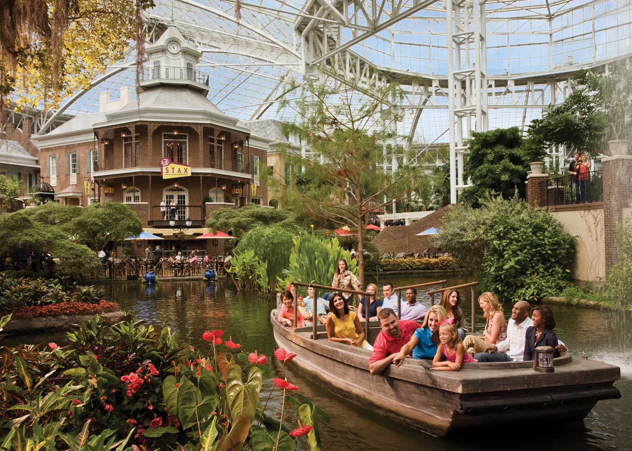
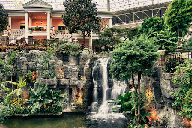
The Gaylord hotels are lovely IMO. I used to live in Nashville where they have one of theirs called the Opryland Hotel, it's quite gorgeous as well. That seems to be the case with all of their hotels. They have really huge atriums that are enclosed with a glass ceiling, often with tons of plants and water features. And usually also with a charming little shopping district to walk around in. All INSIDE the hotel. Here's a couple of pics from the Opryland Hotel Gaylord (google image search it, it's a really gorgeous hotel and they also decorate really well at Christmas)-

op_deltaboat_300.jpg


gaylord-opryland-hotel.jpg

wow, those are incredible! o_O
 

Bairstow

Well-Known Member
The Gaylord Palms is ridiculous in the most amazing way. It is like its own ecosystem. A replica of the fort at St Augustine, pirate ships, large multi-story waterfalls, an ice skating rink, etc... It is nearly impossible to believe. It really makes you feel like you stepped into Willy Wonka's Chocolate Factory. I don't think Disney has the stomach to spend the kind of dough needed to make something even 1/5 that scale. I wish they would prove me wrong, though.

Is it free to just park there and walk around?
 

Bairstow

Well-Known Member
Don't.
It was just a stock Vekoma SLC, aka a "hang and bang."

Of all the things I miss about Opryland, Hangman is way down the list.

See, I've never been on an SLC.
I'm not sure how I can consider myself a respectible coaster nerd when I haven't.
Plus, Hangman had that wicked bone white paint scheme.
 

Skyway

Well-Known Member
I totally get why the GCH was an impractical design for a hotel lobby. You walk in, and you immediately have to walk around this huge obstacle to get to the desk and your room. I'm sure it is quite jammed in there when the DME drops off a bunch of guests all checking in at once, with bags on the floor and kids everywhere.

But wasn't one of the selling points of MyMagic+ the ability to check in prior to arrival. So you would no longer need to wait in line in a hotel lobby.

My guess is the renovation of the GCH has to do with humidity and water damage to the ceiling. I doubt the cost of keeping the fountain running is too excessive (especially compared to the cost of the renovation). There has to be a significant structural issue to the building to require this drastic and expensive change.
 

Spike-in-Berlin

Well-Known Member
I totally get why the GCH was an impractical design for a hotel lobby. You walk in, and you immediately have to walk around this huge obstacle to get to the desk and your room. I'm sure it is quite jammed in there when the DME drops off a bunch of guests all checking in at once, with bags on the floor and kids everywhere.

But wasn't one of the selling points of MyMagic+ the ability to check in prior to arrival. So you would no longer need to wait in line in a hotel lobby.

My guess is the renovation of the GCH has to do with humidity and water damage to the ceiling. I doubt the cost of keeping the fountain running is too excessive (especially compared to the cost of the renovation). There has to be a significant structural issue to the building to require this drastic and expensive change.

As an architect who has already designed a few hotels (though none of them was built so far or I could have afforded the Poly a little more often) I can assure you, that the lobby design works, it's not about the positioning of the waterfalls and tropical garden (the "rainforest"), it's about the capacity of the lobby, about floor area and the size of the reception. Positioning the garden feature in the center makes pretty much sense anyway in a building that has an atrium design! A good hotel lobby in a holiday resort (the Poly is neither a convention resort nor an airport or city hotel) is not about rational functionality but about atmosphere, immersion and theming. Becket had done a brillant job there (not in the longhouses because the prefabricated room modules turned out to be a flawed design idea) in the late 1960ies, when actually the Tiki Culture was already in decline (Walt loved Tiki Culture when it was on it's zenith in the 1960ies, the Poly is one result, the Tiki Room the other) Today hundreds or even thousands of hotels worldwide feature an atrium etc. with a garden, waterfalls or other water features. The Poly was one of the first of it's kind in an era of architecture that was still dominated by the cold and functional International Style. The new design is far more functional, it reduces the lobby from a location where you like to stay and spend time (the German technical term is "Aufenthaltsqualität" meaning the quality of sojourn, how much do you like to stay at a place or room) to a mere traffic space, you rush through, the suites with the sofas to the left and right are not placed around something, they are placed a the side, out of the way. Everything looks like they wanted to create a runway for the guests. If I remember the time I spent an the Poly lobby just by sitting there, doing nothing but people watching and inhaling the atmosphere of the place, the new design is nothing less than a desaster. There is nothing to discover anymore. When you come in the Poly now, you walk around the rain forest, you want to see it from all sides, you want to find out what is behind, where can you go, there is something to discover.
The new lobby is a bean counters lobby, easy to maintain, functional, without anything special, without anything unique, without any magic, totally UNDISNEYISH! The mini-fountain, as a very poor substitute for the gone rainforest (how ironic - SAVE THE RAINFOREST! :rolleyes:) is on the brink of insulting the feelings of those guests who know what it used to be. I mean it couldn't be any smaller, could it? It would fit into our living room without a problem and our living room is not very large. Even the wanna-be-Tiki statue looks really terrible, honestly WDI, take a look at a good book about Tiki culture or JUST WALK AROUND THE PRESENT POLY and you will see how untikiish this statue looks like. WDI hits rock bottom with this "new" lobby.
BTW, Tiki Culture has a revival since the late 1990ies (which hit me right on, I love it!) which brought back Tiki bars etc. in many cities of the western world. And waterfalls are an absolute essential element of Tiki styled locations. Take them out (there are four in the GCH rain forest atrium) and the Poly has lost it's Tiki character. I am quite sure Walt would be not amused although he never saw the finished Poly. But he wouldn't be amused about almost everything TDO does in his name so what does it matter anyway. So TDO, take away the waterfall and volcano from the Nanea Pool as well and replace it with some cheap fake rockworks, easy to clean, I am quite sure it is too expensive to maintain too and you could save some bucks here as well. And after you did it don't forget to raise the room rates!:(
The only solace to me is, that I will NEVER again have to fight the urge to stay there despite the insane room rates. With actually sub-par rooms concerning cleanliness and mousekeeping and with outdated and loud ACs (at least in the Fiji LH) what reason do I have to pay these prices anymore?
 
Last edited:

Spike-in-Berlin

Well-Known Member
BTW a question to all insiders and experts here, would you have preferred the high rise version of the Poly, which was the original design idea in 1969?
 

PREMiERdrum

Well-Known Member
And your head and neck thank you...:confused:

I've been on two: Hangman (now Kong) and Serial Thriller (now Thunderhawk).
I've had enough for this lifetime...

At Geauga Lake / Six Flags Ohio / Six Flags Worlds of Adventure / Geauga lake??? Man, I still get nostalgic for the pre-2000 version of the park in Aurora. The Funtime-era placemaking in the 1950's area is something I wish other parks would take a peek at.
 

Father Robinson

Well-Known Member
As an architect who has already designed a few hotels (though none of them was built so far or I could have afforded the Poly a little more often) I can assure you, that the lobby design works, it's not about the positioning of the waterfalls and tropical garden (the "rainforest"), it's about the capacity of the lobby, about floor area and the size of the reception. Positioning the garden feature in the center makes pretty much sense anyway in a building that has an atrium design! A good hotel lobby in a holiday resort (the Poly is neither a convention resort nor an airport or city hotel) is not about rational functionality but about atmosphere, immersion and theming. Becket had done a brillant job there (not in the longhouses because the prefabricated room modules turned out to be a flawed design idea) in the late 1960ies, when actually the Tiki Culture was already in decline (Walt loved Tiki Culture when it was on it's zenith in the 1960ies, the Poly is one result, the Tiki Room the other) Today hundreds or even thousands of hotels worldwide feature an atrium etc. with a garden, waterfalls or other water features. The Poly was one of the first of it's kind in an era of architecture that was still dominated by the cold and functional International Style. The new design is far more functional, it reduces the lobby from a location where you like to stay and spend time (the German technical term is "Aufenthaltsqualität" meaning the quality of sojourn, how much do you like to stay at a place or room) to a mere traffic space, you rush through, the suites with the sofas to the left and right are not placed around something, they are placed a the side, out of the way. Everything looks like they wanted to create a runway for the guests. If I remember the time I spent an the Poly lobby just by sitting there, doing nothing but people watching and inhaling the atmosphere of the place, the new design is nothing less than a desaster. There is nothing to discover anymore. When you come in the Poly now, you walk around the rain forest, you want to see it from all sides, you want to find out what is behind, where can you go, there is something to discover.
The new lobby is a bean counters lobby, easy to maintain, functional, without anything special, without anything unique, without any magic, totally UNDISNEYISH! The mini-fountain, as a very poor substitute for the gone rainforest (how ironic - SAVE THE RAINFOREST! :rolleyes:) is on the brink of insulting the feelings of those guests who know what it used to be. I mean it couldn't be any smaller, could it? It would fit into our living room without a problem and our living room is not very large. Even the wanna-be-Tiki statue looks really terrible, honestly WDI, take a look at a good book about Tiki culture or JUST WALK AROUND THE PRESENT POLY and you will see how untikiish this statue looks like. WDI hits rock bottom with this "new" lobby.
BTW, Tiki Culture has a revival since the late 1990ies (which hit me right on, I love it!) which brought back Tiki bars etc. in many cities of the western world. And waterfalls are an absolute essential element of Tiki styled locations. Take them out (there are four in the GCH rain forest atrium) and the Poly has lost it's Tiki character. I am quite sure Walt would be not amused although he never saw the finished Poly. But he wouldn't be amused about almost everything TDO does in his name so what does it matter anyway. So TDO, take away the waterfall and volcano from the Nanea Pool as well and replace it with some cheap fake rockworks, easy to clean, I am quite sure it is too expensive to maintain too and you could save some bucks here as well. And after you did it don't forget to raise the room rates!:(
The only solace to me is, that I will NEVER again have to fight the urge to stay there despite the insane room rates. With actually sub-par rooms concerning cleanliness and mousekeeping and with outdated and loud ACs (at least in the Fiji LH) what reason do I have to pay these prices anymore?
This is what It's all about, Disney!!
 

mebucko

Well-Known Member
As an architect who has already designed a few hotels (though none of them was built so far or I could have afforded the Poly a little more often) I can assure you, that the lobby design works, it's not about the positioning of the waterfalls and tropical garden (the "rainforest"), it's about the capacity of the lobby, about floor area and the size of the reception. Positioning the garden feature in the center makes pretty much sense anyway in a building that has an atrium design! A good hotel lobby in a holiday resort (the Poly is neither a convention resort nor an airport or city hotel) is not about rational functionality but about atmosphere, immersion and theming. Becket had done a brillant job there (not in the longhouses because the prefabricated room modules turned out to be a flawed design idea) in the late 1960ies, when actually the Tiki Culture was already in decline (Walt loved Tiki Culture when it was on it's zenith in the 1960ies, the Poly is one result, the Tiki Room the other) Today hundreds or even thousands of hotels worldwide feature an atrium etc. with a garden, waterfalls or other water features. The Poly was one of the first of it's kind in an era of architecture that was still dominated by the cold and functional International Style. The new design is far more functional, it reduces the lobby from a location where you like to stay and spend time (the German technical term is "Aufenthaltsqualität" meaning the quality of sojourn, how much do you like to stay at a place or room) to a mere traffic space, you rush through, the suites with the sofas to the left and right are not placed around something, they are placed a the side, out of the way. Everything looks like they wanted to create a runway for the guests. If I remember the time I spent an the Poly lobby just by sitting there, doing nothing but people watching and inhaling the atmosphere of the place, the new design is nothing less than a desaster. There is nothing to discover anymore. When you come in the Poly now, you walk around the rain forest, you want to see it from all sides, you want to find out what is behind, where can you go, there is something to discover.
The new lobby is a bean counters lobby, easy to maintain, functional, without anything special, without anything unique, without any magic, totally UNDISNEYISH! The mini-fountain, as a very poor substitute for the gone rainforest (how ironic - SAVE THE RAINFOREST! :rolleyes:) is on the brink of insulting the feelings of those guests who know what it used to be. I mean it couldn't be any smaller, could it? It would fit into our living room without a problem and our living room is not very large. Even the wanna-be-Tiki statue looks really terrible, honestly WDI, take a look at a good book about Tiki culture or JUST WALK AROUND THE PRESENT POLY and you will see how untikiish this statue looks like. WDI hits rock bottom with this "new" lobby.
BTW, Tiki Culture has a revival since the late 1990ies (which hit me right on, I love it!) which brought back Tiki bars etc. in many cities of the western world. And waterfalls are an absolute essential element of Tiki styled locations. Take them out (there are four in the GCH rain forest atrium) and the Poly has lost it's Tiki character. I am quite sure Walt would be not amused although he never saw the finished Poly. But he wouldn't be amused about almost everything TDO does in his name so what does it matter anyway. So TDO, take away the waterfall and volcano from the Nanea Pool as well and replace it with some cheap fake rockworks, easy to clean, I am quite sure it is too expensive to maintain too and you could save some bucks here as well. And after you did it don't forget to raise the room rates!:(
The only solace to me is, that I will NEVER again have to fight the urge to stay there despite the insane room rates. With actually sub-par rooms concerning cleanliness and mousekeeping and with outdated and loud ACs (at least in the Fiji LH) what reason do I have to pay these prices anymore?
Thank you, Spike-in-Berlin!
Your contribution is one of the best on this thread - thoroughly enjoyed your insight and input!
Thanks for sharing!
Bill
 

BoarderPhreak

Well-Known Member
Now, if Disney took a page out of Gaylord's designs... That would be epic. Unfortunately, that would probably entail razing the Poly to the ground and starting over.
 

Communicore

Well-Known Member
I think she might have been talking about the Brady Bunch feel of some of the design, especially the staircase. But we also have to look at the theme itself. Hawaii 5-0 was popular at the time, and other shows were featuring Hawaii in the '70s more than at any other time since. So, I think that people may also slightly associate authentic Hawaiian theming with the '70s because of TV.

So, there might be some elements, like the staircase and maybe the type of wood staining that can be updated; but the classic Polynesian elements should stay. And I am with everyone else who has said that the sound and overall ambiance brought about by the water feature is amazing and should stay (even if it might need to be accented or touched up a bit).
I love the staircase, and the dark walls!
 

Register on WDWMAGIC. This sidebar will go away, and you'll see fewer ads.

Back
Top Bottom