John park hopper
Well-Known Member
Since when has Polynesia lost all its color and become bland beige, the art work looks nice just lacks color.
Last edited:
That's what modern Polynesian resorts look like. White, beige and natural woods.Since when has Polynesia lost all its color and become bland beige, the at work looks nice just lacks color.
Since when has Polynesia lost all its color and become bland beige, the at work looks nice just lacks color.
All hotels built by major mainland corporations IMO don't reflect the Hawaiian cultureThat's what modern Polynesian resorts look like. White, beige and natural woods.
Conrad Bora Bora https://www.hilton.com/en/hotels/pptbnci-conrad-bora-bora-nui/
Hilton Tahiti https://www.hilton.com/en/hotels/ppthihh-hilton-hotel-tahiti/
Sofitel Fiji https://www.sofitel-fiji.com/
None of my examples were Hawaiian.All hotels built by major mainland corporations IMO don't reflect the Hawaiian culture
The Official Colors and Flowers of 8 Hawaiian islands
Hawaii – Red – Lehua flower
Maui – Pink – Lokelani rose
Kahoolawe – Gray – Hinahina plant
Lanai – Orange – Kaunaoa plant
Molokai – Green – Kukui Nut flower
Oahu – Yellow – Ilima flower
Kauai – Purple – Mokihana berry
Niihau – White – White Pupu shell
Don't see beige any where

It appears they are keeping that side of the Polynesian tower white to blend in with the Pavilion. Unless there has been an updated paint work that I haven't seen yet.Guessing the wedding pavilion will be removed and a new venue designed and built. It has to be around 30 years old now. Seems that not many weddings today take place in a traditional, formal setting.
None of my examples were Hawaiian.
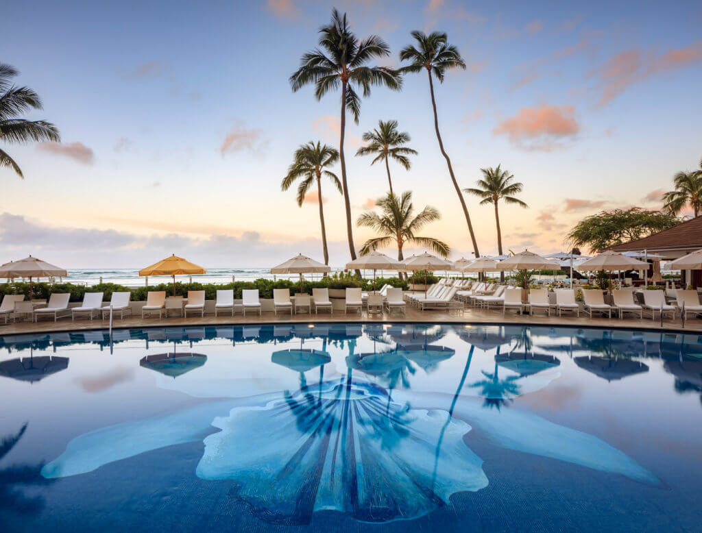
Here is the Halekulani (Waikiki Beach, Honolulu, Hawaii), which is one of the best hotels in Honolulu. Ranked #1 on TripAdvisor. It was ranked #2 in the world by NY Times (or some newspaper) back in the 1990s when I went as a kid.
Notice, the white, beige and natural wood colors. Color kitsch is not really in luxurious Polynesian hotels.

Luxury Waikiki Oceanfront Accommodations
Halekulani is a cherished luxury Waikiki oceanfront hotel offering a long tradition of excellence in hospitality, cuisine and amenities.www.halekulani.com
Creative theming costs MONEY to create and maintain.The problem is that moderately upscale hotel decor isn’t really location specific. A nice Hilton in Japan isn’t that different from a nice Hilton in the US or Hawaii.
My assumption is that people go to Disney because they want to feel transported. That said, I think Riviera was more on the bland side and also sold really well, so they may be catering to a market who likes that more “generic greige” look. (I laugh about it, but honestly I do like it for home decor. It’s calming, it opens everything up, and it’s practical because you’re not constantly trying to match shades. It’s kind of like string lights - there’s just something about them, it’s hard for me to just say no to that look. It’s not what I go to Disney for, though.)
Lol! I know it’s not a popular opinion but I tend to cut Iger some slack as I think he is juggling lots of interests and has had to fend off at least two hostile takeovers that I can think of. I don’t think he’s a person who is just enamored with the parks by nature, but I see him as a reasonable type who can be convinced to invest in the parks when shown the benefit of that investment. And I think with the current dynamic of parks and cruises leading profits, that will probably happen.Creative theming costs MONEY to create and maintain.
The more generic, the LESS MONEY it costs to build and maintain.
Cheap and generic is a page from the book of Chapek, and Iger goes right along with it.
TWDC wasn't damaged by Chapek,it was Iger all along
View attachment 805635
I was showing color schemes of a high end Polynesian hotel in 2024.Just checking, did somebody actually just compare the Halekulani to this new generic addition?
Wow.
And proved an entirely different point at the same time.I was showing color schemes of a high end Polynesian hotel in 2024.
I get it, people want a stereotype, kitsch, romanticism (not necessarily bad, but not necessarily current).The problem is that moderately upscale hotel decor isn’t really location specific. A nice Hilton in Japan isn’t that different from a nice Hilton in the US or Hawaii.
My assumption is that people go to Disney because they want to feel transported. That said, I think Riviera was more on the bland side and also sold really well, so they may be catering to a market who likes that more “generic greige” look. (I laugh about it, but honestly I do like it for home decor. It’s calming, it opens everything up, and it’s practical because you’re not constantly trying to match shades. It’s kind of like string lights - there’s just something about them, it’s hard for me to just say no to that look. It’s not what I go to Disney for, though.)
Which was?And proved an entirely different point at the same time.
Grand Cayman is not PolynesiaI get it, people want a stereotype, kitsch, romanticism (not necessarily bad, but not necessarily current).
White/Beige/Woods is the trend in high-end interior design. Hell, I remember staying at the Westin in Grand Cayman in 2013 and the decor was white, beige, wood and pops of teal pillows.
I understand that. I never said it was. I was providing an example of a high-end hotel, in a colorful locale, that as far back as 2013 also used white/beige/wood.Grand Cayman is not Polynesia
Register on WDWMAGIC. This sidebar will go away, and you'll see fewer ads.
