Harmonious is part of World Showcase. World Showcase has an icon.
-
Welcome to the WDWMAGIC.COM Forums!
Please take a look around, and feel free to sign up and join the community.
You are using an out of date browser. It may not display this or other websites correctly.
You should upgrade or use an alternative browser.
You should upgrade or use an alternative browser.
News New Park Entrance coming to Epcot
- Thread starter wdwmagic
- Start date
trainplane3
Well-Known Member
I doodled the Epcot logo but I found a better filler for that:
Surferboy567
Well-Known Member
What have I done? I unleashed these onto the world.
trainplane3
Well-Known Member
Those are just of attractions. Every WS pavilion has a poster while there's only one WS logo. It just so happens that a decent chunk of them have their own logo.Well Harm. did have a Poster(Prob. still up) in the Epcot Experience, does that Count for anything?
raymusiccity
Well-Known Member
Last edited:
dmleblanc1971
Member
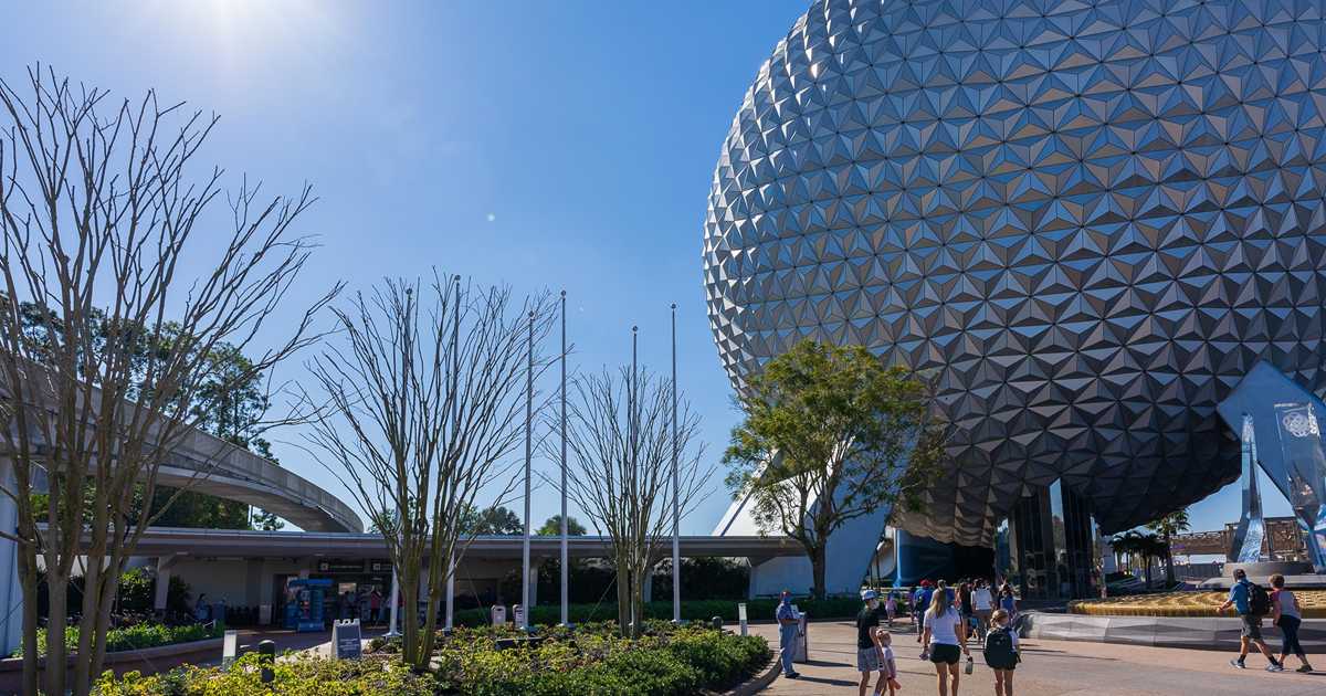
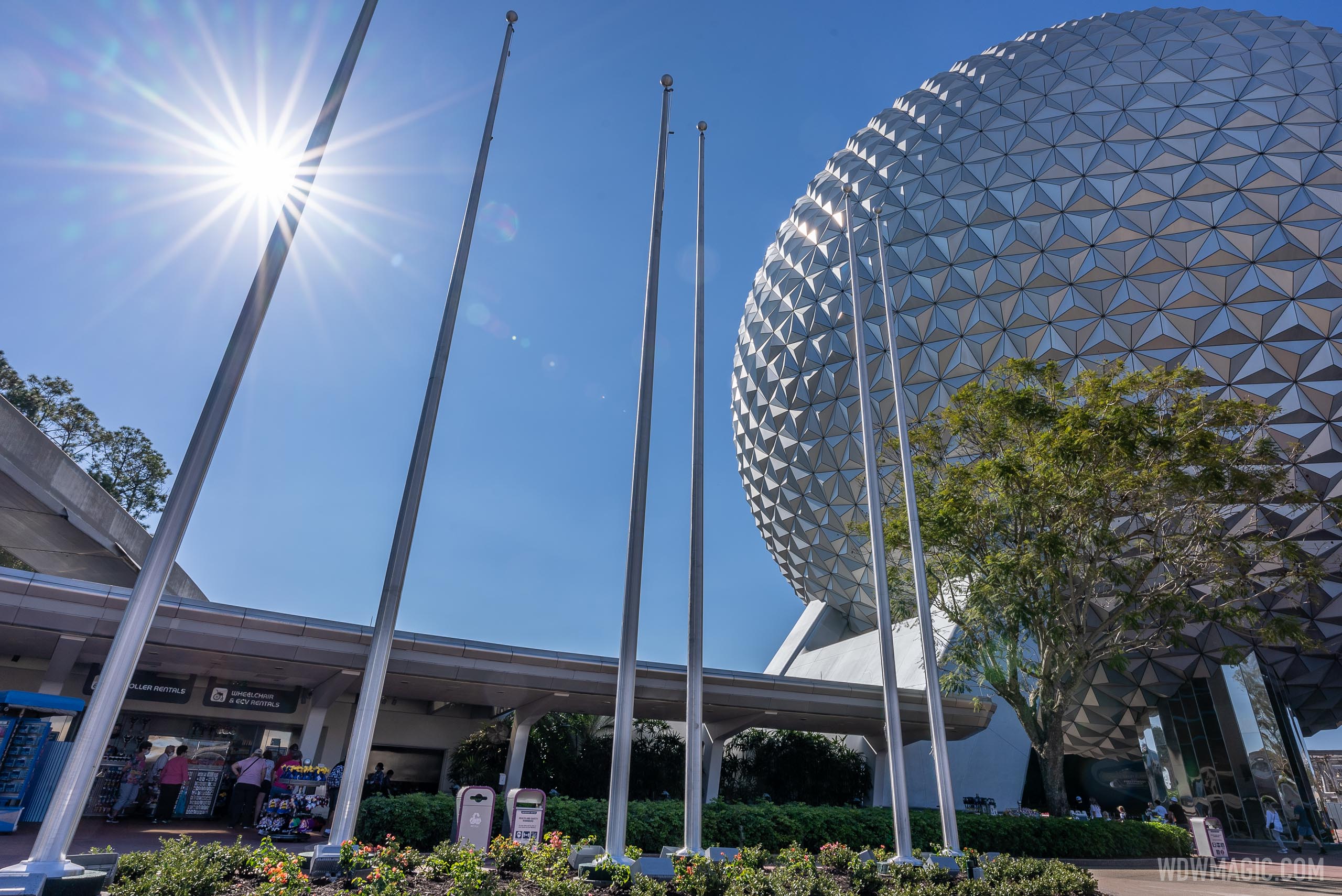
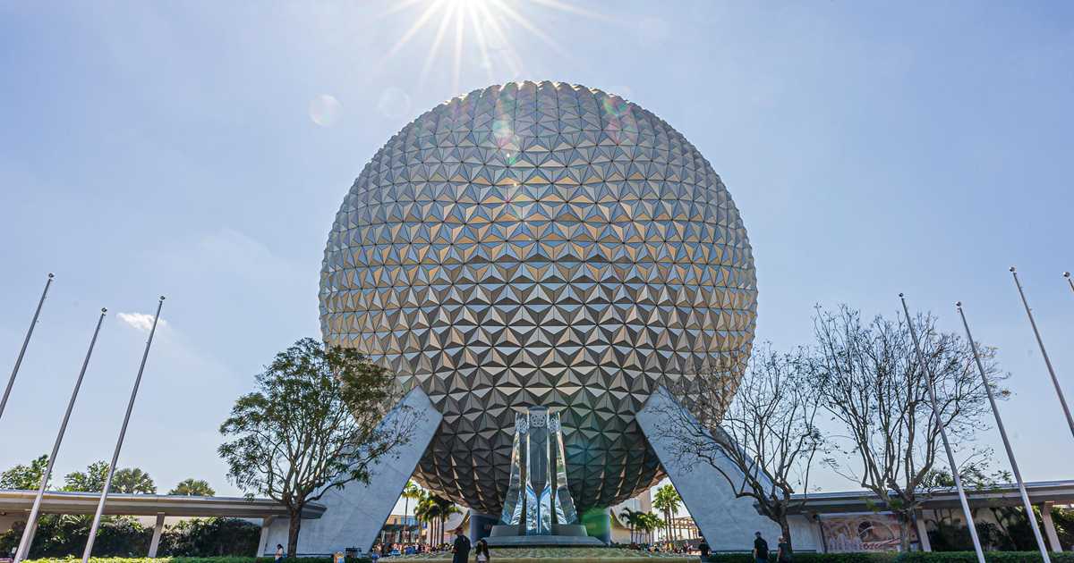
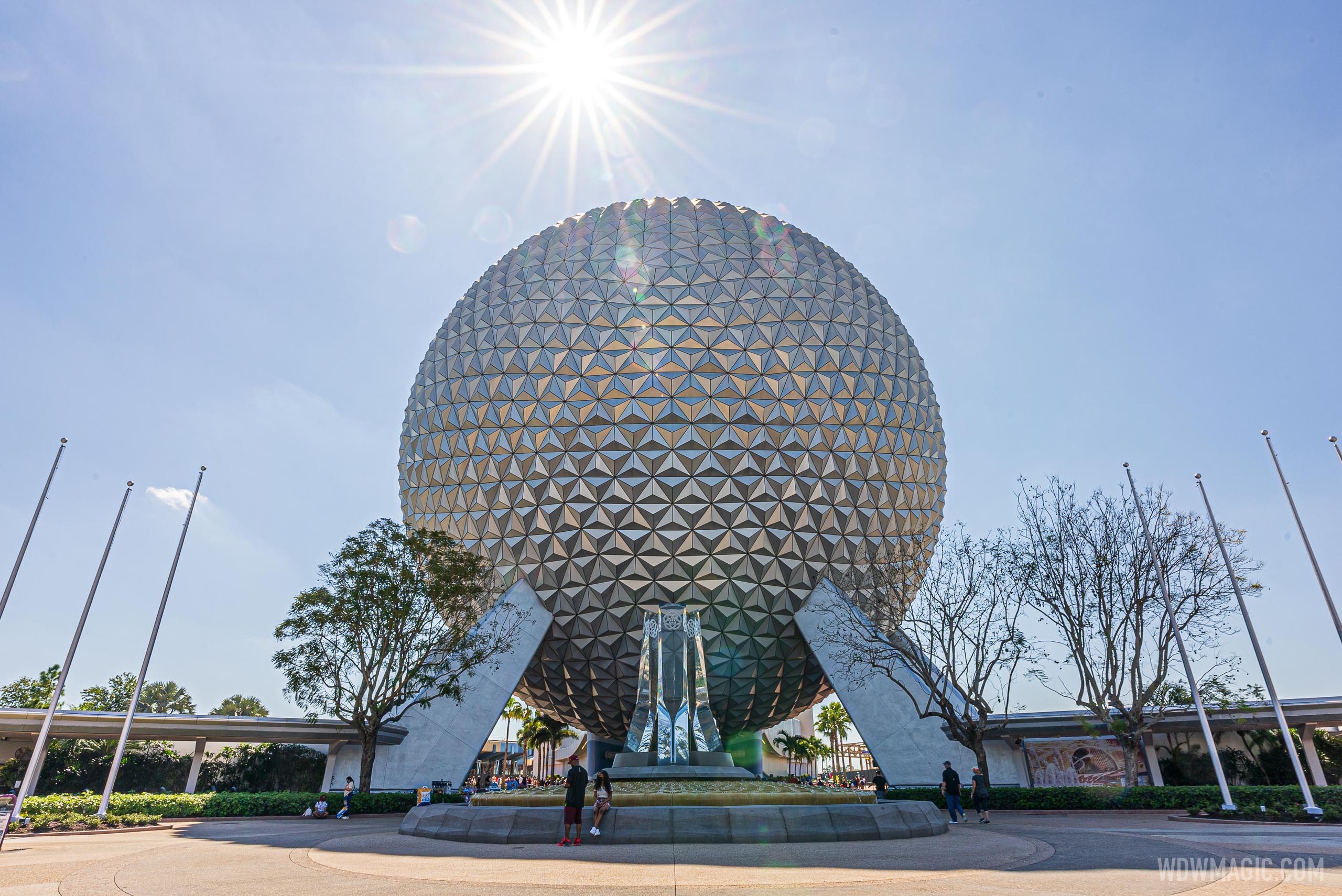
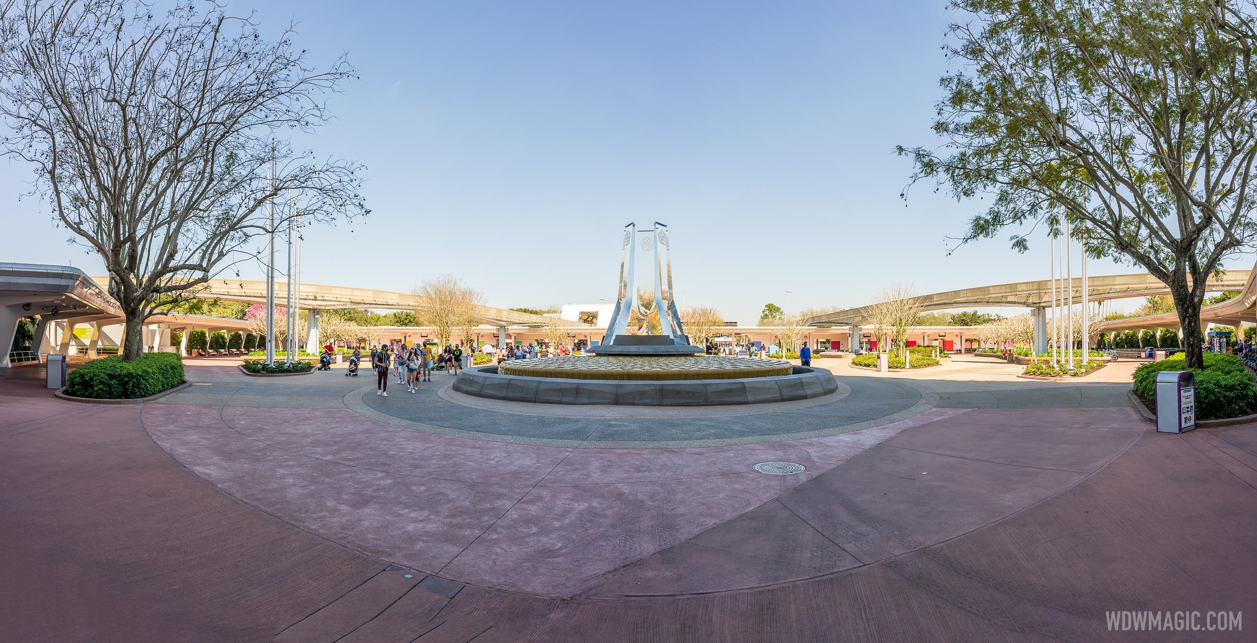
I'm not trying to be negative here, just pointing out that these look in the pictures much too close together to get the same look they were going for in the concept art. Maybe its the angles of the pics that were taken, or the fact that the other six are not in place, but to me they do not seem spaced out enough.
pdude81
Well-Known Member
The concept art had 4 groups of 3 I believe. But that's a cartoon drawn from above which might have been the only angle you could see all 12 flags from. This seems like a conscious change over to two groups of 6, and the pictures show them staggered in depth. So it's the same general idea but different spacing.I'm not trying to be negative here, just pointing out that these look in the pictures much too close together to get the same look they were going for in the concept art. Maybe its the angles of the pics that were taken, or the fact that the other six are not in place, but to me they do not seem spaced out enough.
castlecake2.0
Well-Known Member
I think just the angle, I saw the footers in person and they are spread out, but at the same time clumped a little closer than the concept art.I'm not trying to be negative here, just pointing out that these look in the pictures much too close together to get the same look they were going for in the concept art. Maybe its the angles of the pics that were taken, or the fact that the other six are not in place, but to me they do not seem spaced out enough.
Prototype82
Well-Known Member
Different from the concept art but I think Spaceship Earth will look striking flanked with the symbol flags. Now that we have our beautiful new greenery lets please get the two old trees away from the base! This is looking wonderful.
raymusiccity
Well-Known Member
The contractor measured the poles when they were laying on the ground. They were looking for the height, not the width!I'm not trying to be negative here, just pointing out that these look in the pictures much too close together to get the same look they were going for in the concept art. Maybe its the angles of the pics that were taken, or the fact that the other six are not in place, but to me they do not seem spaced out enough.
Walt d
Well-Known Member
So is one of the flag Polls going to fly a 50th flag?It idea kind of reminds me a bit of what i remember of CommuniCore and Innoventions when I was a kid. Not exactly, but the interactive fun part.
tparris
Well-Known Member
Not sure, maybe they should make a poll for that?So is one of the flag Polls going to fly a 50th flag?
Hiperjavier2004
New Member
So, you mean the first 6 flags was actually the first 6 pavilions?
So, that the first 6 flags in the east side of EPCOT's entrance was actually the first 6 pavilions: "Guardians of the Galaxy: Cosmic Rewind", "PLAY! Pavilion", "Mission: SPACE Pavilion", "Test Track", Odyssey Pavilion" and "Spaceship Earth: Our Shared Story"!!
And soon, the last 6 flags in the west side of EPCOT's entrance will be installed, which was actually the last 6 pavilions: "HarmonioUS", "Imagination! Pavilion", "The Land Pavilion", "The Seas with Nemo and Friends Pavilion", "Journey of Water, Inspired by Moana" and "World Showcase"!!!
Like this!!!
Attachments
Last edited:
The Rocketeer
Well-Known Member
What are the chances we see some of the flags installed overnight? Do we know if they will be of pavilion/attraction logos or just EPCOT logo flags like the initial concept art?
Disstevefan1
Well-Known Member
Beautiful. I can’t wait to see it in person..... someday.....
Register on WDWMAGIC. This sidebar will go away, and you'll see fewer ads.

