Surferboy567
Well-Known Member
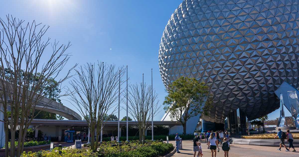
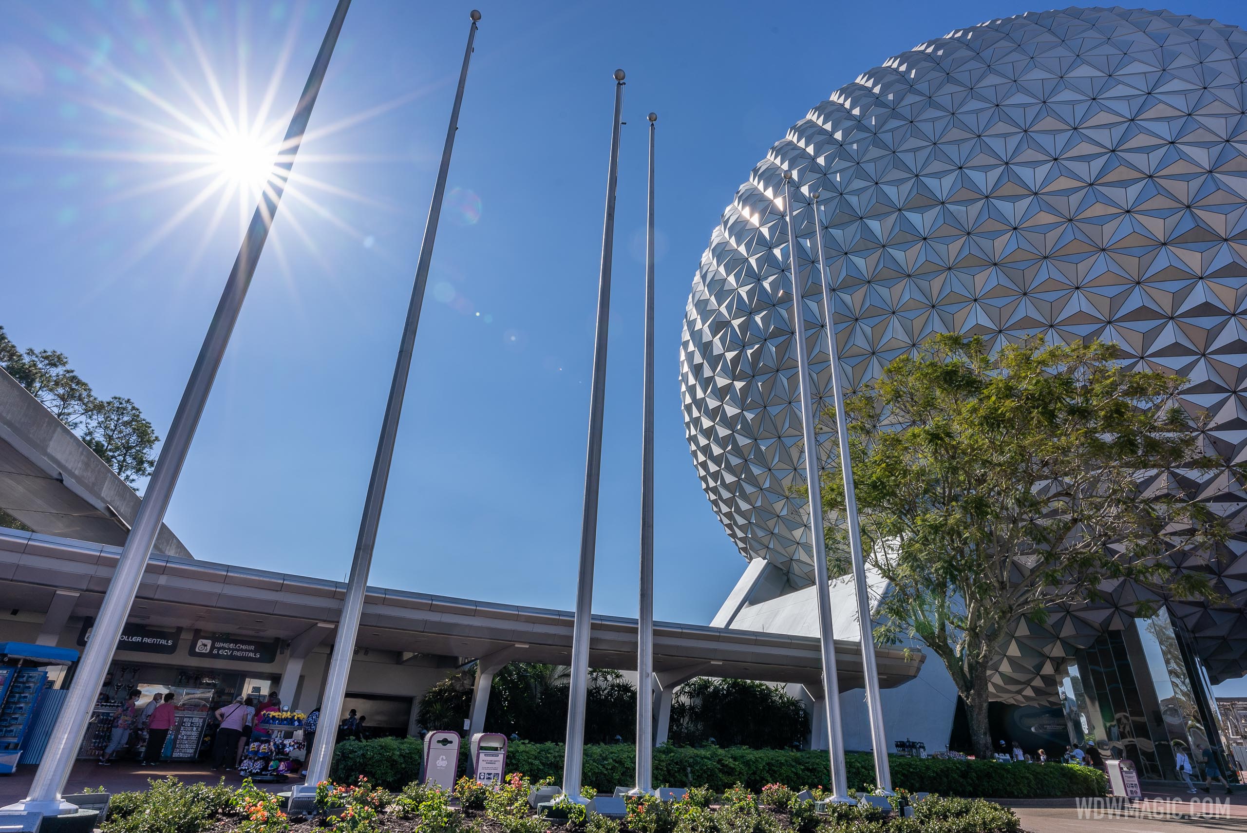
Does HarmonioUS have a pavilion logo?12 flags is 12 pavilions?
That flag must be all 12 pavilions: "Spaceship Earth: Our Shared Story", "Imagination! Pavilion", "Odyssey Pavilion", "Journey of Water, Inspired by Moana", "The Seas with Nemo and Friends Pavilion", "The Land Pavilion", "Guardians of the Galaxy: Cosmic Rewind", "PLAY! Pavilion", "Mission: SPACE Pavilion", "Test Track", "HarmonioUS" and "World Showcase"!!!
EDIT: Since, it’s not a pavilion I doubt it.