hpyhnt 1000
Well-Known Member
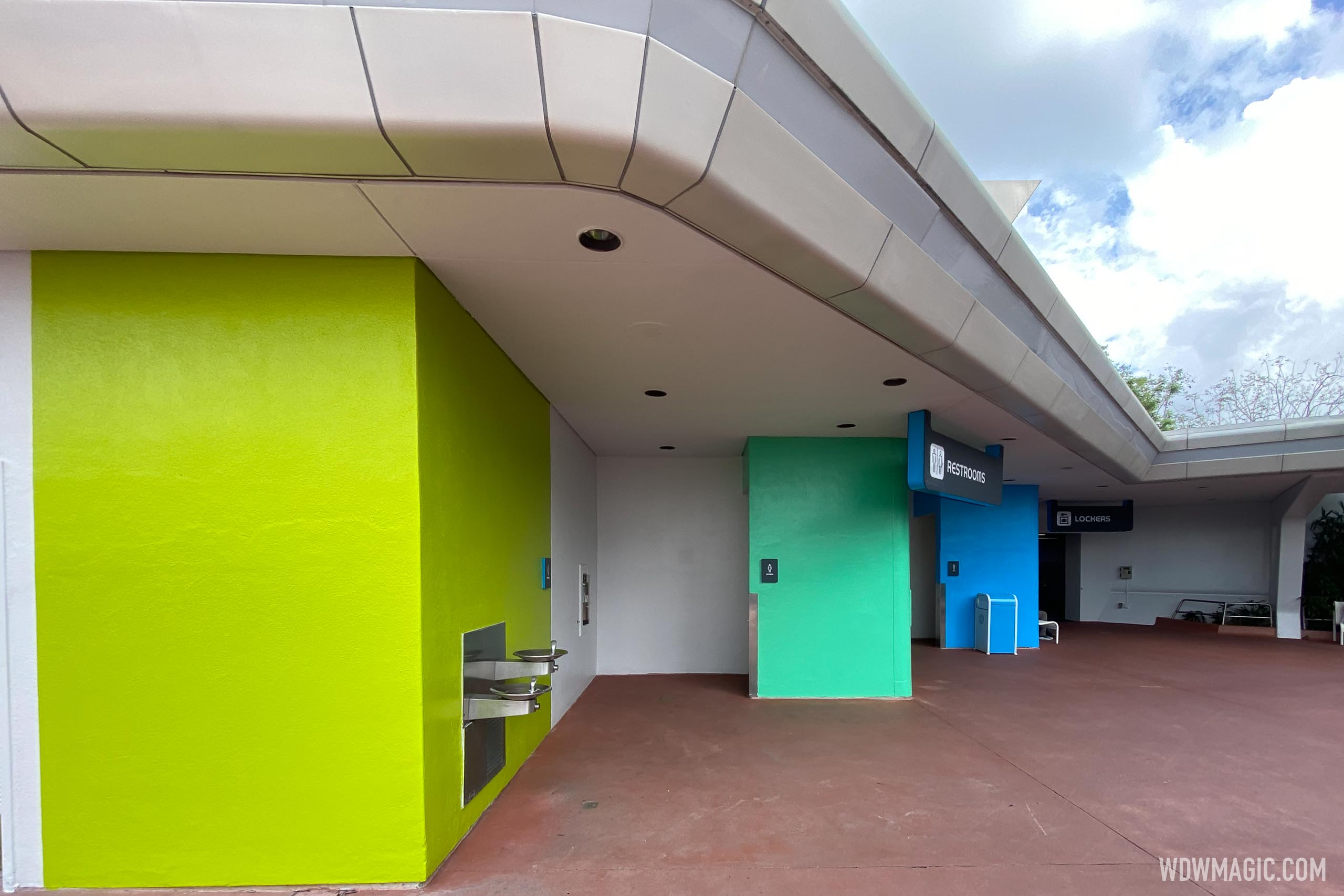
I appreciate what they're going for on this, clearly mimicking the colors of the directional signage and pavilion logos for each half of the park.


I suspect it'll look more cohesive as the rest of the park gets updated, but I think I would have preferred an extension of the blues and grays of the SSE shops and overhead restroom signs. That would give the SSE area a fully cohesive look rather than half one scheme and half something else.
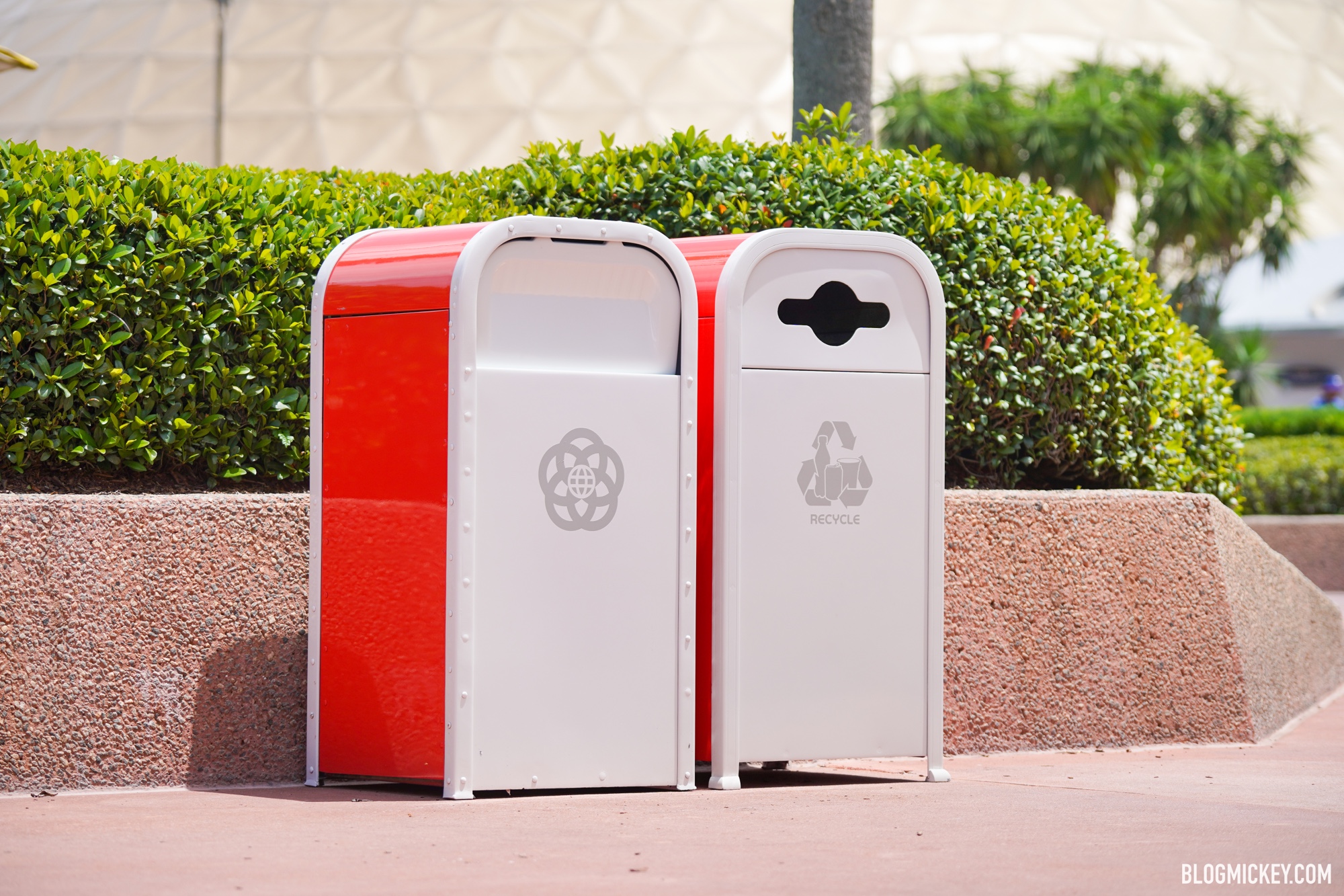
Still loving the new signage though, and same with the new trash can design.
I suspect it'll look more cohesive as the rest of the park gets updated, but I think I would have preferred an extension of the blues and grays of the SSE shops and overhead restroom signs. That would give the SSE area a fully cohesive look rather than half one scheme and half something else.
Still loving the new signage though, and same with the new trash can design.


 )
)