Fan or no, I understand the flapless design -- no touching the garbage can.
Mmm… the garbage-can-smelting-in-the-Florida-sun smell can flow freely into the air now!
Fan or no, I understand the flapless design -- no touching the garbage can.
Not sure what is going on with this. I think there is only one of these out. Perhaps a mistake, or maybe the first of many.Why are we already deviating from the epcot font? Also not a fan of the flapless design. From Blogmickey View attachment 574016
I love the idea of taking the parks signage and font back to the original.Not sure what is going on with this. I think there is only one of these out. Perhaps a mistake, or maybe the first of many.
Not sure what is going on with this. I think there is only one of these out. Perhaps a mistake, or maybe the first of many.
There’s multiple of this flapless design around world showcase already, but still with the brown colourNot sure what is going on with this. I think there is only one of these out. Perhaps a mistake, or maybe the first of many.
I think he’s specifically referring to this fontThere’s multiple of this flapless design around world showcase already, but still with the brown colour

Incredible, just absolutely incredible.
I thought that it looked like it belonged at the Poly instead of Epcot.Wait did they just reuse the font from Poly?View attachment 574071Picture is from the Orlando Sentinel. But I’m almost positive it’s the same font!
Wait did they just reuse the font from Poly?Picture is from the Orlando Sentinel. But I’m almost positive it’s the same font!

That thing is awful.If that is indeed a "Poly font", then they're doing it wrong. There's nothing about that font that fits with the them of Poly. It is indeed more modern and befitting of Epcot even if it isn't the new Epcot font.
Remember, you can use more than one font.
View attachment 574168
If that is indeed a "Poly font", then they're doing it wrong. There's nothing about that font that fits with the them of Poly. It is indeed more modern and befitting of Epcot even if it isn't the new Epcot font.
Remember, you can use more than one font.
View attachment 574168

From what I can tell that's only 2 fonts but they manage to not clash somehow. Pretty neat. I think the "frontier" font was meant to bring in the Indigenous theming throughout the pavilion. Very weird though.If that is indeed a "Poly font", then they're doing it wrong. There's nothing about that font that fits with the them of Poly. It is indeed more modern and befitting of Epcot even if it isn't the new Epcot font.
Remember, you can use more than one font.
View attachment 574168

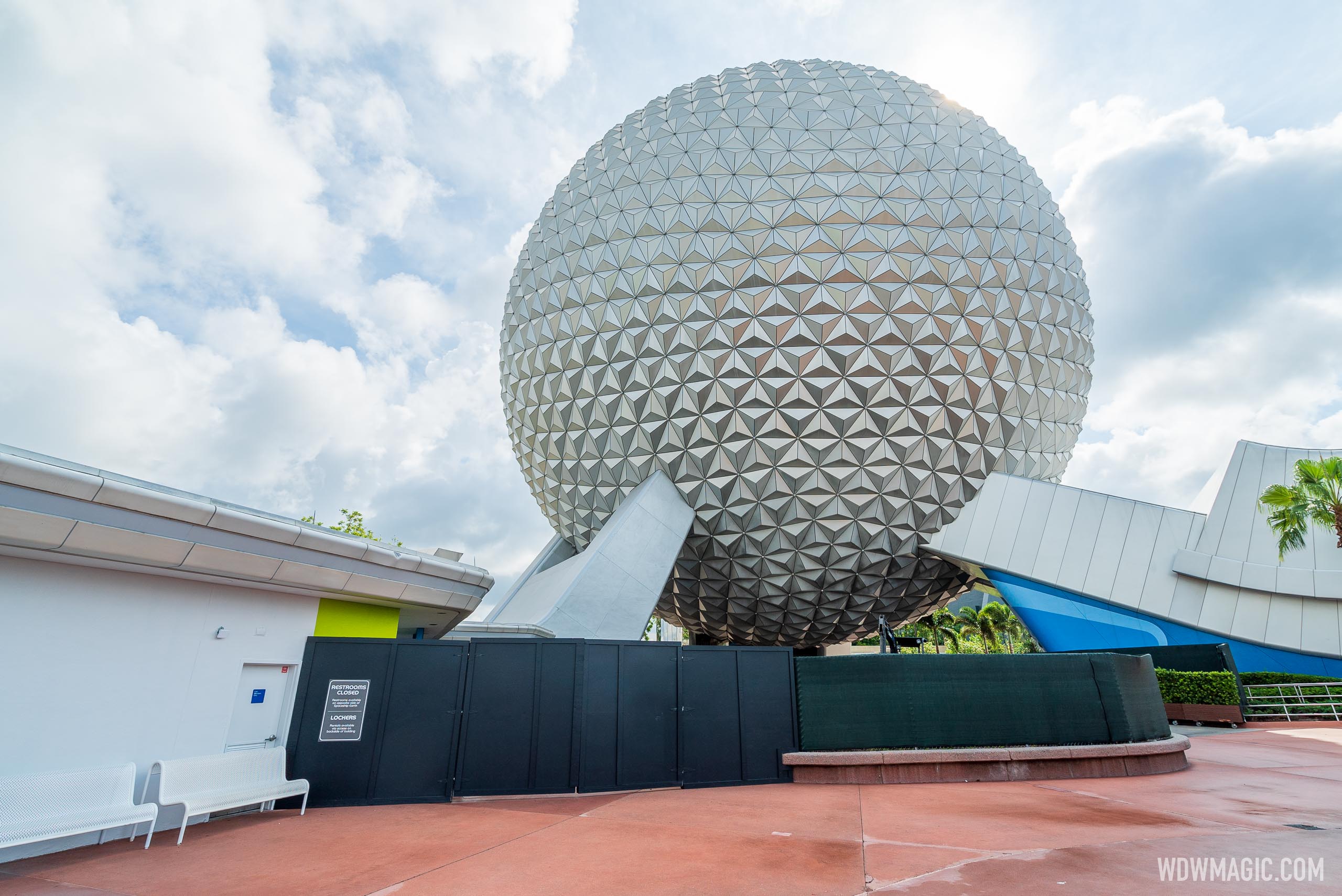
More construction walls up beneath Spaceship Earth along with restroom closure

More construction walls up beneath Spaceship Earth along with restroom closure
Work is continuing on improvements around Spaceship Earth at EPCOT.www.wdwmagic.com
I think that Disneyland and Walt Disney World were some of the first places to consistently use garbage cans that were designed with flaps to decrease the chances of this happening. The flap designs also ensures that guests don't have to see the trash starting to spill out of the garbage can when it is full.Mmm… the garbage-can-smelting-in-the-Florida-sun smell can flow freely into the air now!
Uh.
Before anyone freaks out, it's safe to assume this is just default white light at 100% brightness as a test.
Register on WDWMAGIC. This sidebar will go away, and you'll see fewer ads.
