Changing the font seems like change for the sake of change, to allow someone to say, “we’ve updated Epcot!”.
-
Welcome to the WDWMAGIC.COM Forums!
Please take a look around, and feel free to sign up and join the community.
You are using an out of date browser. It may not display this or other websites correctly.
You should upgrade or use an alternative browser.
You should upgrade or use an alternative browser.
EPCOT New Park Entrance coming to Epcot
- Thread starter wdwmagic
- Start date
flynnibus
Premium Member
Changing the font seems like change for the sake of change, to allow someone to say, “we’ve updated Epcot!”.
its better than the last iteration
Goofyernmost
Well-Known Member
It is a very nice font, and fits into everyone's opinion of how EPCOT should present itself. If along with that, it also updated, it becomes a win - win! I'm really happy with it. I always have liked that font, but could never find the exact spot that it fit in. If fits in EPCOT.Changing the font seems like change for the sake of change, to allow someone to say, “we’ve updated Epcot!”.
Goofywilliam
Well-Known Member
I believe (and feel free to correct me if I’m wrong) it’s Handel Gothic, or at least a modified form of it. Here’s a little history about the typeface: https://en.wikipedia.org/wiki/Handel_GothicI wish I could remember the name of that font, but I can tell you that it existed in the 1980's. I was in publishing during that time and I remember using it back then. Futuristic I guess, but it was a clean, easy to read typeface that made great headline's especially in bold. I'm not sure how something that existed 40 years ago can still be futuristic though. Must be the person that designed it was way, way ahead of his/her time. It's design is very easy to read, sharp, straight edges that almost give it a 3D look.
Also (for anyone interested) if you have an Adobe Creative Cloud account, it’s free for you to use: https://fonts.adobe.com/fonts/handel-gothic
Last edited:
ImperfectPixie
Well-Known Member
It is a very nice font, and fits into everyone's opinion of how EPCOT should present itself. If along with that, it also updated, it becomes a win - win! I'm really happy with it. I always have liked that font, but could never find the exact spot that it fit in. If fits in EPCOT.
I have to admit, while I enjoy quite a large selection of downloaded fonts, I miss the days of hand-drawn, intricate lettering...like the OG Imagineers used to do.I believe (and feel free to correct me if I’m wrong) it’s Handel Gothic, or at least a modified form of it. Here’s a little history about the typeface: https://en.wikipedia.org/wiki/Handel_Gothic
Also (for anyone interested) if you have an Adobe Creative Cloud account, it’s free for you to use: https://fonts.adobe.com/fonts/handel-gothic
I believe (and feel free to correct me if I’m wrong) it’s Handel Gothic, or at least a modified form of it. Here’s a little history about the typeface: https://en.wikipedia.org/wiki/Handel_Gothic
Also (for anyone interested) if you have an Adobe Creative Cloud account, it’s free for you to use: https://fonts.adobe.com/fonts/handel-gothic
It's in the family of Handel Gothic, but it's not. The E's are the same, but not the A's, N's, or several other letters. I've tried to identify a currently available font, and found some that are close, but always a few differences.
ImperfectPixie
Well-Known Member
They may have used Handel Gothic (or something else) as a starting point and developed their own typeface.It's in the family of Handel Gothic, but it's not. The E's are the same, but not the A's, N's, or several other letters. I've tried to identify a currently available font, and found some that are close, but always a few differences.
Soluna16
Well-Known Member
Me and a friend were discussing this the other day walking to our car from the EPCOT entrance. I personally would rather them keep the current names but my guess of new names will be
Nemo
Sven (Olaf is at Hollywood Studios)
Groot
Joy
Remy
And maybe Figment cause what the heck why not
It should just be the festival mascots + stuff important to EPCOT if they do this.
Remy
Figment
Spike or Orange Bird
You could add others as they show up to World Showcase (Mary Poppins, etc)
Nemo seems fine for the Seas.
Timothy_Q
Well-Known Member
Complaining about the font change seems like complaining for the sake of complaining.Changing the font seems like change for the sake of change, to allow someone to say, “we’ve updated Epcot!”.
Complaining about the font change seems like complaining for the sake of complaining.
Except I'm not complaining about the font change. Not sure where you got that in my post, but try again.
trainplane3
Well-Known Member
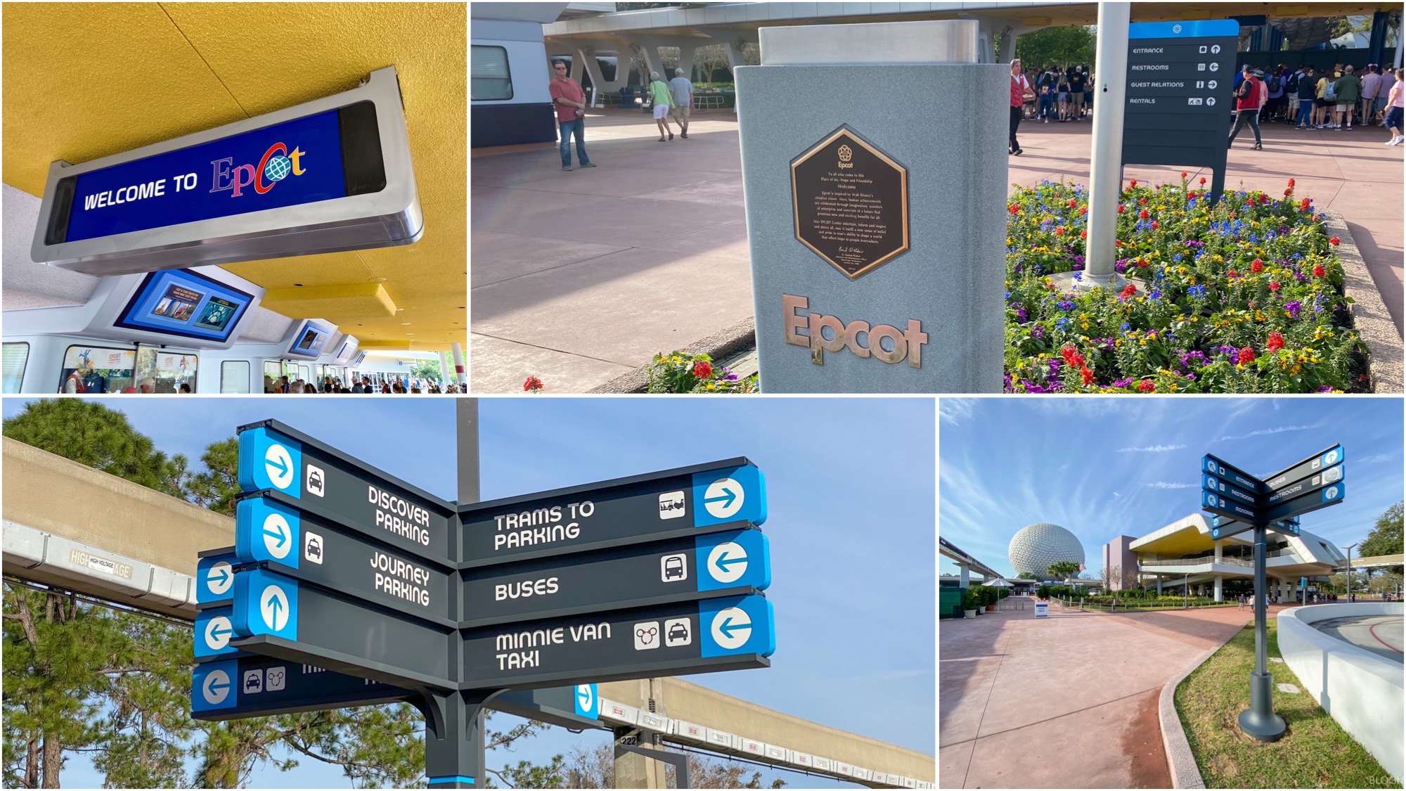
Here's the other new signage:
 blogmickey.com
New Directional Signage Installed for Epcot Entrance Overhaul Project
Walt Disney World news, photos, and reviews! We provide you with daily news from the Walt Disney World theme parks and beyond
Timothy_Q
Well-Known Member
The new signs are such a big improvement over the ugly ones they're replacingHere's the other new signage:
New Directional Signage Installed for Epcot Entrance Overhaul Project
Walt Disney World news, photos, and reviews! We provide you with daily news from the Walt Disney World theme parks and beyond
Rich Brownn
Well-Known Member
I've always wondered what happened to those signs at the ticket booths (the once covered by the "welcome to EPCoT" banner). Seems like the broke in 1984 and no one ever bothered to fix them.The new signs are such a big improvement over the ugly ones they're replacing
Weren't they the early green LED ones?I've always wondered what happened to those signs at the ticket booths (the once covered by the "welcome to EPCoT" banner). Seems like the broke in 1984 and no one ever bothered to fix them.
Rich Brownn
Well-Known Member
I don't think they were LED. When the changed it seemed more like the old airport-styled signed that clicked as it rotated into position... except instead of vertical it went horizontalWeren't they the early green LED ones?
This one doesn’t look LED admittedly. October 1982I don't think they were LED. When the changed it seemed more like the old airport-styled signed that clicked as it rotated into position... except instead of vertical it went horizontal
Late 93/ early 94 when the central plaza was Innoventioned.@marni1971 Why was the original dedication plaque removed? I believe every park except for Epcot and California Adventure still have their original plaques. Even Hollywood Studios still has the MGM one.
I'm guessing the current one will be replaced as well once this project is complete.
I don't think they were LED. When the changed it seemed more like the old airport-styled signed that clicked as it rotated into position... except instead of vertical it went horizontal
Bingo. Some kind of early electronic display (aside from the self illumination why else would they have used a god awful font?!)
Last edited:
Rich Brownn
Well-Known Member
Yeah that's the signs I remember. They haven't worked in so long they make the Yeti look good. Wonder what happened? (And they were useless, seems odd they never redesigned the plaza at any time to remove them)
Goofyernmost
Well-Known Member
Are there any updated picture of the Entrance (after tickets) to EPCOT headed toward SSE. I don't know if I missed some or not.
Register on WDWMAGIC. This sidebar will go away, and you'll see fewer ads.