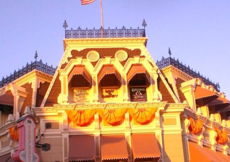
New look for the Confectionery on Main Street U.S.A at Magic Kingdom

devoy1701

Well-Known Member
It looks whitewashed, which for buildings of that "era" wasn't uncommon. But, toss in the red and blue and there's a definite patriotic feel to the establishment.

I'll be interested to see the finished product.....

i think all of the paint scheme's on Main Street during this latest round of refurbs has really made each building contrast sharply with the one right next to it, while still tying the whole street together. Each building stands out on its own instead of blending together as one big storefront that it is. I think this looks great!
 

MissM

Well-Known Member
Surprised they used red. I'm not opposed to red but it's the first color to fade in the Florida sun. And man, will it fade! Red just does not last here. Even people with red cars will see serious fading of their paint job.

So for anyone who doesn't like the red, give it a year or so and it will get much paler, pinker and duller in color! :lol:
 

jt04

Well-Known Member
I like it as a great change of pace. More details will just make it better.

They put the old CoP sign back and removed the temp one. Hopefully to be auctioned off so I can put it in my yard.
 

tirian

Well-Known Member
Surprised they used red. I'm not opposed to red but it's the first color to fade in the Florida sun. And man, will it fade! Red just does not last here. Even people with red cars will see serious fading of their paint job.

So for anyone who doesn't like the red, give it a year or so and it will get much paler, pinker and duller in color! :lol:

That's planned for many of the colors. Hence why John Hench purple is initially so dark. :wave:
 

Victor Kelly

Well-Known Member
Not liking it too much, but it is a picture, and final judgement will be made by me in a few years on the next trip.

I kind of liked the more subdued look of the buildings before. Who knows it might just look great in person.
 

jmick71

Member
5857058123_669150edae_b.jpg

this is before and after shown with the rest of main street. i think the new colors don't match with the rest of main street and makes the confectionary the focus not the castle.
final judgements should be made when it is COMPLETE!

i will post pictures of just the confectionary where the colors don't look too bad
 

cblodg

Member
It looks unfinished. I mean, I like that it's been spruced up but, surely that can't be the final paint job. It sticks out and not in a good way, in my opinion of course.
 

njDizFan

Well-Known Member
5857058123_669150edae_b.jpg

this is before and after shown with the rest of main street. i think the new colors don't match with the rest of main street and makes the confectionary the focus not the castle.
final judgements should be made when it is COMPLETE!

i will post pictures of just the confectionary where the colors don't look too bad
thanks, comparing them now, I would also say it looks unfinished. Definately need to bring back the awnings and the bottom roof overhang detail.
 

jmick71

Member
5857661868_a5569552e6_b.jpg

this is a close up of just the confectionary

i like the blue, and if the red fades to pink, it would realy give off the candy shop vibe, my only gripe is to much white
 

awalkinthepark

New Member
I saw it in person last Thursday...looks very out of place...and it is SO MUCH brighter in person and the brick contrast is really off putting..I like the red trim though..but overall I do not like it. It's like it smacked me in the face as soon as I stepped onto Main Street.
 

Mimi

Active Member
5857661868_a5569552e6_b.jpg

this is a close up of just the confectionary

i like the blue, and if the red fades to pink, it would realy give off the candy shop vibe, my only gripe is to much white

Pink would be great!!! I do not like the red at all. Although if they really aren't done with it yet I think we should wait until we judge. For the most part, Disney does pretty good at judging these types of things.
 

jmick71

Member
I love the detail on the roof though post refurb! I can't tell if that detail was there pre refurb...

no the roof is NEW, the new roof has to be my favorite part of the refurb.

it does seem very out of place,
i know it sounds nitpickey but i really hate that the rectangles right below the third story windows are white, without the different color it realy makes the building look plain LOL:p

also i liked how in the old one the over hang was that dark green, i think the new one would look better if it had blue instead of the white,Il post a picture of what im talking about :)
 

nemofinder22

Well-Known Member
no the roof is NEW, the new roof has to be my favorite part of the refurb.

it does seem very out of place,
i know it sounds nitpickey but i really hate that the rectangles right below the third story windows are white, without the different color it realy makes the building look plain LOL:p

also i liked how in the old one the over hang was that dark green, i think the new one would look better if it had blue instead of the white,Il post a picture of what im talking about :)

The roof pattern was there before the refurbishment, but was more or less the same color, rather than what it is now.

149.jpg
 

Register on WDWMAGIC. This sidebar will go away, and you'll see fewer ads.

Back
Top Bottom