unkadug
Follower of "Saget"The Cult
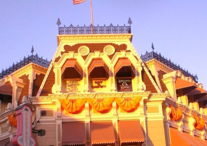
Much better....as long as they finish the awnings.

this is before and after shown with the rest of main street. i think the new colors don't match with the rest of main street and makes the confectionary the focus not the castle.final judgements should be made when it is COMPLETE!
i will post pictures of just the confectionary where the colors don't look too bad
Much better....as long as they finish the awnings.

The roof pattern was there before the refurbishment, but was more or less the same color, rather than what it is now.

Register on WDWMAGIC. This sidebar will go away, and you'll see fewer ads.