News New Gondola Transportation - Disney Skyliner -

Kman101

Well-Known Member
The problem may stem by how the station appearances have changed over the past year.

I just pray the PoP stop isn’t value engineered. It looked truly something.

But most of us, and most of the general public have zero clue what they were like "a year ago". I still think what they showed us is nicely themed for the purpose they serve.
 

Kman101

Well-Known Member
... and some people clearly dis-agree with you, thus the discussion.

But why? They fit the areas they're in. And personally I think they're on par with the pictures you posted of the kennel and fire station. I know there are pages I've skipped to quote you but what would you have wanted?

It seems like sometimes it's complaining to complain and we set these ridiculous standards that we all know they aren't meeting.
 

Kman101

Well-Known Member
And I agree with you.

Joe public doesn’t know what Kali River should have been like either. And how much better it could have been.

And I wish they did.

If anyone can release the gondola station concept art from a year ago I'd love to see it some day. I guess I set my standards low for these stations because they look fine to me. It sucks to hear even they have been budget cut but it's not like they're unthemed. A more elaborate Epcot one would have been nice but this one could very well end up looking nice. I guess I don't make a big deal out of something like this. If they were unthemed I'd be griping about it.
 

marni1971

Park History nut
Premium Member
And I wish they did.

If anyone can release the gondola station concept art from a year ago I'd love to see it some day. I guess I set my standards low for these stations because they look fine to me. It sucks to hear even they have been budget cut but it's not like they're unthemed. A more elaborate Epcot one would have been nice but this one could very well end up looking nice. I guess I don't make a big deal out of something like this. If they were unthemed I'd be griping about it.
I dare say they’ll leak one day. Like I’ve said elsewhere, despite CBR south being... altered... I think it still looks okay. Assuming my opinion counts of course.
 

Kman101

Well-Known Member
I dare say they’ll leak one day. Like I’ve said elsewhere, despite CBR south being... altered... I think it still looks okay. Assuming my opinion counts of course.

It counts :)

It is a shame they budget cut them though. Never seems to fail.

I guess I'm just happy they're themed to the areas they're in, at least the ones we've seen.
 

trainplane3

Well-Known Member
LOL agreed.

I just don't know, aside from some details, what they could do to make these stations better? They look fine for the areas they're in. What more do people want?
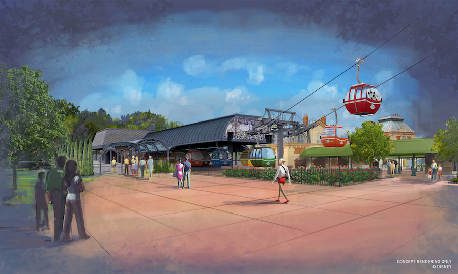
I mean, it looks better than a unused grass oval. But on the other hand, it looks like they took a standard Doppelmayr station and put some basic arches with flares and called it a day. Where the CBR station looks like they actually had a design idea of "make it a beach house" and stuck with it.

I mean this looks like a standard, no frills station:
Doppelmayr_Chondola_Sunday_River_Maine_2009.JPG

And this looks like some very minor French accents, a box behind it, and a cover on the side:
Walt-Disney-World-Gondola-System_Full_31775.jpg


And while the DHS station is the same basic design, it matches the park entrance pretty well:
Walt-Disney-World-Gondola-System_Full_31777.jpg
 

Kman101

Well-Known Member
With the pictures posted together, I can see the annoyance about it being a standard station tailored to look/fit the area they're in, but honestly, it doesn't really bother me, but I get it that it bothers some.
 

danlb_2000

Premium Member
Original Poster
But why? They fit the areas they're in. And personally I think they're on par with the pictures you posted of the kennel and fire station. I know there are pages I've skipped to quote you but what would you have wanted?

It seems like sometimes it's complaining to complain and we set these ridiculous standards that we all know they aren't meeting.

As I said before, when I look at the Epcot and DHS stations I immediately think of off the shelf Gondola stations. I prefer the CBR one which doesn't look like a gondola station.
 

Magic Feather

Well-Known Member
I dare say they’ll leak one day. Like I’ve said elsewhere, despite CBR south being... altered... I think it still looks okay. Assuming my opinion counts of course.
While the new CBR South station is definitely cheaper compared to the original, I can't help but think they hit the perfect balance between style and budget on this version. It just seems pleasant without being overkill.
 

Incomudro

Well-Known Member
And I agree with you.

Joe public doesn’t know what Kali River should have been like either. And how much better it could have been.

But can't we say this about everything?
Like I said - before the internet, we weren't aware - or were barely aware of concepts vs what actually reached production.
Now we sit here as judges.
 

Incomudro

Well-Known Member
I mean, it looks better than a unused grass oval. But on the other hand, it looks like they took a standard Doppelmayr station and put some basic arches with flares and called it a day. Where the CBR station looks like they actually had a design idea of "make it a beach house" and stuck with it.

I mean this looks like a standard, no frills station:
Doppelmayr_Chondola_Sunday_River_Maine_2009.JPG

And this looks like some very minor French accents, a box behind it, and a cover on the side:
Walt-Disney-World-Gondola-System_Full_31775.jpg


And while the DHS station is the same basic design, it matches the park entrance pretty well:
Walt-Disney-World-Gondola-System_Full_31777.jpg
So, some of you are annoyed because you can see the off the shelf structure - the bones - through the theming and believe Disney should have designed and constructed unique canopies from scratch.
Like seeing the Toyota Camry under the Lexus styling cues.
 

MisterPenguin

President of Animal Kingdom
Premium Member
As I said before, when I look at the Epcot and DHS stations I immediately think of off the shelf Gondola stations. I prefer the CBR one which doesn't look like a gondola station.

It looks nice, yes. But, I'm not sure I'd want gondola stations to look like they're not gondola stations.

Imagine if all the bus stops looked like something other than a bus stop, say, a gingerbread house or a giant dollhouse or a quaint cottage. Yeah, they'd look nice, but, I'm not sure I'd see the point of it or give mad props to WDW that none of their bus stops look like bus stops.
 

danlb_2000

Premium Member
Original Poster
It looks nice, yes. But, I'm not sure I'd want gondola stations to look like they're not gondola stations.

Imagine if all the bus stops looked like something other than a bus stop, say, a gingerbread house or a giant dollhouse or a quaint cottage. Yeah, they'd look nice, but, I'm not sure I'd see the point of it or give mad props to WDW that none of their bus stops look like bus stops.

I would argue that some bus stops don't look like bus stops. If it wasn't for the sings the AK Lodge ones just look like a nicely themed covered walkways.


Register on WDWMAGIC. This sidebar will go away, and you'll see fewer ads.

Back
Top Bottom