News New Experience Center to open in the Odyssey Events Pavilion

CastAStone

5th gate? Just build a new resort Bob.
I think my most unpopular opinion about the parks is that the original architecture of Future World beyond Spaceship Earth and the original entrance area wasn't that fantastic and mostly didn't age well. For example, I agree that Horizons was a wonderful attraction. The Horizons building, though? I really don't relate when people talk about that or any of the 1980s pavilions as architecturally interesting or aesthetically pleasing. Perhaps The Living Seas would be an exception, but that's now been ruined with all the metal Nemo characters over the original mural.
I guess to me it wasn’t beautiful or architecturally interesting, it was scene setting, dramatic, iconic, and overwhelming. The rounded concrete and raw metallic trim combined with dramatic lighting and those beautiful fonts and icons made it Very clear that HERE - right here at EPCOT Center - you were experiencing THE FUTURE.

I only went to Epcot in the Communicore era once, and I was a small child, but I still remember the feeling of wonder as I stared at these monolithic temples of concrete. I remember it better on my late 90s trip, also as a kid. It still reverberates when I see it - the ball most of all of course, but the Energy pavilion, the Innoventions, and any of FW West could do it too.

(I don’t love the Wonders of Life architecture, to me it doesn’t fit)
 

JenniferS

When you're the leader, you don't have to follow.
We walked around the entire building 10 mins ago ....
Pink on the TT side, blue near First Aid/Mexico.

5020CAE5-0ED3-491C-9C35-7F3525650C7D.jpeg


92C56EC1-F3AB-472E-8B46-D40F9CAE011D.jpeg


C27166A6-D389-4A79-B926-F9E308153C9C.jpeg

D5935DB3-FC1E-4E27-A834-494EE6F03E6C.jpeg


B2C2C8BB-1067-4FD8-8996-7D852BF0D93E.jpeg
 

gustaftp

Well-Known Member
I think my most unpopular opinion about the parks is that the original architecture of Future World beyond Spaceship Earth and the original entrance area wasn't that fantastic and mostly didn't age well. For example, I agree that Horizons was a wonderful attraction. The Horizons building, though? I really don't relate when people talk about that or any of the 1980s pavilions as architecturally interesting or aesthetically pleasing. Perhaps The Living Seas would be an exception, but that's now been ruined with all the metal Nemo characters over the original mural.
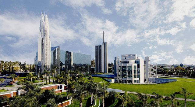
Modern architecture isn't everyone's cup of tea. But even if it isn't to your taste, it still is an impressive collection of modern buildings centered around a unified purpose. The only other place that I know of like this is the Christ Cathedral (formerly Crystal Cathedral) campus in Garden Grove -- only 3 miles from Disneyland! It contains similarly modern and impressive buildings designed by Philip Johnson, John Burgee, Richard Neutra, Gin Wong, and Richard Meier.

Explore_1.jpg
 

Sir_Cliff

Well-Known Member
Modern architecture isn't everyone's cup of tea. But even if it isn't to your taste, it still is an impressive collection of modern buildings centered around a unified purpose. The only other place that I know of like this is the Christ Cathedral (formerly Crystal Cathedral) campus in Garden Grove -- only 3 miles from Disneyland! It contains similarly modern and impressive buildings designed by Philip Johnson, John Burgee, Richard Neutra, Gin Wong, and Richard Meier.
I love a lot of modern architecture (postmodern architecture, not so much) and very much admire the ambition behind the original Future World, but I just don't find the original pavilion buildings quite work for me aesthetically. For the most part, that are quite heavy, dark structures that feel like pretty standard corporate architecture rather than inspiring or optimistic. Take Journey Into Imagination, which I think is one of the nicer buildings. The idea of glass pyramids sounds beautiful and the concept art did indeed look spectacular. In terms of what they built, though, you have big, dark glass and steel pyramids atop big, blocky concrete forms below. Granted the current color scheme does no favours to the building, but to me that building looks more like a pharmaceutical company's headquarters than a celebration of imagination.

I think there's a very good reason they're going back to mid-century modern influences for the new buildings, as those lighter, airier, and more open structures seem far more open, inviting, and optimistic than what they went with initially.

At the end of the day, though, it may just be an issue of taste.

I guess to me it wasn’t beautiful or architecturally interesting, it was scene setting, dramatic, iconic, and overwhelming. The rounded concrete and raw metallic trim combined with dramatic lighting and those beautiful fonts and icons made it Very clear that HERE - right here at EPCOT Center - you were experiencing THE FUTURE.
Something I think they got spot on with EPCOT Center was graphic design. The use of a unified font and the pavilion icons added immensely to the park's identity and I'm glad to see they're going back to it. It reminds me a little of Mexico City's metro network which has used a distinct typeface and series of unique icons for every station since the first lines opened in the 1960s. The difference is that the Mexico City Government retained this graphic style and kept contracting people to design icons as new lines and stations were built into the 21st century. Disney just seemed to throw it all out the window sometime around the mid-1990s.
 

DoleWhipDrea

Well-Known Member
So I guess they’re just sticking with the blue and pink, then? I was kind of hoping to see a rainbow wall, given the new color direction of EPCOT...
 

Figments Friend

Well-Known Member
Oh man....
They are painting the new Pavilion logos on the OUTSIDE of the building....??

I can understand trying to make the place highly visable from the main walkways, but this is a bit too 'loud'.
Oh my....
o_O

Can i just say this right now and get it over with -
Odyssey needs to be repainted once the interior display has run it's course.

Interested in seeing what will be displayed inside, but yeesh.....did not expect this kind of paint job on the ol' building.

-
 

Casper Gutman

Well-Known Member
Oh man....
They are painting the new Pavilion logos on the OUTSIDE of the building....??

I can understand trying to make the place highly visable from the main walkways, but this is a bit too 'loud'.
Oh my....
o_O

Can i just say this right now and get it over with -
Odyssey needs to be repainted once the interior display has run it's course.

Interested in seeing what will be displayed inside, but yeesh.....did not expect this kind of paint job on the ol' building.

-
“Here, have some cheap nostalgia, you dumb animals. Now give us your money.”
 

Register on WDWMAGIC. This sidebar will go away, and you'll see fewer ads.

Back
Top Bottom