-
Welcome to the WDWMAGIC.COM Forums!
Please take a look around, and feel free to sign up and join the community.
You are using an out of date browser. It may not display this or other websites correctly.
You should upgrade or use an alternative browser.
You should upgrade or use an alternative browser.
EPCOT New Experience Center to open in the Odyssey Events Pavilion
- Thread starter wdwmagic
- Start date
jmuboy
Well-Known Member
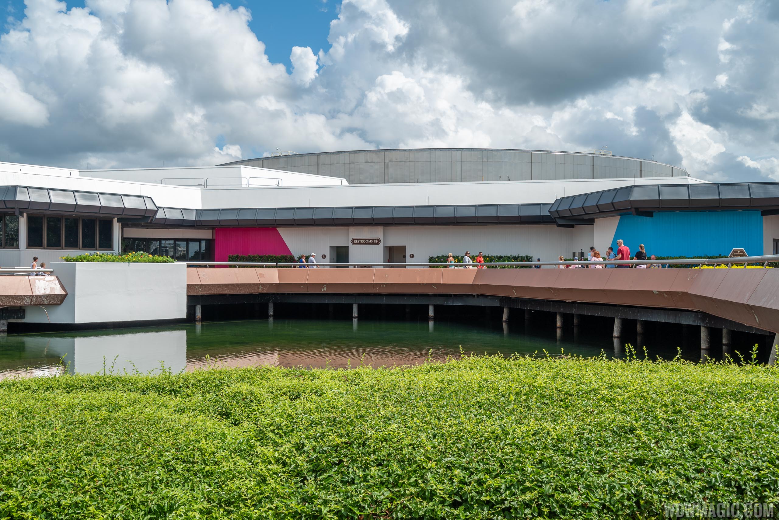
More high res goodness of the Odyssey:
https://www.wdwmagic.com/attraction...magineering-presents-the-epcot-experience.htm

*high res goodness of the quality, not necessarily the building*
I dont hate this....but its just a rehash of the "new" TL paint job. That said, I assume the new exhibit inside will be a lot of what was at D23 EXPO 2019. Looking forward to checking it out.
jmuboy
Well-Known Member
And the same designer who vomited over Innoventions.
Thank god Innoventions East will get a better paint job as part of World Celebration.
Casper Gutman
Well-Known Member
Honestly, I’ve never gotten the hate for this. It was wildly ambitious, strikingly imaginative, and reflected real effort being put into a temporary change to the park. I’d take this any day over slathering irregular blotches of bright paint over aging, archaic buildings,Just don't get this guy...
View attachment 406895
And I wish people would stop crediting WDW with trying to honor the past by preserving Odyssey, WoL, or half of Innoventions. It’s just easier and cheaper to keep them then to replace them with something reflecting a new vision. With their original purpose and meaning gone, these structures are simply husks, crumbling monuments to dead ideals.
jmuboy
Well-Known Member
Honestly, I’ve never gotten the hate for this. It was wildly ambitious, strikingly imaginative, and reflected real effort being put into a temporary change to the park. I’d take this any day over slathering irregular blotches of bright paint over aging, archaic buildings,
And I wish people would stop crediting WDW with trying to honor the past by preserving Odyssey, WoL, or half of Innoventions. It’s just easier and cheaper to keep them then to replace them with something reflecting a new vision. With their original purpose and meaning gone, these structures are simply husks, crumbling monuments to dead ideals.
I liked the CASTLE CAKE too
rkleinlein
Well-Known Member
I hate this too. Not that every building should (or could) be top-notch design, but it is disappointing that the same company who gave us the Contemporary, Space Mountain, and Spaceship Earth now frequently gives us design and architecture that's absolute dreck.Glad I'm not the only one who thinks of that monstrosity! Whenever I pass by I think "Well, Disney could do worse..."
Disstevefan1
Well-Known Member
Walt Disney Imagineering has discovered a revolutionary new story telling technology..... Paint.
aladdin2007
Well-Known Member
Walt Disney Imagineering has discovered a revolutionary new story telling technology..... Paint.
and yet charge exorbitant amounts for it..
Gabe1
Ivory Tower Squabble EST 2011. WINDMILL SURVIVOR
Disney fixes most of the paint job. Well minus the hap hazard 2!color photo opt walls all guests are ignoring. Who wants a first aid, Restroom, baby changing center photo op???
But that Disney silliness aside the black paint I saw today works better than the earlier version of the update


More current, inviting and tranquil transition
But that Disney silliness aside the black paint I saw today works better than the earlier version of the update
More current, inviting and tranquil transition
trainplane3
Well-Known Member
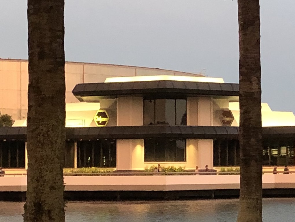
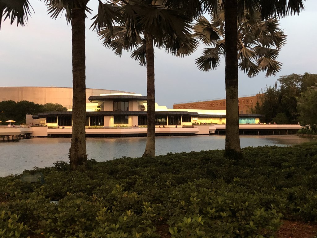
The pink has spread to be over the doorway (as seen now) and I think they painted arrows over at the walkway closest to Mexico.Colours remain at each end as of an hour ago. Doesn’t at all look bad with the black.
View attachment 408735
View attachment 408736
JenniferS
When you're the leader, you don't have to follow.
As of today? I only saw the two splotches I posted.The pink has spread to be over the doorway (as seen now) and I think they painted arrows over at the walkway closest to Mexico.
trainplane3
Well-Known Member
The Other site reported there's chevrons on the insides of the walkway closest to Mexico.As of today? I only saw the two splotches I posted.
Sir_Cliff
Well-Known Member
I think my most unpopular opinion about the parks is that the original architecture of Future World beyond Spaceship Earth and the original entrance area wasn't that fantastic and mostly didn't age well. For example, I agree that Horizons was a wonderful attraction. The Horizons building, though? I really don't relate when people talk about that or any of the 1980s pavilions as architecturally interesting or aesthetically pleasing. Perhaps The Living Seas would be an exception, but that's now been ruined with all the metal Nemo characters over the original mural.That building has always seemed outdated and ugly.
rkleinlein
Well-Known Member
I agree. With the exception of Spaceship Earth, all the buildings were mediocre from the outset and have not aged well. Unfortunately slapping a few garish stripes of paint on them only makes it worse.I think my most unpopular opinion about the parks is that the original architecture of Future World beyond Spaceship Earth and the original entrance area wasn't that fantastic and mostly didn't age well.
Figments Friend
Well-Known Member
Those glass pyramids over at the Imagination Pavilion seem pretty timeless to me.
Now, if we can just be rid of that awful red and orange paint scheme and go back to the more harmonious purple and light blue scheme of yore.....
-
Now, if we can just be rid of that awful red and orange paint scheme and go back to the more harmonious purple and light blue scheme of yore.....
-
Register on WDWMAGIC. This sidebar will go away, and you'll see fewer ads.
