
-
Welcome to the WDWMAGIC.COM Forums!
Please take a look around, and feel free to sign up and join the community.
You are using an out of date browser. It may not display this or other websites correctly.
You should upgrade or use an alternative browser.
You should upgrade or use an alternative browser.
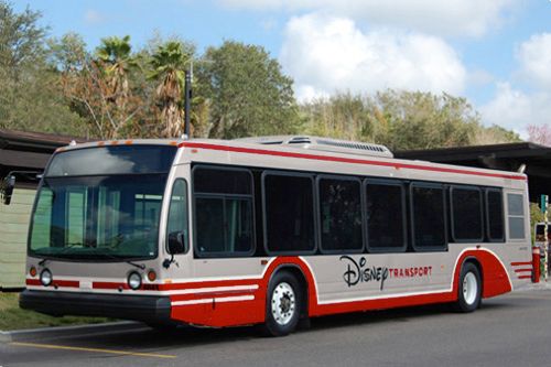
New Disney Bus Paint Scheme
- Thread starter PhotoDave219
- Start date
nc_disneyfreak
Well-Known Member
i think i like the old design better, because it was the design from my familys first trip in 2010 (and 12') so itll always be my fave. the new ones just seem to be missing something, and i cant put my finger on it. i think its the combo of red and silver that seem nasty to me....blue and silver would of been better...i dunno...
BigThunderMatt
Well-Known Member
Higher Visibility after night?!!?!?
The ^@&%$^&%@$* buses were WHITE!!! How much more visible can you get than WHITE!?!??
From the amount of accidents they were having apparently white wasn't visible ENOUGH.
Tomi-Rocket
Well-Known Member
I like it. They desperately needed to be updated and I think the new color scheme is much more sophisticated.
From the amount of accidents they were having apparently white wasn't visible ENOUGH.
Again, 90% of the accidents happen within the load zones due to the load zones being ill designed for the size of the buses.
MarkTwain
Well-Known Member
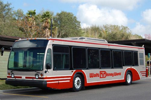
I would like to see them add Florida Project logo into it as well as deepen the red.
Then update all the signs on property to match.
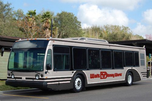
I was thinking the same about deepening the red. I also think the complaints that the new buses are too austere, which may be valid, may have to do with the particularly cool shade of grey metal they ended up using (which they may or may not have had much control over). So I did what I do best and took it to Photoshop.
Here is the bus with darker red and the silver completely desaturated (aka all "coolness"/blue removed):
Slightly warmer-looking IMO. As suggested, here is the same bus with the WDW logo instead:
MarkTwain
Well-Known Member
Since someone suggested blue, here's how that would look with the same shade of silver:
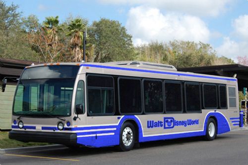
And as long as we're playing around, I thought this black had a nice sharp look to it... I kept the red logo to mimic Monorail Black's red accent:
A fleet of monorail-style multicolored buses might be fun.")
And as long as we're playing around, I thought this black had a nice sharp look to it... I kept the red logo to mimic Monorail Black's red accent:
A fleet of monorail-style multicolored buses might be fun.
articos
Well-Known Member
Also the fact they are, you know, a BUS.From the amount of accidents they were having apparently white wasn't visible ENOUGH.
Maybe these new RFID bands will have an auto shut down system built in for if busses are in movemoent and detect one in front of it
I actually like the new bus paintjob looks kinda retro
I actually like the new bus paintjob looks kinda retro
ewensell3
Well-Known Member
I'm on the fence about it.
On the one hand it is a nice sleek modern look. On the other, it looks like something one would find at an airport or some other business setting. I can live with it (not that it matters), but It doesn't scream "You're having fun at Disney" to me.
Also, that dark silver is going to seriously blend in to the background during the afternoon thunderstorms and anytime there is heavy overcast.
Exactly. Sometimes less is more.I love it. Simple yet classy.
DisneyFan381
Member
I like it. I liked the old version, too, but I like the retro feel of this new color scheme.
Mickey_777
Well-Known Member
I like it over the old color scheme. I wonder what the chances are they implement other colors besides red to go with the reflective silver ala the monorails.
Genie of the Lamp
Well-Known Member
Since someone suggested blue, here's how that would look with the same shade of silver:
And as long as we're playing around, I thought this black had a nice sharp look to it... I kept the red logo to mimic Monorail Black's red accent:
A fleet of monorail-style multicolored buses might be fun.
Now if they went with your designs instead, I would be all head over heals for these buses. Seriously, I know you used photoshop, but man I would definitely make you Senior Concept/graphic designer of all WDW buses and monorails if there was such a job title that existed.
flynnibus
Premium Member
there is something to be said for
going for the 'fun' look..
vs
clean simplicity
Clean is often interpreted as 'boring' when the clean lines are not BOLD or challenging.
The new buses while clean.. are not bold or challenging.. hence boring.
At least the other more busy, dated color scheme, was an emotional play to 'fun'.
going for the 'fun' look..
vs
clean simplicity
Clean is often interpreted as 'boring' when the clean lines are not BOLD or challenging.
The new buses while clean.. are not bold or challenging.. hence boring.
At least the other more busy, dated color scheme, was an emotional play to 'fun'.
imagineer boy
Well-Known Member
If only we could get busses like Tokyo DIsneyland's: http://tdrfan.com/around_the_resort/disney_resort_cruiser/index.htm
rob0519
Well-Known Member
Don't actually like it too much. Looks like buses in every city in the USA. Nothing Disney about it.
I have to agree. Nothing Disney-esque about it. Looks like any municipal bus in any major city. Similar to the lobby of the Contemporary Resort which as looked like a lobby of any major upscale chain for the last few years.
MissAlmyra
Active Member
Wow, TDL's buses are gorgeous! What unique design!
I quite like the new bus color scheme, but I hope the insides get a bit of a refresh as well. Last trip, many of the posters and advertisements in the buses were scratched up or faded.
I quite like the new bus color scheme, but I hope the insides get a bit of a refresh as well. Last trip, many of the posters and advertisements in the buses were scratched up or faded.
Register on WDWMAGIC. This sidebar will go away, and you'll see fewer ads.