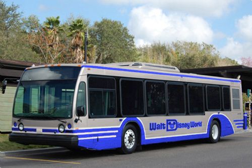
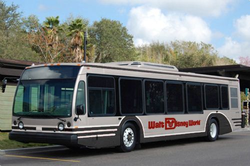
New Disney Bus Paint Scheme

Rescue Ranger

Well-Known Member
I really like it....but a Mickey shaped window or two would have been nice to Disneyfy it a little more with their special touch.

Tokyo buses are AWESOME!!!!! We should have those :(
Funny how its all still Disney, yet still so different.....
 

Lexxweb

Active Member
The old Disney busses looked very late 90s early 00s. I think the new modern these days mixes a little bit of retro in with it. This is with everything from home decorating, fashion, architecture, logos, etc.
The home from Spaceship Earth with the family watching the man on the moon is almost current modern again. It's funny how things always come back around. I like the new bus scheme, I hope the monorail follows suit with something more modern.
 

Goofyernmost

Well-Known Member
Also the fact they are, you know, a BUS.
Having been in public (bus) transportation for a number of years, I can tell you that the number one reason for hitting a bus is that they didn't see it. I find that amazing, but it was common. We had buses that were painted with a design the looked like mountains and sky. When we first introduced them, we had an incredible number of accidents where someone ran into a 42 foot long bus and then said that they didn't even see it. I was the one that said that I thought it was our color choices that caused it. The added a few more reflectors and the numbers dropped considerably.
 

prberk

Well-Known Member
The new one still looks nice, but I also understand the use of white in Florida, the Sunshine State. It reflects the heat, and looks crisp and clean. Always true of the monorails, up in the sky, baking in the sun all day.

I always thought that that was the reason that the buses and monorails were primarily white in the past -- because it was Florida, and it helps reflect the sun and keep out the heat.. and keep down the energy costs for air conditioning as much as possible.
 

prberk

Well-Known Member
There's something ironic about a little kid's T-shirt having to have "I'm going to the Walt Disney World Resort" (as opposed to just "I'm going to Disney World") along with several characters crammed on the front of it, but a huge bus only says "Disney Transportation". :rolleyes:

Transportation is in motion, and like with signs, it is better to be simple and quick for immediate recognition. That is different than for a T-shirt, which is usually right in front of you, and for more time. It also is not as important that you recognize it quickly, eithe rby a relatively short name or by a logo that the mind recognizes right away.

And, to the poster just above, I like white but I the schema itself can be adjusted. Perhaps white instead of silver on the new buses, and Walt Disney World's logo across the side in traditional, recognizable Disney script as usual.
 

allgiggles

Well-Known Member
Transportation is in motion, and like with signs, it is better to be simple and quick for immediate recognition. That is different than for a T-shirt, which is usually right in front of you, and for more time. It also is not as important that you recognize it quickly, eithe rby a relatively short name or by a logo that the mind recognizes right away.

Yeah, I get that (worked in marketing & advertising for many years) but I prefer "simple" for advertising messages in general. Those shirts are just a huge pet peeve of mine because I think they would sell a lot more of them if they simply said "I'm going to Disney World/Disneyland". I would have bought at least 3 of them. As is, I've bought zero and won't ever buy them. I'm sure Disney is worried. :D
 

prberk

Well-Known Member
Yeah, I get that (worked in marketing & advertising for many years) but I prefer "simple" for advertising messages in general. Those shirts are just a huge pet peeve of mine because I think they would sell a lot more of them if they simply said "I'm going to Disney World/Disneyland". I would have bought at least 3 of them. As is, I've bought zero and won't ever buy them. I'm sure Disney is worried. :D

You know, it is true that they could probably do something like "Coke" used to: Put the colloquial name "Disney World" in big, fashionable letters as part of the overall design; and put "Walt Disney World" (with or without "Resort" at the bottom or on the sleeve in a small version like an emblem).

There are definitely many ways to skin this cat.

But as for the buses, since they are used for real transportation and not a two-minute ride that docks in the station between rides, I like white in Florida (for sun reflection), either with simple phrasing (like "Disney" in big letters like today), or the Walt Disney World logo (regular Disney signature font) as it is immediately recognizable. Retro styling is "cool," but white is literally cooler and wins in the Florida sun.
 

PirateFrank

Well-Known Member
Ugh, I hate it. Someone said it looks "municipal" and that's exactly what comes to mind.....either that or a motor home.....what was a fun and cheerful, bright design.....now looks like something i would take as I'm going to work.....balls!


What a hell of a day....first they give Tony the Spanish archer and now this.....what's next? Changing the monorail to look like the Long Island Railroad?
 

Dasnowz

Well-Known Member
does anyone know if the articulated buses (4 to 6) that are ordered are going to be Disney owned or contractor( rumor going around that they might by lynx ran)? Also because I am lazy has anyone seen the permits yet for the new bus area for them that is planned?
 

nc_disneyfreak

Well-Known Member
Since someone suggested blue, here's how that would look with the same shade of silver:

BusAlteredBlue_zpsa4a65503.jpg


And as long as we're playing around, I thought this black had a nice sharp look to it... I kept the red logo to mimic Monorail Black's red accent:

BusAlteredBlack_zpseccb99ba.jpg


A fleet of monorail-style multicolored buses might be fun. :)
I suggested blue lol, and you did a great job! I just think the combo of blue, white and silver looks great. Red and silver to me is just gross. If you take out the silver and put white in its place, then you have a donald duck bus lol....keep the red, lose the silver and put pin stripes of yellow, and add black and theres a mickey bus...it would have been better to use colors of the characters and still keep it clean and modern looking.
 

Dasnowz

Well-Known Member
They were testing buses - but apparently that test is over.. and they decided against them.

lynx has had an articulated bus on property doing test runs within the last 48 hours. There is construction going forward for a bus station that they can access at MK. I stand by my statement that within the last 2 weeks this is a go forward project. I have heard other transportation rumors that the boats will be changing but that has been dispelled.
 

matt9112

Well-Known Member
Ugh, I hate it. Someone said it looks "municipal" and that's exactly what comes to mind.....either that or a motor home.....what was a fun and cheerful, bright design.....now looks like something i would take as I'm going to work.....balls!


What a hell of a day....first they give Tony the Spanish archer and now this.....what's next? Changing the monorail to look like the Long Island Railroad?

looks crisp and clean not cluttered and all over the place like......the rest of disney. its a good direction i assure you. might curtail roving brazilian tour group use =P.
 

Cosmic Commando

Well-Known Member
Ugh, I hate it. Someone said it looks "municipal" and that's exactly what comes to mind.....either that or a motor home.....what was a fun and cheerful, bright design.....now looks like something i would take as I'm going to work.....balls!
I think it's not bad, which is good. I really think it goes back to Samuel Lau, the new vice president of Transportation that they brought in a little while ago. He came from the world of big city municipal transportation. I'm in a quasi-related field, and I could see how someone might look at the purple pants and silly buses and see that as a lack of focus. If you look at the changes recently (the monotone monorail spiel, the bus driver costumes and now this new paint scheme), I think he is leaving his mark on transportation as a safe, professional (somewhat staid) service. It's not bad, but I don't absolutely love it. And it's not completely without design flourish, either... it's just nothing exciting.

I just hope that if WDW transportation is going to look somewhat like a random big city transportation system, they will be serious about moving forward with things like the bendy buses and posted wait times at bus stops to make it function like a good big city transportation system.
 

Register on WDWMAGIC. This sidebar will go away, and you'll see fewer ads.

Back
Top Bottom