New Disney Bus Paint Scheme

Next Big Thing

Well-Known Member
Disney_Transport_Bus%2C_Early_1980s_%282789308761%29.jpg


disney-bus.jpg


bus%252520paint.png


Looking at those all together, can you honestly say this is not an improvement? Be thankful it didn't end up being something like this:

5245996770_2da8bf69c8_z.jpg
 

The Empress Lilly

Well-Known Member
Much better than the previous design!

I kinda dig the retro design, but hesitate to be truly impressed. The retro paint doesn't match the basic bus design.


Ceterum censeo WDW should've build a magical transportation system instead of buses in the first place, the way it did until the mid-eighties. Buses, of whatever paintjob, are for cities.
 

Next Big Thing

Well-Known Member
Much better than the previous design!

I kinda dig the retro design, but hesitate to be truly impressed. The retro paint doesn't match the basic bus design.


Ceterum censeo WDW should've build a magical transportation system instead of buses in the first place, the way it did until the mid-eighties. Buses, of whatever paintjob, are for cities.
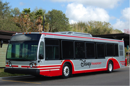
WDW very much resembles a city itself though. A small city, yet a very vibrant one.
 

allgiggles

Well-Known Member
Maybe it is just me but when I think of the name "Disney" I instantly default to Walt. Even though I know that Roy was probably more instrumental in make WDW happen than anyone, Walt is the face of the company and the name. So it just does not get my dander up when I just see the name "Disney".

Oh, I agree -- I automatically default to Walt as well. What annoys me (and my Type A personality) is that some things say "Walt Disney World Resort" and others simply "Disney" or "Walt Disney World". Those shirts are a huge pet peeve of mine... no Super Bowl MVP (or anyone for that matter) has ever said, "I'm going to the Walt Disney World Resort!!!" everyone says "I'm going to Disney World!" yet the darn shirt spells out the proper name. But the buses can just say "Disney Transport". Apparently Disney (see, "Disney" is fine with me) doesn't employ a continuity person. :)

And just to get this post back on topic, I wasn't sure how I felt about the new paint scheme when I saw the pics this morning but now that I saw the new ones this afternoon where you can see the actual paint color and how it reflects in the light, I think I like it. Hopefully we'll get to see at least a few of these when we're there in June.
 

Skippy's Pal

Well-Known Member
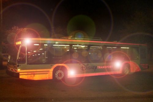
The buses have said "Disney Transport" since the 1990s (maybe longer) why is it suddenly an issue now?


In my own opinion, because when the buses first started saying "Disney Transport," and up until relatively recently, we didn't have to put up with merch, bags, planning DVD's, and everything else that was labeled "Disney Parks." I continue to be baffled why the organization that perfected "placemaking" robs its guests of that sense of place on so many of its materials.
 

Virtual Toad

Well-Known Member
Meh. Not the end of the world, but if was designed by lawyers with the goal of safety it kind of shows it. A very "in the box" design if you ask me. Conservative and corporate as opposed to whimsical and fun.

I will miss the use of John Hench Purple (which tied the buses in quite nicely with the red and purple road signs) and the much more creative, relaxed-looking "Disney" logo placed at a dynamic angle. The new design is admittedly sleek and updated but lacks a certain spark IMHO.
 

invader

Well-Known Member
Very "futuristic," a word in which could be synonymous with cold and disheartening or awesome. Seems to be a mix of both with this update.
 

hpyhnt 1000

Well-Known Member
Don't actually like it too much. Looks like buses in every city in the USA. Nothing Disney about it.

I normally like retro, but I agree with you. This is kinda sterile and generic. Would it have killed them to say "Walt Disney World?" Haven't we had enough of the "One Disney" mindset? I want to say that even the Magical Express buses have a richer palette.

I know this wasn't directed at me, but I agree with the sterile look. Reminds me of the Contemporary. I've never had any issue myself with "Disney Transport". I've always thought the buses looked just perfect as is.

I'm not understanding the comments about how this new design is "bland", "sterile", and "has nothing Disney about it". We all do realize that the previous design was literally a plain white bus with the "Disney Transport" logo blown up and pasted to the side, yes? It was as basic, bland, simple (and cheap) a livery design as you can get.

And people are calling the new design bland?

My thoughts exactly! I don't get it. I can understand not liking the colors or something, but how one can say this design is more bland than a plain white bus with a giant logo stuck to the side is beyond me. But, different strokes I guess...

Meh. Not the end of the world, but if was designed by lawyers with the goal of safety it kind of shows it. A very "in the box" design if you ask me. Conservative and corporate as opposed to whimsical and fun.

"Designed by lawyers with the goal of safety"? Huh?
 

Register on WDWMAGIC. This sidebar will go away, and you'll see fewer ads.

Back
Top Bottom