• The new WDWMAGIC iOS app is here!
    Stay up to date with the latest Disney news, photos, and discussions right from your iPhone. The app is free to download and gives you quick access to news articles, forums, photo galleries, park hours, weather and Lightning Lane pricing. Learn More
  • Welcome to the WDWMAGIC.COM Forums!
    Please take a look around, and feel free to sign up and join the community.

My Four Parks Tribute Posters

scbb11Sketch

Active Member
Original Poster
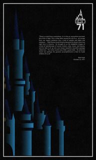
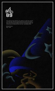
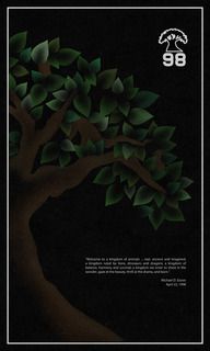
Hi everyone! Today I published my new set of posters entitled "Four Parks." Each poster celebrates a park from the day it opened and each includes a quote from its opening day. Some are the dedication quotes, others are quotes that I just felt honored the park and its ideals more.
I wanted each icon to be shown sort of emerging from the shadows with their nighttime lighting packages. I was inspired by the press materials put out to tease EPCOT Center in 1982, and the rest worked itself out. I went through a ton of iterations for each poster, and if I ever create a blog like I want, I'll show everyone the multiple paths I went down for each design.


To view the posters visit my Flickr here!
To purchase prints visit my Imagekind here!

Thanks for looking, and as usual, comments are encouraged! I hope everyone likes them!
 

scbb11Sketch

Active Member
Original Poster
Originally Posted by marni1971 View Post
Nice... But how dare you have a Studios poster that says 1989 AND has the hat on it!
Good call. Get the earful tower on there pronto!

Well MAYBE I anticipated people like you and already had one planned from the beginning and already started one! :p (Besides, I like the hat more. I think it's a much better icon than a water tower that isn't really visible anywhere in the park. But that's an argument for another time.)

Kind of dark, no offense; but then I'm no art aficionado either.
No offense taken. Dark is kind of what I was going for. This EPCOT poster from before the park opened was my inspiration. I like how Spaceship Earth is hidden in the shadows, but is still reflecting color off its panels. I think it's a cool style.

Thanks everyone for the replies and encouragement and compliments!
 

BringMeTheHoriz

Well-Known Member
Nicely done. I'm an amateur artist myself, but I do oils paintings and charcoal drawings. Haven't done any Disney stuff myself.

Out of the four, I think the Epcot one is the best. The rest are too three-dimensional and computer generated for my taste (of the remaining three the I like the Animal Kingdom one the best). But the Epcot piece has a great simplicity about it, nice color transition, and it fits the 80's theme perfectly. I think you hit a home run with it.
 

Dads 2 Boys

Well-Known Member
Nice... But how dare you have a Studios poster that says 1989 AND has the hat on it!

Really? The person came up with really cool posters and you scold him like he's in 3rd grade? If you didn't like it, don't comment. That was beyond obnoxious.

OP those are really nice and imaginative.
 

marni1971

Park History nut
Premium Member
Really? The person came up with really cool posters and you scold him like he's in 3rd grade? If you didn't like it, don't comment. That was beyond obnoxious.

OP those are really nice and imaginative.
It was said tongue in cheek.

How dare you question me. Someone you don't know. Get off your high horse and get your facts straight.
 

wolf359

Well-Known Member
In fairness, tongue-in-cheek is hard to "hear" without smilies.

Honestly, if I didn't know your general attitude and posting style like I do it would be easy to read what you actually wrote as being a bit nasty, or at least a little tactless. Especially when nasty and tactless is so common around here sometimes.

Quickly moving to ON topic, however, I really like the posters! After really digging the retro-silkscreen style of your other work I think these are a nice contrast and I think the dark look is cool.

I'm of two minds on the Studio poster. I also thought the hat was a controversial choice since it wasn't the opening day icon of the park, but I think from an art direction standpoint it is much more interesting subject than the Earful Tower or the Chinese Theater. Of course, I'd love to see what the "fanboy-alternate" version without the hat looks like too!
 

marni1971

Park History nut
Premium Member
In fairness, tongue-in-cheek is hard to "hear" without smilies.

Honestly, if I didn't know your general attitude and posting style like I do it would be easy to read what you actually wrote as being a bit nasty, or at least a little tactless. Especially when nasty and tactless is so common around here sometimes.
Fair enough. To the OP, I meant it when I said nice. They are :wave:
 

Register on WDWMAGIC. This sidebar will go away, and you'll see fewer ads.

Back
Top Bottom