I thought the phone was moved to the Chapeau shop.STOP. WHERE IS THE PARTY LINE PHONE? SOMEONE TELL ME THEY SEE IT. MY TWITTER THUMBS ARE READY.
-
The new WDWMAGIC iOS app is here!
Stay up to date with the latest Disney news, photos, and discussions right from your iPhone. The app is free to download and gives you quick access to news articles, forums, photo galleries, park hours, weather and Lightning Lane pricing. Learn More -
Welcome to the WDWMAGIC.COM Forums!
Please take a look around, and feel free to sign up and join the community.
You are using an out of date browser. It may not display this or other websites correctly.
You should upgrade or use an alternative browser.
You should upgrade or use an alternative browser.
News Magic Kingdom's Main Street Confectionery closing for refurbishment
- Thread starter wdwmagic
- Start date
castlecake2.0
Well-Known Member
As in new chapeau shop in town square theatre?I thought the phone was moved to the Chapeau shop.
The one that was connected to the confectionery.As in new chapeau shop in town square theatre?
FigmentFan82
Well-Known Member
Doesn't KK sell a bunch of Werther's products?Werther's is just the brand of caramel they're using as opposed to selling a bunch of products made by Werther's. To be fair, that's how this new confectionary works too -- they're simply using Mars candy in their products rather than selling something specifically made by Mars.
The original comment was tongue in cheek, but I can't say I'd be overly surprised if it actually did happen.
castlecake2.0
Well-Known Member
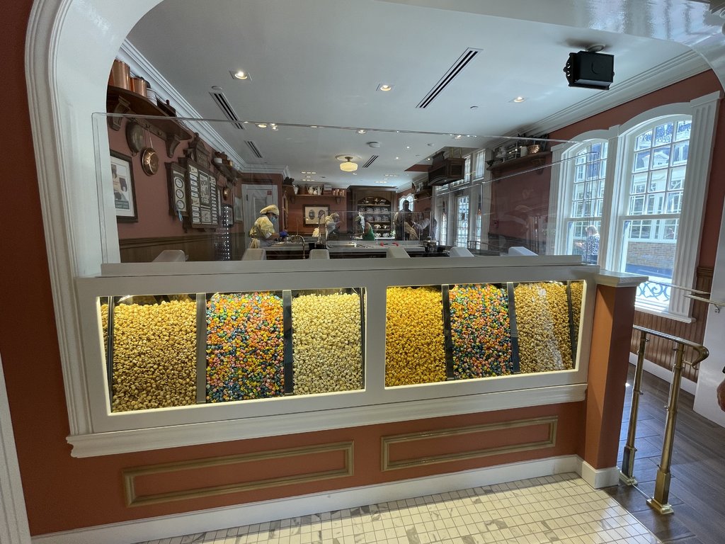
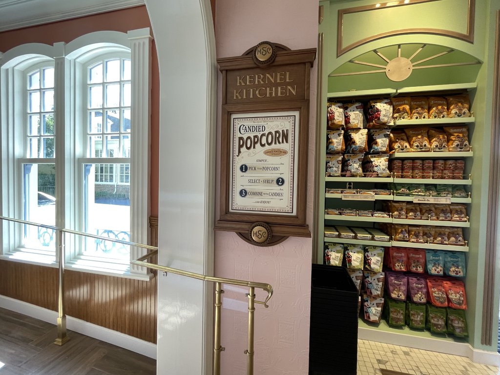
That is now the popcorn room of the new confectionery and as far as I can tell no longer includes the phone.
UNCgolf
Well-Known Member
That is now the popcorn room of the new confectionery and as far as I can tell no longer includes the phone.
Why would it? That's an old phone from an old era; this is a 21st century shop now!
Hopefully it's still there, but I wouldn't be surprised if it's gone. And removing fun little thematic details like that is the exact kind of thing they've been doing regularly for the past few years -- that's what I've been complaining about.
Last edited:
The Japanese?Who else pays that much for popcorn?
castlecake2.0
Well-Known Member
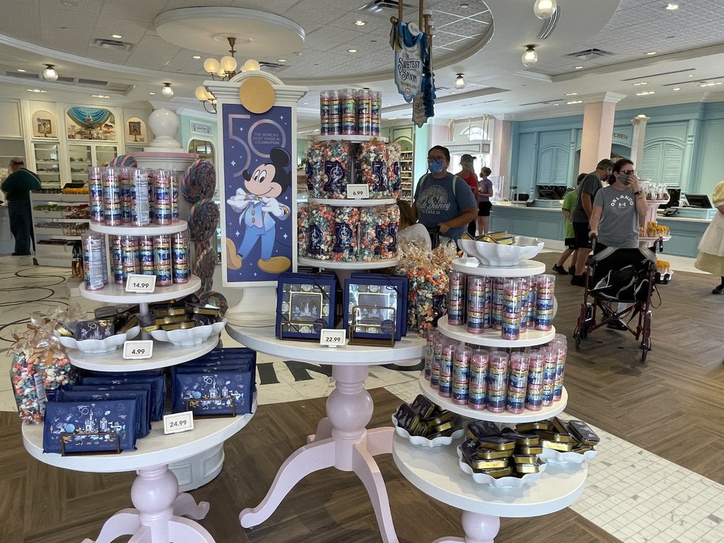
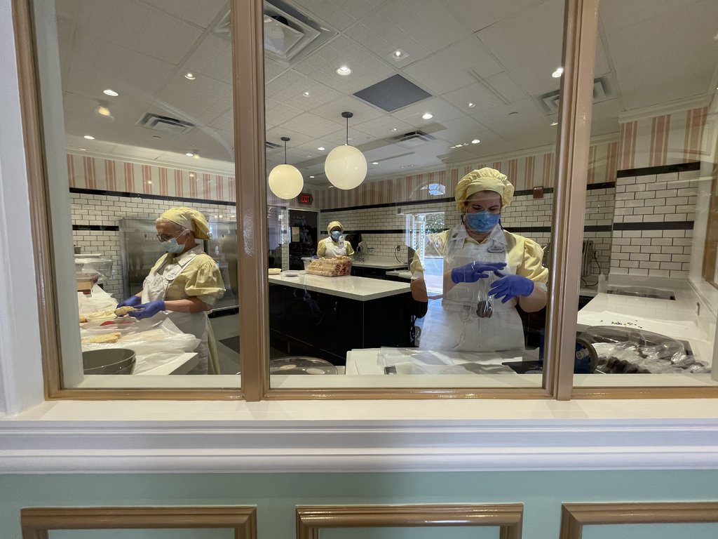
After much consideration I feel like it needs some more set dressing. I get wanting things to be more clean and less chaotic, but they went like two notches too far. Add some light fixtures over the register areas, and maybe some mirrors or art with lights above on some of the blank walls. Saying this, I went back and looked at some old photos and the previous version was never as detailed as the emporium was. The lack of charm I think comes from the area being bigger and more open, where before it was smaller and cozy, which is cute until about 1pm-close when it just becomes crowded and frustrating.
Centauri Space Station
Well-Known Member
I saw it today! I thought it was nice, more spacious for sure and still charming


Animaniac93-98
Well-Known Member
Looks like they basically punted on theme
The theme is "Disney", just like the rest of WDW.
Magic Kingdom's Mall of America is where you buy Mickey Mouse stuff.
ToTBellHop
Well-Known Member
From what I’ve read, the flavor profiles range from super sweet to sickeningly sweet.
Animaniac93-98
Well-Known Member
Walt Disney was old enough to remember America of the early 20th century. So were seniors who visited Disneyland in the 1950s and 60s.
But Main Street wasn't an anomaly in Disney's media output. The setting was routinely the source of stories made for theaters and television like Pollyanna, Summer Magic and Lady and the Tramp. Nostalgia for that era was key to the Disney brand.
Now no one is alive to remember those days, and the studio has no interest in telling those stories (even in updated ways like the Pollyanna remake with a black cast). This has made it easier for Disney to ignore the importance of Main Street and what made it "Disney" in the first place.
stuart
Well-Known Member
Crediting my sister with spotting this one, but on images on another site show the sign at Glacier Kitchen, and next to the items listed there is the dining plan logo!
Someone had to sign off on those, so error, or some future proofing - although adding stickers to them would be an easy job.
Someone had to sign off on those, so error, or some future proofing - although adding stickers to them would be an easy job.
UNCgolf
Well-Known Member
From what I’ve read, the flavor profiles range from super sweet to sickeningly sweet.
Well they're basically taking sugar and adding more sugar on top, so...
brb1006
Well-Known Member
I really want to try the honey slavered popcorn that's exclusive to Tokyo Disneyland. It's sold near the Pooh's Hunny Hunt attraction!The Japanese?
EricsBiscuit
Well-Known Member
Whoever designed this should be fired. It looks awful.
James Alucobond
Well-Known Member
At absolute worst, it’s completely inoffensive. Calling for someone to be fired over this is ridiculous.Whoever designed this should be fired. It looks awful.
Sir_Cliff
Well-Known Member
I'm finding hard to feel strongly about this one. A bit bland, but perhaps also slightly better than the old confectionary store and the popcorn area actually looks really well-done.
The only thing that kind of puzzles me is the whole "sweetist spoon" conceit. I take it this is some invented backstory about a prize awarded by the store? If so, it's one of those ways modern WDI understands how to tell stories in the parks that really doesn't appeal to me. Rather than creating convincing environments that tell a story in and of themselves, they seem to love inserting overly elaborate backstories that people really have to stop and read (or lookup online) to understand. In this case, the cartoon images in the front window and on the signs also don't look like either a picture or drawing from the same period as the store which torpedos the effectiveness of the whole thing fleshing out the store as a real place. In other words, that kind of bugs me the most out of all of this as it is the kind of 'theming' that feels forced rather than underwhelming.
Hmm, I guess we all have our triggers!
ToTBellHop
Well-Known Member
I really like the popcorn area. And, it’s a fun concept. We will definitely try that out.I'm finding hard to feel strongly about this one. A bit bland, but perhaps also slightly better than the old confectionary store and the popcorn area actually looks really well-done.
The only thing that kind of puzzles me is the whole "sweetist spoon" conceit. I take it this is some invented backstory about a prize awarded by the store? If so, it's one of those ways modern WDI understands how to tell stories in the parks that really doesn't appeal to me. Rather than creating convincing environments that tell a story in and of themselves, they seem to love inserting overly elaborate backstories that people really have to stop and read (or lookup online) to understand. In this case, the cartoon images in the front window and on the signs also don't look like either a picture or drawing from the same period as the store which torpedos the effectiveness of the whole thing fleshing out the store as a real place. In other words, that kind of bugs me the most out of all of this as it is the kind of 'theming' that feels forced rather than underwhelming.
Hmm, I guess we all have our triggers!
Register on WDWMAGIC. This sidebar will go away, and you'll see fewer ads.
