News Magic Kingdom's Main Street Confectionery closing for refurbishment

TrojanUSC

Well-Known Member
Crediting my sister with spotting this one, but on images on another site show the sign at Glacier Kitchen, and next to the items listed there is the dining plan logo!

Someone had to sign off on those, so error, or some future proofing - although adding stickers to them would be an easy job.

Oh jeez the food is homogenized enough as it is. DDP coming back will just make it worse. I know it will come back, but it's terrible for everyone involved.
 

James Alucobond

Well-Known Member
I'm finding hard to feel strongly about this one. A bit bland, but perhaps also slightly better than the old confectionary store and the popcorn area actually looks really well-done.

The only thing that kind of puzzles me is the whole "sweetist spoon" conceit. I take it this is some invented backstory about a prize awarded by the store? If so, it's one of those ways modern WDI understands how to tell stories in the parks that really doesn't appeal to me. Rather than creating convincing environments that tell a story in and of themselves, they seem to love inserting overly elaborate backstories that people really have to stop and read (or lookup online) to understand. In this case, the cartoon images in the front window and on the signs also don't look like either a picture or drawing from the same period as the store which torpedos the effectiveness of the whole thing fleshing out the store as a real place. In other words, that kind of bugs me the most out of all of this as it is the kind of 'theming' that feels forced rather than underwhelming.

Hmm, I guess we all have our triggers!
So you're saying you're not interested in my Main Street, U.S.A. baker fanfiction? 🤔
 

James Alucobond

Well-Known Member
I really miss the old floor. I know it’s silly to say that, but it really brought a lot of fun and whimsy to the space. I imagine the little tiles and grout were hard to keep clean, but the new flooring just seems bland and generic…
I don't know if generic is the right word considering the custom medallion in the center, but they do seem overly fond of the faux wood tile even when it's not appropriate to the style of the space. To me, it's the most glaringly anachronistic element.
 

UNCgolf

Well-Known Member
I don't know if generic is the right word considering the custom medallion in the center, but they do seem overly fond of the faux wood tile even when it's not appropriate to the style of the space. To me, it's the most glaringly anachronistic element.

The old space wasn't exactly great in many ways, but the tile alone went such a long way in helping the overall theme.

This isn't a theme thing, but I preferred having part of the show kitchen out in the space instead of completely behind windows as well.
 

Animaniac93-98

Well-Known Member
I'm finding hard to feel strongly about this one. A bit bland, but perhaps also slightly better than the old confectionary store and the popcorn area actually looks really well-done.

The only thing that kind of puzzles me is the whole "sweetist spoon" conceit. I take it this is some invented backstory about a prize awarded by the store? If so, it's one of those ways modern WDI understands how to tell stories in the parks that really doesn't appeal to me. Rather than creating convincing environments that tell a story in and of themselves, they seem to love inserting overly elaborate backstories that people really have to stop and read (or lookup online) to understand. In this case, the cartoon images in the front window and on the signs also don't look like either a picture or drawing from the same period as the store which torpedos the effectiveness of the whole thing fleshing out the store as a real place. In other words, that kind of bugs me the most out of all of this as it is the kind of 'theming' that feels forced rather than underwhelming.

Hmm, I guess we all have our triggers!
I think it's another way they're trying to make the parks more inclusive, by having more backstories with PoC.

Of course the idea of the confectionary needing a backstory at all is silly (especially one printed on signs in the actual store), and as you say the execution is not that great either.
 

Figment82

Well-Known Member
I don't know if generic is the right word considering the custom medallion in the center, but they do seem overly fond of the faux wood tile even when it's not appropriate to the style of the space. To me, it's the most glaringly anachronistic element.
You’re right, generic isn’t the right word. It just feels like the “go-to” flooring surface nowadays. I feel like it could easily read “Ale & Compass” and fit in at the Yacht Club instead.
 

James Alucobond

Well-Known Member
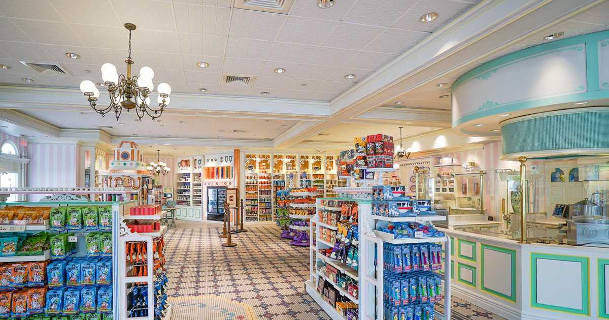
Please explain to me how installing a drop ceiling in a confectionary themed to turn of the century small town america is a good idea. No molding. Boring flooring. It’s a disaster.
The drop ceiling was always there, even in the previous version. In fact, it's been slightly improved as the tiles now have a light embossed effect to make them look more like tin panels. There is molding everywhere. The floor is slightly anachronistic but certainly not boring.
 

lazyboy97o

Well-Known Member
The drop ceiling was always there, even in the previous version. In fact, it's been slightly improved as the tiles now have a light embossed effect to make them look more like tin panels. There is molding everywhere. The floor is slightly anachronistic but certainly not boring.
That ceiling texture was there before. It’s still bad. The molding is in a few spaces but not fully realized Given the supposed aesthetic goal. It’s a very contemporary design with some stuff glued onto it.
 

James Alucobond

Well-Known Member
That ceiling texture was there before. It’s still bad. The molding is in a few spaces but not fully realized Given the supposed aesthetic goal. It’s a very contemporary design with some stuff glued onto it.
I am not saying I wouldn't prefer a non-drop ceiling. I was responding to the premise that this was a major factor in the redesign being disastrous when it's actually just the result of not touching something that was already there. The statement about moldings was also that there simply weren't any, which is not the case. It's literally on every single wall and permanent counter.

EDIT: Oh, whoops. My bad on the texture. You're totally right there. For some reason, one of the shots of the new one looked to me like it had more of a baroque pattern in the inner circle, but it was just light and image artifacting.
 
Last edited:

lazyboy97o

Well-Known Member
I am not saying I wouldn't prefer a non-drop ceiling. I was responding to the premise that this was a major factor in the redesign being disastrous when it's actually just the result of not touching something that was already there. The statement about moldings was also that there simply weren't any, which is not the case. It's literally on every single wall and permanent counter.
You just claimed the tiles were new and different. And they absolutely did touch the ceiling which is blatantly obvious in the photos, there was a giant circle before.

The literalism about the moldings comments is just lame.
 

EricsBiscuit

Well-Known Member
The drop ceiling was always there, even in the previous version. In fact, it's been slightly improved as the tiles now have a light embossed effect to make them look more like tin panels. There is molding everywhere. The floor is slightly anachronistic but certainly not boring.
It would literally take one day for some dude on a ladder to install tiles on that drop ceiling. The floor is bland, as is everything else. No theming whatsoever.
 

James Alucobond

Well-Known Member
You just claimed the tiles were new and different. And they absolutely did touch the ceiling which is blatantly obvious in the photos, there was a giant circle before.
Sorry, see my edit above while you were posting re: the tile patterning. And yes, they changed the shaped and configuration of the built-out portion of the ceiling but kept the drop ceiling elsewhere, I imagine so that they wouldn't have to frame everything out and realign fixtures already set at drop ceiling height.

The literalism about the moldings comments is just lame.
... Why? There either is molding or there isn't. The claim was that there was none. There is in fact more molding than there was in the previous iteration of this space.

It would literally take one day for some dude on a ladder to install tiles on that drop ceiling. The floor is bland, as is everything else. No theming whatsoever.
They could trade out the lightweight drop tiles themselves for something more decorative to mitigate the appearance, but probably not a great idea to just paste true ceiling tiles over a drop framework.
 

EricsBiscuit

Well-Known Member
Sorry, see my edit above while you were posting re: the tile patterning. And yes, they changed the shaped and configuration of the built-out portion of the ceiling but kept the drop ceiling elsewhere, I imagine so that they wouldn't have to frame everything out and realign fixtures already set at drop ceiling height.


... Why? There either is molding or there isn't. The claim was that there was none. There is in fact more molding than there was in the previous iteration of this space.


They could trade out the lightweight drop tiles themselves for something more decorative to mitigate the appearance, but probably not a great idea to just paste true ceiling tiles over a drop framework.
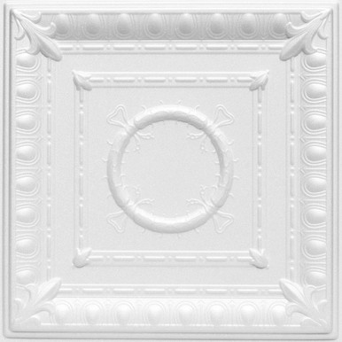
I have bought tens of thousands of dollars of these tiles for many projects before:

they literally hang on the frame and you don’t have to take anything down. With a good scissor lift you can do thousands of square feet a day. Easy peasy and it looks better than ugly and bland drop ceiling.
 

James Alucobond

Well-Known Member
I have bought tens of thousands of dollars of these tiles for many projects before:

they literally hang on the frame and you don’t have to take anything down. With a good scissor lift you can do thousands of square feet a day. Easy peasy and it looks better than ugly and bland drop ceiling.
Look, I'm not trying to be difficult here. I'm not saying the space is perfect. I have already stated that there are things I would love to see changed or improved. I'm just saying that I wouldn't call for someone to be fired because they left a drop ceiling in a room that already had a drop ceiling or claim that a room with hundreds of moldings had zero moldings.

I become more convinced with each passing day that, were the Emporium built today, someone would driveby post that Disney should be ashamed of their Barnes & Noble knockoff.
1632876449490.png
 

Register on WDWMAGIC. This sidebar will go away, and you'll see fewer ads.

Back
Top Bottom