News Magic Kingdom's Main Street Confectionery closing for refurbishment

Disney Analyst

Well-Known Member
Here is a look at the Main Street Confectionery before the refurb

Okay this refurb is genuinely an improvement. That old floor was hideous and far too busy and old display shelving super ugly.


Using your photos, my thoughts:

UGH, anxiety inducing. 😰 ⬇️

1632876130773.png


Calm, bright clean, and open. LOVE 😍 ⬇️


1632876159849.png


Fancy 7/11 ⬇️:eek:


1632876308582.png


Gorgeously organized and displayed, feels luxurious and clean. ⬇️😍


1632876353048.png

1632876368890.png
 

Disney Analyst

Well-Known Member
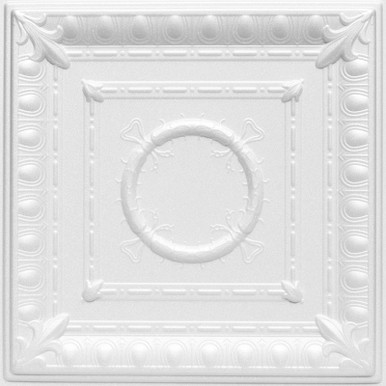
I have bought tens of thousands of dollars of these tiles for many projects before:

they literally hang on the frame and you don’t have to take anything down. With a good scissor lift you can do thousands of square feet a day. Easy peasy and it looks better than ugly and bland drop ceiling.

Back when I managed a restaurant, we had DISGUSTING dentist office type drop down tiles, when we renovated we kept the drop ceiling, but put up much nicer tiles (kind of like what you pictured). It makes a huge difference.

While the ones used in the Confectionary are not generic tiles like you'd see in an office, they do appear to be saved from the old design, and I don't particularly love that old tile design, so a swap could really benefit the space.

But apart from that, this refurb is a HUGE success, a far better space has been created, and no one need be fired.
 

UNCgolf

Well-Known Member
But apart from that, this refurb is a HUGE success, a far better space has been created, and no one need be fired.

Sure, if you don't care about theming -- which is fine, by the way, there's nothing wrong with not caring about that -- but it's a nice open modern space that doesn't look anything like something you'd find in the time period it's supposed to evoke.

The old space wasn't great either, but stuff like the tile floor was 10000x better than what's there now.
 
Last edited:

Andrew C

You know what's funny?
Okay this refurb is genuinely an improvement. That old floor was hideous and far too busy and old display shelving super ugly.


Using your photos, my thoughts:

UGH, anxiety inducing. 😰 ⬇️

View attachment 589807

Calm, bright clean, and open. LOVE 😍 ⬇️


View attachment 589808

Fancy 7/11 ⬇️:eek:


View attachment 589809

Gorgeously organized and displayed, feels luxurious and clean. ⬇️😍


View attachment 589810
View attachment 589811
Besides the flooring, looks all the same to me. 🤷‍♂️ I guess I have the eyes of a peasant. 😂
 

UNCgolf

Well-Known Member
Look, I'm not trying to be difficult here. I'm not saying the space is perfect. I have already stated that there are things I would love to see changed or improved. I'm just saying that I wouldn't call for someone to be fired because they left a drop ceiling in a room that already had a drop ceiling or claim that a room with hundreds of moldings had zero moldings.

I become more convinced with each passing day that, were the Emporium built today, someone would driveby post that Disney should be ashamed of their Barnes & Noble knockoff.
View attachment 589812

Someone might, although the Emporium doesn't really look like a Barnes & Noble to me.

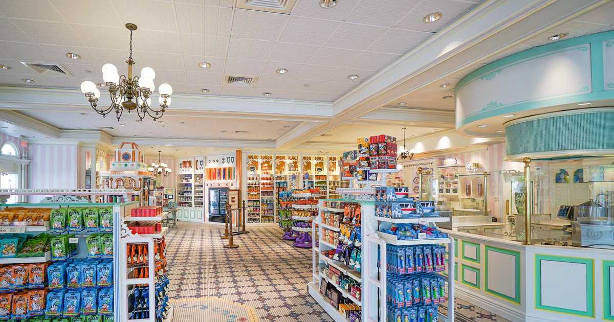
That doesn't really matter, though. Here's the issue -- when looking at the majority of Disney's new builds and renovations over the past few years, it seems obvious that theme/place setting is a tertiary concern at best. There may be some small nods to it here and there, but the goal is to build modern spaces. Intricate details that point to a theme are an afterthought if they exist at all. The Beaches and Cream renovation and the creperie are clear examples, and even something like the new Polynesian entrance displays a lack of interest in building out believable, detailed spaces. It could have been pretty good, but they did a halfway job with it and said "that's good enough!".

All that goes out the window if the space is themed to an IP, though. They're still very willing to build elaborately detailed spaces when they're in service of IP place setting like at Galaxy's Edge.

SWGE furthers my point, though -- the shops there are pretty small and cramped due to theme. Would anyone be happy if they turned one of them into a giant, open modern space (something like World of Disney) full of Star Wars merchandise, or even just ripped out a lot of the theming to create more space? That would destroy the theme of being on Batuu. My complaint is that the non-IP locations deserve the same level of theme and detail that the IP ones do. I'm just as interested in the Main Street USA theme as I am the SWGE theme, if not more so.

Was Disney always great about it in the past? Of course not. It's not as though the parks were 100% perfect in, say, 1990. But they sure seemed to care about it far more than they do now, and the fact that they did care is a big part of what made Disney Disney to me.

EDIT: Can't believe I forgot to mention the Riviera, which is like a monument to lack of theme/detail.
 
Last edited:

lazyboy97o

Well-Known Member
Someone might, although the Emporium doesn't really look like a Barnes & Noble to me.

That doesn't really matter, though. Here's the issue -- when looking at the majority of Disney's new builds and renovations over the past few years, it seems obvious that theme/place setting is a tertiary concern at best. There may be some small nods to it here and there, but the goal is to build modern spaces. Intricate details that point to a theme are an afterthought if they exist at all. The Beaches and Cream renovation are clear examples, and even something like the new Polynesian entrance displays a clear lack of interest in building out believable, detailed spaces. It could have been pretty good, but they did a halfway job with it and said "that's good enough!".

All that goes out the window if the space is themed to an IP, though. They're still very willing to build elaborately detailed spaces when they're in service of IP place setting like at Galaxy's Edge.

SWGE furthers my point, though -- the shops there are pretty small and cramped due to theme. Would anyone be happy if they turned one of them into a giant, open modern space like World of Disney full of Star Wars merchandise, or even just ripped out a lot of the theming to create more space? That would destroy the theme of being on Batuu. My complaint is that the non-IP locations deserve the same level of theme and detail that the IP ones do. I'm just as interested in the Main Street USA theme as I am the SWGE theme, if not more so.

EDIT: Can't believe I forgot to mention the Riviera, which is like a monument to lack of theme or detail.
It’s not just Disney, but a wider issue within the industry and even one amongst the fans. “Theming” has been reduced to stuff that is applied. Any box can be themed by applying stuff to it and returned by ripping it off and applying new stuff. Things are measured by their level of “theming” which equates to the amount of stuff. There almost no sense of spatial or material design as part of theming when these are key aspects to created place and feel.

Yes, there are operational and regulatory challenges to creating authenticity but so often these can be handled in a variety of manners that is not obviously anachronistic (and sometimes it means using anachronism that feel right). A tight little Victorian store would likely not pass muster today for a variety of reasons but that doesn’t mean you need big expanses of painted gyp board, be it the walls or the ceiling. It’s more and more a McMansion approach, big with some stuff applied but no sense of proportion, scale, purpose or materiality.
 

Animaniac93-98

Well-Known Member
SWGE furthers my point, though -- the shops there are pretty small and cramped due to theme. Would anyone be happy if they turned one of them into a giant, open modern space (something like World of Disney) full of Star Wars merchandise, or even just ripped out a lot of the theming to create more space? That would destroy the theme of being on Batuu.

But it would still be "Star Wars" and it looks like that's enough for most.

Disney fans routinely praise Animal Kingdom for its detail and theming. Shouldn't the other parks be held to that standard?
 

James Alucobond

Well-Known Member
Someone might, although the Emporium doesn't really look like a Barnes & Noble to me.

That doesn't really matter, though. Here's the issue -- when looking at the majority of Disney's new builds and renovations over the past few years, it seems obvious that theme/place setting is a tertiary concern at best. There may be some small nods to it here and there, but the goal is to build modern spaces. Intricate details that point to a theme are an afterthought if they exist at all. The Beaches and Cream renovation are clear examples, and even something like the new Polynesian entrance displays a clear lack of interest in building out believable, detailed spaces. It could have been pretty good, but they did a halfway job with it and said "that's good enough!".

All that goes out the window if the space is themed to an IP, though. They're still very willing to build elaborately detailed spaces when they're in service of IP place setting like at Galaxy's Edge.

SWGE furthers my point, though -- the shops there are pretty small and cramped due to theme. Would anyone be happy if they turned one of them into a giant, open modern space (something like World of Disney) full of Star Wars merchandise, or even just ripped out a lot of the theming to create more space? That would destroy the theme of being on Batuu. My complaint is that the non-IP locations deserve the same level of theme and detail that the IP ones do. I'm just as interested in the Main Street USA theme as I am the SWGE theme, if not more so.

Was Disney always great about it in the past? Of course not. It's not as though the parks were 100% perfect in, say, 1990. But they sure seemed to care about it far more than they do now, and the fact that they did care is a big part of what made Disney Disney to me.

EDIT: Can't believe I forgot to mention the Riviera, which is like a monument to lack of theme/detail.
And I am fully with you. I can consistently point out four to six major things with any design of late that could be done with relative ease to massively improve the product. It's frankly mindboggling at times as to why they make the decisions they do with regard to cutting corners in certain ways. And we should continue to call them out for those things.

I just think it's not terribly helpful to be hyperbolic about it and make driveby posts calling for designers and contractors to be fired. And that's not in reference to you; I always find your posts insightful.
 

Casper Gutman

Well-Known Member
And I am fully with you. I can consistently point out four to six major things with any design of late that could be done with relative ease to massively improve the product. It's frankly mindboggling at times as to why they make the decisions they do with regard to cutting corners in certain ways. And we should continue to call them out for those things.

I just think it's not terribly helpful to be hyperbolic about it and make driveby posts calling for designers and contractors to be fired. And that's not in reference to you; I always find your posts insightful.
The designers and contractors shouldn’t be fired. The executives who give them their orders and set the operative philosophy regarding theming should be… reassigned.

What baffles me about all this is how counterproductive it all seems. When I am at a theme park, I go into stores to look at them, not to buy. The more intricate details, the longer I stay. And the longer I stay, the more likely I am to see a piece of merchandise and decide to buy it. I have no reason to go into a space like this, and thus there is no chance for an impulse buy. If the idea is to put all focus on the merchandise, well… I can look at the merchandise online, away from other sweaty tourists and bloodthirsty strollers. But I won’t. Because I’m not going to buy park related merchandise if it’s not linked to a particular moment in the park. So no sale.

So what’s the philosophy here? Why are they actively trying to keep people out of stores (and restaurants)?
 

UNCgolf

Well-Known Member
But that looks like a candy shop on the northeast coast. Would make more sense at BoardWalk Inn.

The Disney Boardwalk should absolutely have a candy shop with a counter for ice cream and milkshakes that looks something like this. I'd go in there just to look at it and then I'd probably end up getting a milkshake or something else because I was there.

What @Casper Gutman said above is exactly how I feel -- I used to go into the stores at Disney because they were unique and fun to explore just for the theming. Now they all sell the same stuff and there's not much interesting about the stores themselves, so why bother going in? You could just make one stop at World of Disney and get everything you wanted, with a few scattered exceptions.

I don't think I've bought a single thing in either of my last two Disney trips. I'm not a big merch purchaser anyways, but I'm sure I would have been suckered into buying a couple of things if I'd actually spent time in the stores.
 
Last edited:

aladdin2007

Well-Known Member
And I am fully with you. I can consistently point out four to six major things with any design of late that could be done with relative ease to massively improve the product. It's frankly mindboggling at times as to why they make the decisions they do with regard to cutting corners in certain ways. And we should continue to call them out for those things.

I just think it's not terribly helpful to be hyperbolic about it and make driveby posts calling for designers and contractors to be fired. And that's not in reference to you; I always find your posts insightful.
I agree with that as well; with that said this could have been a lot worse,,,, but also could have been better. What saves it is the chandelier in the middle, I guess........ It irks me they took the "lets make sure its minimal and doesn't show signs of belonging in the magic kingdom on main street" approach. They love this so they dont have to update it again. The sad part of it is I dont think Imagineering has anything to do with these refurbs now, its all local management which as of late is a clueless group for more than one reason or another. This is like some of the other locations that all look like they came right out of Riveria, to me anyway. The same thing happened with the candy kitchen shop at the studios, and other spots such as the Yacht Club, Grand Floridian, mickeys of hollywood at the studios etc and the list goes on...oh the high end jewelry shop across from it thats what this reminds me of now. But some of those are worse off than how the confectionary turned out. The Disney we knew and loved is dead, and everything is pretty much going to end up looking like this format from here on out Im afraid. Just wait for the emporium to look like creations, wouldn't put it past them.
 

James Alucobond

Well-Known Member
The Disney we knew and loved is dead, and everything is pretty much going to end up looking like this format from here on out Im afraid. Just wait for the emporium to look like creations, wouldn't put it past them.
I feel like this is where I would draw the line on your statement and disagree. The things that get proper attention still turn out very, very well and remind us (or me, at least) of why we love Disney World so much. There are simply higher powers at work with philosophies on merchandising and IP integration that are at odds with the way some of us would prefer things in the parks be treated, and I don't see that philosophical shift as necessarily permanent. Changes in leadership can affect that; guest experience can affect that; we can affect that.
 

Register on WDWMAGIC. This sidebar will go away, and you'll see fewer ads.

Back
Top Bottom