
-
Welcome to the WDWMAGIC.COM Forums!
Please take a look around, and feel free to sign up and join the community.
You are using an out of date browser. It may not display this or other websites correctly.
You should upgrade or use an alternative browser.
You should upgrade or use an alternative browser.
News EPCOT Parking Plaza refurbishment?
- Thread starter wdwmagic
- Start date
castlecake2.0
Well-Known Member
The new auto plaza sign will be a giant framed photo of Julie Andrews dancing in front of Spaceship Earth. Each toll booth will also receive a succulent.
"Mr. Iger, clean up that concrete!"
Andrew C
You know what's funny?
That will work...
Some more photos of the new signage.

 www.wdwmagic.com
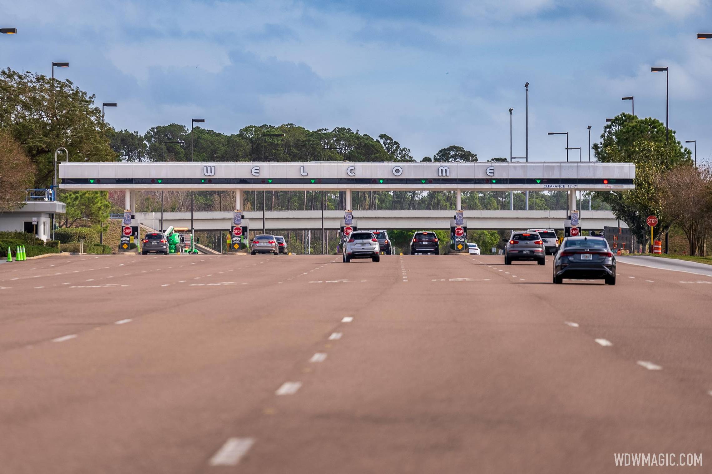
EPCOT's Auto Plaza refresh continues with new 'Welcome' lettering
EPCOT's Auto Plaza refresh continues with new 'Welcome' lettering
EPCOT's Auto Plaza refresh continues with new 'Welcome' lettering
www.wdwmagic.com
mightynine
Well-Known Member
Man, we couldn't drag out the power washer overnight before the letters went up? Or is that light reflection making it look dirty?
Ayla
Well-Known Member
Really, how can you tell? They blend right in with the dirty white background.New welcome letters installed.
Andrew C
You know what's funny?
Looks wet....so it was either just sprayed down...or is not wet and is dirty.Man, we couldn't drag out the power washer overnight before the letters went up? Or is that light reflection making it look dirty?
Not a reflection, unfortunately. Saw it in person yesterday, it's dirty.Man, we couldn't drag out the power washer overnight before the letters went up? Or is that light reflection making it look dirty?
Andrew C
You know what's funny?
Free delivery by tomorrow.Not a reflection, unfortunately. Saw it in person yesterday, it's dirty.
dmw
Well-Known Member
- In the Parks
- No
Some contrast is needed - either paint the background a darker color, or make the letters a darker color.Some more photos of the new signage.
EPCOT's Auto Plaza refresh continues with new 'Welcome' lettering
EPCOT's Auto Plaza refresh continues with new 'Welcome' lettering
EPCOT's Auto Plaza refresh continues with new 'Welcome' lettering
Lettering so light it blends into the background and you can barely see it during the day. Someone screwed up and this still got through whatever approval process was needed.  Not to mention the lack of a power wash before install.
Not to mention the lack of a power wash before install.tnemgif
Well-Known Member
I disagree. I don’t think many will have a hard time reading this. I find it more legible than the blue, due to the outlines/shadows.Some contrast is needed - either paint the background a darker color, or make the letters a darker color.
I‘m interested to see how it looks at night.
NelleBelle
Well-Known Member
If it hadn't been pointed out that the sign said "WELCOME", I never would've noticed it! It totally blends in!! This is terrible! If they wanted to go with that design, they needed to make the "blue" (what little there is of it) background around the letters, larger so it stands out, or hey, just keep the blue-theme of the the original "welcome" sign and change up the font to whatever it is they're destroying, er, "updating", EPCOT with these days!  Awful, just awful, IMO.
Awful, just awful, IMO.Register on WDWMAGIC. This sidebar will go away, and you'll see fewer ads.