Regarding the glorification of the queue...
When I see pictures of queues like the one at Starbucks, I can't help but draw a comparison to what has happened to the suburban landscape. Over time, the architecture of the suburban home (even suburbia as a concept) has adapted to fit the car, rather than the pedestrian. Even within the last 20 years, garages have an increased dominance and are now front and center, often the largest component in the massing scheme of a house, beckoning the automobile to enter rather than the individual. The focus on the front door, speaking to the passerby on foot, has relinquished its importance to the function of the car. The automobile has been an essential component of many people's lives for much longer, but the architecture was behind in reflecting that. Many garages were detached and recessed on the property, or blended in with the overall massing and tucked in a back corner. Now the double wide strip of pavement to the two or three car garage door dwarfs the sidewalk and front door in comparison.
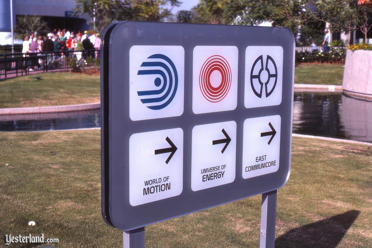
It seems Disney has adapted a similar methodology in design as of late. Queues have always been an essential component in theme park design. At its best, the experiential components of an attraction, building, or restaurant, etc. should be front and center. Sometimes the idea of putting the functional components of a space and making them front of house can be rewarding (a kitchen as a center piece in a fine restaurant), but sometimes it is just sloppy (queue at Starbucks). When I see the winding queue dominating the space, I think of it as the exposed guts, the intestines folded about themselves, when what I really want to see is the overall body and not be so confronted with how it works. An urban space might accomplish this by putting the experience in the front and the queue forms as it may, promoting an efficiency of space dedicated to experience. The suburban approach has no qualms with dedicating and even promoting space relegated to the function at the expense of experience. In theme parks, the foot and stroller are the cars of suburbia.
") I had a wonderful trip to Disneyland Paris (this was my 6th trip since 1993) & spent as much if not more time looking at all the fantastic detail as going on rides - DLP is so beautifully designed.
I had a wonderful trip to Disneyland Paris (this was my 6th trip since 1993) & spent as much if not more time looking at all the fantastic detail as going on rides - DLP is so beautifully designed.