Eddie Sotto's take on the current state of the parks (Part II)

Eddie Sotto

Premium Member
I can see them trying for a reveal at IOA - as you exit Ports of Entry, you get a vista of the park across the lagoon, with several key wienies beckoning you from across the water. But it's more than TWO choices at the same time, so it adds excitement but maybe also conflict.

Uni Florida has no reveal that I can tell :)

More like the vista of World Showcase, which is still a reveal but more of a buffet than a main course.

Uni has more of a Hub concept with Island "choices" than any iconic single element. It's not really goal oriented like a MK is with a Castle to reach as a destination. You might argue that each "Island" draws you along from one to the other to a degree. To your point, it does not seem like they are composing vistas with a sense of mystery, setup and payoff.
 
Last edited:

Eddie Sotto

Premium Member
When theme becomes a process. Margarine to spread on any type of bread.
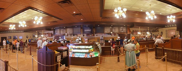
Here's an article on how Starbucks was integrated into the WDW MK. It's all there.A textbook case of a well and richly themed space including story, earthy coffee inspired palette, the period, the details are there, everything. Well, almost everything.
http://www./2013/06/story-of-starbu...ouse-fit-into-magic-kingdoms-main-street-usa/
9066969365_8c3a3d5ff4_z.jpg


This image is obviously distorted, but makes a statement. You can see the Starbucks format thinly layered (mirrored times 2) beneath the expected victorian furnishings that are everywhere else on Main Street, in fact, the store is "generically Main Street" if there is such a thing. Has Main Street become "churn of the century"? What happened to charm? Soul? Fun? Has the need for mass capacity queues created the equivalent to shopping malls with mass parking lots in front of the stores? Does that erode the experience? Is there a choice since it will be so popular? Hmmm. What is "special" about this experience that you can't get on the way to work? Victorian Fonts? It may be just sign of the times, or is it?
9066970441_a55edf41df_z.jpg


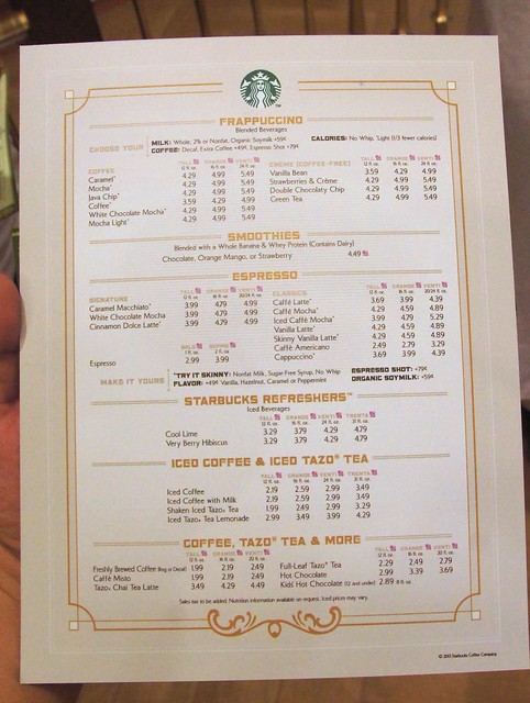
Corporate details....
http://www./wp-content/uploads/2013/06/starbucks.jpg


BTW I LOVE STARBUCKS and spend a fortune in there. I respect the company and everything they do. It's a place I'm in all of the time in every town I go to and that's the point..Is it "special" when it's at Disneyland too? Could they not just serve the coffee out of the old market house and have bags of it on the shelves with other stuff? Is it special?

Speaking of special, "down the road" they are busy inventing new themed drinks people wish they could try and making a fortune, meanwhile Disney is obsessed with importing ordinary everyday experiences to replicate the world we left. Makes you think. Why can't the same effort go into things for Main Street that are uniquely Disney?
images
l.jpg
Five%20Millionth%20Butterbeer%20Celebration%20LR.jpg


I must admit, it's a bit messed up to see kids holding beer mugs..
 
Last edited:

yankspy

Well-Known Member
When theme becomes a process. Margarine to spread on any type of bread.
Here's an article on how Starbucks was integrated into the WDW MK. It's all there. The story, the period, the details, everything. Well, almost everything.
http://www./2013/06/story-of-starbu...ouse-fit-into-magic-kingdoms-main-street-usa/
9066969365_8c3a3d5ff4_z.jpg


This image is obviously distorted, but makes a statement. You can see the Starbucks format thinly layered beneath the expected victorian furnishings that are everywhere else on Main Street, in fact, the store is "generically Main Street" if there is such a thing. What happened to charm? Soul? Fun? What is "special" about this experience that you can't get on the way to work? Victorian Fonts?
9066970441_a55edf41df_z.jpg


Corporate details....
http://www./wp-content/uploads/2013/06/starbucks.jpg


BTW I LOVE STARBUCKS and spend a fortune in there. I respect the company and everything they do. It's a place I'm in all of the time in every town I go to and that's the point..Is it "special" when it's at Disneyland too? Could they not just serve the coffee out of the old market house and have bags of it on the shelves with other stuff? Is it special?

Speaking of special, "down the road" they are busy inventing new themed drinks people wish they could try and making a fortune, meanwhile Disney is obsessed with importing ordinary everyday experiences to replicate the world we left. Makes you think. Why can't the same effort go into things for Main Street that are uniquely Disney?
images
l.jpg
Five%20Millionth%20Butterbeer%20Celebration%20LR.jpg


You hit the nail on the head with the "thinly layered Starbucks theme" comment. I can tell that it is a Starbucks even without the logo and that is what bothers me. My family always makes fun of me for not wanting to eat some cereal or something in the room every morning and my answer is that I can do that at home. I go to disney to do things I cannot do at home.

I think I would rather have the horrible Nescafé if it meant getting the old bakery back. (Crazy as that sounds) sometimes the atmosphere or the total experience can enhance the food, beverage, etc. I am originally from NYC where there is an Italian bakery on every block but I love the cannoli in Epcot, not because it tastes better but because I get to watch Illuminations while eating it.

I think one recent addition that fits the bill is the caramel shop in Germany. You do not see a whole shop devoted to just caramel in everyday life. I am not even a huge fan of caramel but between the piped in smell and the novelty of having a caramel dipped whatever I always go there. (I might add that the place always has a huge line).
 

The Empress Lilly

Well-Known Member
I can see them trying for a reveal at IOA - as you exit Ports of Entry, you get a vista of the park across the lagoon, with several key wienies beckoning you from across the water. But it's more than TWO choices at the same time, so it adds excitement but maybe also conflict.

Uni Florida has no reveal that I can tell :)
Yes, I think IoA aims for a reveal at the exit of PoE. Unlike MS, PoE is crooked, you can not really see from the entrance into the park. From the entrance you have to walk through PoE to see the lake and park revealed.

There's really only two directions to choose from at the lake, go left or go right. So the two choice presentation remains. Overall though, IoA design feels unintuitive. Despite the park being one road around a lake you can get lost. You can't see the weenies, you can't see well over the lake, the lands' layouts are messy. Maybe it is all intentional, hoping to create a sense of discovery. However that may be, for my liking it doesn't work.


I can't think of a reveal at USF either. I do think Potter aims for a true reveal moment. And this one they did get right! If you arrive from lost Continent, you walk beneath this arch to be revealed the village and Hogwarths in the distance. The transition between the lands here is rubbish, but the reveal is terrific:


wizarding-world-of-harry-potter-at-universal-studi-orlando-united-states+1152_12980011874-tpfil02aw-17625.jpg
 

lazyboy97o

Well-Known Member
Eddie, you stated exactly why I take such issue with so much of what has been done with Main Street, USA in the past few years. I have similar issues with the Jolly Holiday Bakery. Mary Poppins is painted on, but nothing about the experience has anything meaningful to do to with her or the Banks'.
 

Eddie Sotto

Premium Member
It's as if Disney mythology has become a "theme" in of itself, apart from any transportive world. Of course, guests come to see and hear "Disney" so it seems justified to a degree. But I wonder if there is line that gets crossed when areas just become references to Disney versus the settings from the films themselves? Isn't it funny that guests look for Hidden Mickey's (and love it I might add) as a creative replacement for immersive detail that supports the land or theme itself. Maybe I'm taking this way too far?
 

BryceM

Well-Known Member
I find IOA's Port of Entry to be tied with Main Street USA as having one of the best theme park entrances. The land's theming is certainly some of the best, and I actually find it to have a pretty awesome "reveal". The music changes from that light, tingly music found in the main strip, to a deeper, more "epic" score as you pass underneath the final arch and Hulk, Jurassic Park Discovery Center, Hogwarts and Mythos come into view.

I know some people would like the lighthouse to be at the end of Port of Entry, but I really do like where it is at. It serves as the weenie for the park itself, while all of the other things found in the park (across the lagoon after entering through Port of Entry) entice you to explore and make your way through each of the islands.
 

BryceM

Well-Known Member
Yes, I think IoA aims for a reveal at the exit of PoE. Unlike MS, PoE is crooked, you can not really see from the entrance into the park. From the entrance you have to walk through PoE to see the lake and park revealed.

There's really only two directions to choose from at the lake, go left or go right. So the two choice presentation remains. Overall though, IoA design feels unintuitive. Despite the park being one road around a lake you can get lost. You can't see the weenies, you can't see well over the lake, the lands' layouts are messy. Maybe it is all intentional, hoping to create a sense of discovery. However that may be, for my liking it doesn't work.


I can't think of a reveal at USF either. I do think Potter aims for a true reveal moment. And this one they did get right! If you arrive from lost Continent, you walk beneath this arch to be revealed the village and Hogwarths in the distance. The transition between the lands here is rubbish, but the reveal is terrific:


wizarding-world-of-harry-potter-at-universal-studi-orlando-united-states+1152_12980011874-tpfil02aw-17625.jpg
I agree that the transition between Hogsmeade and The Lost Continent is harsh, but at least all of this (the buildings on the right already have been) is getting demolished for a better, less drastic transition between the two lands.

All of the things you mentioned that you did not like about IOA's design, are some of the things that I love about the park, especially the way Port of Entry is set up. But it's really just opinion.

Just FYI, I enjoy this discussion about the ACTUAL parks themselves and the thematic qualities of each park. This seems so rare to find a discussion like this on the forums these days. :)
 

Eddie Sotto

Premium Member
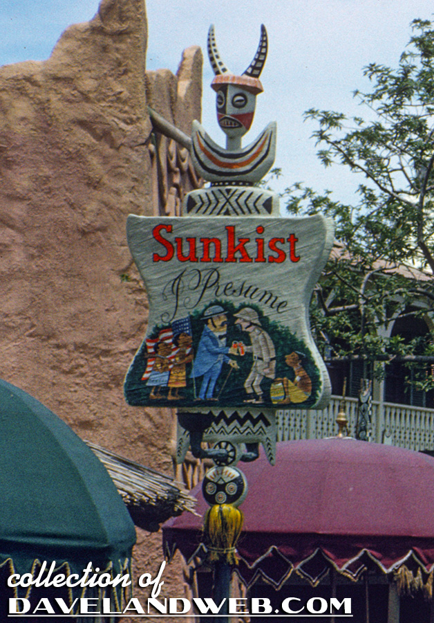
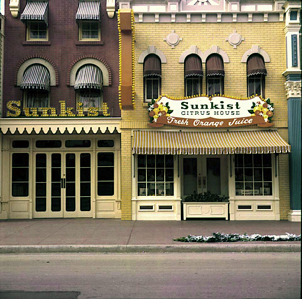
Truth be told, I'm sensitive about this Starbucks thing because I used to work at Sunkist! It too was a big styled interior with a giant "Grandma Moses" style mural and oranges making their way through it. Somehow I'll give it a free pass for being out of period but being wholly unique. I mostly worked in Adventureland. Notice how big the sponsor's name was in relation to the name of the facility back then.


CTCT_1963_N05R_d1.jpg
SunkistCitrusHouse.png
 

lazyboy97o

Well-Known Member
I think what disturbs me most about the Starbucks issue (and prior similar discussions) is how many people just do not know their history. It astonishes me how many people don't realize the age of Coca-Cola. How many people today would understand the reference in the name "Sunkist I Presume"? Or get Schweitzer Falls on the Jungle Cruise?
 

KevinYee

Well-Known Member
It's as if Disney mythology has become a "theme" in of itself, apart from any transportive world. Of course, guests come to see and hear "Disney" so it seems justified to a degree. But I wonder if there is line that gets crossed when areas just become references to Disney versus the settings from the films themselves? Isn't it funny that guests look for Hidden Mickey's (and love it I might add) as a creative replacement for immersive detail that supports the land or theme itself. Maybe I'm taking this way too far?

I don't think you're taking it too far... i think you are spot-on as usual.

Baudrillard would have a field day with that. People now seek the simulation of the simulation. It's enough to make me want to embrace the Last Child in the Woods movement.
 

lazyboy97o

Well-Known Member
I don't think you're taking it too far... i think you are spot-on as usual.

Baudrillard would have a field day with that. People now seek the simulation of the simulation. It's enough to make me want to embrace the Last Child in the Woods movement.
This is why I dislike Disney's more recent endeavors in Victorian design and the constant Armchair Imagineering for more Victorian design, like redoing the Transportation and Ticket Center. We've discussed Mictorian design before, and that is what it is, not a simulation of Victorian design, but a simulation of Disney's previous simulations of Victorian design.
 

englanddg

One Little Spark...
Carsland is a great reveal when you enter from the back, not down the street.
I'd agree. Coming through Bugsland (or whatever that kiddy area is) into it is not at all the same as walking into it from the rear entrance.

All the articles I read showed the rear entrance, so that's what I expected...it wasn't what I got (at least on the first walkthrough...we later walked in through the back)...and from the back, THAT is really fun. Especially if you catch it during a parade and slow down and read the signs.

Just...nice. Very nice.
 

flynnibus

Premium Member
I'd agree. Coming through Bugsland (or whatever that kiddy area is) into it is not at all the same as walking into it from the rear entrance.

The north side (near the front of the park) is what's left of the bountiful farms portion of DCA. A section completely dissected and decimated through the revamp. Basically the only thing left is the restaurant, blue sky celler (which itself is intended to be temporary), and its tough to be a bug. The complete wasteland it is doesn't help either. Most people think its just some random walkway these days :)

I like the street entrance as well.. I think it just pales compared to the arch entrance in terms of unwinding and of course the cars zipping by :)
 

englanddg

One Little Spark...
The north side (near the front of the park) is what's left of the bountiful farms portion of DCA. A section completely dissected and decimated through the revamp. Basically the only thing left is the restaurant, blue sky celler (which itself is intended to be temporary), and its tough to be a bug. The complete wasteland it is doesn't help either. Most people think its just some random walkway these days :)

I like the street entrance as well.. I think it just pales compared to the arch entrance in terms of unwinding and of course the cars zipping by :)
My trip to DCA, having always done WDW and never been...was just odd.

I enjoyed it and much of the theme...same with DLC...but...well, it was just interesting.

Certainly more eye for detail overall at DLC, I think. But it's less "grand" than WDW (ah, the blessing of size).

Anyhow, I didn't mind the street entrance until we walked the other entrance later. I still don't dislike it...but after your explaination (a history of that park that I was not aware of), it makes more sense why it feels disjointed.

And you are correct...I did think it was a "random walkway"... <grin>
 

Eddie Sotto

Premium Member
I don't think you're taking it too far... i think you are spot-on as usual.

Baudrillard would have a field day with that. People now seek the simulation of the simulation. It's enough to make me want to embrace the Last Child in the Woods movement.

Eventually they find out that the simulation does not emotionally work anymore. I.E. "Pay no attention to the man behind the curtain."
 
Last edited:

Eddie Sotto

Premium Member
This is why I dislike Disney's more recent endeavors in Victorian design and the constant Armchair Imagineering for more Victorian design, like redoing the Transportation and Ticket Center. We've discussed Mictorian design before, and that is what it is, not a simulation of Victorian design, but a simulation of Disney's previous simulations of Victorian design.

"Micktorian" (or "Clicktorian" if you are referring to CAD degraded Victorian) has become the architectural language of generic Disney. I'm not sure that I hate it if it's done well, but it does start to look like it came out of a tube. Kind of like British Colonialism, it takes over and the Sun never sets on it.
 

Eddie Sotto

Premium Member
So you may ask, why Victorian and not Contemporary? It's relatively timeless and was the style chosen as an extension of Main Street to live outside the berm originally (Group Sales, Kennel, Tickets, etc). So this look gets extended further and further. It's also optimistic and when treated in a "dollhouse" like scale has the Disney innocence. On the WDW property the period look extended to the water craft so that kind of set the tone. I still love those boats, and not opposed to Victorian as an out of berm style when it makes sense, and like anything needs to be well done.
 
Last edited:

Eddie Sotto

Premium Member
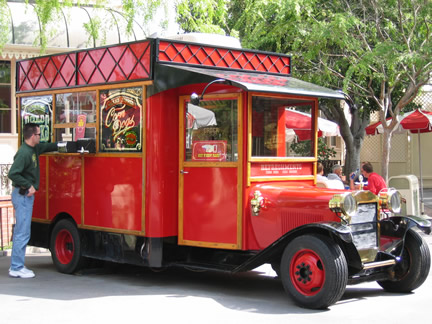
There are great examples of creativity and good theming too. For every contrived food stand with fake recycled "crates" almost hiding a computer screen, there is something awesome like this food truck in DAK or the Corn Dog Truck at DL. There's nothing better than well done honesty. The galvanized tub (crate shot below) seems "invisible" because it makes sense, but do the colorful aged crates? They almost become distracting because they are working too hard to hide something. It's a tough call and not an easy design assignment. I've done the same thing with crates myself. I guess the lesson is that you try to stick to what is logical and make that work in a unique way. Seamless logic becomes "hiding in plain sight". In this case it's a food truck, you embrace that it's fun. I like that they are both uniquely worthy of posting a picture on Instagram.
3086547503_b7ff8cbbf5_z.jpg
CornDogTruck.jpg
DSCN1487.JPG
 
Last edited:

Register on WDWMAGIC. This sidebar will go away, and you'll see fewer ads.

Back
Top Bottom