Eddie Sotto's take on the current state of the parks (Part II)

RandySavage

Well-Known Member
However, I think that weather plays an important difference with how we feel about older versus newer buildings of the same style. There's some beauty that's created by the work of God through sun and rain that new buildings by definition cannot capture. The patina of copper, the silvering of certain types of wood, the softening of stone.

I agree. Natural materials are key. I think a little more weathering and aging (not dilapidation) would make some of the perfectly pristine elements of the park's (e.g. HK's Mystic Manor) look even better.
 

Eddie Sotto

Premium Member
CAD is not the issue. CAD is a tool. Education is the issue. Most architecture programs do not teach traditional architecture. Most architects are not trained traditional proportions, and ornament is looked down upon. It's easy to try and copy an architectural style. It's hard to pull it off.

The program I went through the first project was to draw a doric order study, then study a building which used the doric order, then design a building which used the doric order, Ionic Order, rinse and repeat. Though my own design sense leans modern, I am a fully trained classicist. Most new classical work is awful, and is like nails on chalkboard to me, as I know how it should be.

I said that earlier and you are right that CAD is a tool, yet it is not sympathetic to free hand drawing (harder to create tapered columns and sculptural elements) so I refer to it as more of a "crayon". You can create those elements in CAD, but in my experience the results are limited by the software or are potentially more time consuming. Corinthian Columns might have been a different and harder assignment. Many firms scan in hand drawn elements as additional detail as the amount of time it takes to build a capital is too intensive and still not elegant enough. The point of all of this is that in the days of hand drawing, you could not hide the lack of training behind the machine, you either knew it or you didn't. We hired 80 year old set designers for DLP to hand draw elegant half and full size details, and generate elevations for the new areas of Main Street, scanned them into sheets and then the rest of the building was in CAD.

I applaud you for learning those Classic, lesser used styles! Do you freelance?
 
Last edited:

Eddie Sotto

Premium Member
Great observations, Randy, and oh my gosh- you should be an Imagineer! I am not a professional at all in these areas of discussion and have little to add from that perspective. However, I think that weather plays an important difference with how we feel about older versus newer buildings of the same style. There's some beauty that's created by the work of God through sun and rain that new buildings by definition cannot capture. The patina of copper, the silvering of certain types of wood, the softening of stone.

Good point, nothing beats the effects of time. Knott's Berry Farm's Ghost Town had that going for it. The rusty patinas, natural sagging on the timbers and wear on the handrails lent lots of credibility to the place.
 
Last edited:

Eddie Sotto

Premium Member
While I certainly agree that the entrance to Main Street now feels less special and dramatic in its new surroundings, I now get that feeling of awe even stronger when I come in via tram or through Downtown Disney. I'm not sure why. Maybe the initial sights from either route (large fountain and World of Disney by the tram exit and the gardens or the Rainforest Cafe building) tell me I'm on the property before I even get the park. The lackluster piece is getting through security and seeing nothing special in the area between DL and DCA. That surprises me and seems to diminish that special feeling.

Both situations have their advantages and it's not like DTD does not work, only coming from the ordinary parking lot to the themed world had a far greater sense of juxtaposition and contrast, that's all.
 

lazyboy97o

Well-Known Member
Both situations have their advantages and it's not like DTD does not work, only coming from the ordinary parking lot to the themed world had a far greater sense of juxtaposition and contrast, that's all.
This is where I think CityWalk at Universal Orlando Resort works well. It's contemporary design offers a strong contrast to Islands of Adventure's Port of Entry. The mission style of the entry to Universal Studios Florida starts something, but quickly falls apart upon entry into the park.
 

The Empress Lilly

Well-Known Member
Anybody else confused by the exterior of the new restroom facility at the USA Pavilion?

http://www.wdwmagic.com/attractions...new-american-adventure-restrooms-now-open.htm
Way ahead of ya!

Con:

- No benches for the people waiting outside. Do they have to sit on the flower beds?
(Personally, I am beginning to suspect benches are removed to force people into restaurants for rest and relaxation)
- The entire garden area has been reduced to a toilet area. Noboy can linger here anymore. After all, who hangs out in front of a bathroom?
- What is that wooden 'construction beam' portico all about? That is not a proper covering, that is the building skeleton.
- What is that material on top anyway? A piece of transparant plastic? Above the portico? Are they serious?
- Weird mixture between traditional and modern style elements, everywhere. For example the tiles, some of which look like 1895 wallpaper, some like 1995 swimming pool tiles. (I understand that in a way this is the new design sensibility for the entire pavilion, to make the AA contemporary instead of periodical, the design therefore reflecting layers of history on top of each other)
- Period elements feel like mere additions, without proper thought to function or use. For example, the curved wooden 'window frames' around the mirrors. 'Let's add some traditional style elements...gimme the catalogue....oh look!...these window frames we can glue to the wall by the mirrors'.
- Too many colour schemes at once.
- AA CM's wear flight attendant costumes now. Perhaps unrelated at first sight, but like the bathrooms the new uniforms stink.


Pro:
- Classy, restrained signage everywhere.
- The bathrooms do not look cheap. A bit like the repurposed 20k plot in FL, or the Rapunzel bathrooms, you can not fault TDO for being cheap.
- More bathrooms were seriously needed in this area. This IS TDO catering to actual guest wellbeing, investing money without direct return.
- Erm...
 

The Empress Lilly

Well-Known Member
I think classical pencil and drawer design yields different results from computer aided design by sheer force of technology.

A periodical style is the product as much of technology as of fashion. CAD may be a crayon, not lending itself to classical refineries. But this is not just a loss. CAD openes new avenues that hitherto could barely be dreamed of. You can click and drag an entire building design, the computer drawing out the result in front of you before your very eyes. It would take twenty clerks eighty years to calculate the load bearing of ten thousand crooked beams (say, of a Chinese olympic sports venue). Whereas a computer does it instantaneously. This means you can experiment. You can point, click and drag your design to amazing forms, to unbelievably bended and twisted shapes. This yields a unique architecture.

I should put a picture here of the Bilbao Guggenheim, but of course this forum deserves the baby of that one, the Disney concert hall in LA:

Image-Disney_Concert_Hall_by_Carol_Highsmith_edit.jpg


It's a unique product of CAD. It not only couldn't have been designed without it, it is also the organic result of what happens when you add spaces into a computer and play with their forms. Modern architects do not have less craftsmanship, they have a different one. What use is Vitrivius to them, or mediaeval masonry? They are trained in CAD design, play with this, experiment with this. And so create a style for our age. And, if it were up to me, unique for our age. To every age its art! Neo-Victorianism belongs to the theme park.
 
Last edited:

The Empress Lilly

Well-Known Member
I agree. Natural materials are key. I think a little more weathering and aging (not dilapidation) would make some of the perfectly pristine elements of the park's (e.g. HK's Mystic Manor) look even better.
Natural materials are the best, you just can't compete with the natural patina of old stone, which gives old buildings a magical aura.

But not the Disney park! The castle parks are pristine. Old withour wear and tear. Even Frontierland.
 
Last edited:

The Empress Lilly

Well-Known Member
It's as if Disney mythology has become a "theme" in of itself, apart from any transportive world. Of course, guests come to see and hear "Disney" so it seems justified to a degree. But I wonder if there is line that gets crossed when areas just become references to Disney versus the settings from the films themselves? Isn't it funny that guests look for Hidden Mickey's (and love it I might add) as a creative replacement for immersive detail that supports the land or theme itself. Maybe I'm taking this way too far?
Don't get me started on Hidden Mickeys... :grumpy:

I don't hate them in itself, I hate how they have come to be regarded as a substitute for clever, surprising detail. And, although I guess this should really be a personal preference, I loathe how so many guests treat them as the height of experiencing Disney design.

But, to return to another topic from last page, my thoughts about Hidden Mickey's are as nothing compared to my feelings about the Starbucks invasion, on which I shall not dwell here. I have extensively spoken my mind about that over several other threads and would not want to sound like a broken record. Or frustrated. ;)
 
Last edited:

Omnispace

Well-Known Member
While I certainly agree that the entrance to Main Street now feels less special and dramatic in its new surroundings, I now get that feeling of awe even stronger when I come in via tram or through Downtown Disney. I'm not sure why. Maybe the initial sights from either route (large fountain and World of Disney by the tram exit and the gardens or the Rainforest Cafe building) tell me I'm on the property before I even get the park. The lackluster piece is getting through security and seeing nothing special in the area between DL and DCA. That surprises me and seems to diminish that special feeling.

I'm glad you enjoy the experience. I thought it was a nice environment the last time I visited there -- certainly more amicable than the utilitarian parking lot. My personal feeling is that the new entry area should have been more park-like than urban; more naturalistic than manicured -- less "designed" -- more neutral -- perhaps even in character to the Hub of Disneyland. If one needed to attach meaning to it, it could have represented Walt Disney's rural origins in Missouri or even pre-development California when he first arrived in the state. The urban character of the current area is almost as if Los Angeles has encroached onto the doorstep of Disneyland. There is no longer a break between Disneyland and the surrounding metropolis that allows one to make the emotional adjustment into the new experience. The parking lot accomplished that by being a massive void. A space such as what I describe would accomplish that break and could still include some elements to say it is "Disney".
 

Eddie Sotto

Premium Member
I think classical pencil and drawer design yields different results from computer aided design by sheer force of technology.

A periodical style is the product as much of technology as of fashion. CAD may be a crayon, not lending itself to classical refineries. But this is not just a loss. CAD openes new avenues that hitherto could barely be dreamed of. You can click and drag an entire building design, the computer drawing out the result in front of you before your very eyes. It would take twenty clerks eighty years to calculate the load bearing of ten thousand crooked beams (say, of a Chinese olympic sports venue). Whereas a computer does it instantaneously. This means you can experiment. You can point, click and drag your design to amazing forms, to unbelievably bended and twisted shapes. This yields a unique architecture.

I should put a picture here of the Bilbao Guggenheim, but of course this forum deserves the baby of that one, the Disney concert hall in LA:

Image-Disney_Concert_Hall_by_Carol_Highsmith_edit.jpg


It's a unique product of CAD. It not only couldn't have been designed without it, it is also the organic result of what happens when you add spaces into a computer and play with their forms. Modern architects do not have less craftsmanship, they have a different one. What use is Vitrivius to them, or mediaeval masonry? They are trained in CAD design, play with this, experiment with this. And so create a style for our age. And, if it were up to me, unique for our age. To every age its art! Neo-Victorianism belongs to the theme park.

Sure. All part of the evolution of architecture. Without a doubt, CAD has it's place and other software such as solid works allow for things to be done that would have been less feasible in the past. I'd argue that the craftsmanship comes second to the form in Geary's case, but that's fine. Waterjetting computer shapes and 3D printing is creating a smaller revolution in housewares and sculpture. Like the mechanical lathe allowed for gingerbread victorian, computers allow for a different type of "excess" in our day. Bilbao to me is great, but as "over the top" as a Queen Anne house. I enjoy it all.
 

Eddie Sotto

Premium Member
Anybody else confused by the exterior of the new restroom facility at the USA Pavilion?

http://www.wdwmagic.com/attractions...new-american-adventure-restrooms-now-open.htm
The inside seems to be a nice upgrade...However...considering all the exterior detail and cultural richness you find in the neighboring pavilions, you'd think that the USA learned little in 200 years. Like how to finish off a brick doorway with some trim. A blank wall as a focal point? That can't be finished, that's all I can say. So much for American "Adventure". Where is a Collection of American Roses, named for the first ladies? Benches with bronzes of Franklin and others? Something in that big empty area! and as you say, a bench or two..
 
Last edited:

Eddie Sotto

Premium Member
Imagineer Bob Gurr has a fun and refreshing article about how cars and the love of them has have changed over the decades. A nice break from globalization and janky moldings.

This sketch he did reminds me of the Batmobile. Alex Kerr did the one for TV but this one from the 1940's sure looks like an inspiration. Bob is a great guy and true talent.

http://micechat.com/42676-design-those-were-the-times-no-18-1946-futuristic-cars-arrive/
pica-610x381.jpg
 

The Empress Lilly

Well-Known Member
I thought it would be interesting to compare the AA bathroom work with a similar work by classical trained architects. How's that for synergy, two subjects rolled into one? :)
The building volume and style are roughly the same. The execution is very different. Is that owing to a clear difference in mastery of the subject matter? The setting and use are of course entirely different. Are the designers of the AA aiming for a different application of classical style elements altogether? A contemporary, experimental one?

The-American-Adventure-Pavilion_Full_19498.jpg;width=638

US-pavilion-venice-2007.jpg

The-American-Adventure-Pavilion_Full_19500.jpg;width=638


The architect is William Delano, trained in beaux-arts. The pavilion is from 1930, the 'Stati Uniti d'America' in the tympanum reveal it is located in Italy, build as the American entry for the Venice Biennale.

Bonus!
We all loves us some art, so here is a modern use of the American pavilion. A threadmill on an inverted tank. What delightful wit and social commentary! :)

images
 
Last edited:

RandySavage

Well-Known Member
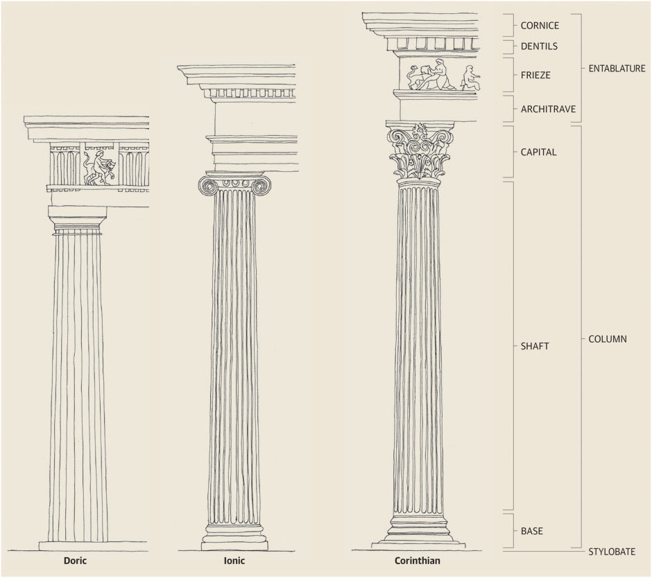
I do think that the bathrooms can be an interesting learning tool on the basics of Classical architecture.

The four things that jump out about the bathrooms to me are:

1. Columns are used to support an Entablature, and the end column shaft, classically, must align with the vertical edge of the entablature (as seen below). In these bathrooms, there are no end columns (or the 'end' columns are about a couple feet too far in).

2. The freize height, classically, should be in Proportion (proportion that was developed and perfected and used for millennia across all the western styles) to the column height. In these bathrooms, there is too tall a frieze, making the entablature out of proportion with the columns (as a whole looking too big and heavy for them).

3. The access point (typically a door, but here an opening) requires a surround. Here there is none.

4. The portico here (the slats or boards over the entryway) is not like any portico I've seen in the classic Federal or Georgian styles.

Empress Lilly's Delano example follows these basic rules of classical architecture.

Drawings-of-the-Greek-ord-001.jpg
 
Last edited:

Omnispace

Well-Known Member
I do think that the bathrooms can be an interesting learning tool on the basics of Classical architecture.

The four things that jump out about the bathrooms to me are:

1. Columns are used to support an Entablature, and the end column shaft, classically, must align with the vertical edge of the entablature (as seen below). In these bathrooms, there are no end columns (or the 'end' columns are about a couple feet too far in).

2. The freize height, classically, should be in Proportion (proportion that was developed and perfected and used for millennia across all the western styles) to the column height. In these bathrooms, there is too tall a frieze, making the entablature out of proportion with the columns (as a whole looking too big and heavy for them).

3. The access point (typically a door, but here an opening) requires a surround. Here there is none.

4. The portico here (the slats or boards over the entryway) is not like any portico I've seen in the classic Federal or Georgian styles.

Empress Lilly's Delano example follows these basic rules of classical architecture.

I bet those columns make a nice hollow sound when you knock on them. :)
 

BalooChicago

Well-Known Member
I said that earlier and you are right that CAD is a tool, yet it is not sympathetic to free hand drawing (harder to create tapered columns and sculptural elements) so I refer to it as more of a "crayon". You can create those elements in CAD, but in my experience the results are limited by the software or are potentially more time consuming. Corinthian Columns might have been a different and harder assignment.

We went through all the orders our sophomore year, then were required to spend two semesters in Rome studying, and traveling throughout Italy 3rd year. We weren't allowed to use CAD until our fourth year (of a 5 year professional - B.Arch program). It's a pretty cool program, and pretty unique.

I applaud you for learning those Classic, lesser used styles! Do you freelance?

Sadly I do not. The one project I can take full credit for designing is a classical project no-less, but my preference is modern, and my "designer" days are behind me. (I did interview with imagineering after Rome) My career has taken me in a more technical direction, designing and developing details that support other designers visions.

I do know many people who are practicing classicists - some of whom would make Wren jealous of their talents.

The Tuscaloosa Federal Courthouse by HBRA is, in my opinion, the best work of classical architecture in nearly a century.
 

Register on WDWMAGIC. This sidebar will go away, and you'll see fewer ads.

Back
Top Bottom