peter11435
Well-Known Member
Like the swan and dolphin tower over yacht club and boardwalk?Totally different, Grand Floridian doesn't tower over Poly.
Like the swan and dolphin tower over yacht club and boardwalk?Totally different, Grand Floridian doesn't tower over Poly.
Like the swan and dolphin tower over yacht club and boardwalk?
Like the swan and dolphin tower over yacht club and boardwalk?
That was their choice in order to complete EPCOT Center. The developers of EPCOT (The Tishman Group) were given permission to build the Swan and Dolphin buildings on land leased from WDW, due to funding shortfalls. But that's a whole other conversation.There you go Skippy, you've found one that actually makes more sense. I think Disney should have never allowed Swan and Dolphin to be put on property. It's too visible from multiple locations.
But the resorts are at least separated. Unlike CBR and Riviera, which feel like they are right next to each other.
Yep. I’ve seen video of the parking lot tram that used to run back there. The literal Boardwalk is older than the Boardwalk Inn. Very weird to see the fancy Boardwalk with no hotel there.Y'all seem to be conveniently forgetting that the Swolphin predated Boardwalk, Yacht, and Beach. Disney choose to clash with the "thematic harmony" of the Dolphin and Swan when they created the seaside resort complex.
...ugh...
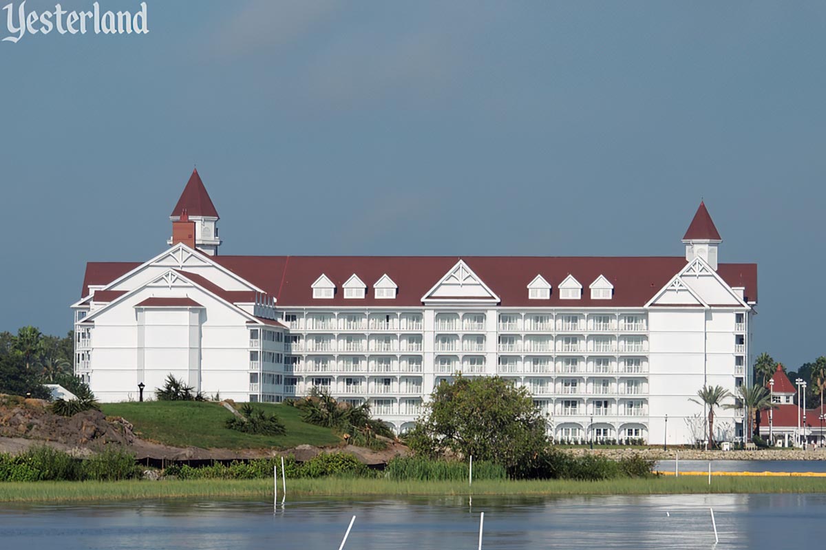
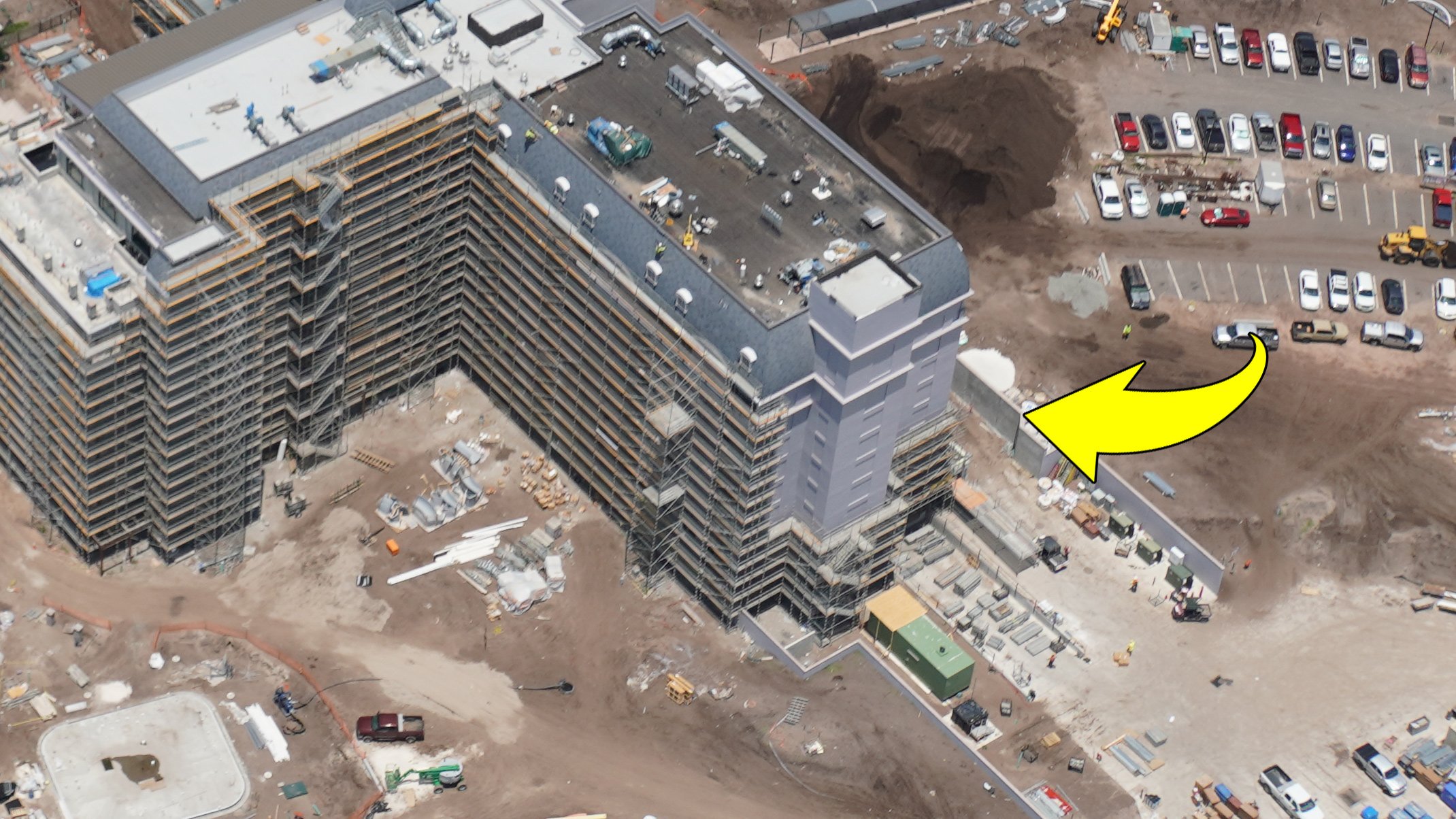
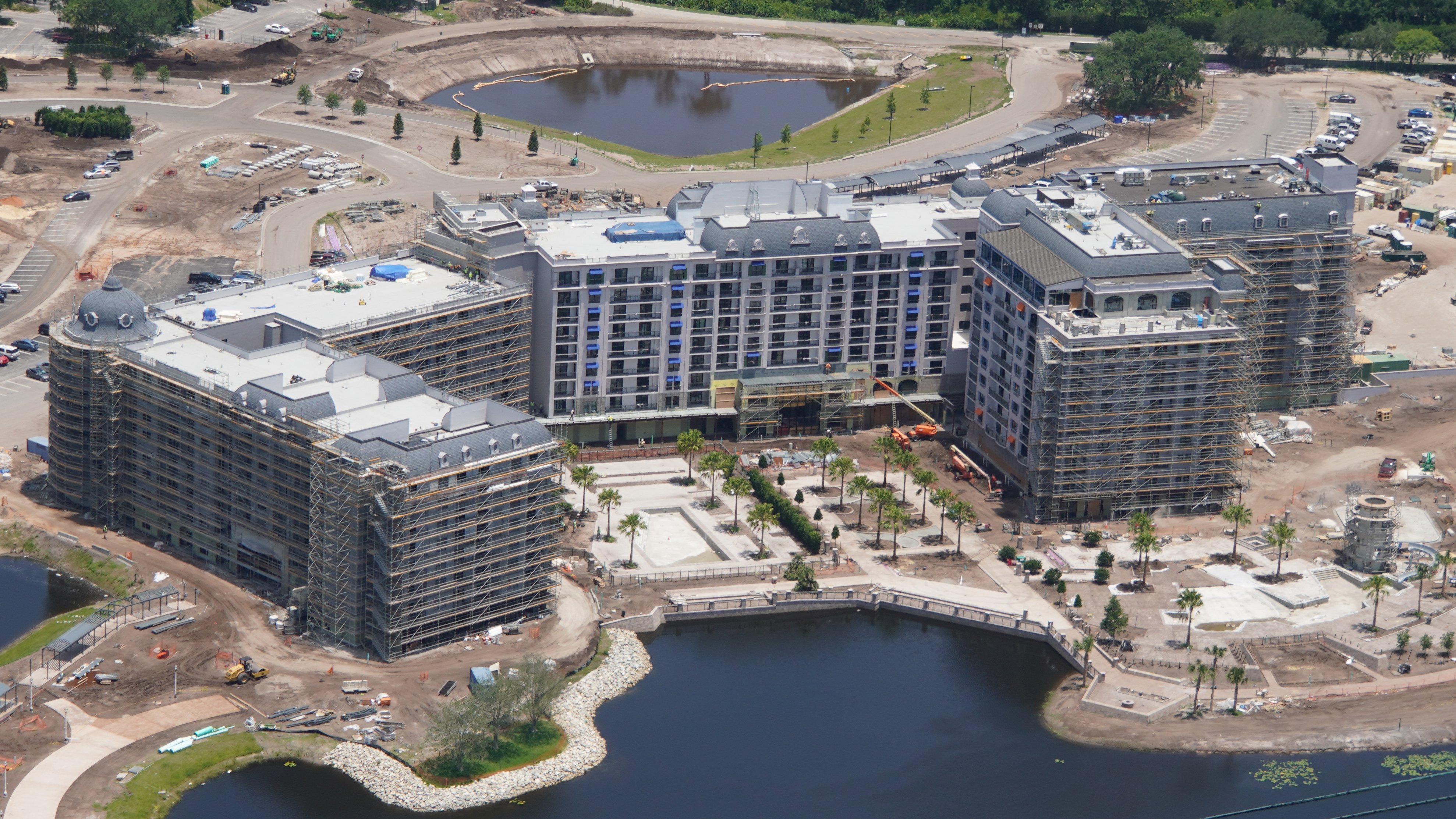
Yeah, this building is what it is at this point. It's not like a LEGO set where they are just gonna pop a curved piece on there.if it's not there now, it's most likely not coming... It is too large an element to pop on the top after all the scaffolding comes down...It would have been framed up with the rest of the building.
I wish at the very least they would have (or still can?) plant some tall palms or even non-palm trees that grow taller for those blank ends of the GF DVC building. It's really so ugly from that angle. The approaches on the monorail coming from the Polynesian and the walkway from the original buildings are fine, but the lagoon-side is awful which is a shame....ugh...

From a Bioreconstruct tweet a couple days ago, I'm not sure if there are plans to "roof" that section:

Especially considering how there isn't any other section of the hotel that looks like that part:

Thing is, it'd probably look awkward with trees in those spots. Just big blotches of green in the middle of a pure white building. Some added detail to the building in those spots would work but there's no ROI on doing that.I wish at the very least they would have (or still can?) plant some tall palms or even non-palm trees that grow taller for those blank ends of the GF DVC building. It's really so ugly from that angle. The approaches on the monorail coming from the Polynesian and the walkway from the original buildings are fine, but the lagoon-side is awful which is a shame.
Yeah, the best we can hope for now is that they paint it blue, then it'll be invisible. LolYeah, this building is what it is at this point. It's not like a LEGO set where they are just gonna pop a curved piece on there.
As I said above, I wonder if it would look worse to just paint on some fake windows and detailing? Unlike Riviera, this side of VGF is actually visible from some significant public areas, right?Thing is, it'd probably look awkward with trees in those spots. Just big blotches of green in the middle of a pure white building. Some added detail to the building in those spots would work but there's no ROI on doing that.
View attachment 375057
Oops. Yeah, I agree about the faux windows.but why didn't those units on the end get the benefit of added windows and views? (this is direct waterfront) Why at the very least were there not faux windows added to the structure to at least make it look complete? ...
All hallmarks of shoddy design.
Half of what you see where those blank walls are on the VGF is either bathroom or closet, depending on the direction you are facing. They could have tried to put a window near the end, but that would be over the headboard or a TV, again, depending on the direction, and not feasible honestly. Faux windows would be the only realistic solution to breakup the boring facade.Oops. Yeah, I agree about the faux windows.
I read on another thread that they wanted to keep the rooms more consistent - though I agree that it seems like it would make more sense to have a category of room with even better views and more points? OTOH, I wonder if the windows would interfere with the interior layout? I know that DVC rooms use a lot of the wall space for murphy beds.
Half of what you see where those blank walls are on the VGF is either bathroom or closet, depending on the direction you are facing. They could have tried to put a window near the end, but that would be over the headboard or a TV, again, depending on the direction, and not feasible honestly. Faux windows would be the only realistic solution to breakup the boring facade.
My assumption is that it may have something to with building codes. Just an assumption.On the ends of the original outer resort buildings at the GF the stairwells are only semi-enclosed which at least provides some visual interest even if it is only of a staircase. I'm curious as to why this detail wasn't carried over. I don't suppose they would have done this on a new build like Riviera, however.
My assumption is that it may have something to with building codes. Just an assumption.
Register on WDWMAGIC. This sidebar will go away, and you'll see fewer ads.