Carousel of Progress Sign Change

coolmark18

Member
I think as a Temp sign, it would be improved ten fold if they just filled in the wire letters. The fact they no solid makes them really hard to read.
 

TP2000

Well-Known Member
Where is that from?

Wait a minute... Is that the house of the future on the left?

That's the Disneyland Clock Of The World that stood at the entrance of Tomorrowland from 1955 to 1966.

And yes, that's the Monsanto House Of The Future on the left of this picture. But notice the first-generation round Skyway buckets passing unobstructed over Snow Hill in the background, plus they've moved the flags from the Court Of States out from where Walt installed the Astrojets in '56 to the Tomorrowland entrance, which dates that picture as being from 1957 or 1958, after the Monsanto house opened in summer '57, but before the Matterhorn arrived in 1959.

.
 

TubaGeek

God bless the "Ignore" button.
Apparently they're so embarrassed by what's in the building that they decided to put it into "stealth mode".
Don't get me wrong, it's one of my favorite attractions, but that last act is just laughable, and not in a good way.
 

coolmark18

Member
Apparently they're so embarrassed by what's in the building that they decided to put it into "stealth mode".
Don't get me wrong, it's one of my favorite attractions, but that last act is just laughable, and not in a good way.

I actually really like the last act because at the time it was created thats really what they thought it would be like. Not so much as a state-of-the-art attraction but as a bit of Disney history - I realli like it.
 

Mansion Butler

Active Member
I actually really like the last act because at the time it was created thats really what they thought it would be like. Not so much as a state-of-the-art attraction but as a bit of Disney history - I realli like it.
It was put in six years before the actual year it represents, and it looks like 1994. They talk just a tiny bit about new technologies, but mostly they're talking about current technologies.
 

Admiral01

Premium Member
cop1988.jpg


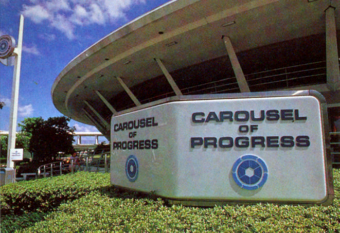
Icons like this and the original Epcot batch really show how ahead of the time they were. You could bring that back today with updated type, and it wouldn't look out of place at all.

One of the little things I miss about that EPCOT Future World pavilions (and CoP) is the logos. They really worked for me. I don't think they seem dated at all. They are such a small thing, but I would love to see them back.
 

JustInTime

Well-Known Member
One of the little things I miss about that EPCOT Future World pavilions (and CoP) is the logos. They really worked for me. I don't think they seem dated at all. They are such a small thing, but I would love to see them back.

That looks very dated. And it feels out of place in Magic Kingdom. I mean, it's Tomorroland. Not Yesterland.
 

GymLeaderPhil

Well-Known Member
That looks very dated. And it feels out of place in Magic Kingdom. I mean, it's Tomorroland. Not Yesterland.
Personally I think they could easily pull off a modern look with a similar sign as the one posted above. The logo itself is brilliant because it accurately depicts how many show scenes, theater cars, and the direction the theaters travel in.

I hope that COP eventually gets the refurbishment it deserves.
 

Thrill Seeker

Well-Known Member
That looks very dated. And it feels out of place in Magic Kingdom. I mean, it's Tomorroland. Not Yesterland.

If you remember the old TTA spiel, CoP was presented by the Tomorrowland Retro Historical Society. Slap a logo for that on the old sign as well as a new font and you have a winner!
 

Sassagoula-Rvr

Well-Known Member
Those pictures are what disappoints me....Ik Walt is long gone, but in the spirit of what makes Disney...Disney. Does anyone else wish that TDO would say, "We're not having this anymore, we're going to do the little things like not have dirty/unpainted signs..." etc.
 

flavious27

Well-Known Member
Personally I think they could easily pull off a modern look with a similar sign as the one posted above. The logo itself is brilliant because it accurately depicts how many show scenes, theater cars, and the direction the theaters travel in.

I hope that COP eventually gets the refurbishment it deserves.

Agreed, the logos properly show the theme of the attraction without having to add any text.
 

aladdin2007

Well-Known Member
Just had a thought, maybe this sign is in fact temporary while they redo the one that was there into a special 40th anniversary sign version? probably unlikely but :wave:
 

Thurp

Member
If you look at bottom of the sign, the way it's anchored, it definitely looks temporary. Or they went the cheap route all around.
 

acr123

Member
Just had a thought, maybe this sign is in fact temporary while they redo the one that was there into a special 40th anniversary sign version? probably unlikely but :wave:

Im pretty sure we are either getting a new sign or the old one is being re-done in some extensive way. That is my guess. I just cant imagine the sign that is out there now being perminant.....I just cant.
 

devoy1701

Well-Known Member
I'm really hoping here that a CoP upgrade/redo is in order for the 40th. That and the Jungle Cruise. WDW has so much potential and opportunity to please all of us fanboys...I hope they take a lot of these chances!
 

Register on WDWMAGIC. This sidebar will go away, and you'll see fewer ads.

Back
Top Bottom