-
Welcome to the WDWMAGIC.COM Forums!
Please take a look around, and feel free to sign up and join the community.
You are using an out of date browser. It may not display this or other websites correctly.
You should upgrade or use an alternative browser.
You should upgrade or use an alternative browser.
Carousel of Progress exterior refurbishment
- Thread starter WDWtraveler
- Start date
punkabella
Well-Known Member
I love it! The typeface and color choices are excellent! Who'd think that a bit of paint would make us so happy?!? I'd love to see more painting for other attractions in need of a redo get something that matches the theme of the attraction as well as this does.
COProgressFan
Well-Known Member
It is really amazing what a little paint can do!
A thorough painting and scrubbing would do wonders for Tomorrowland. Most of the fixtures, trim, railings around Peoplemover tracks (above MILF and Stitch) are just filthy.
Goofyernmost
Well-Known Member
You're right though, I'm sure he didn't have it in mind and he shouldn't have because it was one small park unlike WDW which, overall, covers acres and acres. However, I'm not entirely sure he would have been that unhappy about it as long as people (families) were having fun together. Also it was a different world back then. The baby boomers were just getting big enough to independently walk and even as short a time as in the 80's it didn't occur to most of us to bring children young enough to require strollers. My daughters were 6 & 8 at the time of our first visit and it never, ever crossed our minds that our 6 year old couldn't keep up with us. She could and she did actually flex a muscle or two and still enjoy the experience. It is sad that so many people feel that they need to ride their kids around on their collective butts. But, alas, they do! The truth is though that I don't believe that Walt ever had anything related to strollers in his mind at all.All of those strollers make me sad.
I don't think that's the progress Uncle Walt had in mind. :\
+(Edit- thanks Goof. Wrong wording, but I'm glad you're paying attention!)
castlecake2.0
Well-Known Member
Marty called, wants changes!
raymusiccity
Well-Known Member
All of those strollers make me sad.
I don't think that's the progress Uncle Walt had in mind. :\
+(Edit- thanks Goof. Wrong wording, but I'm glad you're paying attention!)
Here's a great photo that's proof positive of the attractions load capacity. What's really ironic is your comment that the strollers make you sad. I was surprised to see this many strollers back in 1964-65 .......there's even a baby carriage !!
Looks like Walt pioneered the '20 minute waiting sign', too !
Wngo905
Well-Known Member
- In the Parks
- No
45 minute show of the Carousel of Progress?!!?! Wow, I would love to see that. Anyone know what was cut out of the DL version when it came here?
I am all for changing the outside and cleaning the inside. I would however, be truly sorry to hear the father's voice ever change. It is so memorable for me!!! If they could only find a way to incorporate "You'll Shoot Your Eye Out". They could also do a great commercial about soaps in the 50's "Over the years I got to be quite a connoisseur of soap. Though my personal preference was for Lux, I found that Palmolive had a nice, piquant after-dinner flavor - heavy, but with a touch of mellow smoothness. Lifebuoy, on the other hand... (Yechh!)"
KikoKea
Well-Known Member
Maybe they included a pre-show in that 45 min?45 minute show of the Carousel of Progress?!!?! Wow, I would love to see that. Anyone know what was cut out of the DL version when it came here?
I am all for changing the outside and cleaning the inside. I would however, be truly sorry to hear the father's voice ever change. It is so memorable for me!!! If they could only find a way to incorporate "You'll Shoot Your Eye Out". They could also do a great commercial about soaps in the 50's "Over the years I got to be quite a connoisseur of soap. Though my personal preference was for Lux, I found that Palmolive had a nice, piquant after-dinner flavor - heavy, but with a touch of mellow smoothness. Lifebuoy, on the other hand... (Yechh!)"
MissM
Well-Known Member
Oh! I forgot. I was there Saturday and took a few pics of the continuing exterior painting. It's still a work in progress. Some areas are still white (see far left on first pic) but the upper level is blue with some stripes that are still being worked on. Sorry they're blurry, I was on the PeopleMover! 
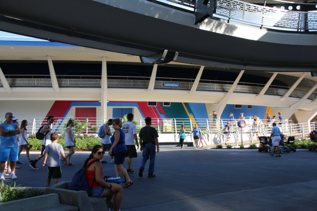
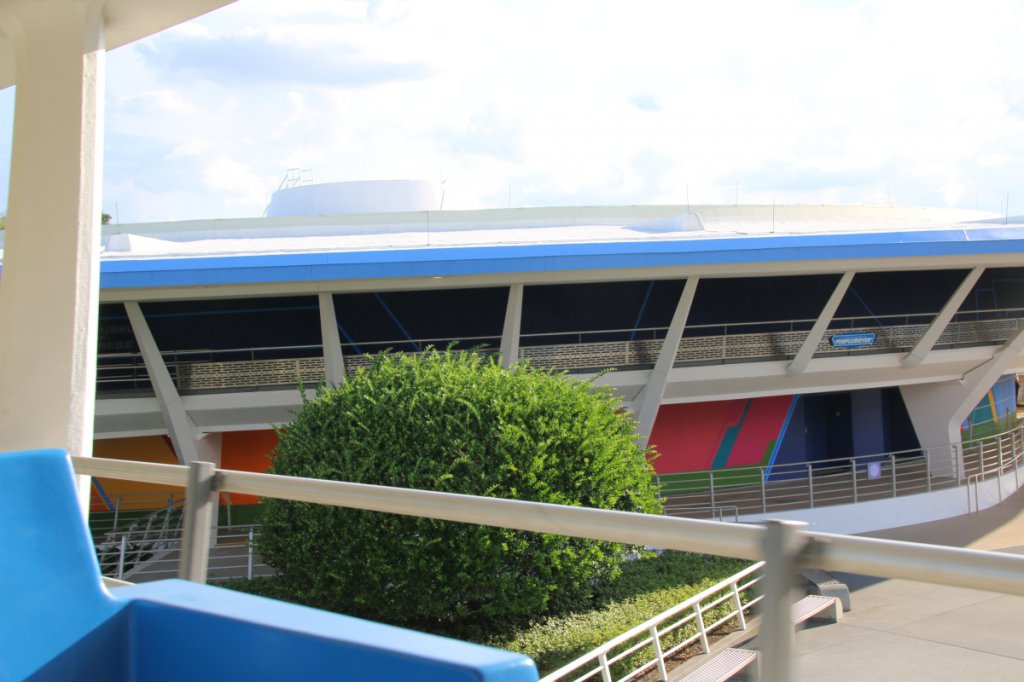
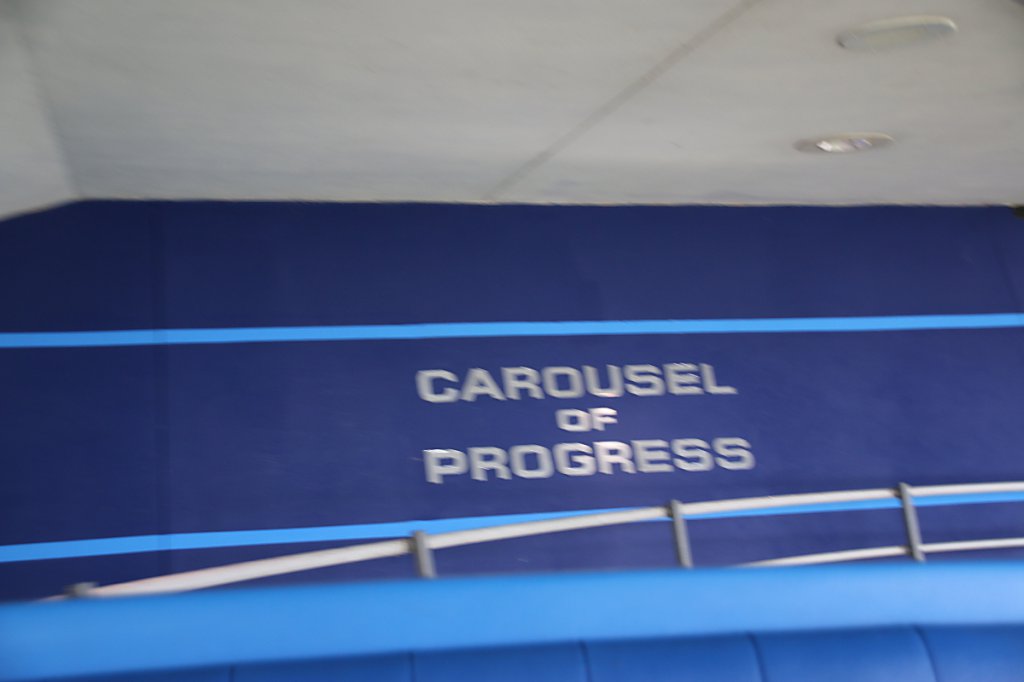
raymusiccity
Well-Known Member
Maybe they included a pre-show in that 45 min?
The Worlds Fair version included additional levels and presentations to show off 'The wonders of General Electric'.
Some portions seem to be the basis for portions of 'Spaceship Earth'.
It's a perfect example of what Disney could accomplish in EPCOT with the right corporate sponsors!

"The Carousel of Progress, which was the first portion of Progressland, was on the second floor of the pavilion. When the audience was invited on stage in the final act ... they entered a moving ramp that would take them up to the third floor's show ... The ramp developed into a tube enclosed in special mirrors which created a kaleidoscopic montage by reflecting activities in the area at the top of the ramp. This was a natural progression, because when the audience emerged on the third floor, they would find themselves in the 160-foot long "Corridor of Mirrors."
Visitors file out of the Finale theater and up "The Gateway to Future Progress," as the "Time Tube" moving ramp came to be known.
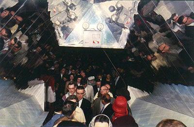
Something that G.E. expressed interest in having in the Pavilion was an exhibit(s) that would showcase their employees and the job they were doing. "We wanted something so that our share holders could see what we were doing and be proud of," expressed [Pavilion Manager] Steve Van Voorhis. "The Corridor of Mirrors," the early working title, was the result -- the name was later changed to the "Galaxy of Science and Engineering." It featured hundreds of simulated stars twinkling overhead, as constantly changing color photographs of G.E.'s research, development, and engineering activities were projected on screens etched in the huge mirrors. Each project area was in the form of a symbol aligned with basic sciences.
After walking through the mirrored corridor, the audience would come to the second big show planned and designed by Disney, "The Skydome Spectacular."
KikoKea
Well-Known Member
My parents took us to the 1964 WF, but I was little and remember very little about it, so this is very interesting. Thanks for finding and sharing it.The Worlds Fair version included additional levels and presentations to show off 'The wonders of General Electric'.
Some portions seem to be the basis for portions of 'Spaceship Earth'.
It's a perfect example of what Disney could accomplish in EPCOT with the right corporate sponsors!

"The Carousel of Progress, which was the first portion of Progressland, was on the second floor of the pavilion. When the audience was invited on stage in the final act ... they entered a moving ramp that would take them up to the third floor's show ... The ramp developed into a tube enclosed in special mirrors which created a kaleidoscopic montage by reflecting activities in the area at the top of the ramp. This was a natural progression, because when the audience emerged on the third floor, they would find themselves in the 160-foot long "Corridor of Mirrors."
Visitors file out of the Finale theater and up "The Gateway to Future Progress," as the "Time Tube" moving ramp came to be known.

Something that G.E. expressed interest in having in the Pavilion was an exhibit(s) that would showcase their employees and the job they were doing. "We wanted something so that our share holders could see what we were doing and be proud of," expressed [Pavilion Manager] Steve Van Voorhis. "The Corridor of Mirrors," the early working title, was the result -- the name was later changed to the "Galaxy of Science and Engineering." It featured hundreds of simulated stars twinkling overhead, as constantly changing color photographs of G.E.'s research, development, and engineering activities were projected on screens etched in the huge mirrors. Each project area was in the form of a symbol aligned with basic sciences.
After walking through the mirrored corridor, the audience would come to the second big show planned and designed by Disney, "The Skydome Spectacular."
MissM
Well-Known Member
While we're on the subject of CoP updates, I noticed a few changes to the interior too. First off, my theater had freshly re-padded seats. (No photo but they were nicely plush.) Also, minor tweaks and updates seem to continue in the show scenes. Nothing huge or earth-shattering but proof at least it's getting some attention.
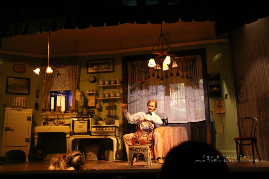
Though not the best image (someone put their head right in my shot!) you can see how the lighting in the second scene is much warmer and a much more appropriate feel of early evening as opposed to just random daytime brightness. It's more dynamic in person (I think my camera tried to "compensate" for the yellow tones! LOL)
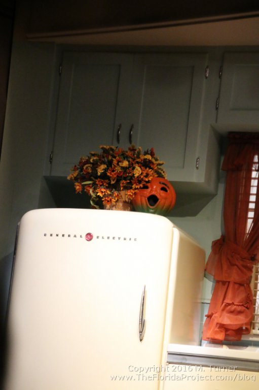
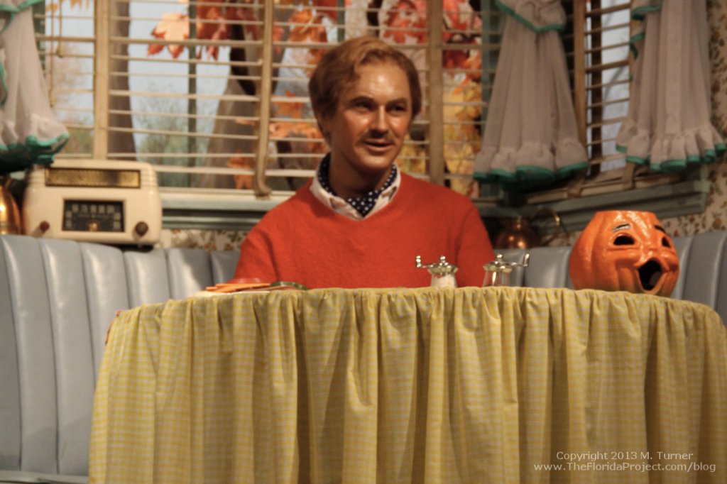
In the third scene, they moved the Jack O' Lantern from the table over to the top of the fridge.
(You can also see the difference in lighting color from the previous scene, with this having much more of the daylight feel.)
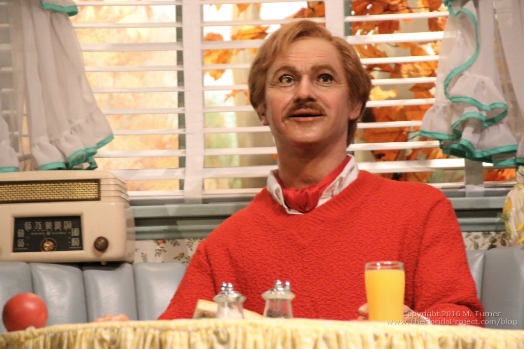
Here's how it looked a few years ago:
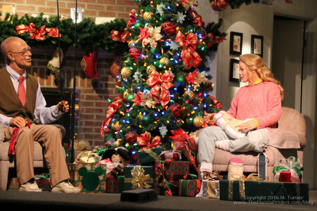
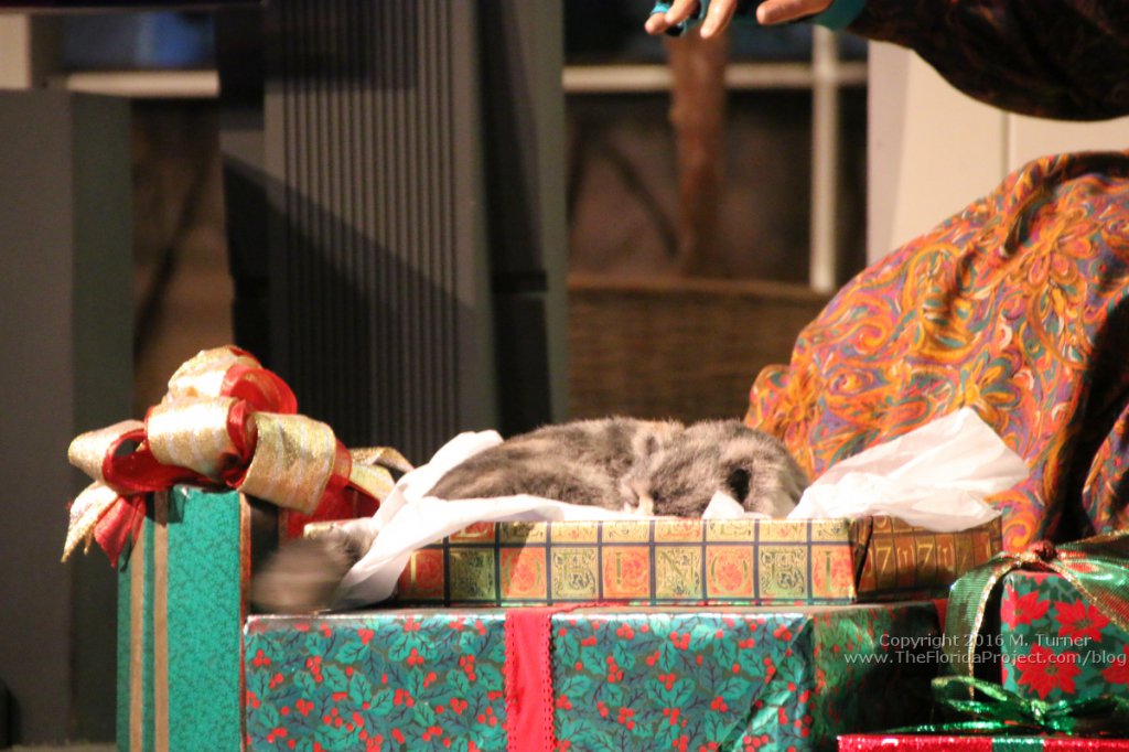
In the final scene, they added more gifts around Patty's feet, partially obscuring her tacky snow boots. Plus, they re-wrapped several presents with new paper. Most noteable is the one near Grandma and the cat that previously was HORRIBLY faded "Santa" paper. It looked so terrible before!
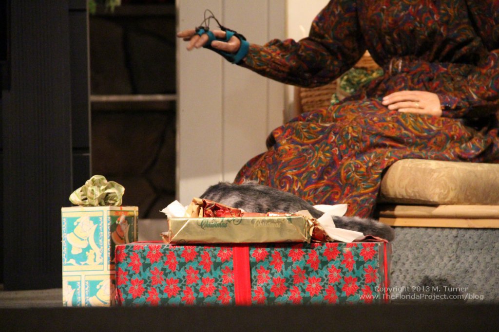
Again, compared to pics I found in my collection from a few years ago:
Anyway, I know most of these are small, tiny examples of details most people would never notice (we happen to ride it frequently and I greatly appreciate the small details of it!) but it's always nice to see it getting some love no matter how small.
I should also note Saturday we had quite a full theater despite the park being very empty that day and everyone applauded when we rotated back to offload! Made me smile.
Though not the best image (someone put their head right in my shot!) you can see how the lighting in the second scene is much warmer and a much more appropriate feel of early evening as opposed to just random daytime brightness. It's more dynamic in person (I think my camera tried to "compensate" for the yellow tones! LOL)
In the third scene, they moved the Jack O' Lantern from the table over to the top of the fridge.
(You can also see the difference in lighting color from the previous scene, with this having much more of the daylight feel.)
Here's how it looked a few years ago:
In the final scene, they added more gifts around Patty's feet, partially obscuring her tacky snow boots. Plus, they re-wrapped several presents with new paper. Most noteable is the one near Grandma and the cat that previously was HORRIBLY faded "Santa" paper. It looked so terrible before!
Again, compared to pics I found in my collection from a few years ago:
Anyway, I know most of these are small, tiny examples of details most people would never notice (we happen to ride it frequently and I greatly appreciate the small details of it!) but it's always nice to see it getting some love no matter how small.
I should also note Saturday we had quite a full theater despite the park being very empty that day and everyone applauded when we rotated back to offload! Made me smile.
Figments Friend
Well-Known Member
Looks like 'kitty' has been turned around as well, looking at the above 'before' and 'after' photos.
Now his back is to the audience, probably to draw more attention to his twitching tail.
I also see a 'hidden Mickey' that is not so hidden on one of those X-mas present wrappings.
-
Now his back is to the audience, probably to draw more attention to his twitching tail.
I also see a 'hidden Mickey' that is not so hidden on one of those X-mas present wrappings.
-
MissM
Well-Known Member
Yeah there are a few other assorted little changes scattered throughout but I didn't want to do a massive post detailing each one. LOL (The roses for Sarah on the table next to John are missing now from the first scene for example.) The kitty is a good one though since you can definitely see him better now. I actually like the fact there's always a kitty in among the scenes.Looks like 'kitty' has been turned around as well, looking at the above 'before' and 'after' photos.
Now his back is to the audience, probably to draw more attention to his twitching tail.
I also see a 'hidden Mickey' that is not so hidden on one of those X-mas present wrappings.
-
The Mickey on the present has actually been there for awhile but it's newer in the sense it wasn't there a few years ago. I think it showed up when they changed the tree lights to LED. They got noticeably brighter a few years ago. Probably about the time the tv went flat screen.
DznyRktekt
Well-Known Member
John's ascot/ neck scarf is red in the first photo and black with white dots in the second photo.
Register on WDWMAGIC. This sidebar will go away, and you'll see fewer ads.
