ToTBellHop
Well-Known Member
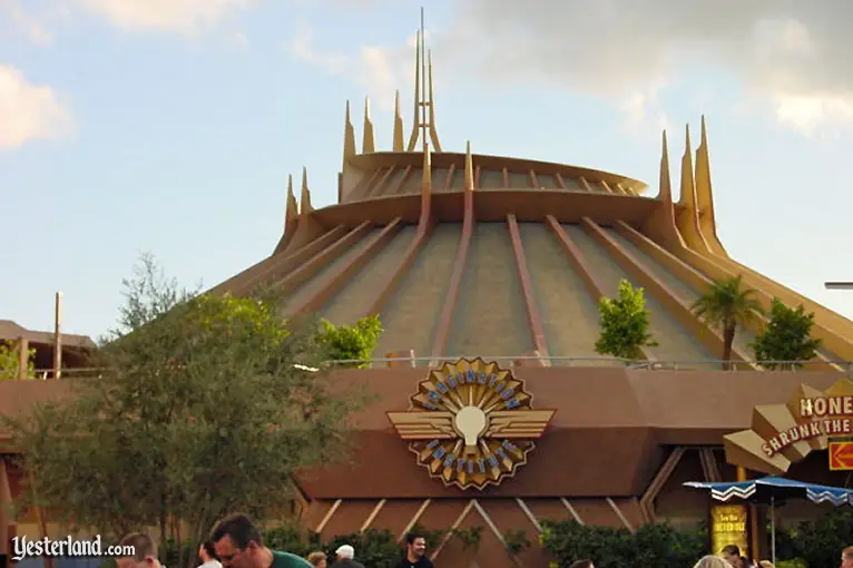
There's no reason Space Mountain couldn't have gotten a cool lighting scheme sooner to work with the rest of the land. At least it finally has awesome nighttime lighting now.
The entire 09 debacle was such a wasted opportunity.There's no reason Space Mountain couldn't have gotten a cool lighting scheme sooner to work with the rest of the land. At least it finally has awesome nighttime lighting now.
I'm not really sure what the cost would be, sorry. I don't think it would be as expensive as a new themed land, but it certainly wouldn't be cheap.What's do you suppose the rough cost of would be then?
I wouldn't imagine it would cost as much as something like Everest or Star Wars Land or Pandora...
OopsThe structure was 1967 vintage, does not make the rest any less true though.
I think the engineers knew but management wouldn't give them the budget necessary. This was during the reign of the notoriously cheap Paul Pressler.Honestly, Rocket Rods ticks me off. You'd think that some Disney engineer would have known to bank the turns, but apparently not. The plus side was that they retooled Test Track in the planning stages because of RR, but it's like no one at Disney had ever driven on a highway before (in terms of the turns on Peoplemover/RR).
One word - Yuck!Yeah and we saw at Disneyland what adapting Space Mountain to the new land aesthetic looks like.


Somebody knows something and he won't tell us.Very blue. And very white.
Isn't it?
The plus side was that they retooled Test Track in the planning stages because of RR, but it's like no one at Disney had ever driven on a highway before (in terms of the turns on Peoplemover/RR).
Somebody knows something and he won't tell us.
Worst Paint job in Disney history. That is it was until Guardians of the Galaxy:Mission Breakout.One word - Yuck!
Agreed.Worst Paint job in Disney history. That is it was until Guardians of the Galaxy:Mission Breakout.
Lovely. Was anyone else expecting purple?
Maybe it was already mentioned, but watching/listening to recent videos of the Peoplemover you don't hear the Stitch part anymore.
That looks absolutely beautiful. If the rest of the land were to follow that style I would cry tears of joy.One more from the peoplemover this time: View attachment 192398
Now if they would just remove that stupid stage that clogs up the area!

Or just move it to where it used to be and make it purpose built this time. Yes, the current one is a blot on the landscape and ruins the aesthetics of the land. A DJ shouting "yo yo yo" to the bass beat of this weeks bubblegum pop song that drowns out the area BGM is not what cohesive theming is about. Not that I'd assume the Walt Disney Company needs a lesson in theming....The TL stage is awful. Looks like it was pieced together by a local Orlando after-school theater club. Shanghai has a pretty nifty stage/dance area in comparison... maybe TDO can re-use those plans to save money.

Register on WDWMAGIC. This sidebar will go away, and you'll see fewer ads.
