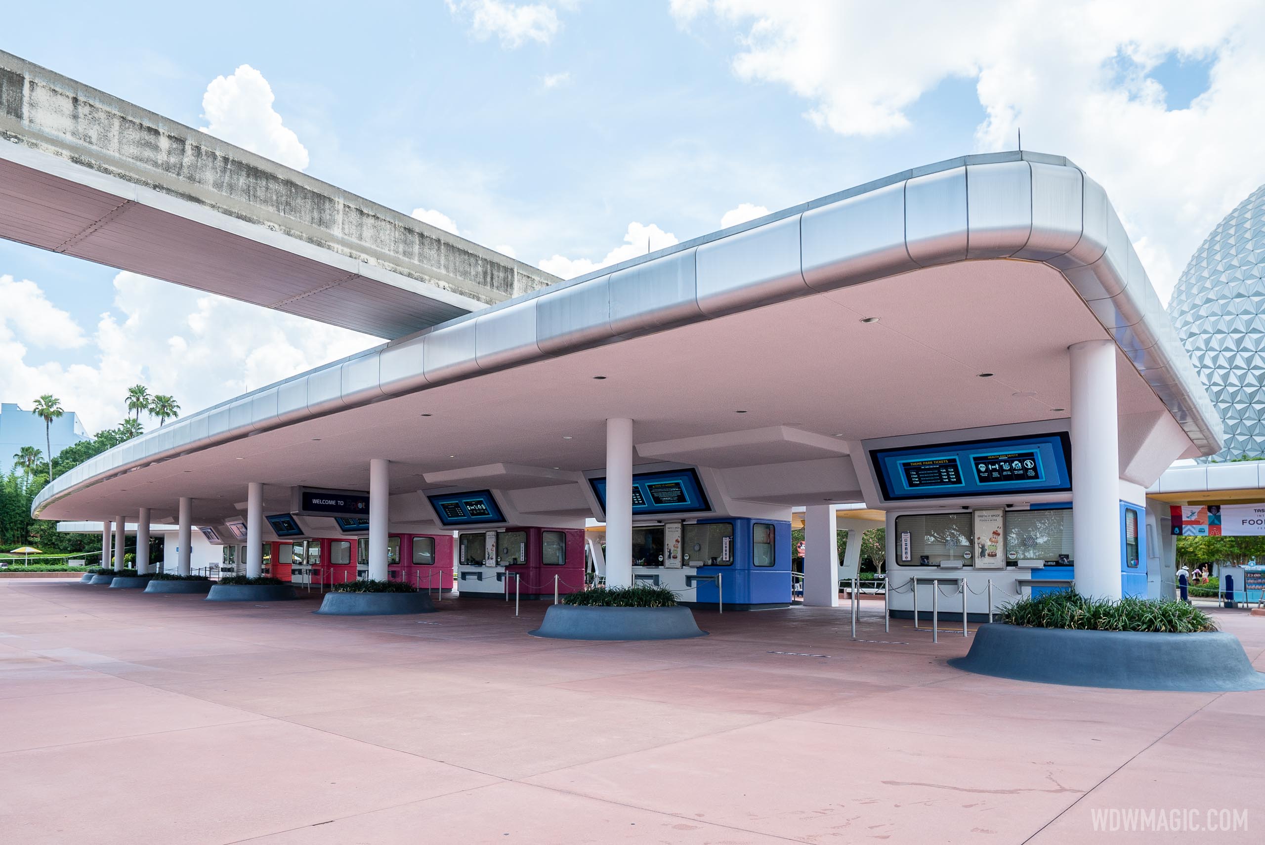
I...kinda like the new scheme for the ticket booths? No, I can't explain why, and the logical side of my brain keeps screaming I should in no way like this. Weird colors! Strange blocking! And yet...
I'm not saying it's the best thing ever, but I do think it's cleaner and brighter than what was there before. Removing the yellow from the ceiling makes a world of difference. Never liked that mix of pink concrete, purple walls, and yellow ceiling from the old scheme. Blegh...
Old:
From: https://www.burnsland.com/wdw/ec_tickets_703.shtml
New:
Good point on the logo colors. The booth colors are very clearly intended to match these. Wonder if the logos were supposed to be included on the ticket booths as well, but were left off since some of these new additions are "paused."


