-
Welcome to the WDWMAGIC.COM Forums!
Please take a look around, and feel free to sign up and join the community.
You are using an out of date browser. It may not display this or other websites correctly.
You should upgrade or use an alternative browser.
You should upgrade or use an alternative browser.
West Side Parking Garage construction
- Thread starter wdwmagic
- Start date
dstrawn9889
Well-Known Member
well at least they seem in a hurry
Yep that is the planHeard last night from a guy who'd know, shooting for November, to have it open by Christmas.
roj2323
Well-Known Member
Yep that is the plan
I'd love to be wrong and see this happen.
I have a feeling however that even if it is not completely finished it will be complete enough to use the bottom level and possibly the second level. That alone would be a huge help to the current parking fiasco.
dstrawn9889
Well-Known Member
have you seen how they theme a resort like art of animation or pop? you wouldn't think they would leave a concrete parking structure unthemed?
roj2323
Well-Known Member
Photo Update part 3
West side Parking garage - They seemed like they were in a hurry today. there were trucks and guys everywhere.View attachment 46776
View attachment 46777 View attachment 46778
I have a ton more photos of the parking garage but I'll post those to flicker.
The complete 93 photo album http://www.flickr.com/photos/95909967@N06/sets/72157641335110454/
jt04
Well-Known Member
have you seen how they theme a resort like art of animation or pop? you wouldn't think they would leave a concrete parking structure unthemed?
Pretty sure the sides facing the retail areas will be themed. That is all that is needed. Helps in place setting IMO.
CDavid
Well-Known Member
Pretty sure the sides facing the retail areas will be themed. That is all that is needed. Helps in place setting IMO.
You don't want a plain (often ugly) parking garage facing Buena Vista Drive either, which is just as important if not more so, as the retail facing sides are partially obscured behind the retail structures.
maxairmike
Well-Known Member
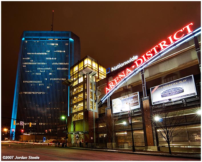
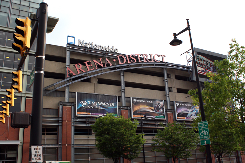
I would think something similar in style to how they did the main garage for Columbus, OH's Arena District would be something to consider. Using more brick on the outside (like they do on most all of the buildings in the District) could give it a bit more "class/style" than what's pictured. It also works well with the idea of bringing the venue banners out to the road on the garage.


djkidkaz
Well-Known Member
I would think something similar in style to how they did the main garage for Columbus, OH's Arena District would be something to consider. Using more brick on the outside (like they do on most all of the buildings in the District) could give it a bit more "class/style" than what's pictured. It also works well with the idea of bringing the venue banners out to the road on the garage.


Thats very City Walk and doesn't seem very Disney to me at all. Just because its a parking garage doesn't mean it has to look like one. Im hoping the outside gets themed very nicely as its one of the first things everyone will see as they arrive to DTD.
jt04
Well-Known Member
You don't want a plain (often ugly) parking garage facing Buena Vista Drive either, which is just as important if not more so, as the retail facing sides are partially obscured behind the retail structures.
I do like the idea that they would have an aesthetic that lowers expectations upon arrival to some degree. That way when you walk into a "district" you are more impressed. Always liked the UNI style of using a lot a greenery to deal with the visual impact on approach.
danlb_2000
Premium Member
Interesting. The planters on the corner structures are a cool idea, should help break up what can be a pretty monotonous structure.
dstrawn9889
Well-Known Member
that looks nice, not blocky UNI parking deck... and the louvers will effectively hide whether the parking deck is full or empty... a more uniform appearance
jt04
Well-Known Member
Absolutely perfect. Couldn't be better. Can anyone read the added notes?
Attractive without hinting too heavily at the theme inside. Very pleased with the subtle 'mid century modern' style. Compliments the direction they seem to be taking on the west side without raising expectations too high upon arrival. Kudos!
Attractive without hinting too heavily at the theme inside. Very pleased with the subtle 'mid century modern' style. Compliments the direction they seem to be taking on the west side without raising expectations too high upon arrival. Kudos!
Magenta Panther
Well-Known Member
This has me almost as excited as the Tangled bathrooms.
Register on WDWMAGIC. This sidebar will go away, and you'll see fewer ads.
