Transformative Multi-Year Expansion Announced for WDS Paris

Sir_Cliff

Well-Known Member
I think they honestly did a pretty decent job with the new Casa de Coco.

With the possible exception of the family 'photos', they have kept the theming fairly subtle and not too cartoony. Having one side themed to the family shoemaking business and the other to music is a nice touch and they have kept a lot of the old fittings and theming. If anything, I think most guests will probably miss more touches related to the movie on the 'music' side.

The outdoor terrace is also a welcome addition for a restaurant that was always crowded. While it does contribute to the 'toonification', it seems like the new Miguel statue at front is, at least for the moment, a popular photo opportunity. The only issue is that perhaps it causes a bit of a bottleneck!

 
Last edited:

LondonTom

Well-Known Member
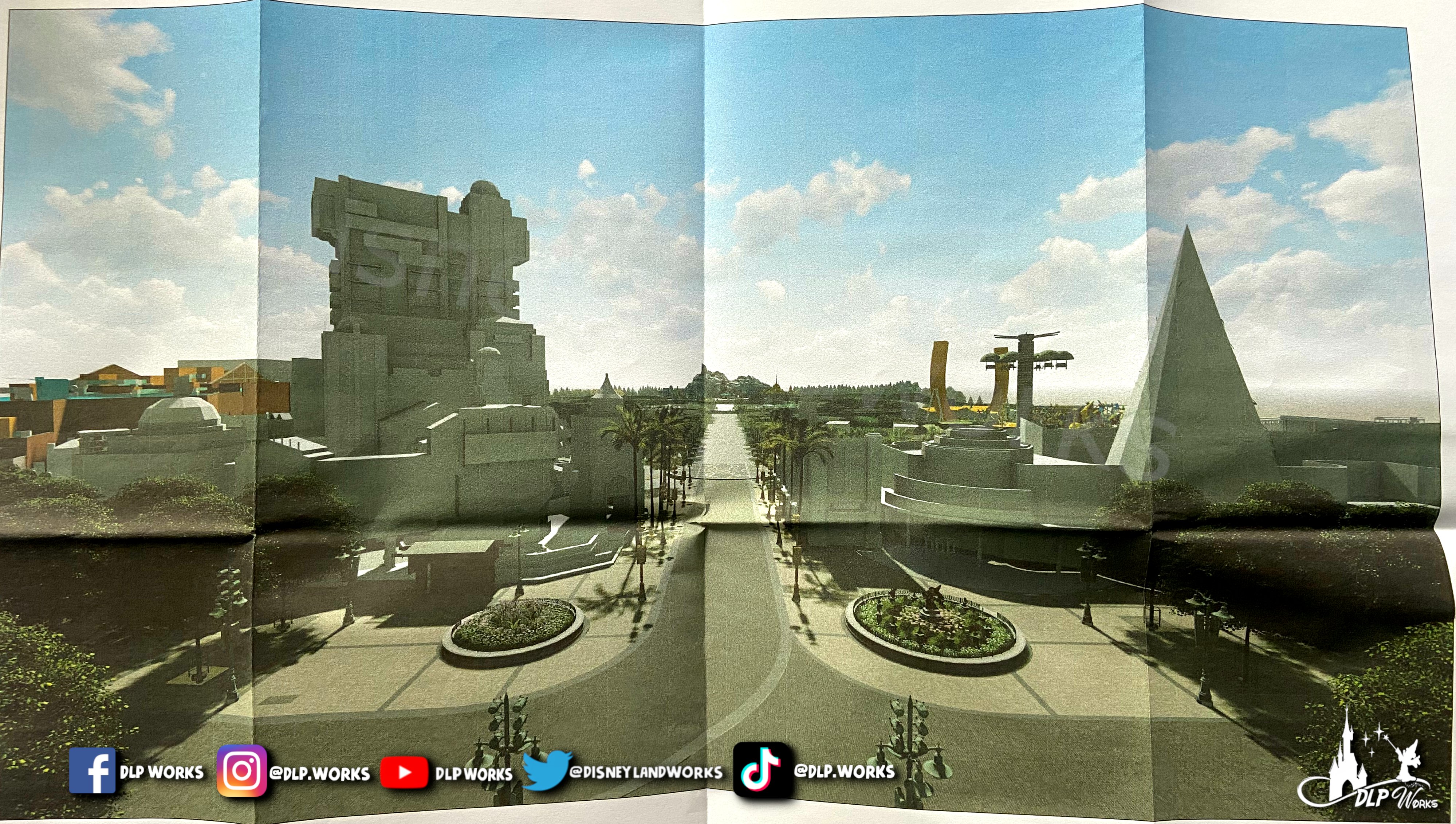
Official visual concepts from the construction permits shared by DLP Works:


I don't fully get why they would want to close off Studio 1 like that with the awning. Kind of like its hiding the rest of the park...


Though maybe its the long empty path they want to hide 😂


I really hope it doesn't look that bad in real life, it looks a long empty path 😂
 

mrflo

Well-Known Member
I don't fully get why they would want to close off Studio 1 like that with the awning. Kind of like its hiding the rest of the park...
According to the sources one of the goals is to reduce the direct exposure of day light to the inside of the Studio 1 building. The new exit is also supposed to provide some kind of reveal effect after guests walking through the entrance of a cinema facade.

The whole thing looks a bit better in the 3D models that Outsidears has shared in April. Though despite the fact that the additional greenery is very welcome, I agree that the whole long empty pathway does not look very appealing from this point of view. Considering that they will also remove some of the Hollywood facades, it will make it look even more bland - especially on a grey cold November day when most of those trees are leafless. Ideally they should have added some additional Hollywood theming, neon lights, some fountains, etc. that you can already find in other Disney Hollywood-themed areas.
 

cjkeating

Well-Known Member
I really hope it doesn't look that bad in real life, it looks a long empty path 😂
A reveal of a long path down to a castle... where have we seen this before? Oh yes Main Street! :D

The walk shouldn't be completely "empty" as it has the garden performance area, one and eventually two flat rides. Plus lots of trees and gardens and I am sure without checking some food kiosks.
 

Sir_Cliff

Well-Known Member
This is yet more information that just makes me curious to see how it works in practice.

I understand wanting to reduce light bleed into the building, but not sure how it will look exiting and then walking around some kind of wall to the "big reveal". Maybe not a huge deal, but it also seems to make crowd flow a little more awkward as people will now not only need to be funnelled through the soundstage doors when entering and exiting the park, but also around this new wall and the Walt statue.

I do appreciate the optimistic comparisons of the new walkway to Main Street USA and the Frozen castle in the far distance to the castle next-door, but so far I am also struggling to imagine anything beyond a long path surrounded by gardens with a few structures close to the exit and then Frozenland way off in the distance. Again, though, very curious to see if they have any concept art that can explain what they at least hope it looks like.
 

mrflo

Well-Known Member
In principle both paths (will) lead towards a weenie. The issue is that the Frozen castle is much further away from the Studio 1 exit than the DLP castle from Main Street Station. This is also reflected in the visualisation of the building permit. If you compare both views below, the castle fits perfectly in the spot drawing attention to itself while the Frozen one in WDS is hardly noticeable. Hopefully this will still look better in reality and from a different angle. One of it is a masterclass example of Theme Park design, the other one probably not so much. 🫤

DSC07463.jpg
F2R4he9XUAEoIi6

Image sources: Touringplans.com / DLP Works
 

AndyS2992

Well-Known Member
Well, it's a start. I'd rather they move the 'Partners' statue to it's rightful place in the hub of Disneyland park in front of the castle, people will whine it's blocking the castle projections/fireworks but meh, it's where it is in other parks. And then with those planters, the Mickey one is fine but they should put a statue of Walt on the other side as they both point down the street. I would like to see a replica of the Roy and Minnie 'Sharing the Magic' bench statue placed somewhere in this area also.
 

cjkeating

Well-Known Member
Well, it's a start. I'd rather they move the 'Partners' statue to it's rightful place in the hub of Disneyland park in front of the castle, people will whine it's blocking the castle projections/fireworks but meh, it's where it is in other parks. And then with those planters, the Mickey one is fine but they should put a statue of Walt on the other side as they both point down the street. I would like to see a replica of the Roy and Minnie 'Sharing the Magic' bench statue placed somewhere in this area also.
Is it just me who finds all the Walt statues a bit unnecessary? I get it at DL and MK was his project but... after that... he's very removed from the rest of the international parks.

I may have this feeling because after Walt's death the company stagnated because they were all trying to second guess "What would Walt have done?" and they had to move on from that... but nowadays whenever they are doing something bad in the parks they roll out the Walt quote about "Disneyland will never be completed." to justify doing something because it is cheap/easy/mandated from up above.
 

cjkeating

Well-Known Member
In principle both paths (will) lead towards a weenie. The issue is that the Frozen castle is much further away from the Studio 1 exit than the DLP castle from Main Street Station. This is also reflected in the visualisation of the building permit. If you compare both views below, the castle fits perfectly in the spot drawing attention to itself while the Frozen one in WDS is hardly noticeable. Hopefully this will still look better in reality and from a different angle. One of it is a masterclass example of Theme Park design, the other one probably not so much. 🫤

DSC07463.jpg
F2R4he9XUAEoIi6

Image sources: Touringplans.com / DLP Works
Overtime the view will become more of a draw when Frozen is flanked by another land on either side. I also just noticed that the animation building hat is a very pointy pyramid!
 

AndyS2992

Well-Known Member
Is it just me who finds all the Walt statues a bit unnecessary? I get it at DL and MK was his project but... after that... he's very removed from the rest of the international parks.

I may have this feeling because after Walt's death the company stagnated because they were all trying to second guess "What would Walt have done?" and they had to move on from that... but nowadays whenever they are doing something bad in the parks they roll out the Walt quote about "Disneyland will never be completed." to justify doing something because it is cheap/easy/mandated from up above.

True, but the park is called Walt Disney Studios, have to incorporate him in somewhere lol Though point being, they have a statue one side and nothing on the other and it being not symmetrical bothers me a little. A nice fountain similar to the one at DHS and DCA would look nice in that planter space on the left also.
 

LondonTom

Well-Known Member
A reveal of a long path down to a castle... where have we seen this before? Oh yes Main Street! :D
If they were giving us the Hollywood Boulevard version of Main Street I'd be for all it. I absolutely adore that stroll (And a couple of restaurants /snack places would be grand, you could then have less in Studio 1 giving everyone more room👀)

It just looks, incredibly empty (And yeah once Arredelle is in properly in place, in person it could look a lot better if your eyes are not drawn ...to the long empty path so much 😂)
 

Markiewong

Well-Known Member
If they were giving us the Hollywood Boulevard version of Main Street I'd be for all it. I absolutely adore that stroll (And a couple of restaurants /snack places would be grand, you could then have less in Studio 1 giving everyone more room👀)

It just looks, incredibly empty (And yeah once Arredelle is in properly in place, in person it could look a lot better if your eyes are not drawn ...to the long empty path so much 😂)
The problem is dat Studios lacked green, trying to increase that percentage by throwing everything into one single lane is a choice. But it is probably the main reason for not building a Hollywood version of main street. I think a more quiete green space instead of another busy area is a welcome addition for Studios.
 
Last edited:

JakeDLP

Member
I don't view the lake promenade a main street. I see it as, Frontlot: Town square, Studio one : Main Street, Hollywood boulevard: Main Street continued. With the tower of terror and Floor rosette being the parks hub. I see the promenade as an additional area, sort of like the street after carthay circle in DCA that's between cars land and avengers campus leading up to Pixar Pier.
The problem is dat Studios lacked green, trying to increase that percentage by throwing everything into one single lane is a choice. But it is probably the main reason for not building a Hollywood version of main street. I think a more quite green space instead of another busy area is a welcome addition for Studios.
 

mrflo

Well-Known Member
A few additional observations from the video:

- That is the latest view of the construction site I have seen in a couple of days. Progress seems to be steady but slow and I have a hard time seeing this opening by spring or summer of 2025. Hopefully things will accelerate. But so far winter 2025 seems more realistic to me.

- Weather has not been that great in Central Europe over the last couple of days. Nevertheless the spot in the lake looked particularly windy in the video. We have talked about this before that there is hardly any shelter between Arendelle and Studio One. Considering how open the lake area is to the elements, it does not look like this will be a pleasant place to be during rainy or in particular cold & windy weather.

- I have seen several comments online how unprofessional this video looks for a company like Disney. On the one side you can say it is just a little insta video. Yet I have to agree that I am not particularly impressed how DLP is handling the overall communication about the expansion. And this is not something you can blame on budget cuts as DLP even seems to have a dedicated Comms Manager just for Imagineering projects in Paris. Even local parks like Europa-Park are doing a way better job in teasing and informing about upcoming new attractions. Hopefully we will get at least something new at the D23 event next month.
 

Register on WDWMAGIC. This sidebar will go away, and you'll see fewer ads.

Back
Top Bottom