Toy Story Land expansion announced for Disney's Hollywood Studios

lazyboy97o

Well-Known Member
I think it works ok if you think about it in the storybook context when you are looking at it, but no one does because Disney has already trained us to expect "realistic" forced perspective. So we see wonky sizes and what appears to be sun faded paint instead of "watercolor". Interesting, but probably not the best artistic choice.
The area was called Fantasy Forest. No other part of the land, as originally designed or with Mine Train, follows this supposed direction.
 

MisterPenguin

President of Animal Kingdom
Premium Member
I think it works ok if you think about it in the storybook context when you are looking at it, but no one does because Disney has already trained us to expect "realistic" forced perspective. So we see wonky sizes and what appears to be sun faded paint instead of "watercolor". Interesting, but probably not the best artistic choice.
Not doubting you, but it's odd that the castle is in a style of a water color but nothing else about the facade or surroundings is also in a style of a water color.
 

mm52200

Well-Known Member
Just a small point. Beasts Castle isn't supposed to look like a realistic forced perspective castle. It is supposed to look like a watercolor illustration in a children's storybook. That part of New Fantasyland is even called Storybook Forest.
Literally not a thing. Not a concept for the land. It’s called Enchanted Forest. But regardless, every video they went out of their way to say it’s the Beasts castle from the film. Not anything else.
 

Bocabear

Well-Known Member
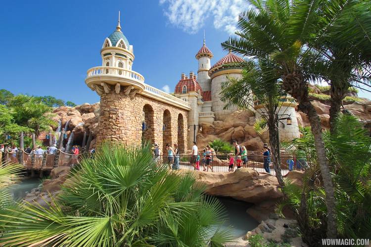
That’s why they built Prince Eric’s castle as the facade of Ariel’s Undersea Adventure? Or Belles house? I’m pretty sure it’s also called the Enchanted Forest. Not trying to argue with you but I don’t think that was the concept, it was just Disney being cheap
I wholeheartedly agree, but Maybe they thought it would look better than it does....It clearly looks bad, they should fix that...they added extra rock work after the area opened... so it would not be unheard of to make a change here.
 

Disneyhead'71

Well-Known Member
I'm not saying the storybook thing worked as intended or was even a good decision. I just remember seeing an interview with an Art Director from Imagineering where he explained it using phrases like "a page ripped from a storybook" and gave a anecdote about how in a storybook they use pastel watercolors and will put a small castle on a hill to make it look way off in the distance. It was full of Disney speak and I remember thinking then that it probably wasn't going to work.

Anyway, why is it that people only complain about the wonky forced perspective of Beast's Castle? The forced perspective is wonky all over New Fantasyland. Someone mentioned Prince Eric's Castle. The forced perspective there is as bad if not worse than Beast's Castle because in the queue, you get right up on it going through the stone arch. You can clearly see that the railing above you is like 10 inches high and the the lighthouse thing is small.

Fantasyland_Full_17161.jpg


And don't get me started on the God awful forced perspective on the new Castle Courtyard turrets.

New-Fantasyland-Castle-Walls-Revealed-at-Magic-Kingdom.jpg
 

MisterPenguin

President of Animal Kingdom
Premium Member
I'm not saying the storybook thing worked as intended or was even a good decision. I just remember seeing an interview with an Art Director from Imagineering where he explained it using phrases like "a page ripped from a storybook" and gave a anecdote about how in a storybook they use pastel watercolors and will put a small castle on a hill to make it look way off in the distance. It was full of Disney speak and I remember thinking then that it probably wasn't going to work.

Anyway, why is it that people only complain about the wonky forced perspective of Beast's Castle? The forced perspective is wonky all over New Fantasyland. Someone mentioned Prince Eric's Castle. The forced perspective there is as bad if not worse than Beast's Castle because in the queue, you get right up on it going through the stone arch. You can clearly see that the railing above you is like 10 inches high and the the lighthouse thing is small.

Fantasyland_Full_17161.jpg


And don't get me started on the God awful forced perspective on the new Castle Courtyard turrets.

New-Fantasyland-Castle-Walls-Revealed-at-Magic-Kingdom.jpg
Are you sure those aren't giants?
 

UNCgolf

Well-Known Member
The forced perspective there is as bad if not worse than Beast's Castle because in the queue, you get right up on it going through the stone arch. You can clearly see that the railing above you is like 10 inches high and the the lighthouse thing is small.

This is probably harder for people to notice since you just kind of walk right past it without every lingering -- that ride has a massive queue that's never close to being full. It works much better from a distance than the Beast's Castle, though.

As for the turrets, well, I've never understood why they are even there. They don't make any sense.

Regardless, I agree that New Fantasyland as a whole has numerous issues, although it's still dramatically better than the topic of this thread.
 
Last edited:

Bocabear

Well-Known Member
Eric's castle doesn't bother me a bit... It is larger, nicely designed and looks good in it's placement within the setting. There is nothing glaringly wrong to me about this, and that Queue is pretty amazing... The Beasts Castle is just too small.. Perhaps if there were some larger parts in the foreground at the top and the tower structure pushed father back it would feel more distant... but as it stands it appears as a small set dropped on the top of the rock...not like it was built there... Eric's castle looks better seated...
 

Disneyhead'71

Well-Known Member
The thing that throws me for a loop, even accepting the storybook trope, is the entrance to Be Our Guest looks miles from the Castle. Like we have to walk through the Mines of Moria to get there. But BOOM (cue the music) "Try the grey stuff...".

With NFL, I find it best to turn off the analytics and just enjoy the plethora of "Ooo, pretty."

Even then the Castle Courtyard turrets push my limits. They ugly.
 
Last edited:

Rich Brownn

Well-Known Member
This is probably harder for people to notice since you just kind of walk right past it without every lingering -- that ride has a massive queue that's never close to being full. It works much better from a distance than the Beast's Castle, though.

As for the turrets, well, I've never understood why they are even there. They don't make any sense.

Regardless, I agree that New Fantasyland as a whole has numerous issues, although it's still dramatically better than the topic of this thread.
The turrets are suppose to indicate the passage to/from the forest to the town
 

Animaniac93-98

Well-Known Member
Well they definitely don't work.

Indeed. While many of us understand what New Fantasyland was trying to do, we also recognize the execution was less than ideal.

Again, look at Tokyo. It did many of the same things, but better, and not just Beast's castle. Belle's village is larger, both in terms of scale and number of buildings for example.

It's not perfect either. Beast's castle absolutely looks better from some angles than others, the painted backdrop above the theater may not have been the best choice, but it's overall is a clear improvement over what was done a decade earlier.
 

FigmentFan82

Well-Known Member
I think part of the problem in TSL is how barren it is. If there were more themed structures scattered throughout, it might be easier to achieve forced perspective or at least create a better sense of what exactly it's supposed to be.

It's supposedly Andy's backyard (not sure why they didn't name it that instead of the generic Toy Story Land), but I only discovered that by reading it here. I never once got that impression when I was there in person; I couldn't really tell it was supposed to be anything other than scattered props.
*cries in Honey I Shrunk Playground
 

Register on WDWMAGIC. This sidebar will go away, and you'll see fewer ads.

Back
Top Bottom