Yikes. That's definitely not great to see."Another area recently rethemed toward 1970s Tomorrowland, just with paint. " By bioreconstruct on twitter

-
Welcome to the WDWMAGIC.COM Forums!
Please take a look around, and feel free to sign up and join the community.
You are using an out of date browser. It may not display this or other websites correctly.
You should upgrade or use an alternative browser.
You should upgrade or use an alternative browser.
News Tomorrowland love
- Thread starter marni1971
- Start date
tirian
Well-Known Member
Over the past few days, I've learned a lot about Disney fans' mindset following the initial reaction to an incomplete installation ("It's terrible! My childhood is destroyed! It's not what Walt wanted! Off with Messrs. Iger and Chapek's heads! What about the yeti?!") to the evolution of acceptance ("well, I guess it's better than <fill in the blank>") to appreciation when the final product is finished ("Wow, that sign is quite nice").
Always entertaining, this website.
Not even just a thing here. Go on Twitter for even more hot takes. If you think it's crazy here, just wait till you explore outside this site.
Steph15251
Well-Known Member
I think both GE and Pandora have great design so I do not think it is all bad.I agree completely. There have been missteps in the past, but overall, Disney design has been pretty good, even spectacular. Why are they now churning out so much design and architecture that's bad? Did all the good ones go to Universal?
trainplane3
Well-Known Member
So in Blog Mickey's Astro Oribter video, it seems the "basic" metal fins are all gone from the TTA. The only ones left are the big ones that light up at night.
I'm talking about these fins:
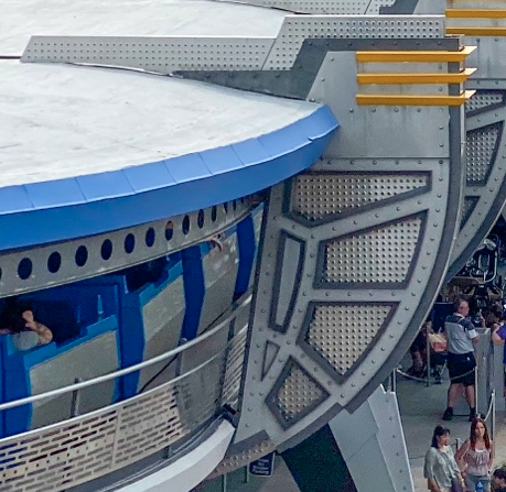
Before:

Right at this moment (you need to look in the background and yes the angle is impossible to match on Google Maps):
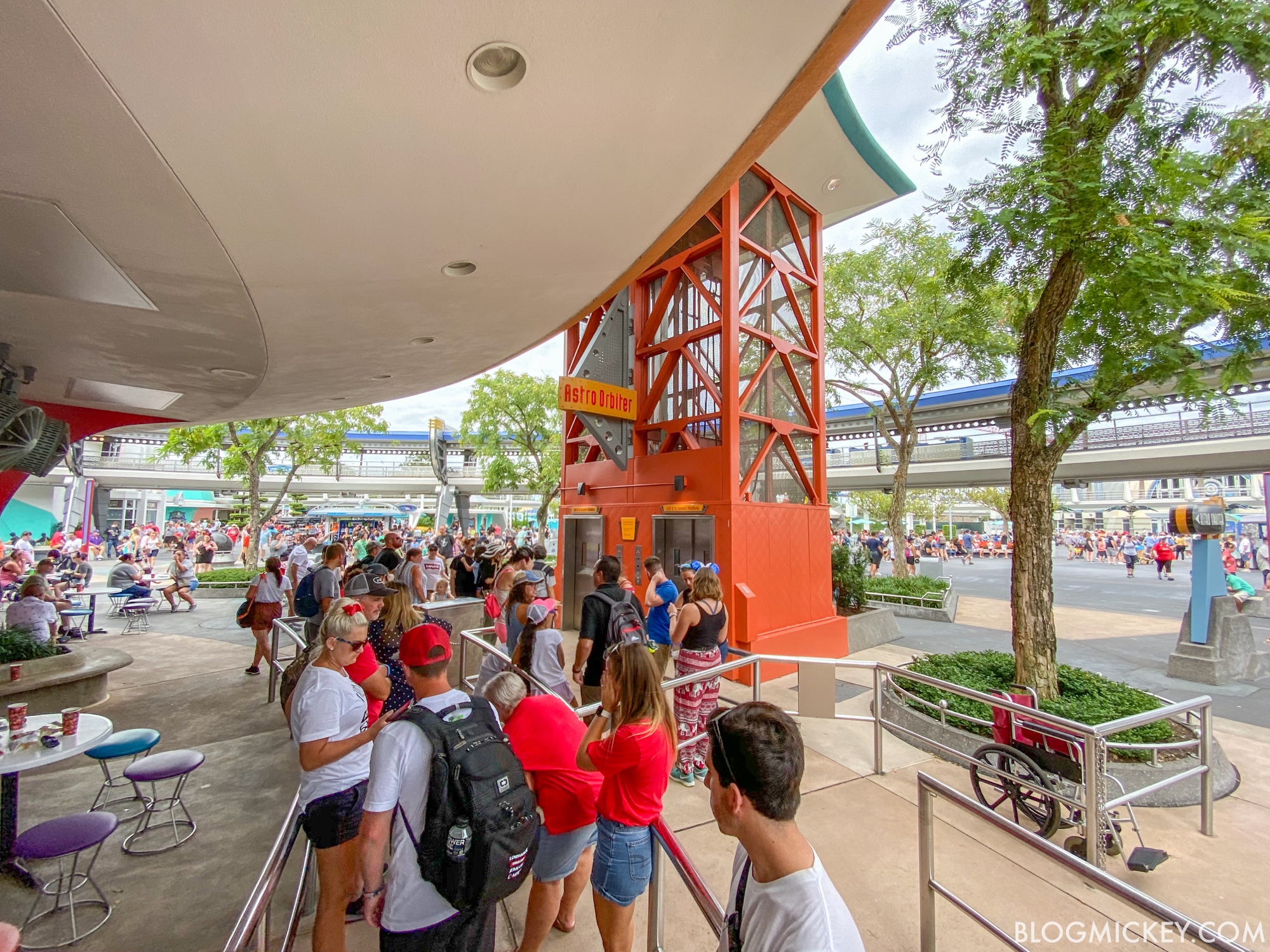
I'm talking about these fins:
Before:
Right at this moment (you need to look in the background and yes the angle is impossible to match on Google Maps):

So in Blog Mickey's Astro Oribter video, it seems the "basic" metal fins are all gone from the TTA. The only ones left are the big ones that light up at night.
I'm talking about these fins:
View attachment 412777
Before:
View attachment 412778
Right at this moment (you need to look in the background and yes the angle is impossible to match on Google Maps):

Yes, only the big fins are left. Blog Mickey pointed this out a few days ago:
https://blogmickey.com/2019/09/even...-stripped-from-tomorrowland-at-magic-kingdom/
trainplane3
Well-Known Member
Ah. Oops. I read that too and somehow overlooked that. Oh well.Yes, only the big fins are left. Blog Mickey pointed this out a few days ago:
https://blogmickey.com/2019/09/even...-stripped-from-tomorrowland-at-magic-kingdom/
Thanks for pointing it out.
Donaldfan1934
Well-Known Member
So in Blog Mickey's Astro Oribter video, it seems the "basic" metal fins are all gone from the TTA. The only ones left are the big ones that light up at night.
I'm talking about these fins:
View attachment 412777
Before:
View attachment 412778
Right at this moment (you need to look in the background and yes the angle is impossible to match on Google Maps):

Well, looks like my theory was wrong. It’s great to see it back open, but they seriously need to update the aesthethics before it ends up sticking out like a sore thumb.
WDWtraveler
Well-Known Member
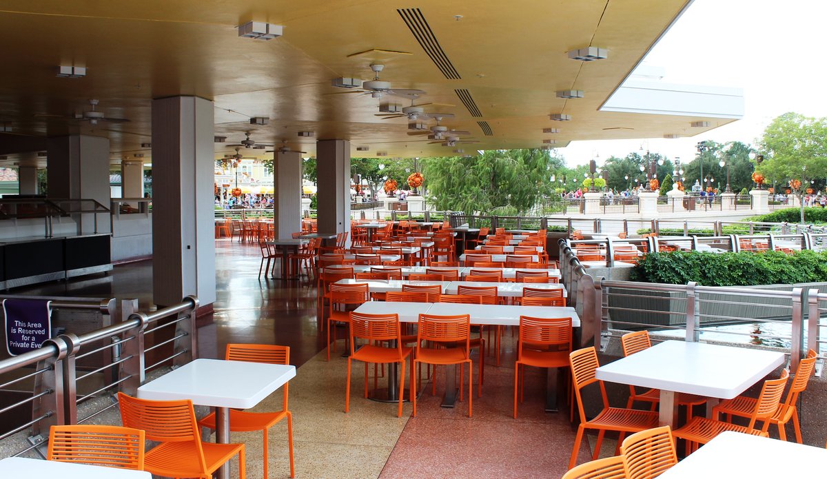
Photo update as of Saturday, September 21, 2019. Not sure this has been posted. All new orange chairs and white tables have appeared at Tomorrowland Terrace restaurant.
timjeddwid
New Member
Photo update as of Saturday, September 21, 2019. Not sure this has been posted. All new orange chairs and white tables have appeared at Tomorrowland Terrace restaurant.
View attachment 412906
Oh this looks like a potentially big clue as to where they’re taking things aesthetically. Probably taking it away from gray/blue/purple and towards white and orange. Let’s see if some orange/red goes up along with the white.
Photo update as of Saturday, September 21, 2019. Not sure this has been posted. All new orange chairs and white tables have appeared at Tomorrowland Terrace restaurant.
View attachment 412906
Ah, tomato soup red. All we need now is avacado green and yellow mustard for the 60s/70s trifecta of modern decor.
brihow
Well-Known Member
Oh this looks like a potentially big clue as to where they’re taking things aesthetically. Probably taking it away from gray/blue/purple and towards white and orange. Let’s see if some orange/red goes up along with the white.
I'd love for you to be right, but Tron uses blue as an accent color, and the 'purple instagram wall' was introduced as part of the recent repainting in tomorrowland. From everything I've seen they don't have a strict color palette.
_caleb
Well-Known Member
Photo update as of Saturday, September 21, 2019. Not sure this has been posted. All new orange chairs and white tables have appeared at Tomorrowland Terrace restaurant.
View attachment 412906
I like it. To me, the new color scheme seems more 1960s-inspired than 1970s, a modern nod to DL’s Tomorrowland in the 60s- lots of white with pops of bright color. It’s retro-future, to be sure.
Donaldfan1934
Well-Known Member
I get where you’re coming from. For the past five years or so of repainting, most of it has come off as either randomized color testing or a cheap quick fixes to disguise fixtures of the 1994 aesthetic they aren’t quite ready to remove just yet. However, now that things like the new entrance sign and reversion of the Peoplemover fins to their original state have come into fruition, I think the bigger picture of what’s being done here is becoming much more clear.I'd love for you to be right, but Tron uses blue as an accent color, and the 'purple instagram wall' was introduced as part of the recent repainting in tomorrowland. From everything I've seen they don't have a strict color palette.
The direction Imagineers want to take Tomorrowland seems to be a combination of the original 1970’s aesthetic and the 2016 SDL aesthetic and that can be seen in the usage of the variety of color you mentioned. For example, not only was orange used predominantly in the original 1970’s aesthetic, but also SDL’s as well.
SDL’s Tomorrowland‘s nighttime lighting package is also a mix of oranges, blues and purples.
So, although a lot of the repainting has made little sense up until recently, I for one am optimistic that we’ll end up with a great, big beautiful new Tomorrowland sometime in the next couple of years.
Last edited:
Flynnwriter
Well-Known Member
Is this for real? Paint Tomorrowland white? That’s insane. Is it from the talented team who brought us Guardians of the Galaxy tower at DCA?
Flynnwriter
Well-Known Member
I get where you’re coming from. For the past five years or so of repainting, most of it has come off as either randomized color testing or a cheap quick fixes to disguise fixtures of the 1994 aesthetic they aren’t quite ready to remove just yet. However, now that things like the new entrance sign and reversion of the Peoplemover fins to their original state have come into fruition, I think the bigger picture of what’s being done here is becoming much more clear.
The direction Imagineers want to take Tomorrowland seems to be a combination of the original 1970’s aesthetic and the 2016 SDL aesthetic and that can be seen in the usage of the variety of color you mentioned. For example, not only was orange used predominantly in the original 1970’s aesthetic, but also SDL’s as well.
View attachment 413161View attachment 413163
SDL’s Tomorrowland‘s nighttime lighting package is also a mix of oranges, blues and purples.
So, although a lot of the repainting has made little sense up until recently, I for one am optimistic that we’ll end up with a great, big beautiful new Tomorrowland sometime in the next couple of years.
Shanghai is beautiful. But the architecture and plan is nothing like WDW Tomorrowland. Having just been there, it’s the play of sweeping ramps and multiple levels that delivers big time. Maybe they could focus on improving the rides in this land that are in desperate need of an update.
Flynnwriter
Well-Known Member
Disney just released the designers in charge of re-imagining Tomorrowland:
Andrew C
You know what's funny?
Register on WDWMAGIC. This sidebar will go away, and you'll see fewer ads.
