-
Welcome to the WDWMAGIC.COM Forums!
Please take a look around, and feel free to sign up and join the community.
You are using an out of date browser. It may not display this or other websites correctly.
You should upgrade or use an alternative browser.
You should upgrade or use an alternative browser.
News Tomorrowland love
- Thread starter marni1971
- Start date
Sirwalterraleigh
Premium Member
I love this kinda “response”…
The problem is at the spinner at the front gate…it takes some people years and most at least months to get there…
But what do they do when things are not going well? Spend $50 for a shift of a CP and throw them into a moving sweat suit.
I can’t

The problem is at the spinner at the front gate…it takes some people years and most at least months to get there…
But what do they do when things are not going well? Spend $50 for a shift of a CP and throw them into a moving sweat suit.
I can’t
FettFan
Well-Known Member
To be honest, I agree with all of the others, but I really like the look of Creations Shop and LOVE the similar looking Connections Eatery. It screams like it’s in the style of OG EPCOT and is night and day better than what was there before.
I would say it screams of a mid-90s Natural Wonders store.


Yall remember Natural Wonders, right?
Sirwalterraleigh
Premium Member
Creations is a tad on the bright side…like adjust the tint down a little bit 
FettFan
Well-Known Member
Creations is a tad on the bright side…like adjust the tint down a little bit
James Alucobond
Well-Known Member
I’ll be honest, I struggle to see any visual relation between what you posted and Connections / Creations.I would say it screams of a mid-90s Natural Wonders store.


Yall remember Natural Wonders, right?
Disney Maddux
Well-Known Member
FettFan
Well-Known Member
I’ll be honest, I struggle to see any visual relation between what you posted and Connections / Creations.
Well, it's definitely got more white in it, I'll give you that. Almost like Natural Wonders and Centorium had a baby together.
I don't know, when I went into Creations I just got a sudden urge to idly look at stuff, play with a rain stick and then leave without buying anything.
Then I poured out a Beverly in remembrance of what used to be great.
James Alucobond
Well-Known Member
They have literally nothing to do with one another unless your metric is that there is something wooden in vague proximity to the ceiling and display cases in both instances.Well, it's definitely got more white in it, I'll give you that. Almost like Natural Wonders and Centorium had a baby together.
I don't know, when I went into Creations I just got a sudden urge to idly look at stuff, play with a rain stick and then leave without buying anything.
Then I poured out a Beverly in remembrance of what used to be great.

Bocabear
Well-Known Member
Different eras, different ideas completely... Centorium was trying to play with the modern and add a lot of whimsy... Mouse Gear just played up the whimsical and cartoon, Creations strips away all of that and is just a shop...in the ikea sense.....
I like modern... I like a mix of natural and modern... But this tends to look like an airport duty-free shop more than I place I want to linger and purchase... Same thing with Connections...Looks like an airport food court...At least they have the big mural for color....
I was no fan of Electric (carpet on the walls) Umbrella... but there could have been something that felt more Disney but not crazy...More unique...
Last edited:
Movielover
Well-Known Member
If you are pouring it out for Mouse Gear, then I hope its not expensive stuff you are drinking...Then I poured out a Beverly in remembrance of what used to be great.
Incomudro
Well-Known Member
Yeah, the presence of wood doesn't make the two look similar to me.I’ll be honest, I struggle to see any visual relation between what you posted and Connections / Creations.
Mickeynerd17
Well-Known Member
You can find the exact same ceiling in MCO's luggage checking lobby.But this tends to look like an airport duty-free shop more than I place I want to linger and purchase... Same thing with Connections...Looks like an airport food court...At least they have the big mural for color....
Disone
Well-Known Member
Agree. At this point I think they should own it and theme the exits of Connections to jet gateways that take you to guardians and mission space... Making it not only a place that you eat but a place that you catch your connection to your next attraction.Different eras, different ideas completely... Centorium was trying to play with the modern and add a lot of whimsy... Mouse Gear just played up the whimsical and cartoon, Creations strips away all of that and is just a shop...in the ikea sense.....
I like modern... I like a mix of natural and modern... But this tends to look like an airport duty-free shop more than I place I want to linger and purchase... Same thing with Connections...Looks like an airport food court...At least they have the big mural for color....
Add a mission space rocket to that novacore vehicle already out there and you can have a very futuristic looking spaceport.
Bocabear
Well-Known Member
That is actually a re4ally interesting idea...Sadly it is no longer FutureWorld, and now World Celebration....which means absolutely nothing. Except I guess, celebrating trees and a lack of water features... The re-naming of the districts is so half-baked...more confusing now than ever...Agree. At this point I think they should own it and theme the exits of Connections to jet gateways that take you to guardians and mission space... Making it not only a place that you eat but a place that you catch your connection to your next attraction.
Add a mission space rocket to that novacore vehicle already out there and you can have a very futuristic looking spaceport.
HMF
Well-Known Member
I would like to set this thread back on topic with my article on the history of Magic Kingdom's Tomorrowland.
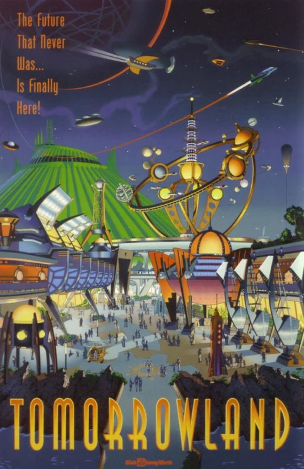

Tha Realest
Well-Known Member
Creations feels like they took over a flagship GAP store, which makes sense when you consider the professional backgrounds of most of P&RDifferent eras, different ideas completely... Centorium was trying to play with the modern and add a lot of whimsy... Mouse Gear just played up the whimsical and cartoon, Creations strips away all of that and is just a shop...in the ikea sense.....
I like modern... I like a mix of natural and modern... But this tends to look like an airport duty-free shop more than I place I want to linger and purchase... Same thing with Connections...Looks like an airport food court...At least they have the big mural for color....
I was no fan of Electric (carpet on the walls) Umbrella... but there could have been something that felt more Disney but not crazy...More unique...
Bocabear
Well-Known Member
A good summation to what brings us to where we are now and thanks for bringing the thread back on topic. It feels like WDI cant seem to figure out what to do with Tomorrowland...Or is it just budget? We cannot know. Fact remains that someone has to head up the charge and give the land back a coherent design and theme... There is far too much dead space that California's version does not have.I would like to set this thread back on topic with my article on the history of Magic Kingdom's Tomorrowland.

MILF needs to be moved to Hollywood Studios to make room for something more appropriate to the theme of the land... The Alien Encounter building needs a new attraction....The land it self needs a new entrance...not the silver painted rocks...it needs it's WOW back.
I am sure a walk through the Imagineering Archives could inspire the newer generations of imagineers... The old guard had an amazing sense of drama and scale that is now missing...
James Alucobond
Well-Known Member
WALL-E seems like an easy one to slot in where Stitch was, and Elio feels like it could be an appropriate Monsters Inc. replacement, assuming it does well. I still think they should follow through on the electric lightcycle upgrade to the Speedway and bring a lot of the Shanghai elements that complement TRON to the main section of Tomorrowland. The Shanghai stage, for instance, looks about a billion times better than the one we have currently.A good summation to what brings us to where we are now and thanks for bringing the thread back on topic. It feels like WDI cant seem to figure out what to do with Tomorrowland...Or is it just budget? We cannot know. Fact remains that someone has to head up the charge and give the land back a coherent design and theme... There is far too much dead space that California's version does not have.
MILF needs to be moved to Hollywood Studios to make room for something more appropriate to the theme of the land... The Alien Encounter building needs a new attraction....The land it self needs a new entrance...not the silver painted rocks...it needs it's WOW back.
I am sure a walk through the Imagineering Archives could inspire the newer generations of imagineers... The old guard had an amazing sense of drama and scale that is now missing...
Most of the other attractions, restaurants, shops, and areas just need an appropriate amount of TLC. Like, why not replace the PeopleMover vignettes with Space 220-esque windows that give you "views" of vast Tomorrowland cityscapes and add some minor projection mapping in a few places? And as you said, the entrance needs to be something really visually arresting.
Register on WDWMAGIC. This sidebar will go away, and you'll see fewer ads.

