MerlinTheGoat
Well-Known Member
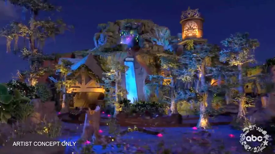
While I still don't know how complete that lighting package is, I think the blue used around the upper parts is too overwhelming. Blue works great as a way to illuminate water, as seen from the lower parts. As well as a few highlights on the hill itself. And some of that saturation is probably the camera's fault as digital cameras have known problems with capturing blue light accurately (film cameras don't have this problem btw). But even still, they needed some warmer colors like green and amber-ish white. As it is, I think that's way too much blue, which is saying a lot coming from someone whose favorite color is blue...
In addition, I was expecting the drop itself to glow more based on what the render suggested (like maybe using some internal spotlights built into the sides or something). Again, not sure how complete this is yet given how much they've been fiddling lately.

In addition, I was expecting the drop itself to glow more based on what the render suggested (like maybe using some internal spotlights built into the sides or something). Again, not sure how complete this is yet given how much they've been fiddling lately.
