-
Welcome to the WDWMAGIC.COM Forums!
Please take a look around, and feel free to sign up and join the community.
You are using an out of date browser. It may not display this or other websites correctly.
You should upgrade or use an alternative browser.
You should upgrade or use an alternative browser.
News Tiana’s Palace Coming to Disneyland Later this Year
- Thread starter DCBaker
- Start date
Epcot81Fan
Well-Known Member
Because Walt designed it to create a sense of an actual place not Fantasyland West like today.I think just the sheer size of the Tiana’s Palace marquee bothers me more than the smokestacks. All other marquees in NOS are very understated and much smaller in comparison.
Consumer
Well-Known Member
Makes it feel more like an attraction.I think just the sheer size of the Tiana’s Palace marquee bothers me more than the smokestacks. All other marquees in NOS are very understated and much smaller in comparison.
mickEblu
Well-Known Member
Makes it feel more like an attraction.
True and yet the POTC and HM marquees are much smaller in comparison. HM’s is a tiny plaque. Across NOS there was an effort to make the land feel like a real, lived in place. This would is the first non temporary addition to the land that strays from that outside of the small Tiana themed shop that goes unnoticed. Considering we’ll probably never see non IP lands again (or at least in my lifetime) it would have been nice if they just preserved NOS as it was.
Last edited:
Suspirian
Well-Known Member
I remember having the steak gumbo there andI had a po’boy from French Market last year and was not pleased one bit with it.
 . I didn't even know steak gumbo existed. Maybe we should lock down the regular version before we try experimenting?
Californian Elitist
Well-Known Member
1000% agreed. I have literally never seen steak gumbo anywhere else outside of Disneyland.I remember having the steak gumbo there and
They definitely need to perfect the original recipe.
CraftyFox
Well-Known Member
True and yet the POTC and HM marquees are much smaller in comparison. HM’s is a tiny plaque. Across NOS there was an effort to make the land feel like a real, lived in place. This would is the first non temporary addition to the land that strays from that outside of the small Tiana themed shop that goes unnoticed. Considering we’ll probably never see non IP lands again (or at least in my lifetime) it would have been nice if they just preserved NOS as it was.
While I agree that a smaller sign would better blend with the rest of NOS as it currently stands, there is actually a lot of historical precedent for a facade like the Tiana’s Palace we’re getting. Based off the technology and signage around the land, NOS is heavily based off the period from around 1890 (see the bathroom signs) to the mid-1920’s. During this period many Clubs and Supper Clubs around the United States advertised themselves with huge, garish signs and themed exteriors. (I had to crop these photos since these facades unfortunately contain some unpleasant early 20th century racist caricatures).
Popular themes included chicken coops, tropical islands, and (yes) steamboats. While I haven’t been able to find an exterior with steamboat pipes (I was able to find one from an earlier period that looks like an entire ship), there is historical precedent for paddle-wheelers as a theme.
Anyways to summarize that ramble, the Tiana’s Palace exterior actually has a lot of historical precedent (although the final design leans towards the whimsical) it just seems out of place because of how understated much of NOS is, especially compared to actual photos of New Orleans from this period.
mickEblu
Well-Known Member
While I agree that a smaller sign would better blend with the rest of NOS as it currently stands, there is actually a lot of historical precedent for a facade like the Tiana’s Palace we’re getting. Based off the technology and signage around the land, NOS is heavily based off the period from around 1890 (see the bathroom signs) to the mid-1920’s. During this period many Clubs and Supper Clubs around the United States advertised themselves with huge, garish signs and themed exteriors. (I had to crop these photos since these facades unfortunately contain some unpleasant early 20th century racist caricatures).
View attachment 735040
View attachment 735041
Popular themes included chicken coops, tropical islands, and (yes) steamboats. While I haven’t been able to find an exterior with steamboat pipes (I was able to find one from an earlier period that looks like an entire ship), there is historical precedent for paddle-wheelers as a theme.
View attachment 735043
Anyways to summarize that ramble, the Tiana’s Palace exterior actually has a lot of historical precedent (although the final design leans towards the whimsical) it just seems out of place because of how understated much of NOS is, especially compared to actual photos of New Orleans from this period.
What good is it being authentic if it doesn’t feel authentic to the land that it resides in? I just need theme park lands and attractions to feel authentic. I don’t need them to BE authentic. I don’t care if the drums that Ralphie plays in Tiana Bayou Splash are a copy of some famous New Orleans drum set if the ride is boring or doesn’t make me feel like I’m in a bayou.
FerretAfros
Well-Known Member
It's not just that this is an additional steamboat presence, but it's that it's so clearly copied from the Mark Twain itself which is right there [**gestures toward the river**], rather than pulling inspiration from any number of other perfectly valid (real or imagined) steamboats. Even the riverboat in the film that is clearly inspired by the Twain (including sound effects provided by the Twain's bell) took more artistic liberties than this new sign structure. Instead of implying that there's extensive riverboat traffic that passes through the area and making the theme seem more realistic and layered, we're instead reminded that we're just in a silly theme park with silly decorations for silly people who like silly movies. It's a minor detail, but it only serves to undercut the overall theme and atmosphere.Yup not mention the cartoony steamboat smokestacks in a land that has actual steamboats passing by the restaurant.
That said, I (foolishly) hope that the duplicated design in the sign means that they can finally remove the goofy gold leaf from the Twain's smokestacks, which has been a pet peeve of mine for the last 17 years. For the first 49 years of her life, the tops of the smokestacks were plain black, just like real steamboats that plied real rivers. This was a classic look that reflected the historical approach, with whimsical shapes for the tops accompanied by the functional color scheme:
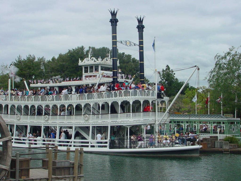
As part of the 50th anniversary celebration in 2005, all attractions dating back to 1955 received a golden attraction vehicle (or photo op) with varying degrees of success; the golden teacup was quite classy, while the Jungle Cruise boat bordered on ridiculous. Due to the scale of the Twain, it wasn't really practical to coat the entire thing gold, so instead it was given gold trim, gold leaf on the smokestacks, and festive bunting (and a somewhat tacky sign) to make the normal livery a little more festive:

As the celebration wound down in late 2006, all of the other vehicles were returned to their original coloring. The Twain's swags were removed and the trim was painted back to white, but the gold leaf remained on its smokestacks. As the Twain went in and out of various refurbishments in the years since, they've often cleaned and replaced the gold leaf atop the smokestacks, but it remains to this day, though no other hints of the 50th novelty color schemes remain in the park:

And although it always starts off looking nice and fresh, it always ends up looking grimy as the soot from the smokestacks (the hint is right there in the name!) collects around the top of them. There's a reason that historically these features were black, as trying to make them any other color is going to be a Sisyphean task. Even with the Twain's relatively frequent refurbishments and clean-burning diesel engine, it only takes a couple weeks for the soot to accumulate again.
Perhaps now that there's a whimsical facade on a cartoon-inspired restaurant nearby that can carry the torch of the gold smokestacks, the Twain will finally be allowed to return to an appropriate color scheme after all these years.
Phroobar
Well-Known Member
I can see why you cropped it. That is pretty bad. I found an interior shot. While it is highly themed, the racist cartoon paintings are pretty bad. I'm sure it was amazing for it's time.While I agree that a smaller sign would better blend with the rest of NOS as it currently stands, there is actually a lot of historical precedent for a facade like the Tiana’s Palace we’re getting. Based off the technology and signage around the land, NOS is heavily based off the period from around 1890 (see the bathroom signs) to the mid-1920’s. During this period many Clubs and Supper Clubs around the United States advertised themselves with huge, garish signs and themed exteriors. (I had to crop these photos since these facades unfortunately contain some unpleasant early 20th century racist caricatures).
View attachment 735040
Disney Analyst
Well-Known Member
Getting close now.
PiratesMansion
Well-Known Member
Getting close now.
Almost there?
Vegas Disney Fan
Well-Known Member
The last fresh baked showed construction workers clearing out their tools and even showed them vacuuming and mopping the inside, it appeared to be finished.
Tiana's Palace will officially open to Guests on September 7, 2023.

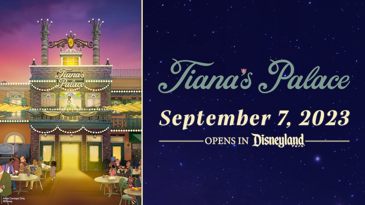
Tiana’s Palace Restaurant Set to Open in Disneyland Park on September 7, 2023
Tiana’s Palace restaurant will open in Disneyland Park on Sept. 7, 2023! We are so excited to expand upon Princess Tiana’s story and welcome you to see this exciting transformation!
disneyparks.disney.go.com
Disney Analyst
Well-Known Member
Tiana's Palace will officially open to Guests on September 7, 2023.
View attachment 738248
Tiana’s Palace Restaurant Set to Open in Disneyland Park on September 7, 2023
Tiana’s Palace restaurant will open in Disneyland Park on Sept. 7, 2023! We are so excited to expand upon Princess Tiana’s story and welcome you to see this exciting transformation!disneyparks.disney.go.com
“We are so excited to welcome you soon to see this exciting transformation, as well as mark the return of the Mint Julep Bar! At Tiana’s Palace, you can enjoy new menu items that represent Tiana’s story and honor the flavors and flair of New Orleans, with an effort to source some ingredients directly from the state of Louisiana when possible. Plus, you’ll now be able to mobile order these new dishes on the Disneyland app* when the location opens. Stay tuned for a first look of the full menu, coming soon to Disney Eats!
We look forward to welcoming you to Tiana’s Palace in New Orleans Square beginning Sept. 7!”
@Californian Elitist
This gave me a chuckle on Twitter
https://x.com/_21royalstreet/status/1692586187448332661?s=46&t=0ti2t96wxRRVMtfJYMArXQ
Edited to say I can’t seem to imbed the Tweet so he’s a screenshot for you
https://x.com/_21royalstreet/status/1692586187448332661?s=46&t=0ti2t96wxRRVMtfJYMArXQ
Edited to say I can’t seem to imbed the Tweet so he’s a screenshot for you
Attachments

Californian Elitist
Well-Known Member
This gave me a chuckle on Twitter
https://x.com/_21royalstreet/status/1692586187448332661?s=46&t=0ti2t96wxRRVMtfJYMArXQ
Edited to say I can’t seem to imbed the Tweet so he’s a screenshot for you

Californian Elitist
Well-Known Member
I not only want to see the menu, but I want to see the ingredients, too.
Register on WDWMAGIC. This sidebar will go away, and you'll see fewer ads.