The World's Most Magical Celebration - Walt Disney World's 50th anniversary

Brian

Well-Known Member
Or darken the blue to bring it in line with the concept art, which looks much better (to my eyes) than what we ended up with:
They were pretty dark to begin with. This photo was taken while the turrets were almost done being painted. Note the difference in color between the fresh paint and the old.

Cinderella-Castle-Refurbishment-Update-Magic-Kingdom-3.jpg
 

LittleBuford

Well-Known Member
They were pretty dark to begin with. This photo was taken while the turrets were almost done being painted. Note the difference in color between the fresh paint and the old.

View attachment 715697
The turrets were subsequently painted a different shade of blue in 2021. Neither version looked good to me. I suppose it's less an issue of darkness and more one of hue—both blues they've used clash with the pink, at least to my eyes. I don't understand why they couldn't replicate the concept art more closely.
 

Brian

Well-Known Member
The turrets were subsequently painted a different shade of blue in 2021. Neither version looked good to me. I suppose it's less an issue of darkness and more one of hue—both blues they've used clash with the pink, at least to my eyes. I don't understand why they couldn't replicate the concept art more closely.
The color in the photo I shared is my personal favorite. I like the high gloss look coupled with the dark blue.
 

Brian

Well-Known Member
If I recall correctly, those also had a weird bit of purple iridescence that showed up at certain times of day, though.
I don't remember the exact timeline, but I believe it was that the photo with the "wet" look was the first attempt, the photo below was the second (trash can COVID signs give us an idea when this color scheme was used), then they went back and painted the turrets only, this time with the color of the "wet" look, but with less gloss for the "final product" for the 50th.

The purple iridescence didn't go over well with many, myself included.

Featured-Cinderella-Castle-Fall.jpg
 

James Alucobond

Well-Known Member
I’m guessing they started with the darker base you showed and added the iridescent finish on top, then. When that struck out, they picked a more mid-tone blue. I do agree that darker colors for the shingles look more sophisticated, though. I’d actually be curious to see what the castle would look like if they went for a more homogenous look for the outer walls and then went with variegated slate blue for the turret shingles.
 

Brian

Well-Known Member
I’m guessing they started with the darker base you showed and added the iridescent finish on top, then. When that struck out, they picked a more mid-tone blue. I do agree that darker colors for the shingles look more sophisticated, though. I’d actually be curious to see what the castle would look like if they went for a more homogenous look for the outer walls and then went with variegated slate blue for the turret shingles.
I don't remember which thread it was in or which member posted it, but they did a beautiful rendering of the castle with the gold trim, no pink, and dark blue turrets and it was gorgeous. That's definitely my ideal color scheme.
 

James Alucobond

Well-Known Member
I don't remember which thread it was in or which member posted it, but they did a beautiful rendering of the castle with the gold trim, no pink, and dark blue turrets and it was gorgeous. That's definitely my ideal color scheme.
I think I remember seeing that at one point. I made this quick and dirty one for personal reference at some point just to see what it would look like if the shingles were a bit more varied and they toned the keep down to a pearl pink instead of salmon.
castle-pearl.png
 

The Rocketeer

Well-Known Member
I looked back at some 1971 pictures and I had forgotten just how monotone the castle was then....
View attachment 715712
No one talks about the changes made to the castle over the years, perhaps because they're so subtle. But notice how there's a few different shades of gray in the portion above the "stonework." In 2006 after the Happiest Celebration on Earth concluded, they made that bottom portion warm and rosy colors and made the stones less monotone and having a pattern of slightly different colors. That's also when they added the plaid and chevron patterns to the two prominent wide turrets (the ones above the clock and window respectively) I'm pretty sure.

I really miss when the castle looked closer to the picture you shared tbh, but I miss when she also was lit up in white lights at night. I don't necessarily dislike the random color changes, but now it seems to be on the blue setting more times than not.

The castle is definitely too busy now, in my opinion. All the gold, the patterns, and the clash of the blue and pink. Sometimes simpler is better.
 

gerarar

Premium Member
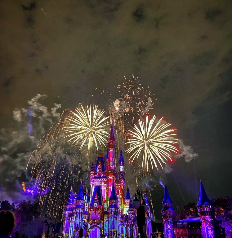
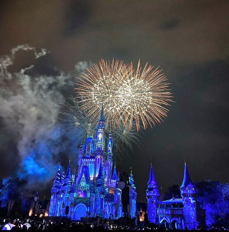
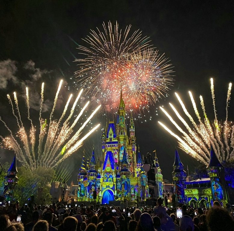
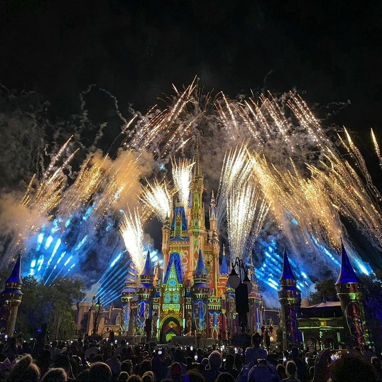
With some of the ribbons now removed, we can see that the ribbons were never really projected on during majority of the show. In contrast to the jabot and swag decorations, those were purely projected on as they can be seen all around the castle despite not being there physically anymore.
Screenshot_20230512_004031_Instagram.jpg

Screenshot_20230512_004043_Instagram.jpg

Screenshot_20230512_004050_Instagram.jpg

Screenshot_20230512_004014_Instagram.jpg


We never got this weird transition period before the 50th because all the ribbons were already installed by HEA's return in July 2021.
 

Register on WDWMAGIC. This sidebar will go away, and you'll see fewer ads.

Back
Top Bottom